Toronto X The Condominium | ?m | 44s | Great Gulf | a—A

For many years I used to live a couple of blocks from where X is now rising and I love almost everything about the building. The one feature I don't think lives up to the rest of the vision is the silly use of random, primary-colour, stripes.

I agree with you. Up close the small patches of colour look OK but you don't have to get very far from the building for these patches to look like a construction defect. I think the main reason the architect added these patches of colour was to add an element of "originality" to what is essentially a design by Mies van der Rohe which is now 60 years old !

http://en.wikipedia.org/wiki/860-880_Lake_Shore_Drive_Apartments

These small patches of colour strike me as being timid. If you want to add colour to your building you should go bold as they do in Holland.

http://img.photobucket.com/albums/v481/azor/rotterdam09/IMG_3110.jpg

(photo by Ronald)
 
Ahh, if only we had a firm as bold and daring as KCAP, and a public willing to go the extra mile. Something like La Pomme Rouge would be perfect for Yonge and Bloor.
 
Wow! You need to relax. You act as if I attacked you personally and not a building. It was an opinion, of which I am entitled. It was actually meant tongue in cheek.

And as a rebuttal you only countered one of my points: The one on primary colours.

You missed my second point: It was poorly executed. I love vibrant colours, as a matter of fact and perhaps if they were bolder and not an afterthought I might not have minded so much.

And of course from a few blocks away the yellow is still all that stands out. The red and blue are lost and it just looks like the black paint is missing. A design flaw I'm sure a Scandinavian would not have tolerated.

I need to relax? My response was an attempt to get you to relax. It's some subtle detail on the building, not 150 metre tall, bright red and plastic. Opinions are welcomed, but arguing that people out grow interest in colour at age 3? Are you sure you want to go with that statement? And I didn't miss your second point. Arguing that it is a design flaw is problematic. It's more a case of it not suiting your personal taste.

I assure you that I'm quite calm. Tiny accents of colour on a building is nothing to get up in arms over. In addition, your comment was a bit condescending to people that like this design element, don't you think? I'm apologize if you considered this an attack. It wasn't meant to be. Lets just move on, shall we?
 
Last edited:
You missed my second point: It was poorly executed. I love vibrant colours, as a matter of fact and perhaps if they were bolder and not an afterthought I might not have minded so much.

And of course from a few blocks away the yellow is still all that stands out. The red and blue are lost and it just looks like the black paint is missing. A design flaw I'm sure a Scandinavian would not have tolerated.

You make a couple of interesting claims:

1) That seeing small areas of colour against a large neutral ground provides the viewer with an inferior emotional experience ( "poorly executed" ) compared to seeing larger areas of colour. That's based on the fact that you "love vibrant colours" and "might not have minded so much" if they had been bolder - which is a matter of personal colour preference. Yet you also dismiss that same love of intensity by saying that "primary colours visually appeal to children under the age of 3".

2) That the varying intensity of different colurs when seen from various distances is a "design flaw" in Madame X. Now, a black/yellow contrast is stronger than a black/red contrast, which in turn is stronger than a black/blue contrast, and The Great Man could have reduced that difference when he designed La X by using larger areas of red and much larger areas of blue, but is the transition in colour that occurs when the building is seen from different distances a "design flaw" or merely the way he intended the colours to pop as the building is approached?
 
I agree with Traynor. From a distance, yellow accents may just appear to be unfinished panels.

The arguement is pretty silly, mostly the counter arguements, the last one made me want to hurl.
 
Aww, calm down sparky, things aren't all that bad...

1452__vacation_l.jpg
 
I agree with Traynor. From a distance, yellow accents may just appear to be unfinished panels.

The arguement is pretty silly, mostly the counter arguements, the last one made me want to hurl.

I respect Traynor's opinion and glad he made it as this is the point of a forum, discussion. But I do not think the design looks like a mistake from a distance. I have a view of X from my office at King/Parliament and it looks great, a slick black tower and I do not even see the colour panels. And I actually love how the closer you get to the condo the colour details unfold. I think once the balconies are all installed this building will be one of the top condos in the city, alongside with Casa.
 
Amazing Tomms!

I can't come close with my borrowed point & shoot, but I'll provide an Oct. 29th update.


Click on the thumbnail to enlarge, then click again on the image for full size.

 
Yet another winning project. The balcony railings are just fantastic. dt, your pics are excellent and greatly appreciated. Cheers.
 
colour panels

I respect Traynor's opinion and glad he made it as this is the point of a forum, discussion. But I do not think the design looks like a mistake from a distance. I have a view of X from my office at King/Parliament and it looks great, a slick black tower and I do not even see the colour panels. And I actually love how the closer you get to the condo the colour details unfold. I think once the balconies are all installed this building will be one of the top condos in the city, alongside with Casa.

Absolutely agree with you Weird Fishes..well said...(its nice and about time that X is a condo building in Toronto that is striking,beautiful and certainly not bland like most Toronto condominium architecture).
 
I agree with Traynor. From a distance, yellow accents may just appear to be unfinished panels.

The arguement is pretty silly, mostly the counter arguements, the last one made me want to hurl.

I always thought that at first glance the yellow vertical slashes at Spire! looked like plywood boards when viewed from a few streets away but then my eyes aren't great with distance. X however uses a bolder or deeper yellow along with blue and red for it's horizontal slashes which I don't think look unfinished at all. I believe Urban Shocker nailed it on the nose when he suggests that the colours pop as one approaches the building; first yellow then red and finally blue delivering a new experience as opposed to it's beautiful, simple black profile when viewed from a distance.
 
Last edited:
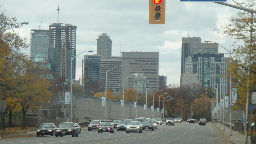
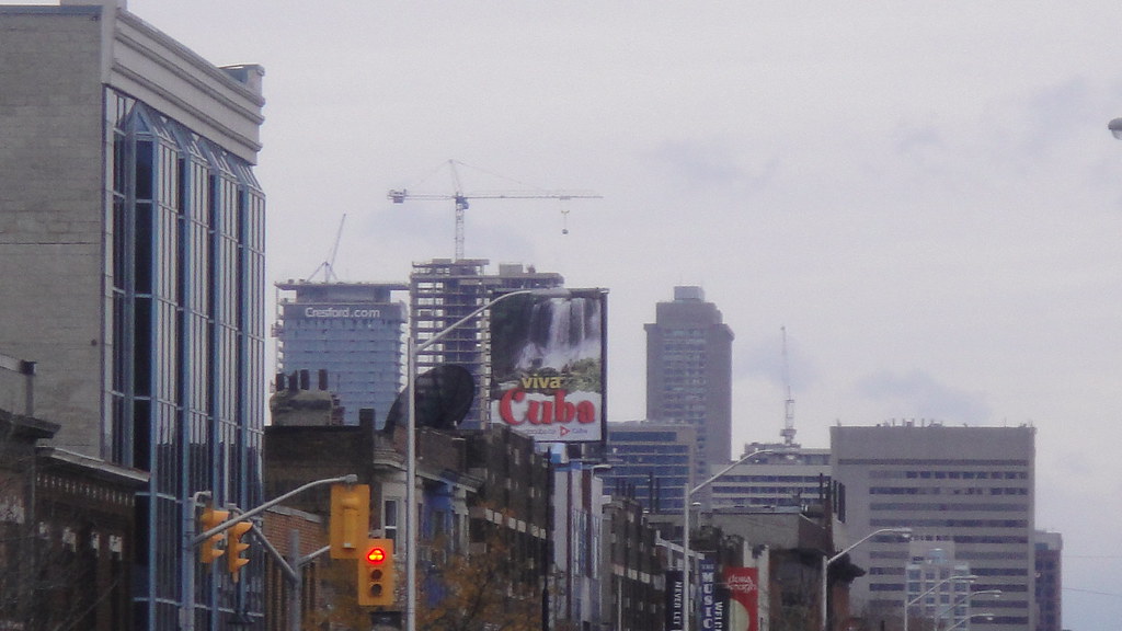
Here's some shots I took today from the Danforth:

Casa, BSN, X Condo, Crystal Blu, etc...

4060951885_29dc7bec87_b.jpg


4060951341_82e5eca6b0_b.jpg


All photos by me: steveve


Happy Halloween everybody!!!
***and don't take candy from strangers and/or get in strangers cars :haha:

steveve-
 
Last edited by a moderator:

Back
Top