Toronto West Harbour City | ?m | 36s | Plaza | BDP Quadrangle

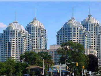
Totally disagree with you on this one and would like to see more like it else where, even taller. I love the north view best of all.

It better than a lot of others that are plain Square box and no class as well glass.

It all boils down to the eye of the viewer.

My thought's exactly. I'd like to see more of this kind of build form and less boring glass boxes that continuously blend into one another.

God I hate this clunker of a building! But I still photographed it.:)

Say what you like about this project at least it stands out, in a good way for me in a bad way for you, unfortunately for you she's not going anywhere soon. Guess you'll just have to keep slandering it as it seems that's the only way for you to deal with it.
 
Is it possible for there to be a "Moderns-for-WHC" subset? (I guess I'd pass for such a Voltairean...)

if I had a bone to pick, it's less with the style, than with the problem with all W-of-Bathurst highrise condos: that maybe they shoudn't exist at all for "respecting Fort York" reasons...
 
I think it's a nice change from a glass box. I'd also like to see more like this but with retail on the bottom floor.

It's not a particularly memorable tower either though, without interesting stone details in all its precast glory. It stands out amidst the glass towers. If you want to see more of this, go to the Etobicoke waterfront or North York where you'll find clusters of towers like this. But I doubt you'll come back raving. It's one kind of banality against another. These kinds of towers interspered with all the glass make for interesting scenes.
 
if I had a bone to pick, it's less with the style, than with the problem with all W-of-Bathurst highrise condos: that maybe they shoudn't exist at all for "respecting Fort York" reasons...

I agree, but then again the city should have purchased all that land years ago and turned it into parkland. Cant blame the developers, the greedy City of Toronto is the ones to blame by issuing all kinds of development permits, to bad its to late now.
 
Last edited:
It's not a particularly memorable tower either though, without interesting stone details in all its precast glory. It stands out amidst the glass towers. If you want to see more of this, go to the Etobicoke waterfront or North York where you'll find clusters of towers like this. But I doubt you'll come back raving. It's one kind of banality against another. These kinds of towers interspered with all the glass make for interesting scenes.

I've been to the Etobicoke waterfront and North York many times and neigher have clusters of anything like this building. (From what I've seen) Why don't you post a few pics and prove me wrong.
 
I've been to the Etobicoke waterfront and North York many times and neigher have clusters of anything like this building. (From what I've seen) Why don't you post a few pics and prove me wrong.

The clusters of non-glass towers which don't leave me thrilled of the alternative:


and the surroundings:


North York's most infamous cluster:
gallery.jpg


I'm not complaining about the examples in Etobicoke. They're attractive and quite comparable precast postmodern buildings, but don't represent an objectively better approach. A more mixed solution would be better in my opinion, rather than for instance, 30 glass or precast towers.
 
clearly there's a lot of well thought out architectural detailing and built form variations on West Harbour City as compared with the Marina Del Rey & Grand Harbour Harbour complexes in Etobicoke ~

West Harbour City
3843624605_cdf1d9cd5a_o.jpg

Grand Harbour


Marina Del Rey
 
The clusters of non-glass towers which don't leave me thrilled of the alternative:


and the surroundings:


North York's most infamous cluster:

gallery.jpg


I'm not complaining about the examples in Etobicoke. They're attractive and quite comparable precast postmodern buildings, but don't represent an objectively better approach. A more mixed solution would be better in my opinion, rather than for instance, 30 glass or precast towers.

So you think those building are similar to WHC?

They look nothing at all alike, not in form, not in massing, not in colour, not in design details and certainly not placement, regarding the street. On the street level, they are completely different. Hell, on almost every level, they are completely different. The only way they are similar, is that they have precast but all building in Toronto are covered by precast or glass.

No doubt about it, West Harbour City is a much nicer building all around.
 
Yes....

Agreed. WHC is nothing like those buildings and while it isn't a stunner it does go easy on my eyes.
 
Besides, why use Grand Harbour and Marina Del Rey as the Etobi-comparison points? They predate the Motel Strip cluster by some two decades...
 
I'll join the Modernists for WHC camp: this building shows far more attention to detail than the average precast tower: Shocker considers this bad Quadrangle, because it doesn't fit with the best of their modernist buildings, but I see a well thought out response to a developer's request for something different and dramatic here. WHC can also be considered a massive step up for a developer - Plazacorp - that has normally foisted fussy or undisciplined dreck on us wherever they gone before (see Yorkville's clunky Regency, the fussy 77 McMurrich, the horrible Imperial Square bldgs at Adelaide & Sherbourne with the exception of the loft building, the non-descript 20 Collier, many other lamentable buildings about town, but last and least, one building that Plazacorp does not even admit to developing on their website; the remarkably ugly University Plaza).

In comparison, WHC reaches for the sky with its peaked-setback rooflines, has playful but not over-the-top spires on the corners of its terraces, and includes patterns in and some colouration of the precast panels where most developers don't pay a dime for those touches. All of that without the cornicey adornments that turn up on so many Plazacorp Forgin' Georgian projects.

Still, I'm not convinced that the windows look as good as they could, and the project awaits final judgement once it has been finished, but I am pretty happy with how this one is coming along in the meantime.

42
 
So you think those building are similar to WHC?

They look nothing at all alike, not in form, not in massing, not in colour, not in design details and certainly not placement, regarding the street. On the street level, they are completely different. Hell, on almost every level, they are completely different. The only way they are similar, is that they have precast but all building in Toronto are covered by precast or glass.

No doubt about it, West Harbour City is a much nicer building all around.

I chose the buildings specifically to be different from WHC for the sake of being realistic. That the examples I brought up differed dramatically is important because who would even suggest repeating WHC many times? WHC is a standout. The fact is that with different budgets, different sites and the demand for differences in styles, the anti-"glass box" philosophy can and will lead to plenty of blandness, as the last few decades have shown.

I think what it comes down is a desire to developers investing more in the architecture of their buildings. I believe that's what it comes down to, not the shape or form of the building. WHC impresses us because the details are above average and we'd like to see more buildings follow its example on that basic level of investment. To quote interchange42 who sums up the exceptional appeal of WHC well:

WHC reaches for the sky with its peaked-setback rooflines, has playful but not over-the-top spires on the corners of its terraces, and includes patterns in and some colouration of the precast panels where most developers don't pay a dime for those touches. All of that without the cornicey adornments that turn up on so many Plazacorp Forgin' Georgian projects.
 
I'll happily agree with interchange42. There are far too many bad faux-historic pre-cast fugly buildings, but this building succeeds in all its attempts to be a decent representation of an art deco apartment building. Like X, its a damn fine hommage.
 

Back
Top