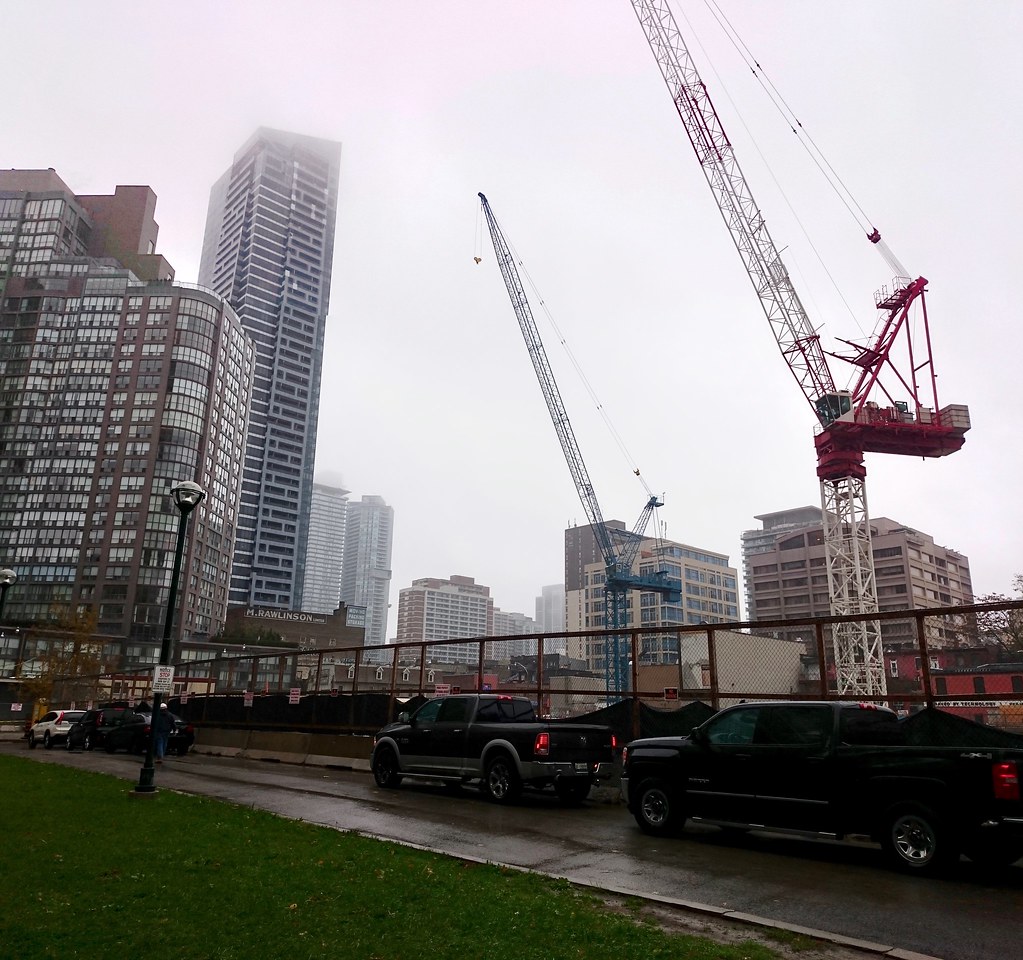
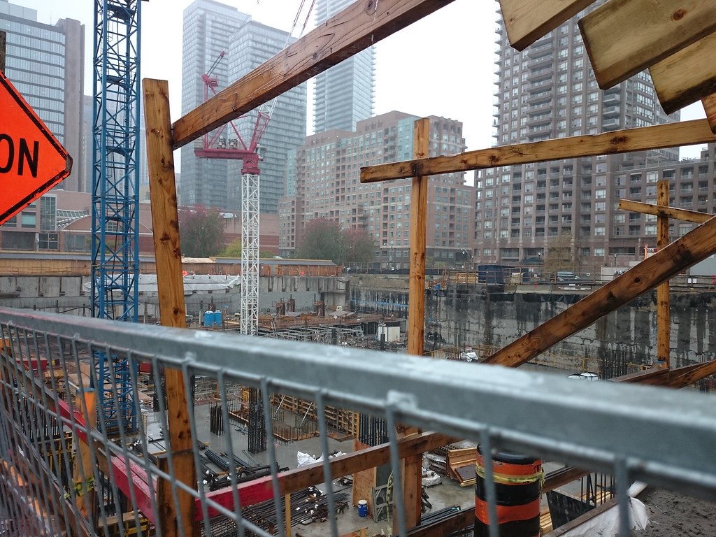
Toronto Wellesley on the Park | 194.15m | 60s | Lanterra | KPMB

From today:
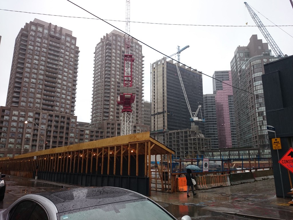
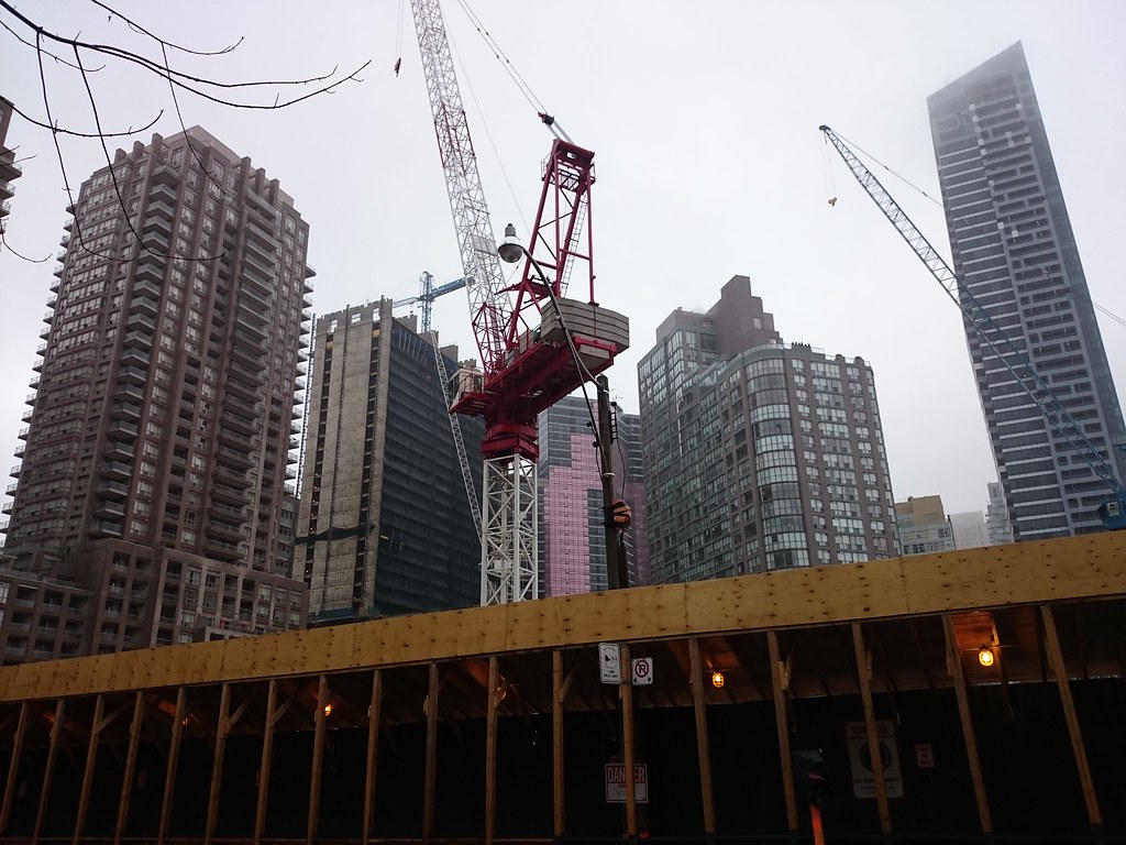
Interesting collection of towers forming surrounding this future park. This tower should sit nicely next to FIVE.
30492485622_d10ae36f66_b.jpg


30609497885_2d540bab4d_b.jpg


30521193771_1fde190995_b.jpg


29977626484_979efdda7f_b.jpg
 
I have it on good authority that as it stands today, the park will include the U driveway as-is and it will remain private property of the owners of 909 Bay Street. This is because the city apparently has been unwilling to negotiate with the residents of 909 Bay who own the parking garage below the U driveway space. Residents are simply trying to reach an agreement where the city will help fund any damage that may happen by allowing their private space to be public.

Can anyone comment if any such arrangements are in place anywhere else, for example in places like College Park? Who is responsible when a skating rink leaks?
 
I wonder if this total site area is the largest currently open in the city where there's only a single tower...
 
Good chance! Certainly no-one else shares their site with a one acre park.

42
 
All the photos of this project make me appreciate that older condo building in the background, Opera Place.

There are several features that make Opera Place interesting: the use of colour in the materials (polished granite at street level, warm orange brick and glass with copper-patina coloured framing), the horizontal massing, the dynamic use of setbacks, and the harmonious use of horizontal and vertical lines along the facade.

It's a refreshing change of pace from all the glass towers in the area.
 
Riverside square is a a single tower and is much bigger! (Though it has midrise buildings as well)
Riverside Square may have a common garage, but above ground it will be multiple buildings.

42
 
All the photos of this project make me appreciate that older condo building in the background, Opera Place.

There are several features that make Opera Place interesting: the use of colour in the materials (polished granite at street level, warm orange brick and glass with copper-patina coloured framing), the horizontal massing, the dynamic use of setbacks, and the harmonious use of horizontal and vertical lines along the facade.

It's a refreshing change of pace from all the glass towers in the area.

I will have to disagree. I don't find this style or these washed out "colours" very appealing. It's ok. It just looks very... baby boomer appropriate. Kids have all moved out, not ready for a retirement home, don't want to move to Florida, getting tired of Richmond Hill/ Oakville. Why not downsize and live in a tasteful bay street condo.
That's the message Opera Place gives me when I walk by.
I'm not judging.
It's just not my thing.
 
Last edited:

Back
Top