Toronto UTSC: Sam Ibrahim Building | 27.1m | 5s | U of T | CEBRA architecture


SIB_EXTERIOR_SEPT24.jpg


NEWS-UTSC_Changes-JAMES-BULLANOFFTHEVARSITY-utsc-web-1536x1024.jpg
 
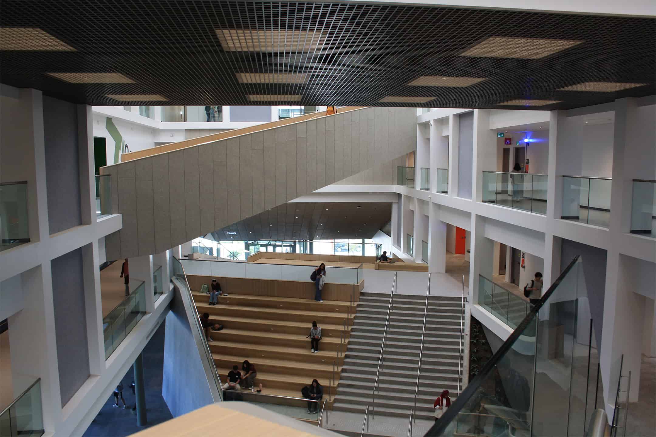
I'm not a fan of these over-done 'Learning Commons' (the wooden risers).

The interior seems to be potentially interesting, though the pics above don't show as much interest as the renders did, but perhaps other views would.

The exterior is entirely corporate office park and forgettable.
 
It's a handsome building that frames the public realm nicely. It urbanizes what was previously a forgettable suburban road. I like the sloped landscape walls. They give it character. The colour palette is forgettable, though.

I find that the colour palette of new builds has been a weakness of several recent UTSC projects, like the new residence with faded brown cladding. If they want to do better, I'd suggest more combinations of neutral or cool colours with warm colours. A classic example is grey with orange accents. That would help to enliven the built form.
 

Back
Top