AlvinofDiaspar
Moderator
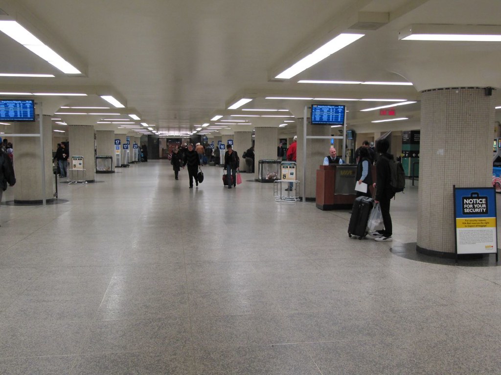
The VIA concourse was refurbished recently but it seems they don't know what to do with the space. What is the supporting furniture for this space? What is the signage strategy for this space? What decorative elements should be added to make it pop? Instead there is temporary furniture like retractable belt stanchions, movable signage, and lighting that can't possibly represent the historic look of the space in 1927 nor act as a modern enhancement. Fluorescent tube lighting came around in the 40s and 50s... and I don't think it is something that should be mimicked aesthetically using LED lights in a 1927 station, unless this is a statement indicating this concourse came to be in the late 40s or beyond. I can't find any photos of this concourse at opening... but it doesn't seem to have much relation to the rest of the station's detail and materials. Still, even if you leave the lighting, ceiling, columns, and walls as they are... there is no real excuse for the uninspired terrazzo flooring and other furnishings or lack thereof.
Big plus though... the ceiling is painted and smooth.
View attachment 471886View attachment 471887
I have never seen a public washroom treated this lovingly.
AoD