Toronto Union Station Revitalization | ?m | ?s | City of Toronto | NORR

That's SAD. (As in Seasonal affective disorder or winter depression, winter blues, summer depression or seasonal depression.)
Social lighting is entirely separate from SAD, and the misleading use of 'light therapy' (which is a plastic inflatable version of the really needed sunshine, not light per-se, which is like what white flour is to whole wheat. The Sun provides many necessary factors for healthy living, far more than just Vit D and photon emission). But if one is to light a public space to provide a healthy, vital, vibrant environment, mimicking the nature of sunlight as closely as possible is a good policy. If it is to be a relaxed space, mimicking candle-light, which the human psyche and retinas have adapted to over eons, is also good policy. Mimicking a welding arc isn't, and that's what most LEDs used for general lighting emulate.

Btw, note that picture of the girl reading with a silly grin on her face. Truly odd since the glare factor and polarized angle incidence is abject. It's amazing what "say cheese" can do. It's a form of shock therapy. Note also the glossy paper, her retinal impression is going to be a very stressed product. Great for causing headaches, and worse.
 
Last edited:
The points pertain to any form of lighting. Chandeliers diffuse and soften light, and offer a much more visually pleasing source even when bright. No matter what the *derivation* of the light, it is imperative that the product be welcoming and enhancing of the architecture.

Just doing quick Google to find the latest status on the chandeliers for Toronto Union Station, not much showing, perhaps the wrong search tags, perhaps the recent cancellation of the contract, but here's a case where the money necessary to get complementary results is not only a prime consideration, it's realized how over-arching it is to 'get it right':
[...]
Oehrlein & Associates
Having worked on historical landmarks like the Washington Monument and the Lincoln Theater, Oehrlein was brought in to take on the difficult task of determining those exact colors of the original Union Station. Their experts examined everything from metals, to plaster, to the walls, floors, ceilings, and roof tiles. The procedure included scraping away layers of filth one by one along with every coat of paint in order to get down to an exact original match in color.

In order to ensure another 100 years of impressive presence in our city, the Station roof was then completely replaced with tiles of the exact shape and color of the originals. The only, but essential difference . . . the use of a special concrete weighing far less than was available over one century ago.

St. Louis Antique Lighting Co.
Recognized for the restoration of lights and fixtures in seven historic State Capitals, St. Louis Antique Lighting Co. provided 12 full-time experts to strip and restore all of Union Station's sconces and giant chandeliers. Each chandelier weighs 3,500 pounds, measures 12 feet in diameter, and requires more than half a mile in wiring and 11,400 watts of electricity. Slowly and carefully, the inviting glow of our Station began to push away the darkness of neglect. [...]
http://www.unionstation.org/renovations

Edit to Add: Will dig further later, but here is the latest reference I can find, and it's from UrbanToronto:
[interchange42 Mod Jim a year ago


Yes, the lighting in the Great Hall will totally change, but we are not being told to what yet exactly.]

Just what is the latest on that, anyone?
 
Last edited:
The City cancelled the contract for their fabrication so I am not sure what is going on with them.
Located the request:
upload_2017-2-6_9-52-4.png


As to what and why that happened is a good question. I still wonder if refurbished used ones aren't available? And at a reasonable price...


Attachments

  • upload_2017-2-6_9-52-4.png
    upload_2017-2-6_9-52-4.png
    34.2 KB · Views: 513
Located the request:
View attachment 98046

As to what and why that happened is a good question. I still wonder if refurbished used ones aren't available? And at a reasonable price...


Given the age of the station it is likely that there are no refurbished originals still around at a decent price. I am still advocating for stadium lighting at around a few billion lumens per square metre in order to brighten up the Great Hall.
 
steveintoronto said:
As to what and why that happened is a good question. I still wonder if refurbished used ones aren't available? And at a reasonable price...

I think large chandeliers like that are unique installations- used ones might be rare to find.

Speaking of chandeliers- I wonder if the tiny ones we have now date back to the original opening?
 
Given the age of the station it is likely that there are no refurbished originals still around at a decent price. I am still advocating for stadium lighting at around a few billion lumens per square metre in order to brighten up the Great Hall.
I am not clear where the idea of refurbished chandeliers came from. The October 2016 Contract Advert (subsequently cancelled) was looking for someone to make some.

Request for Quotation - Prequalification
ecblank.gif
Call number: 3907-16-3141
Commodity:
Goods and Services, Electrical Supplies
Description:
Toronto Union Station Great Hall Chandelier Fabrication,65 Front Street West, Toronto.
The purpose of this Request To Pre-Qualify is to solicit information about your firm’s previous performance and ability to undertake custom luminaire fabrication, specifically regarding Toronto Union Station Great Hall Chandelier Fabrication,65 Front Street West, Toronto.
Issue date: October 6, 2016
ecblank.gif
Closing date: October 20, 2016
 
Mark my words this is happening. Scaffolding is being moved into this area just east of the leather-shop-bypass and under the former Purdy's. The moat is excavated and the at-grade doorways from Union to the TTC have already been cut out of the foundation wall. The area under the former Purdy's is now fully underpinned and new steel columns are installed. I am pretty sure we will soon see the remaining Bay concourse closed and demo'ed once pax are routed through a new diversion into the TTC..

Looks like this will be happening shortly. Pax will be routed entirely into leather shop bypass for the remainder of the Bay concourse to be demoed.

Temporary stairs are located outside in the moat and at grade access to the new lower Bay concourse via new sets of doors is complete.

I assume there are also temporary stairs leading up (west) into the leather shop bypass. Unfortunately I have not been able to gain admittance via Bondfield but I can confirm that until the remaining Bay concourse (hoarding tunnel) is demoed this new lower concourse is limited to the area north of said hoarding (roughly under the former Purdys).

Looking east in moat (notice the two sets of stairs leading up to the leather shop bypass, the angled ones are temporary)
IMG_1126.JPG


Looking east in moat (under the hoarding/tarps on the left of frame are new sets of doors leading to the lower Bay concourse)
IMG_1127.JPG


Looking west in moat
IMG_1128.JPG


Looking west in moat
IMG_1129.JPG


Looking south in Bay concourse from hoarding (majority, if not all, of the excavation and underpinning now completed)
IMG_1130.JPG


Looking north west in Bay concourse from hoarding (you are looking at the back of new full height two story hoarding that encloses the new at-grade doors in the moat)
IMG_1131.JPG


Looking east in moat from leather shop entrance (notice the new set of doors/stairs on the higher grade that lead into leather shop bypass)
IMG_1132.JPG


Looking south from moat at new leather shop doors
IMG_1133.JPG


Looking south at new leather shop doors
IMG_1134.JPG
 

Attachments

  • IMG_1126.JPG
    IMG_1126.JPG
    2.3 MB · Views: 384
  • IMG_1127.JPG
    IMG_1127.JPG
    2.2 MB · Views: 418
  • IMG_1128.JPG
    IMG_1128.JPG
    2.1 MB · Views: 419
  • IMG_1129.JPG
    IMG_1129.JPG
    2.2 MB · Views: 444
  • IMG_1130.JPG
    IMG_1130.JPG
    2.2 MB · Views: 465
  • IMG_1131.JPG
    IMG_1131.JPG
    1.4 MB · Views: 391
  • IMG_1132.JPG
    IMG_1132.JPG
    1.3 MB · Views: 378
  • IMG_1133.JPG
    IMG_1133.JPG
    1.6 MB · Views: 411
  • IMG_1134.JPG
    IMG_1134.JPG
    1.4 MB · Views: 444
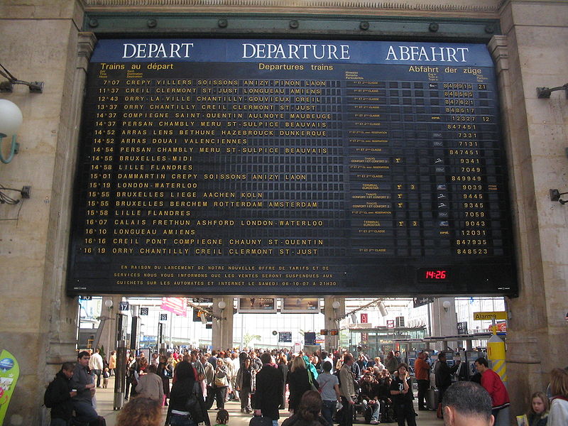
With the concourse closed this would have been a good time for VIA to update their arrivals/departures board to a retro display similar to Paris Gare de Nord

04.jpg

https://soundlandscapes.wordpress.com/2011/10/11/the-gare-du-nord-and-its-sounds/

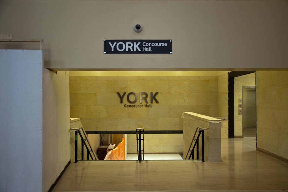
That reminds me. The entrance to the York concourse is greeted by a low unadorned beam running across the span. For tall folks, this is specially problematic. I'm 6ft and I feel like I have to duck even though there's room to spare. The blank beam should be fitted with displays across to create some movement and break up the blank wall. GO schedules can be displayed there.

15749-53201.jpg


Does anybody else get the perception that that beam is too low?
 
Last edited:
That reminds me. The entrance to the York concourse is greeted by a low unadorned beam running across the span. For tall folks, this is specially problematic. I'm 6ft and I feel like I have to duck even though there's room to spare. The blank beam should be fitted with displays across to create some movement and break up the blank wall. GO schedules can be displayed there.

Does anybody else get the perception that that beam is too low?

Which entrance to the concourse?
 
Which entrance to the concourse?

From the main hall (added a pic to the original post discussing it).

Notice how the rest of the walls received a tile treatment. It looks different than the rest of the architecture in the hall. Looks like it was added when the Harvey's was removed.
This beam runs across the entrance and both before and after it, the ceiling is much higher. It has to be structurally necessary to have been put there but it seems way too low. I think a screen or schedule board could help it fit in better.
 
Last edited:
From the main hall (added a pic to the original post discussing it).

Notice how the rest of the walls received a tile treatment. It looks different than the rest of the architecture in the hall. Looks like it was added when the Harvey's was removed.
This beam runs across the entrance and both before and after it, the ceiling is much higher. It has to be structurally necessary to have been put there but it seems way too low. I think a screen or schedule board could help it fit in better.

If it is the spot with the camera and sign for the York Concourse it has always been that low. Even the entrance to Harveys was a little vertically challenged.
 
If it is the spot with the camera and sign for the York Concourse it has always been that low. Even the entrance to Harveys was a little vertically challenged.
I think it's partly an optical illusion caused by the stairs and the next wall. Once the temporary wall to left is removed it may change things?
 
I think it's partly an optical illusion caused by the stairs and the next wall. Once the temporary wall to left is removed it may change things?

That wall was already removed. This is an old picture. Right now, there's scaffolding in the hall preventing a clear view. It is definitely lower than standard height. For example, this beam runs lower than the one that leads to the elevators. In fact, the beam is just slightly higher than the elevator door.

At first I thought that this had to be temporary but from what I've seen over the past year since it opened, it's here to stay. Looks to be structurally necessary.
 

Back
Top