Toronto U of T: University College Revitalization | ?m | 3s | U of T | Kohn Shnier


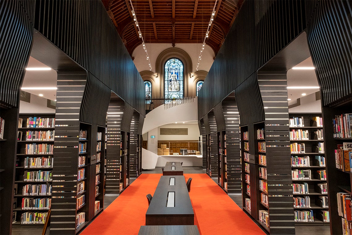
Thanks! The library didn't quite work for me - but I guess it's too early to really judge without proper lighting. The swoops from the columns up to the mezzanine didn't work for me either - the horizontal slats and the vertical lines clashes, looks clumsy and looks way too domineering over that space.

AoD
 

:( That's my alma mater.

I'm not happy.

I was looking forward to this project; including the shift of the library back to the heritage portion of the building.

I really don't like how this has been handled.

I completely support accessibility improvements and modernization of classroom tech.

But on the the aesthetic side, this is a heritage property and every effort should be made to maintain/restore the integrity of the property.

Instead we've got a lot of mishmashed 1/2 modern styling worked into with nods to the building's heritage that serve neither the modern, nor the historical.

Gag!

I'm going to have something to say about this under my real name...........probably can't fix it now..............for another generation, sigh.

But I'm going to do my best to make people regret this crap.

What a waste of money.

Well, at least the dungeon (pic on the site) didn't look as bad as it did before, nor the classrooms as suffocating as they were. Not sure why they chose Kohn Shnier for the job in the first place (wouldn't be my personal choice for sure).

AoD
 
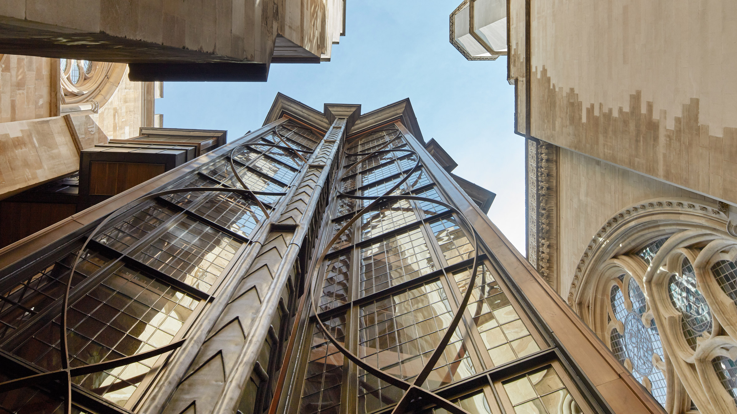
I absolutely love the exterior of the elevator tower. All the interiors feel insensitive and shoehorned-in.

Not the worst, but could have been even better - one of the best vertical access additions I have seen is at Westminster Abbey - it was an absolute delight to use and be in.


AoD
 
Agreed - this is not congruent and feels very off. I think I know what they were going for, but sadly they missed the mark .
Incorrect deployment of the slats and quite overbearing. I like the contouring in some areas, but generally find the result poor.
 
Laidlaw was always somewhat problematic at UC, kind of an unwanted carbuncle/child on the original structure (speaking in Prince Charles cadence). All in all though one of the better libraries and collections on campus.
 
It should compliment the aesthetics of the building but it treats it like an unfortunate backdrop to be covered up and obscured from view.. This doesn't work. Has it not occurred to them that thee old architecture is its best feature? And that people might want to sit in period chairs and at period talbles? Not everything needs to be modern to work.
 
Video tour of the renovated interior spaces:


Photo of the UC library:


uclibr.jpg
 
Video tour of the renovated interior spaces:


Photo of the UC library:


View attachment 356647

I absolutely hate this!

It seems do disrespectful to the history of the space.
 
I'll also chime in that I hate it, but I'm not sure if that's just nostalgia speaking. I was surprised to see that one of the Halls had formerly been a library though, so I guess this is technically a return to form?

I don't know what the right treatment of those spaces would have been. A lot of them were terribly dated, poorly maintained, and accessibility nightmares. But in some cases it was precisely those features that made the spaces what they were. I guess my hope is just that the younger generations will come to remember the new spaces with the same fondness I had for the old ones.

I'd be completely fine w/the Library use; in fact, I endorsed that idea to UC admin many years ago.

It's the actual fit-out, furnishings and layout that are entirely wrong.
 
I'm assuming the one hall with the red carpet is intended as a flex space for rentals and events, so everything needs to be easily removed?

The library seems dark? Almost claustrophobic? Or is that just because it's a tough spot to get a photo of? Without having been in the new space I think it looks less inviting than Laidlaw. The second floor seems unfortunate. I'd have preferred a single floor, allowing a better view of the windows and ceiling from below.

I dislike what they did to Croft the most. It was bordering on dank before, but the reno makes it look generic and bland. But I guess an update is better than a replacement?

The one nice addition was at the north end, under and behind the JCR, there was a newish alumni lounge in the basement the last time I was through (which was probably several years ago, now that I think about it)
 
The library seems dark? Almost claustrophobic? Or is that just because it's a tough spot to get a photo of? Without having been in the new space I think it looks less inviting than Laidlaw. The second floor seems unfortunate. I'd have preferred a single floor, allowing a better view of the windows and ceiling from below.

I dislike what they did to Croft the most. It was bordering on dank before, but the reno makes it look generic and bland. But I guess an update is better than a replacement?

The black wood makes both of these facilities too dark.
The wood slats for the library's upper level railing look solid from an angle so don't achieve an airy feel.
A simple glass railing would have been better.

The acoustic shield / chandelier in the conference hall lowers the ceiling too much and obscures the dome above.
The dark wainscotting brings the walls in too much visually.
 
Should have asked Roy Thomson Hall if they still have those acrylic sound reflectors from before their redo. But yeah, not a huge fan of the design choices (though not nearly as terrible as I feared) - rather heavy-handed. The updated classrooms looks great though.

The library seems to have a lot of indefensible spaces.

AoD
 

Back
Top