Toronto U of T: Robarts Library Renovations & Robarts Common | ?m | ?s | U of T | Diamond Schmitt

Nov 21, 2020

20201121_094558.jpg
20201121_094623.jpg
20201121_095045.jpg
20201121_095136.jpg
20201121_095153.jpg
 
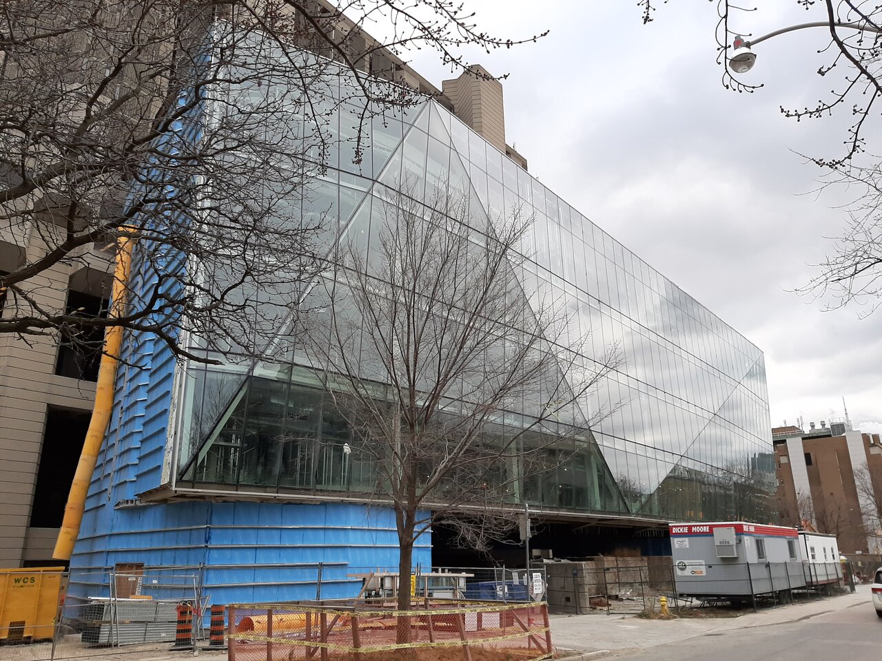
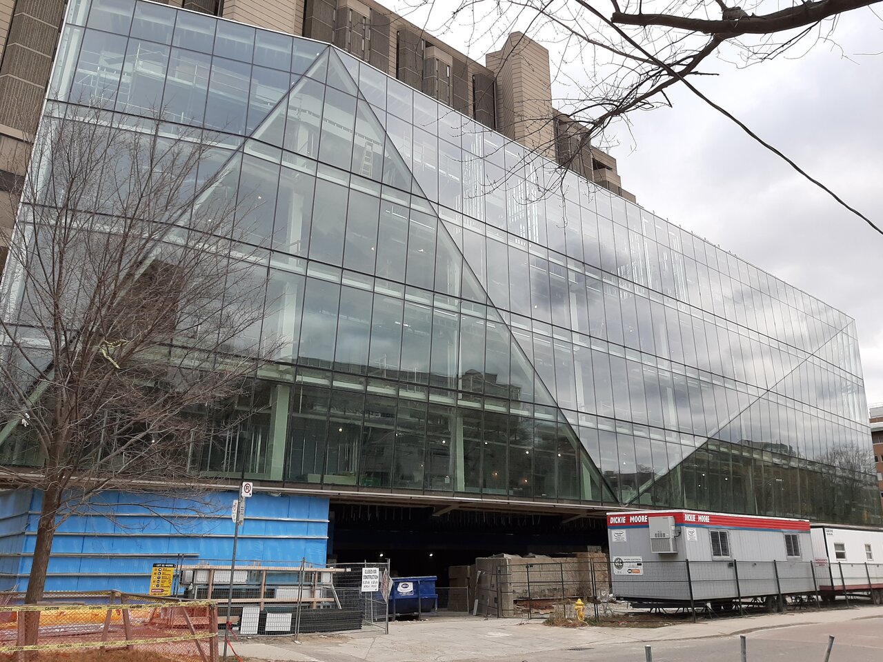
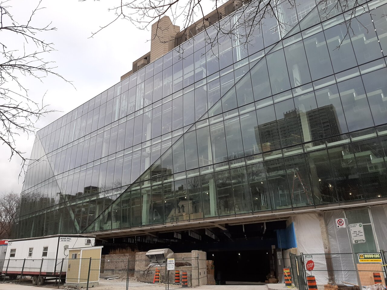
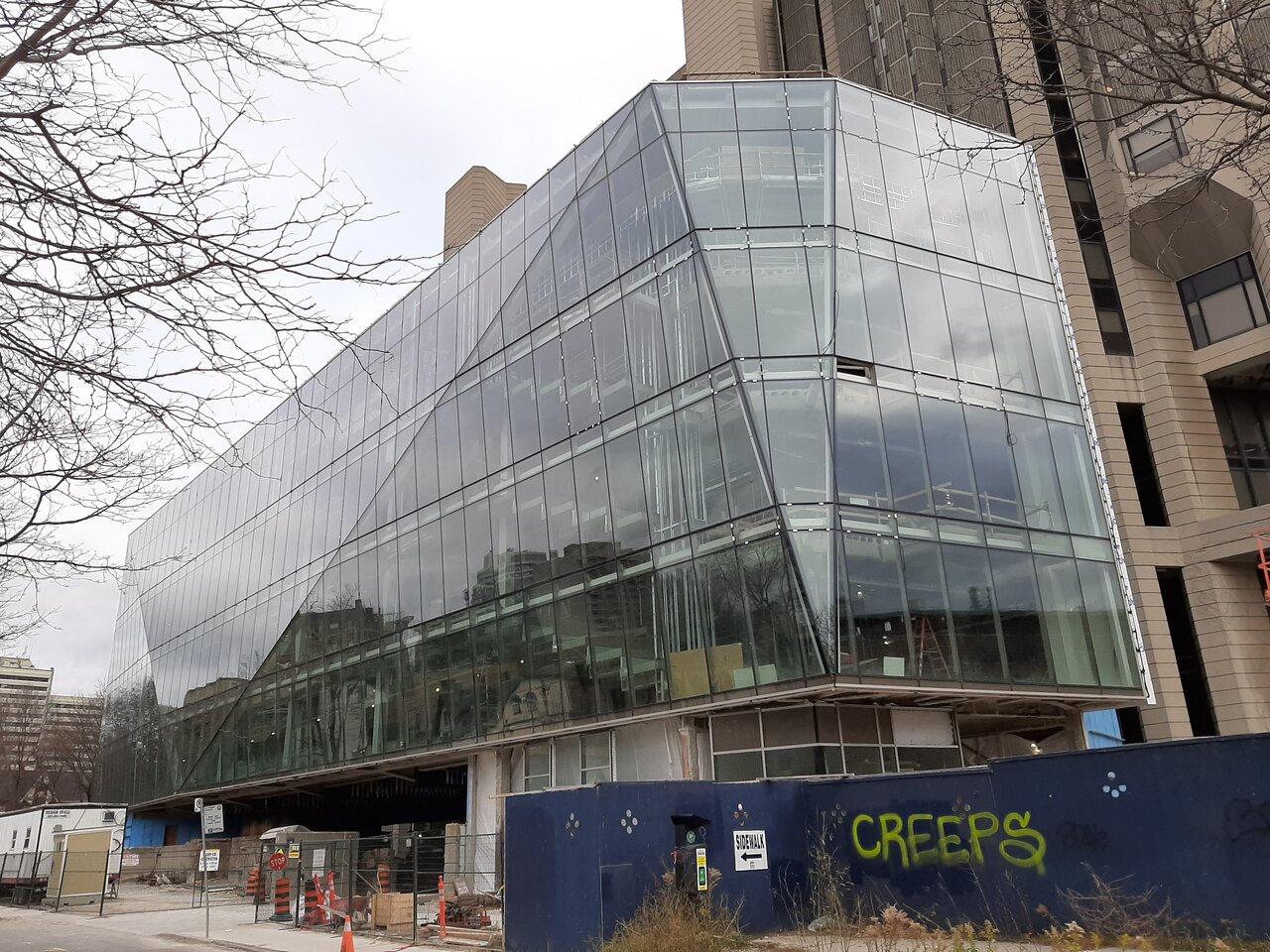
I don't hate this...........but I can't say I care for it either.

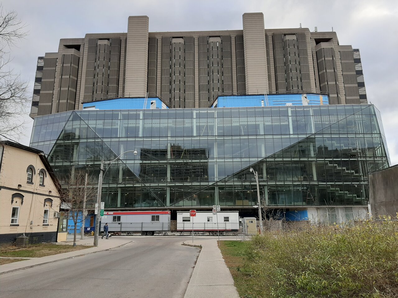
It certainly does not and wasn't meant to blend with the existing structure; but I don't know that it works as a contrast element for me either.

In fairness to the architects, without re-opening the original building, the limited site area restricts one's choices.

But it does feel rather stuck-on to me.

This image, from @Rascacielo ' s post above............:

Makes me wonder about whether the shape of Robarts, you can see the 4 taller bands with windows; and the 2 shorter ones that frame it, could have been emulated within an all or mostly glazed look for the addition.

I'm not sure if that would work better or not.

I feel not so much that the addition is unattractive; but as if it looks as though it doesn't belong.
 
Last edited by a moderator:
I think it's a question of function over form. The original Robarts is primarily a book storage facility - the less light, the better, which explains the narrow slits of windows. The addition contains mostly (maybe exclusively?) study space - having lots of natural light is desirable. Not to say they couldn't have designed something more complementary (a glassier version of the original), but perhaps it's cheaper this way or they wanted the addition to contrast with the original.
 
I think it's a question of function over form. The original Robarts is primarily a book storage facility - the less light, the better, which explains the narrow slits of windows. The addition contains mostly (maybe exclusively?) study space - having lots of natural light is desirable. Not to say they couldn't have designed something more complementary (a glassier version of the original), but perhaps it's cheaper this way or they wanted the addition to contrast with the original.

Your 'glassier version of the original' was the idea I was trying to communicate.

Let the natural light in, a contrast in material palette, but a visual cue/homage to the existing building.
 
Your 'glassier version of the original' was the idea I was trying to communicate.

Let the natural light in, a contrast in material palette, but a visual cue/homage to the existing building.
Indeed. That is exactly what the addition to the National Arts Centre is: brutalism reworked in glass. I am baffled by this project. I guess they wanted to try something different. I don't think it works.
 
The building is not all there yet so it can be properly tied together with the original structure, IMO. So I'll wait till it's more completed before passing any judgements.

Edit/Qualification: I want to see the rest of the cladding added before I write this off or give it a thumbs up.
 
Last edited:
I am no specialist, but although it looks fine by itself, when I look at it attached to Robarts, it's an excrescence and it makes me physically uncomfortable. I just want to reach into the picture and yank it out. Even the Manulife addition doesn't make me feel this way.
 
I like how it makes use of the land around Robarts, but its relationship to the brutalist Robarts is odd, more dissonance than harmonizing or balanced juxtaposition.
 
According to this report of the U of T's Business Board, this one is scheduled to wrap in April of this year.


In the interim some pictures of the interior from said report:

1612287701011.png


Also from the report, a note on some of the bumps this one has had:

1612281102888.png


Almost 2 years behind schedule (original completion date (contract completion date) shows April 2019
 

Attachments

  • 1612281040876.png
    1612281040876.png
    479 KB · Views: 263
Last edited:

Back
Top