You are using an out of date browser. It may not display this or other websites correctly.
You should upgrade or use an alternative browser.
You should upgrade or use an alternative browser.
Toronto U of T: Myhal Centre for Engineering Innovation and Entrepreneurship | ?m | 8s | U of T | Montgomery Sisam
- Thread starter greenleaf
- Start date
Miscreant
Senior Member
Member Bio
- Joined
- Oct 9, 2011
- Messages
- 3,616
- Reaction score
- 1,795
- Location
- Where it's urban. And dense.
ProjectEnd
Superstar
vini007
Active Member
i guess limited funding on this building.. so poorly done..
Miscreant
Senior Member
Member Bio
- Joined
- Oct 9, 2011
- Messages
- 3,616
- Reaction score
- 1,795
- Location
- Where it's urban. And dense.
Really? In what ways? When I was past here two weeks ago I was struck at how tasteful it is. The columns, in my view, are extremely tasteful--they add solidity and continuity to the building without being mundane, because the pattern subtly breaks 1/3 up. The brickwork/colour is very subtle and soft. And if you look carefully, this building 'talks to' the 1960s/70s engineering building just one address south.i guess limited funding on this building.. so poorly done..
I thought this was really tastefully done, in other words.
ADRM
Senior Member
Really? In what ways? When I was past here two weeks ago I was struck at how tasteful it is. The columns, in my view, are extremely tasteful--they add solidity and continuity to the building without being mundane, because the pattern subtly breaks 1/3 up. The brickwork/colour is very subtle and soft. And if you look carefully, this building 'talks to' the 1960s/70s engineering building just one address south.
I thought this was really tastefully done, in other words.
Same -- I'm actually pleasantly surprised by it, and there's some nice, subtle detailing when you walk around it up-close. Really the only things I dislike about it are the horribly cheap-looking panels covering the mech and the fact that it doesn't fit particularly well when you're in the quad.
someMidTowner
¯\_(ツ)_/¯
UT toured the building on Friday: http://urbantoronto.ca/news/2018/08/inside-university-torontos-new-myhal-centre
A few extras:
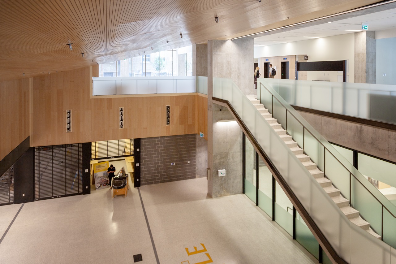
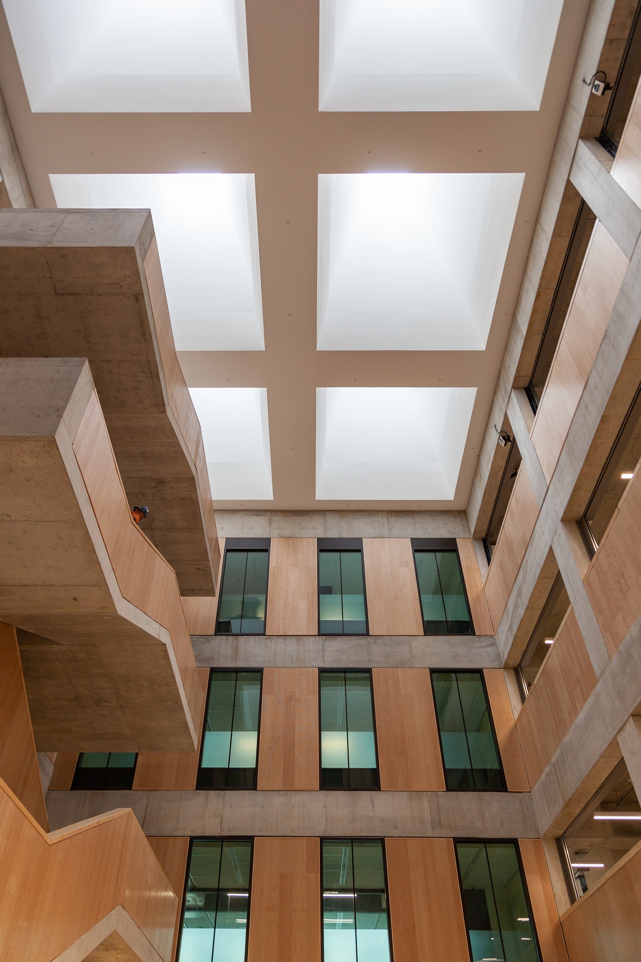
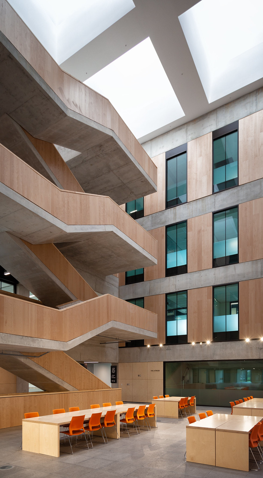
[url=https://flic.kr/p/2ahHLST]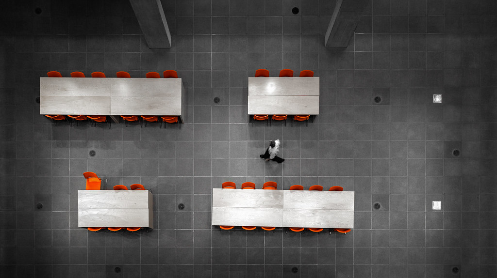 [/url]
A few extras:

[url=https://flic.kr/p/2ahHLST]
 [/url]
Attachments
TrickyRicky
Senior Member
The St. George side of the building is well done and the architecture is congruent with the context. If you're familiar with U of T Engineering buildings you will know how well this fits in. It's the Front Campus side that's a bit jarring and insensitive. Kind of like us Engineers come to think of it  (Alumni but not practicing myself)
jje1000
Senior Member
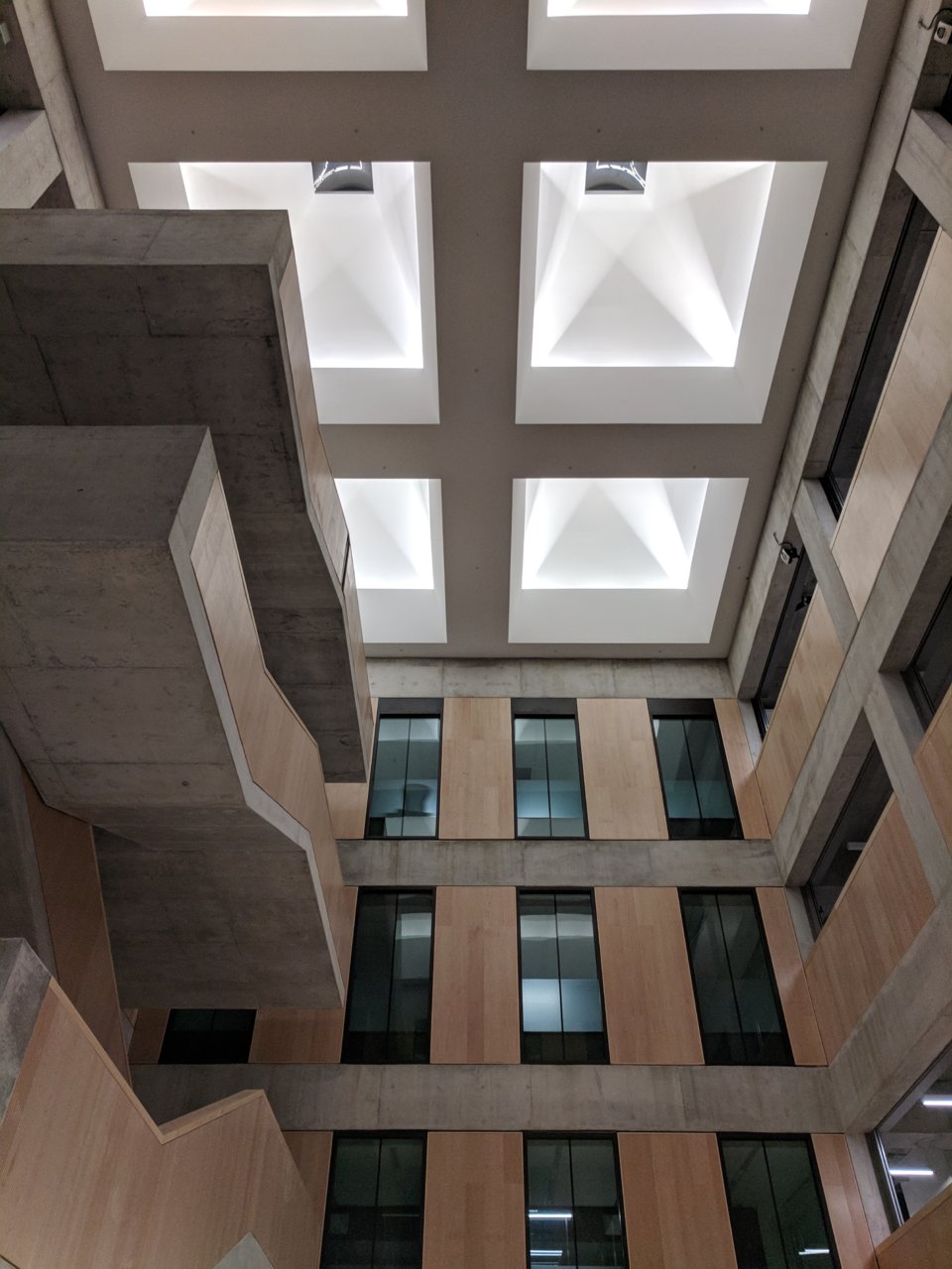
The interiors are very nice (especially the atrium), but I definitely think a darker, more textured exterior cladding material would have been better.
Until the building gets a bit of grime on it, it'll feel 60s-institutional (perhaps its boxy, contextless form has to do with it as well).
Until the building gets a bit of grime on it, it'll feel 60s-institutional (perhaps its boxy, contextless form has to do with it as well).
Patch
Active Member
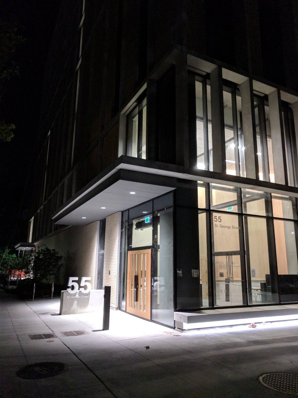
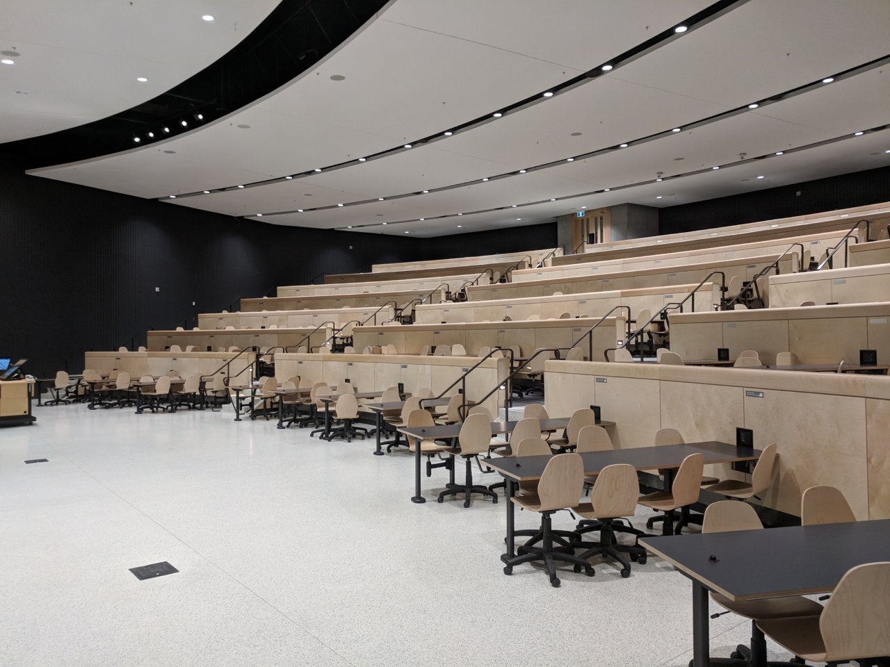
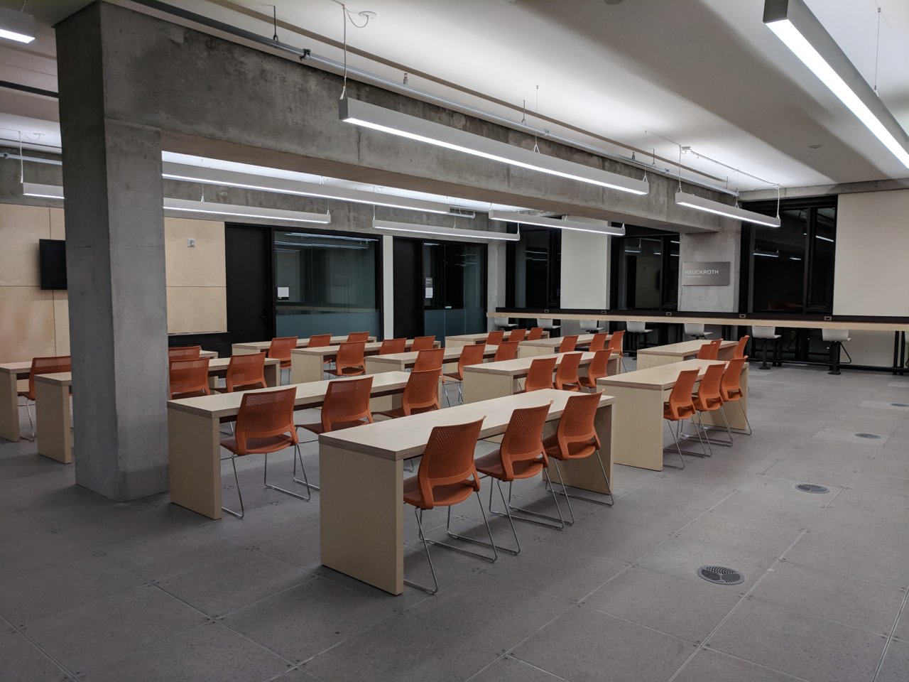
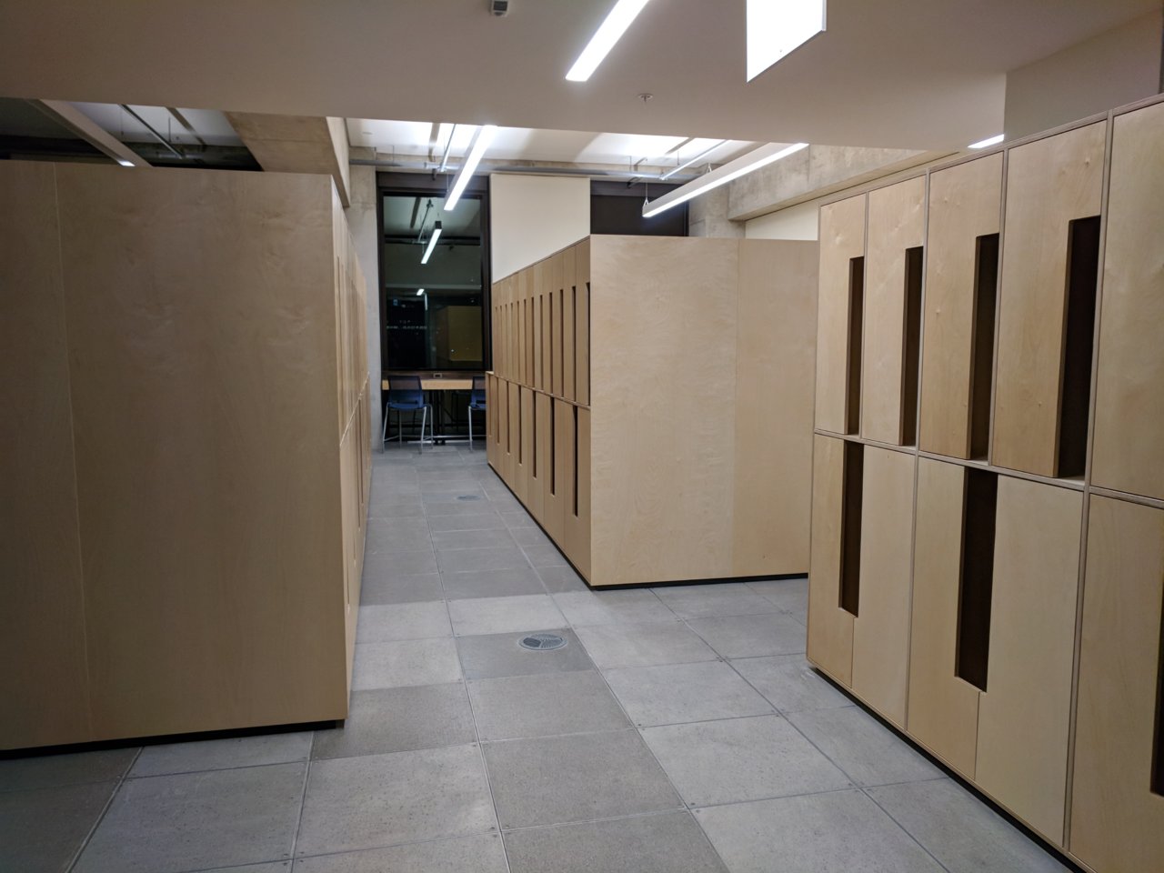
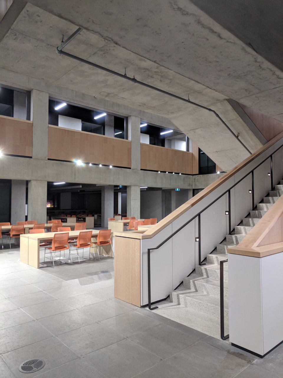
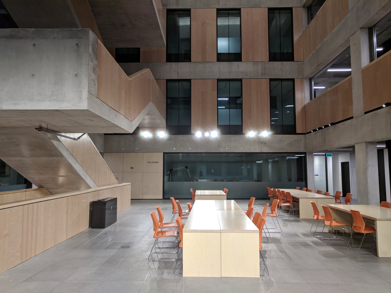
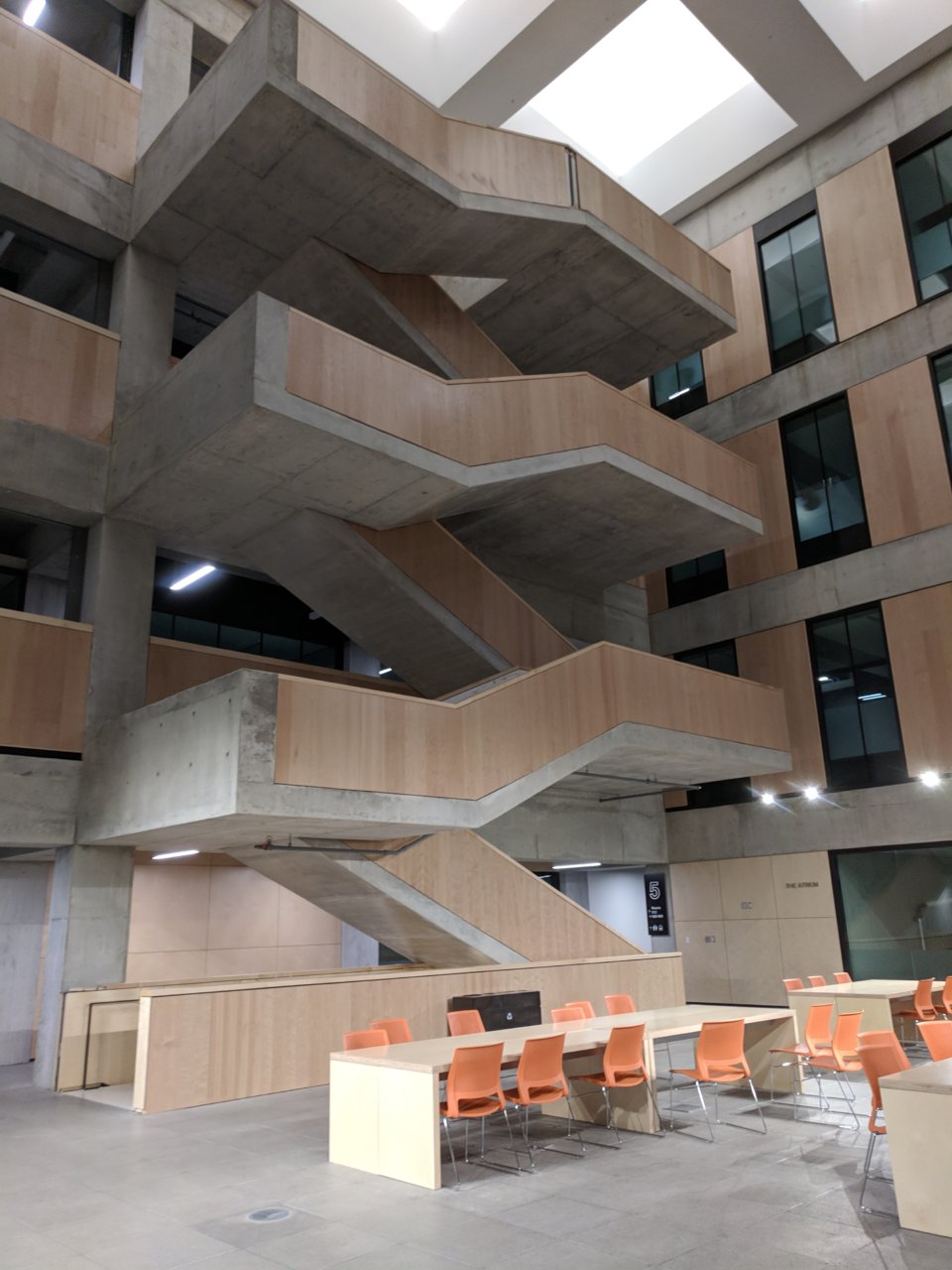
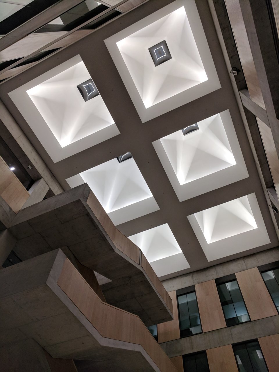
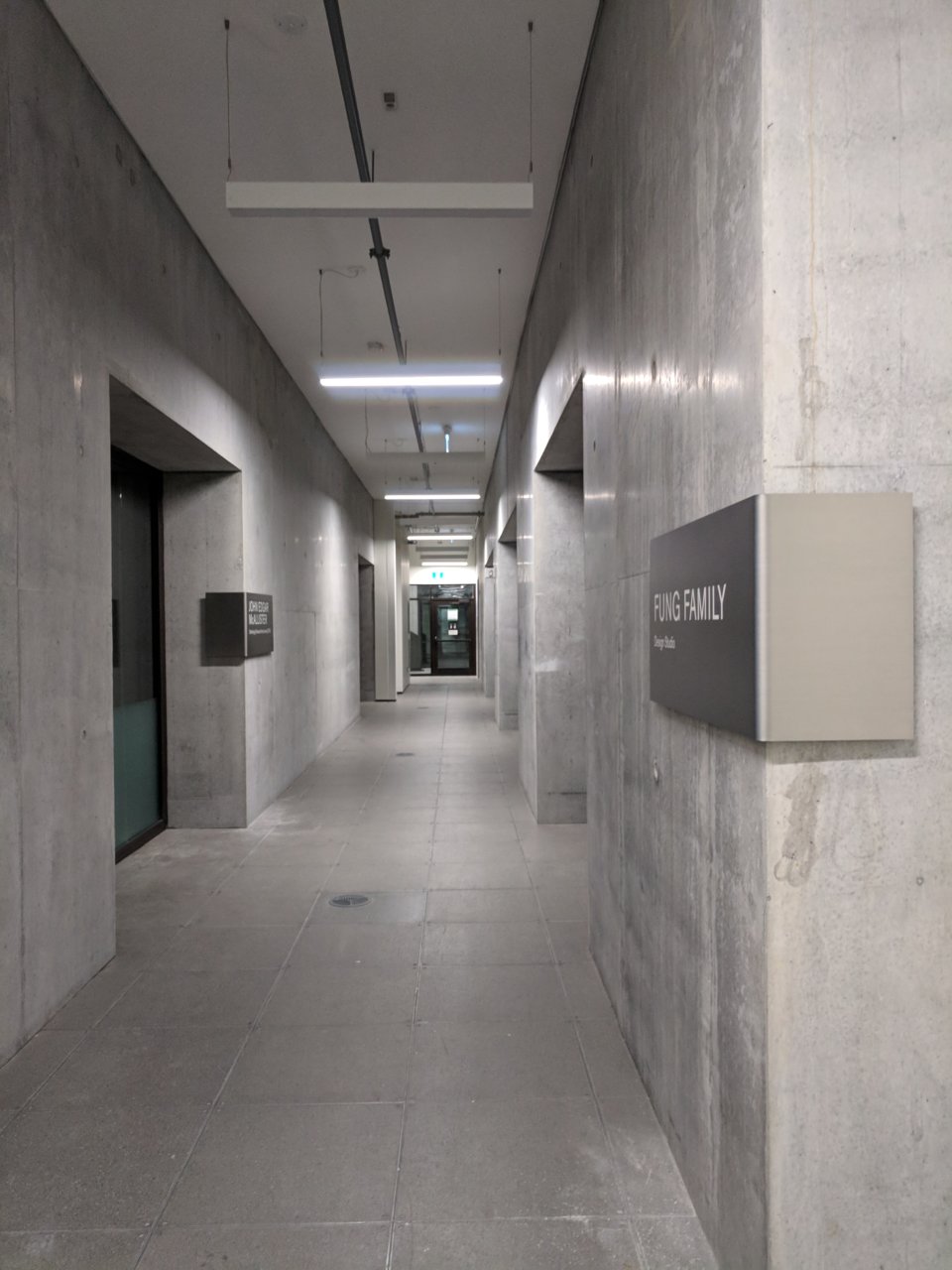
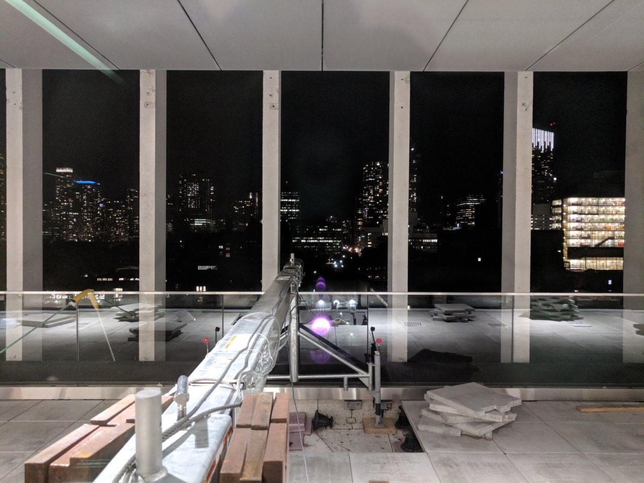
Found this building to be surprisingly unlocked the other night (including many of the interior spaces...). Couldn't resist a self-tour!
Overall the interior seems to be really well done. Great attention to detail and the atrium staircases and skylights are quite eye catching. The terrace also provides some killer views.
They've crammed quite a lot of study space into this building which I'm sure will be heavily utilized. It'll be interesting to see how the space functions now that students are starting to move in.
Attachments
-
 IMG_20180830_225348.jpg167.7 KB · Views: 1,162
 -
 IMG_20180830_223929.jpg121.1 KB · Views: 1,142
 -
 IMG_20180830_223813.jpg170.2 KB · Views: 1,127
 -
 IMG_20180830_223426.jpg166.1 KB · Views: 1,134
 -
 IMG_20180830_222800.jpg156.7 KB · Views: 1,159
 -
 IMG_20180830_222742.jpg177.3 KB · Views: 1,130
 -
 IMG_20180830_222550.jpg184.1 KB · Views: 1,088
 -
 IMG_20180830_222256.jpg168.4 KB · Views: 1,146
 -
 IMG_20180830_222229.jpg158.6 KB · Views: 1,106
 -
 IMG_20180830_222219.jpg146.2 KB · Views: 1,106
 -
 IMG_20180830_222205.jpg150.3 KB · Views: 1,095
 -
 IMG_20180830_222156.jpg144.6 KB · Views: 1,136
 -
 IMG_20180830_222035.jpg126.5 KB · Views: 1,072
 -
 IMG_20180830_221606.jpg178.6 KB · Views: 1,174
 -
 IMG_20180830_221217.jpg218.2 KB · Views: 1,096
innsertnamehere
Superstar
Brutalism is back baby.
AlbertC
Superstar
Great pics, love the interiors!
ProjectEnd
Superstar
RonThom
Active Member
Outside reminds me of melamine. Love it, and the interior concrete. The wood details are nice. And lighting seems to have been well considered. Solid.
Oh, and the giant waffle slab ceiling? Swoon.
Oh, and the giant waffle slab ceiling? Swoon.


![IMG_9250[1].JPG](http://cdn.skyrisecities.com/forum/data/attachments/136/136888-a1fe5332e253205c2fca352c30d14e7a.jpg)
![IMG_9254[1].JPG](http://cdn.skyrisecities.com/forum/data/attachments/136/136889-849a3affb103d9e336402e95d8b9ec43.jpg)


