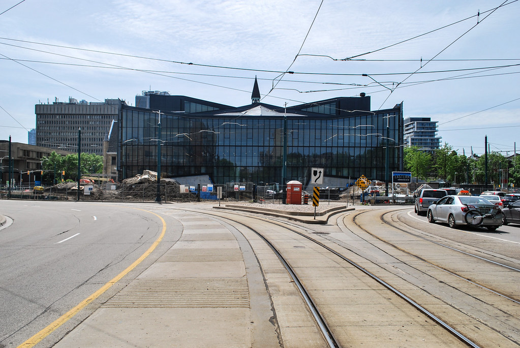
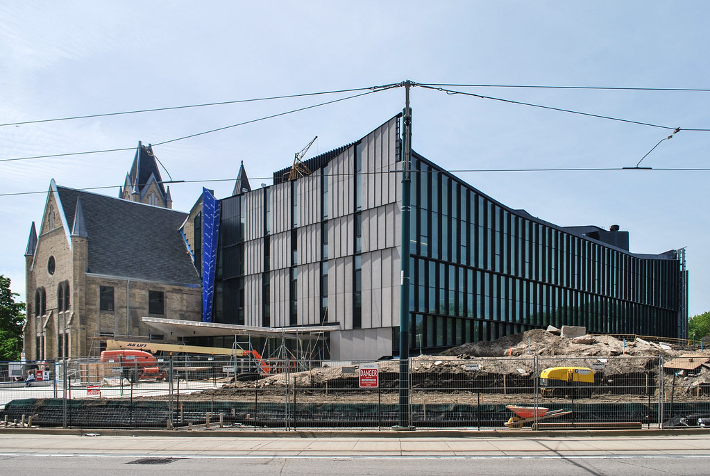
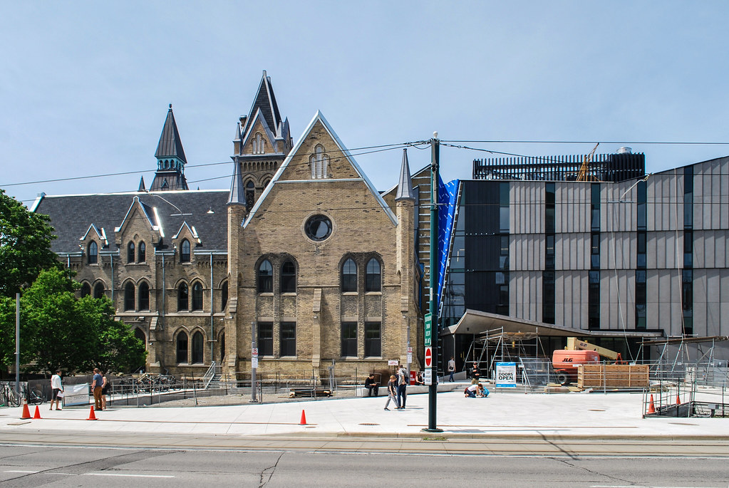
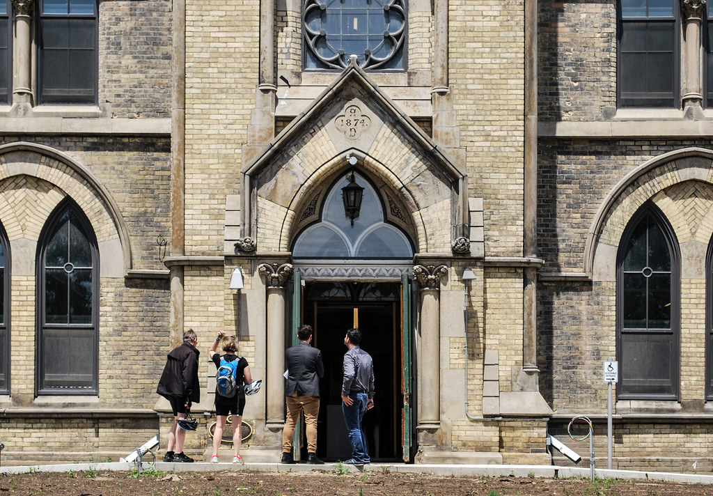
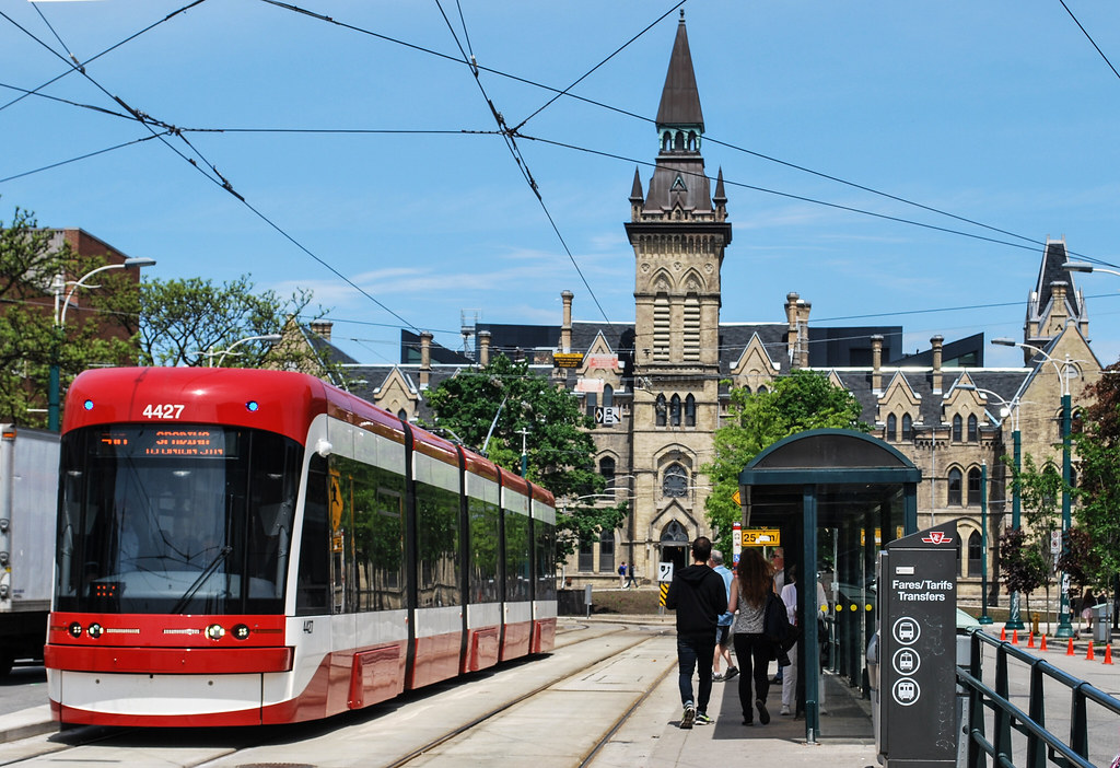
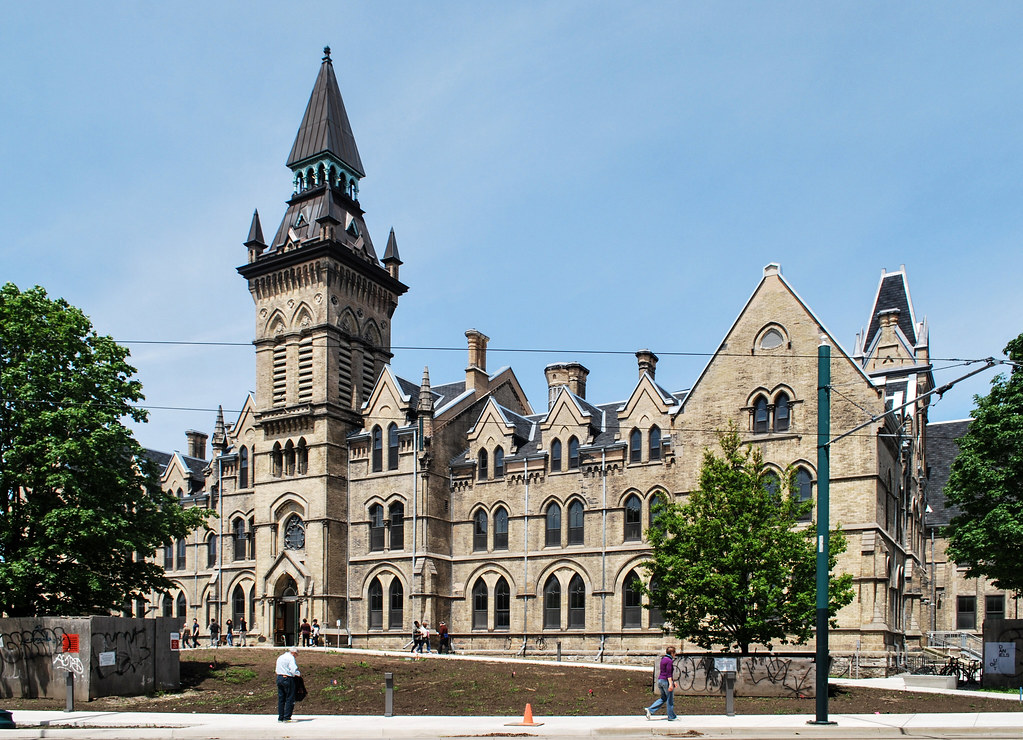
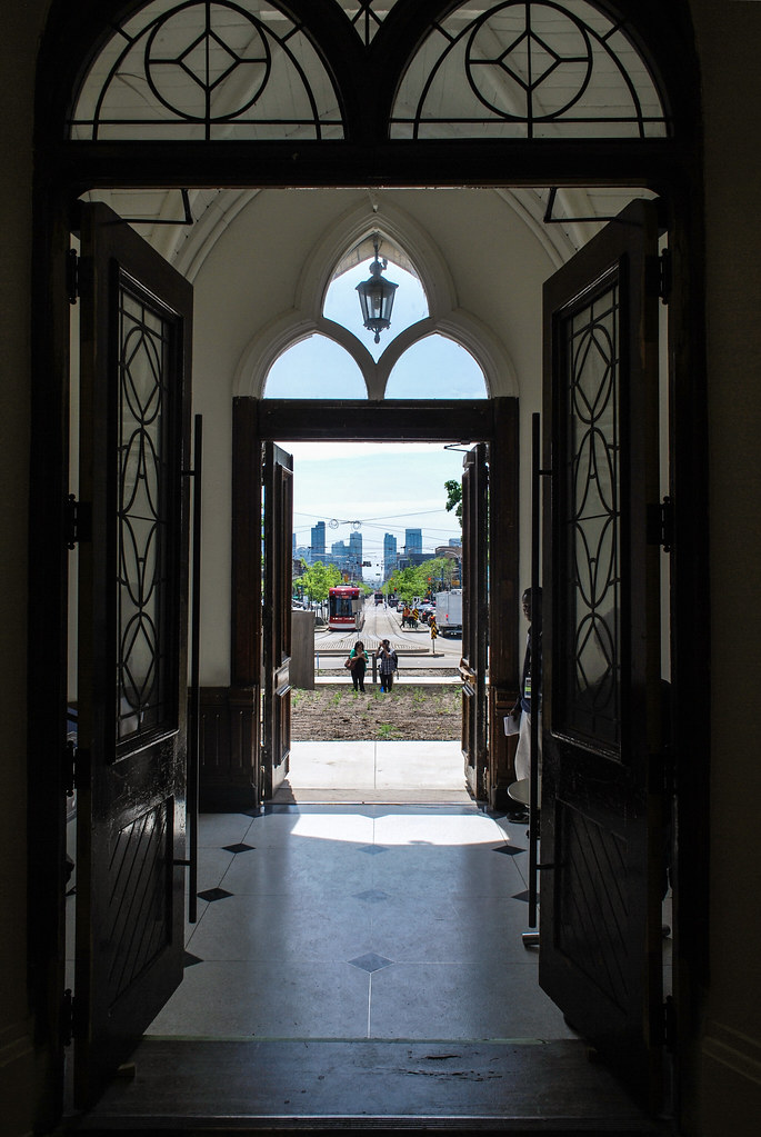
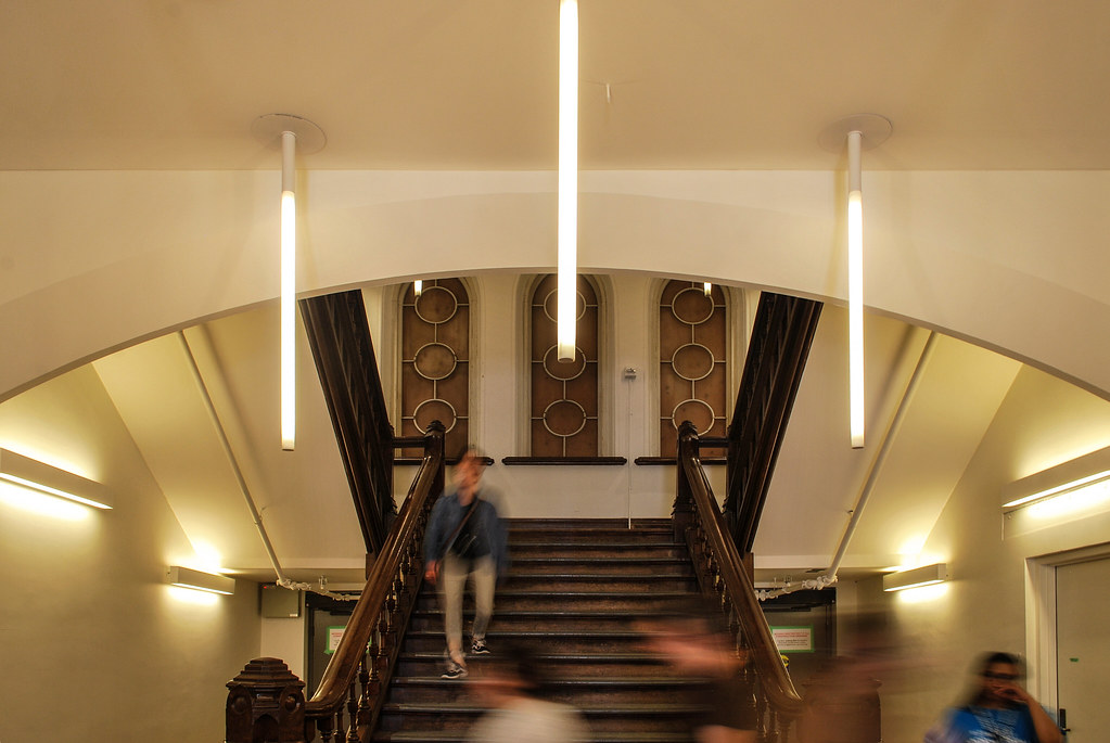
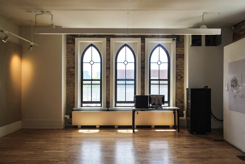
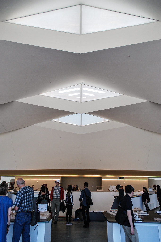
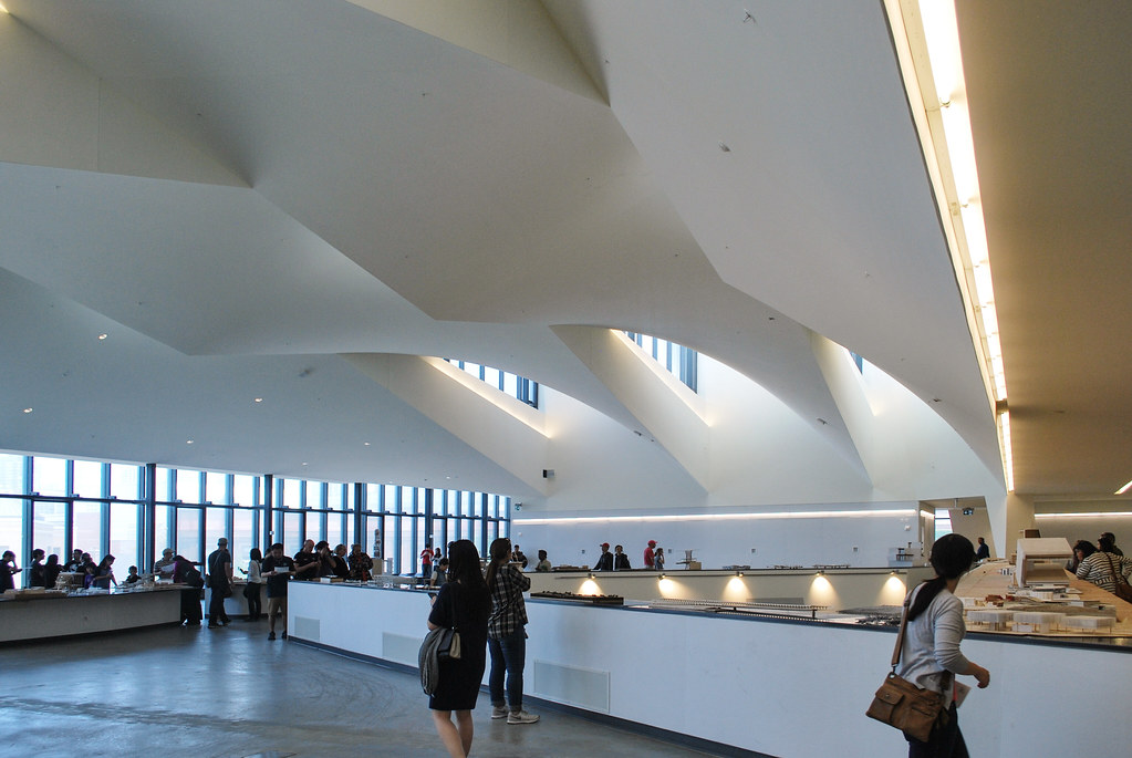
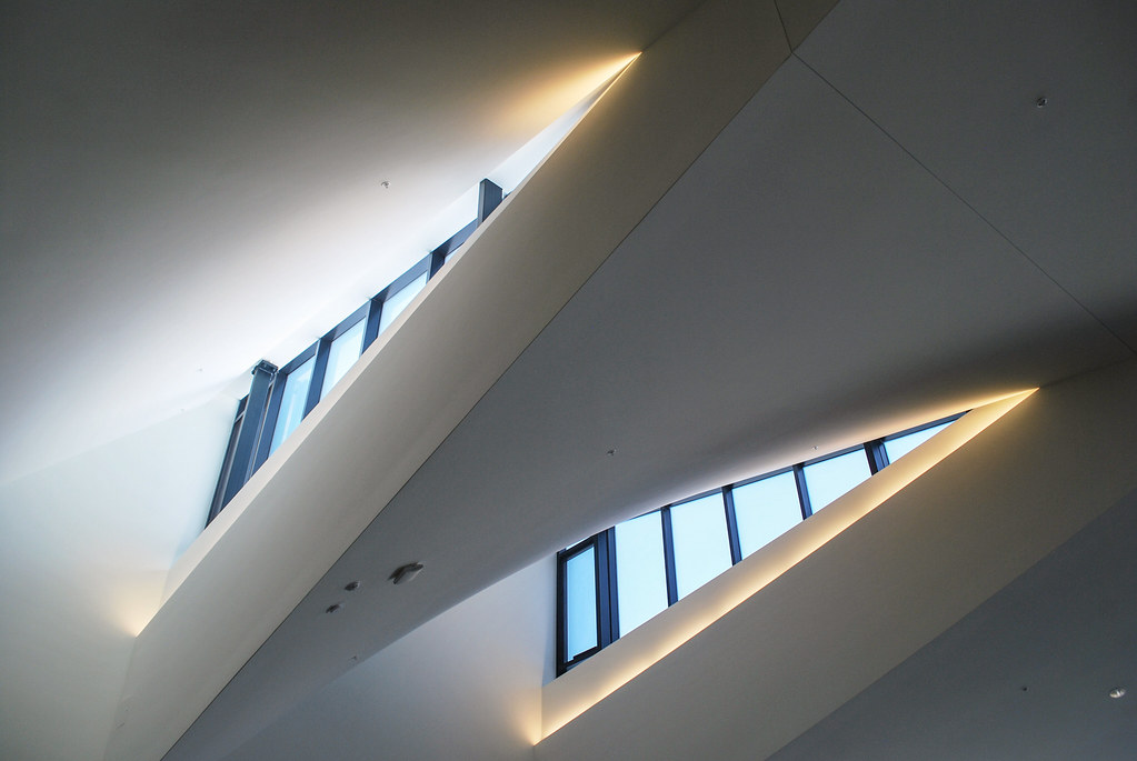
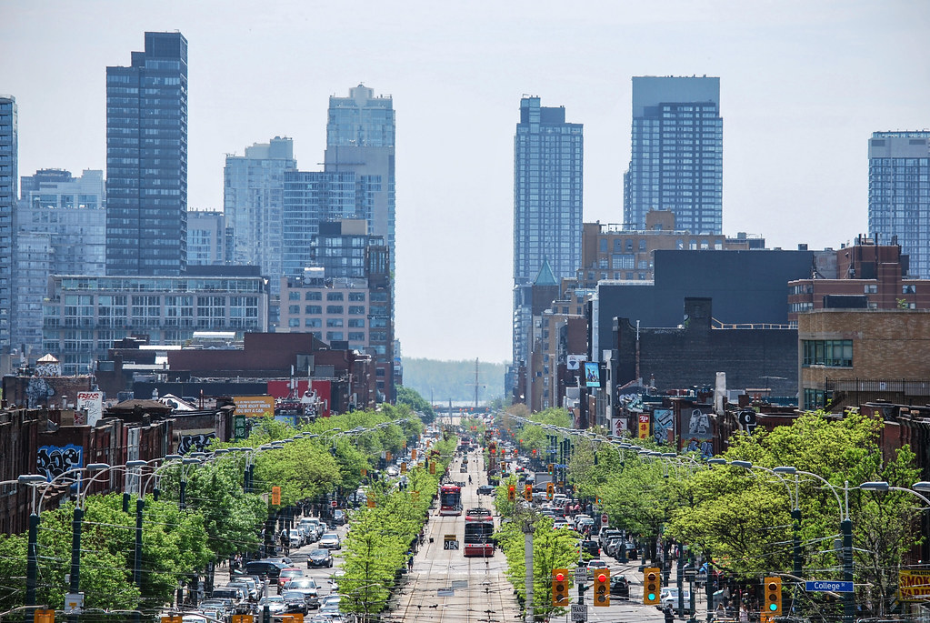
Toronto U of T: John H. Daniels Faculty of Architecture, Landscape, and Design | 18.9m | 3s | U of T | NADAAA

We toured the building yesterday. Take a look: http://urbantoronto.ca/news/2017/05/u-ts-new-daniels-faculty-coming-life-spadina-circle

Bonus photos not used in the article, Part 1:

IMG_1332.jpg
IMG_1333.jpg
IMG_1347.jpg
IMG_1367.jpg
IMG_1370.jpg
IMG_1375.jpg
IMG_1376.jpg
IMG_1380.jpg
IMG_1383.jpg
 

Attachments

  • IMG_1332.jpg
    IMG_1332.jpg
    298.7 KB · Views: 960
  • IMG_1333.jpg
    IMG_1333.jpg
    346.4 KB · Views: 1,537
  • IMG_1347.jpg
    IMG_1347.jpg
    449.4 KB · Views: 873
  • IMG_1367.jpg
    IMG_1367.jpg
    227 KB · Views: 904
  • IMG_1370.jpg
    IMG_1370.jpg
    207 KB · Views: 796
  • IMG_1375.jpg
    IMG_1375.jpg
    230.6 KB · Views: 786
  • IMG_1376.jpg
    IMG_1376.jpg
    528.7 KB · Views: 780
  • IMG_1380.jpg
    IMG_1380.jpg
    453.1 KB · Views: 735
  • IMG_1383.jpg
    IMG_1383.jpg
    451.3 KB · Views: 766
Pt 2:

IMG_1393.jpg
IMG_1394.jpg
IMG_1397.jpg
IMG_1417.jpg
IMG_1433.jpg
IMG_1434.jpg
IMG_1436.jpg


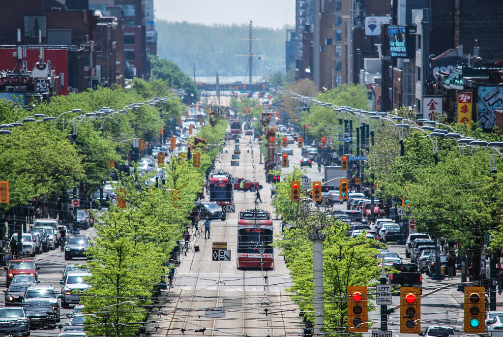
And the view down Spadina:


IMG_1409.jpg

IMG_1411.jpg
 

Attachments

  • IMG_1393.jpg
    IMG_1393.jpg
    196.2 KB · Views: 828
  • IMG_1394.jpg
    IMG_1394.jpg
    250.5 KB · Views: 792
  • IMG_1397.jpg
    IMG_1397.jpg
    282.9 KB · Views: 716
  • IMG_1417.jpg
    IMG_1417.jpg
    352.3 KB · Views: 702
  • IMG_1433.jpg
    IMG_1433.jpg
    326.2 KB · Views: 676
  • IMG_1434.jpg
    IMG_1434.jpg
    304.3 KB · Views: 705
  • IMG_1436.jpg
    IMG_1436.jpg
    273.6 KB · Views: 793
  • IMG_1409.jpg
    IMG_1409.jpg
    505.1 KB · Views: 677
  • IMG_1411.jpg
    IMG_1411.jpg
    554.2 KB · Views: 689
This one's fun! Although personally, it felt smaller to me inside than it looks on the outside. Enjoy it tomorrow, everybody.

A few quirky snaps people haven't made already:

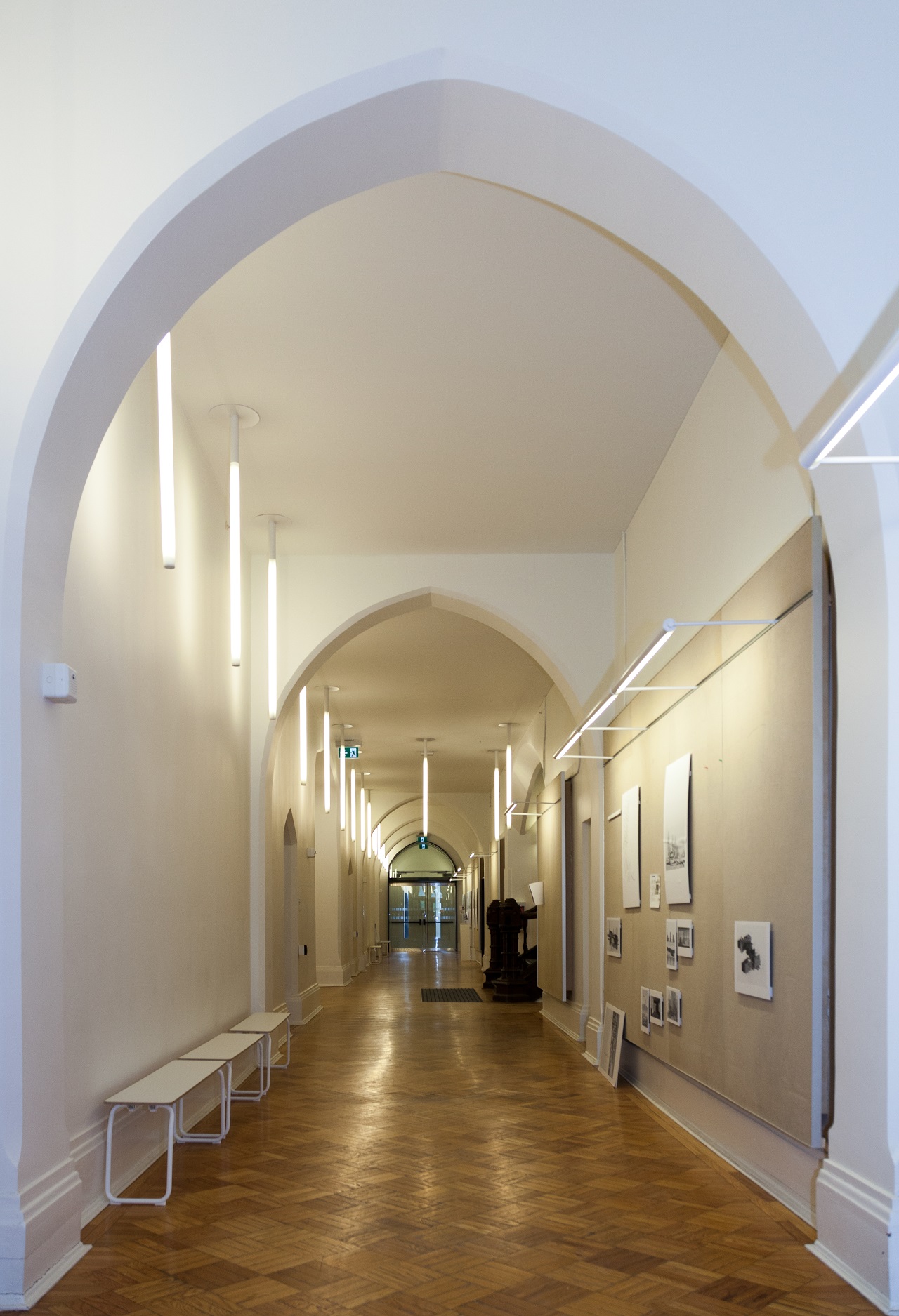
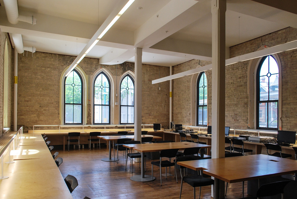
1. Heritage structure largely intact behind drywall of the new section.
2. Looking from old into the new. Note the window I'm fairly certain a "ghosthunter" accessed the roof through years ago before their untimely end.
3. I liked the different textures here.
4. This stairwell was actually a former elevator shaft.
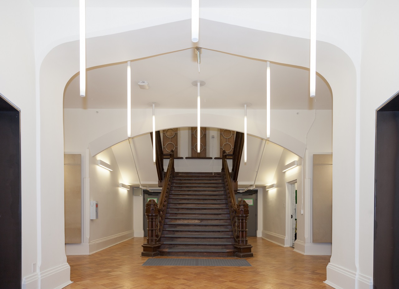
5. Beneath the principal hall, I really liked this space.
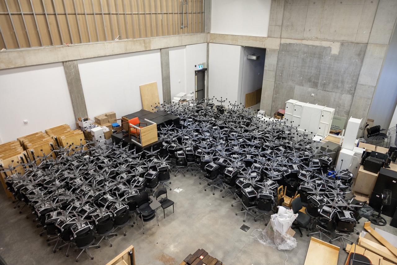
6. I like that the creepiness of the older building is still there in some ways. Some student graffiti also still there in the basement, including a cool portrait.
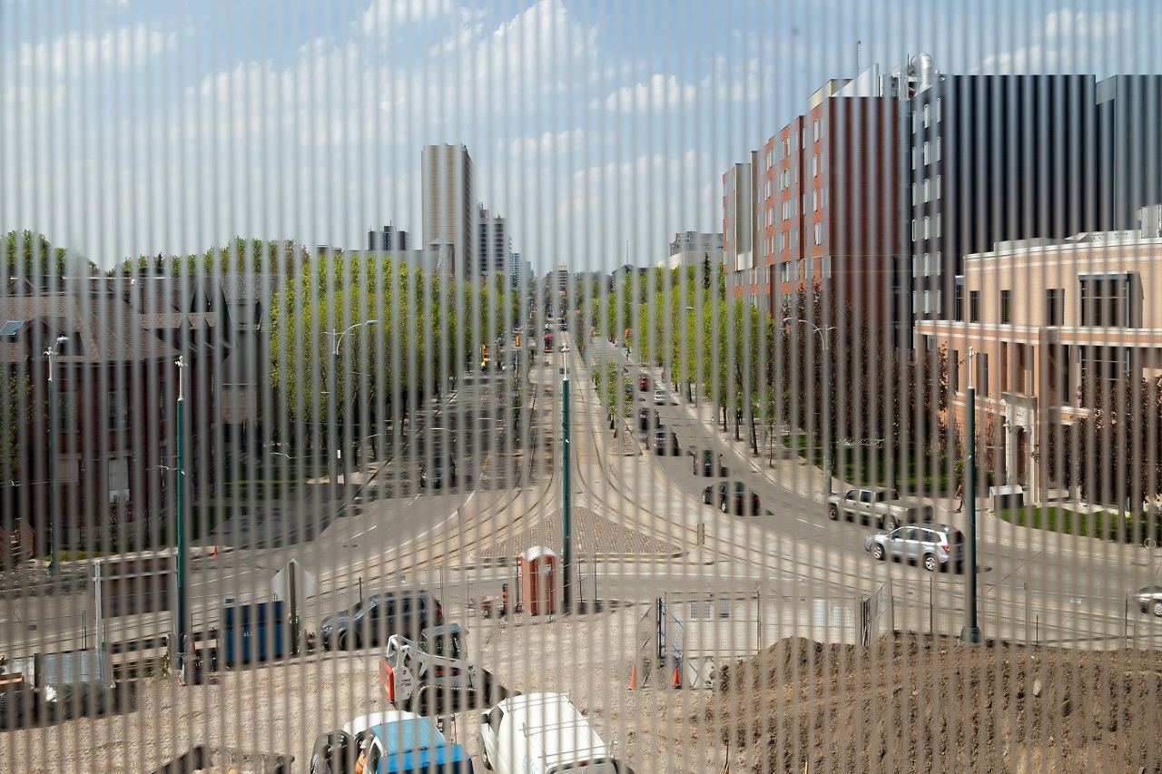
7. The view down Spadina.
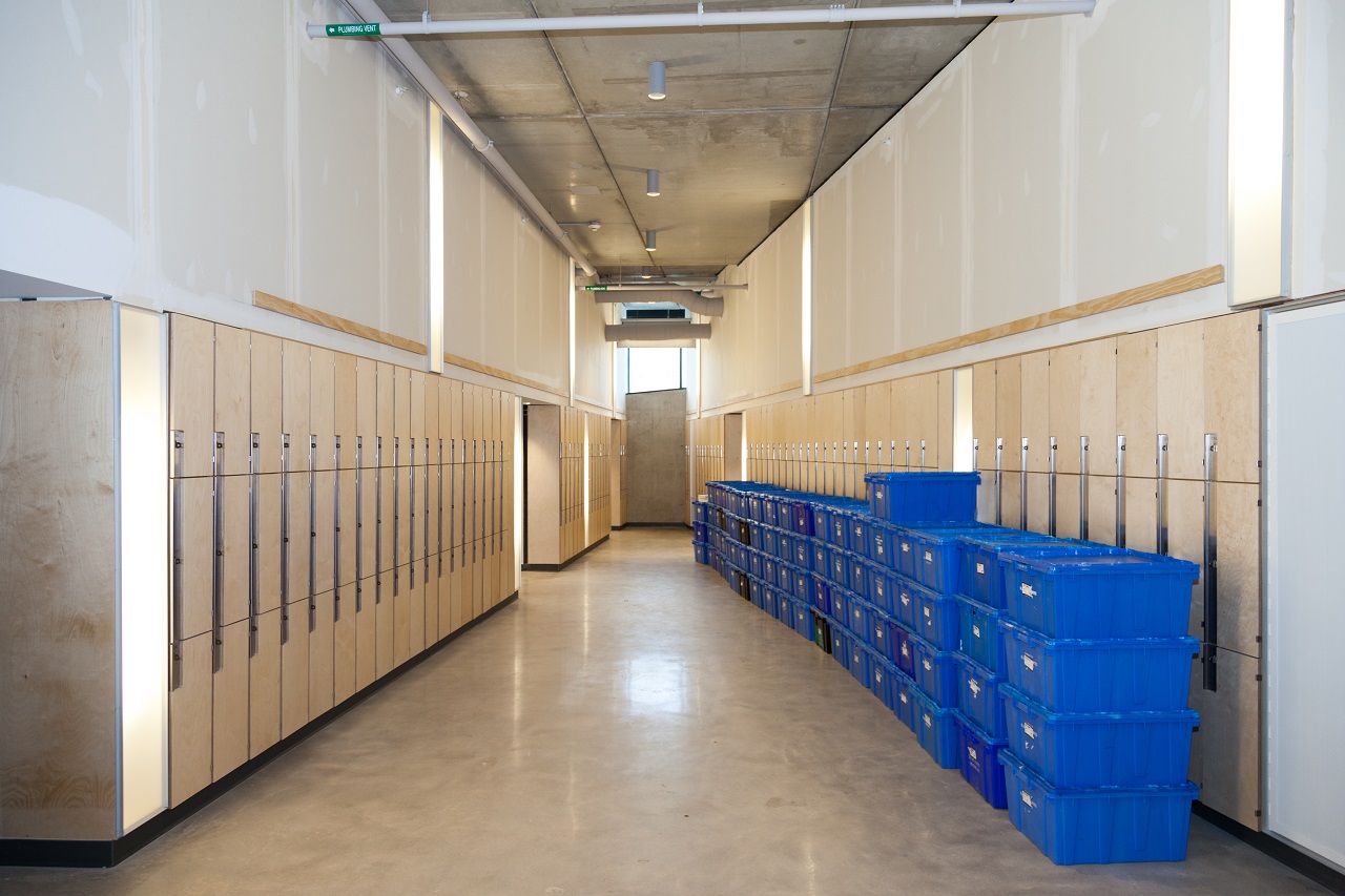
8. They sure didn't skimp on amenities here, haha. Though in seriousness, there are showers in one of the washrooms.

IMG_9797.JPG
IMG_9803.JPG
IMG_9820.JPG
IMG_9822.JPG
IMG_9825.JPG
IMG_9827.JPG
IMG_9854.JPG
IMG_9868.JPG
 

Attachments

  • IMG_9797.JPG
    IMG_9797.JPG
    868.8 KB · Views: 673
  • IMG_9803.JPG
    IMG_9803.JPG
    700.3 KB · Views: 713
  • IMG_9820.JPG
    IMG_9820.JPG
    1.7 MB · Views: 688
  • IMG_9822.JPG
    IMG_9822.JPG
    1.7 MB · Views: 675
  • IMG_9825.JPG
    IMG_9825.JPG
    2 MB · Views: 732
  • IMG_9827.JPG
    IMG_9827.JPG
    1 MB · Views: 651
  • IMG_9854.JPG
    IMG_9854.JPG
    664.2 KB · Views: 720
  • IMG_9868.JPG
    IMG_9868.JPG
    1.5 MB · Views: 639
Last edited by a moderator:
This one's fun! Although personally, it felt smaller to me inside than it looks on the outside. Enjoy it tomorrow, everybody.

A few quirky snaps people haven't made already:

2. Looking from old into the new. Note the window I'm fairly certain a "ghosthunter" accessed the roof through years ago before their untimely end.

Thanks! Details: https://www.thestar.com/news/gta/2009/09/11/ghost_hunt_on_gothic_rooftop_turns_tragic.html

Also:
12:19 a.m.: We head to a couple of small windows that have iron bars placed over them to prevent access to the roof. This is due to the tragedy that occurred last September when a woman fell to her death from the third floor while trying to jump from one roof to another. They still have not repaired the chicken-wire mesh she fell through.

http://thevarsity.ca/2010/10/25/the-haunting-of-one-spadina-crescent/

Interesting Reichstag-like approach to graffiti. Can't wait to see it.

AoD
 
From DOT:

upload_2017-5-27_22-4-36.jpeg


upload_2017-5-27_22-4-44.jpeg


upload_2017-5-27_22-4-51.jpeg


upload_2017-5-27_22-4-58.jpeg


upload_2017-5-27_22-5-8.jpeg


upload_2017-5-27_22-5-15.jpeg


upload_2017-5-27_22-5-22.jpeg


upload_2017-5-27_22-5-31.jpeg


upload_2017-5-27_22-5-39.jpeg


upload_2017-5-27_22-5-47.jpeg


upload_2017-5-27_22-5-54.jpeg


upload_2017-5-27_22-6-0.jpeg


upload_2017-5-27_22-6-7.jpeg


upload_2017-5-27_22-6-13.jpeg


upload_2017-5-27_22-6-19.jpeg


AoD
 

Attachments

  • upload_2017-5-27_22-4-36.jpeg
    upload_2017-5-27_22-4-36.jpeg
    428.5 KB · Views: 634
  • upload_2017-5-27_22-4-44.jpeg
    upload_2017-5-27_22-4-44.jpeg
    248.6 KB · Views: 641
  • upload_2017-5-27_22-4-51.jpeg
    upload_2017-5-27_22-4-51.jpeg
    269.8 KB · Views: 585
  • upload_2017-5-27_22-4-58.jpeg
    upload_2017-5-27_22-4-58.jpeg
    284.3 KB · Views: 633
  • upload_2017-5-27_22-5-8.jpeg
    upload_2017-5-27_22-5-8.jpeg
    338.8 KB · Views: 617
  • upload_2017-5-27_22-5-15.jpeg
    upload_2017-5-27_22-5-15.jpeg
    320.7 KB · Views: 628
  • upload_2017-5-27_22-5-22.jpeg
    upload_2017-5-27_22-5-22.jpeg
    337.5 KB · Views: 625
  • upload_2017-5-27_22-5-31.jpeg
    upload_2017-5-27_22-5-31.jpeg
    241.3 KB · Views: 635
  • upload_2017-5-27_22-5-39.jpeg
    upload_2017-5-27_22-5-39.jpeg
    269.6 KB · Views: 642
  • upload_2017-5-27_22-5-47.jpeg
    upload_2017-5-27_22-5-47.jpeg
    236.4 KB · Views: 647
  • upload_2017-5-27_22-5-54.jpeg
    upload_2017-5-27_22-5-54.jpeg
    187.1 KB · Views: 634
  • upload_2017-5-27_22-6-0.jpeg
    upload_2017-5-27_22-6-0.jpeg
    162.6 KB · Views: 582
  • upload_2017-5-27_22-6-7.jpeg
    upload_2017-5-27_22-6-7.jpeg
    306.5 KB · Views: 653
  • upload_2017-5-27_22-6-13.jpeg
    upload_2017-5-27_22-6-13.jpeg
    202.2 KB · Views: 619
  • upload_2017-5-27_22-6-19.jpeg
    upload_2017-5-27_22-6-19.jpeg
    319.7 KB · Views: 586
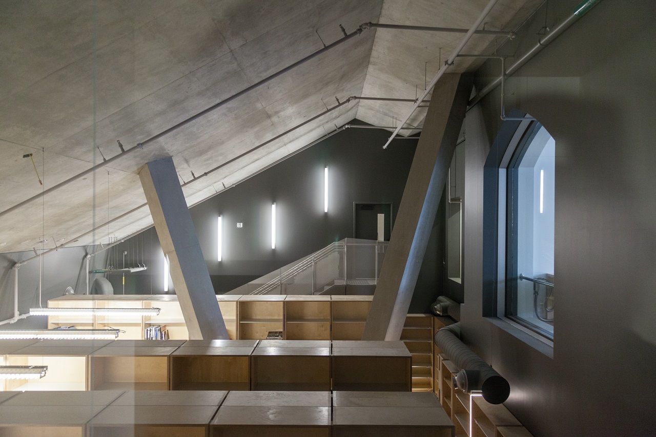
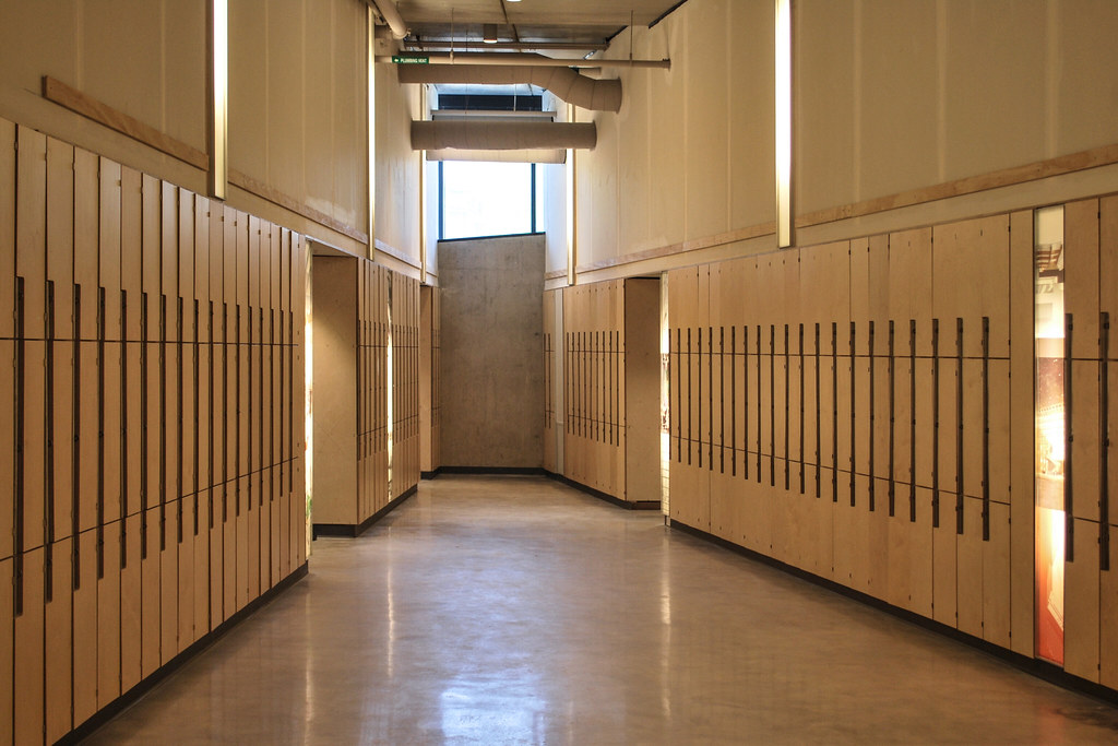
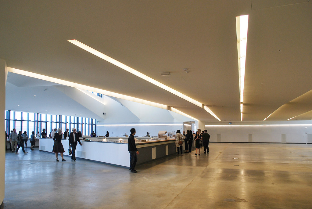
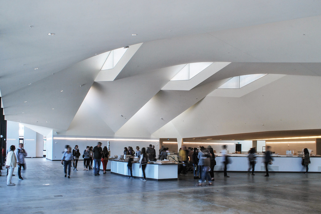
Lots of good things to say about this building; the Master Studio space has the "it" quality of a museum - a great new space in Toronto. The light wood tones throughout are lovely, and there are a lot of interesting details - even the lockers stand out to me as interesting spots in that regard. A lot of the building is unfinished and it would have been interesting to see more of them but the project overall has a very warm, inviting feeling. The heritage component is a big reason for that, but the newer areas are generally quite warm and enveloping.

That said, I am concerned about circulation in the building. There are a lot of awkward conditions in that respect; corridors that pass through crit spaces, etc. I am curious to see how that's going to work.

But yeah, that Master studio space... wow!!! Really encourage anyone who hasn't been today to go experience it tomorrow.
 
I'd echo the sentiment that it felt smaller than it looks from the outside.

Overall, I wasn't impressed - that's as of now though, there's clearly a lot more work to be done.
 
Throwing in some of mine from Sunday:

One Spadina by Marcus Mitanis, on Flickr

One Spadina by Marcus Mitanis, on Flickr

One Spadina by Marcus Mitanis, on Flickr

One Spadina by Marcus Mitanis, on Flickr

One Spadina by Marcus Mitanis, on Flickr

One Spadina by Marcus Mitanis, on Flickr

One Spadina by Marcus Mitanis, on Flickr

One Spadina by Marcus Mitanis, on Flickr

One Spadina by Marcus Mitanis, on Flickr

One Spadina by Marcus Mitanis, on Flickr

One Spadina by Marcus Mitanis, on Flickr

One Spadina by Marcus Mitanis, on Flickr

One Spadina by Marcus Mitanis, on Flickr

One Spadina by Marcus Mitanis, on Flickr

One Spadina by Marcus Mitanis, on Flickr

One Spadina by Marcus Mitanis, on Flickr

One Spadina by Marcus Mitanis, on Flickr

One Spadina by Marcus Mitanis, on Flickr
 
Landscaping finally going in, not as far done at the back as it is at the front:

DSC03227.jpg
DSC03228.jpg
DSC03229.jpg
DSC03230.jpg
DSC03231.jpg
DSC03232.jpg


42
 

Attachments

  • DSC03227.jpg
    DSC03227.jpg
    423.3 KB · Views: 592
  • DSC03228.jpg
    DSC03228.jpg
    448.5 KB · Views: 641
  • DSC03229.jpg
    DSC03229.jpg
    396.1 KB · Views: 616
  • DSC03230.jpg
    DSC03230.jpg
    463 KB · Views: 565
  • DSC03231.jpg
    DSC03231.jpg
    296.8 KB · Views: 637
  • DSC03232.jpg
    DSC03232.jpg
    382.2 KB · Views: 571
If you guys run a story on this building, I encourage you to speak with the end users of this building - faculty (although they are most likely under pressure to say complimentary things) and especially students who are currently using the building.

While the building is not yet finished, there are major flaws with its design and programming. In fact, it feels as though it was inherited from the designers without any consultation during the design process about how the building is going to actually be used by its students.

The Master's studio space on the top floor is an acoustic and spatial nightmare (on presentation/crit days you can't hear the person presenting 1m in front of you but you can hear a group presenting on the other side of the space). Circulation is hopeless - both in the Masters studio (because the walls at its perimeter are the only presentation areas, especially given that there are no walls or vertical structure in the space to use to pin up drawings) and the building in general because it is divided down the very middle by a large lecture ampitheatre that all other circulation has to take long routes to get around. It is notably lacking in respite/lounge/breakoff spaces, kitchenettes, lockers (lockers on the main floor only serve undergrad students) water fountains, and no joke - toilets. It feels divided, with a number of competing elements but no real hierarchy or feeling of intuitiveness or logic in order to navigate its spaces or get from one part of the building to the other.

It's hard to say which part is worst - the lack of basic student amenities, the hopeless circulation or the poor conditions spatially and acoustically in the Masters studio.

Unfortunately, many of these are not teething issues but are very central to its design and therefore likely nearly impossible to undo. There is no space to put lockers for grad students without giving up what little break-off space we have in the studio. The acoustics can be softened by introducing soft materials or dividers on wheels - but these will clutter the space and make circulation even more problematic. Bathrooms can be refitted but I don't imagine anyone will want to carry that expense when fundraising for the new building is still ongoing. The circulation issues and lack of hierarchy/clarity in the rest of the building are not something that can be changed - perhaps signage can help, but it won't make it any more intuitive or friendly.

At the end of the day, someone obviously fought very hard for that fancy ceiling in the Masters studio and that became a central element, all else be damned. Unfortunately as a showpiece, it's only nice to look at, but for students who have to actually use the space for long hours every day, it falls noticeably short.

Just my two cents - there are some who accept it as it is, but many more who are very frustrated with it. Call the students spoilt if you wish, but I previously attended an institution with a much older, uglier, less-cool, less-flashy, out-of-date architecture building, and most students were perfectly okay with it. Why? Because its delight was in its utility and functionality. It made being an architecture student easier and more enjoyable. It served a purpose beyond looking flashy and being a showpiece for its institution and said institution's donors. It served its end users, its day-to-day student body. 1 Spadina Circle, on the other hand, feels like something that was handed down without any regard for how it will actually be expected to function as an academic building.

Maybe it is a dangerous forecast about architectural education at the moment - huge emphasis on thinking big, breaking the mould, doing things differently - but with very little emphasis on how to do the simple things right and make a functionable building that works.

EDIT: That's my rant on this building. I hate to sound so full-out negative but it's been getting a lot of good press from those who look at photos or take a walking tour through the building, and I have yet to hear the opinions of the actual end users - architecture students - who essentially live in the space (or at least spend all waking hours there). Alex Bizokovic was proclaiming it as potentially the best Canadian building in a decade when the thing was still under construction back in the spring. While that's one tack to take, especially after doing a media tour with the parties behind the new building, I think it is more worthwhile to hear a critical perspective, and perhaps one of the end users. At Doors Open, I was a bit taken with the materials, the shape of the spaces, the "museum quality" of the Masters studio. Unfortunately, being a student who uses the building has been a very different experience. Now I look up at that big expensive 34-m span roof over the Masters studio and question the building's priorities...

As you can tell from reading this rant, I feel very strongly about architecture that goes for style over substance. I have no issue with fantastical, expensive, or delightful architecture. But if design flourishes and the desire to make a showpiece are prioritized over basic utility for end users, then the very nature of good architecture has been done a disservice.
 
Last edited:
Thank you!

42
 
Maybe it is a dangerous forecast about architectural education at the moment - huge emphasis on thinking big, breaking the mould, doing things differently - but with very little emphasis on how to do the simple things right and make a functionable building that works.

I'm not entirely surprised the UofT Architecture school built a building that works poorly for students. I would venture to guess that "end users" were likely never consulted or considered much, except as an afterthought. It seems clear that while a new space was very much needed, 1 Spadina was a sort of a vanity project for the school administrators and their Harvard friend at NADAAA (who I believe was selected to design the building before even submitting a design for the site?)

Architectural eduction focuses on (and prizes) streamlined graphics, sexy renderings & if you can swing it, arcane theoretical babble. Roughly, the rules of the game are: make one big move that subverts the expected, solve many problems with that big move... and express it clearly and compellingly in graphics and renderings. It's true that functionality, the "nuts and bolts" of architecture are very much an afterthought in a Master's degree - and most of that is usually only squeezed into one semester.
 

Back
Top