Toronto The One | 328.4m | 91s | Mizrahi Developments | Foster + Partners

I think that build had to be all structural steel - which is beyond the budget for the client. In any case the original scheme would look even better if they could get rid of the ground floor diagrid on Bloor - it looks kind of distracting.

AoD
the city didnt like the longer larger floor plate for shadow reasons i believe.
 
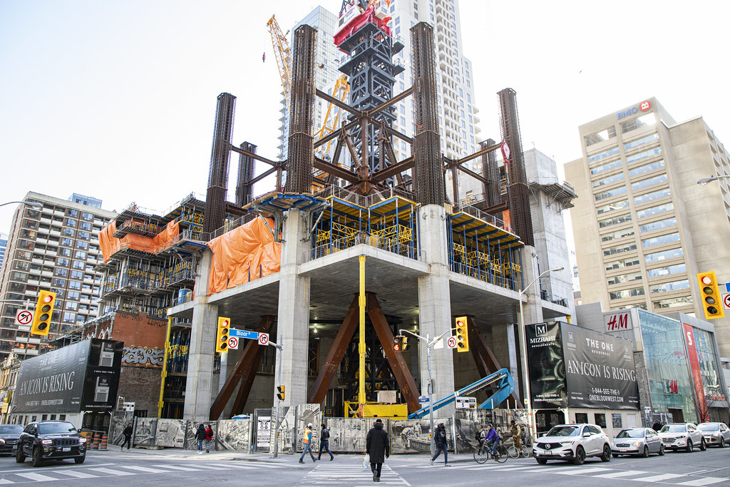
Big post today, lots of activity as I went by the site a bit after 1:30 Friday. A new level of the panels started, more blue forms have been raised, and something new, I think, in those now-exposed corner sections.

And the latest "time-lapse' photo added to my album on Flickr, Oct 2020-Feb 2023:

UTIMG_6556.jpg
UTIMG_6273.jpg
UTIMG_6263.jpg
UTIMG_6301.jpg
UTIMG_6318.jpg
UTIMG_6336.jpg
UTIMG_6364.jpg
UTIMG_6427.jpg
UTIMG_6467.jpg
UTIMG_6497.jpg
UTIMG_6510.jpg
UTIMG_6503.jpg
UTIMG_6535.jpg
 
interesting whats up with the mech level corners they step down? and huge metal brackets.. are those for the safety barrier so the commercial can open?
 
Big post today, lots of activity as I went by the site a bit after 1:30 Friday. A new level of the panels started, more blue forms have been raised, and something new, I think, in those now-exposed corner sections.

And the latest "time-lapse' photo added to my album on Flickr, Oct 2020-Feb 2023:

View attachment 457152View attachment 457151View attachment 457139View attachment 457150View attachment 457149View attachment 457148View attachment 457147View attachment 457146View attachment 457145View attachment 457144View attachment 457142View attachment 457143View attachment 457141
Nice work. Lots of good stuff. Thanks!
 
interesting whats up with the mech level corners they step down? and huge metal brackets.. are those for the safety barrier so the commercial can open?
I think they’re the brackets for the blue platform/barriers, they just moved the one on the corner to the top level.
 
Where is the evidence the "city" neutered any design elements or materials?
I'm assuming they believe because the city won't let them build higher than they originally told the city they would? Mizrahi is the victim here of a massive travesty, donchaknow!
 
I'm assuming they believe because the city won't let them build higher than they originally told the city they would? Mizrahi is the victim here of a massive travesty, donchaknow!
I am not sure what they believe. I am just tired of people accusing the "city" of cheapening a design, when it is almost always the fault of the developer.
 
Where is the evidence the "city" neutered any design elements or materials?
the original proposal which was recently shown here the radish orangish rectangular floor plate design was rejected by the city and changed to the current design.
 
the original proposal which was recently shown here the radish orangish rectangular floor plate design was rejected by the city and changed to the current design.
The change in the colour had nothing to do with the City though, the City just didn't want that rectangular floor-plate. The colour decisions are coming solely from the development team.

42
 
I am not sure what they believe. I am just tired of people accusing the "city" of cheapening a design, when it is almost always the fault of the developer.
im talking about the original proposal which was recently shown here the radish orangish rectangular floor plate design was rejected by the city and changed to the current design. not the height
The change in the colour had nothing to do with the City though, the City just didn't want that rectangular floor-plate. The colour decisions are coming solely from the development team.

42
I'm talking about the design not the color
 
I've removed all of the recent posts regarding 'trophy points'. What you guys see as trophy points, for whatever reason is implemented differently on my screens and only shows as 'points'. Same thing, different name, we don't use that functionality. Surely the 'Reaction Score' is good enough for keeping track of any 👍🏻 that you want to give other members. @The Preservationist, If you like someone's post, you can already say thank you by giving it a like or by choosing one of the other emojis available. Pick the love one if you're sufficiently impressed!

BTW, using the like emojis is better than leaving a post that says 'Thanks for the great photos' as there are lots of members who get alerts every time a thread is updated, and if the update is simply 'Thanks for the great photos', that's annoying for the people who get alerts. Please use the like button, or the other options available under it. That gives your recipient a nice bump to their score, and saves other members from seeing too many alerts. Thanks!

42
 

Back
Top