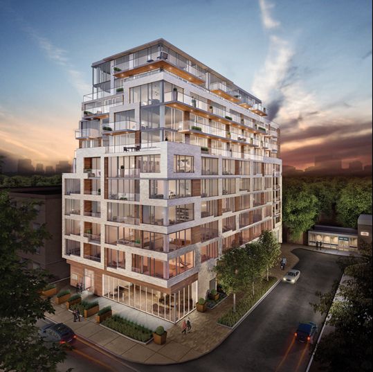
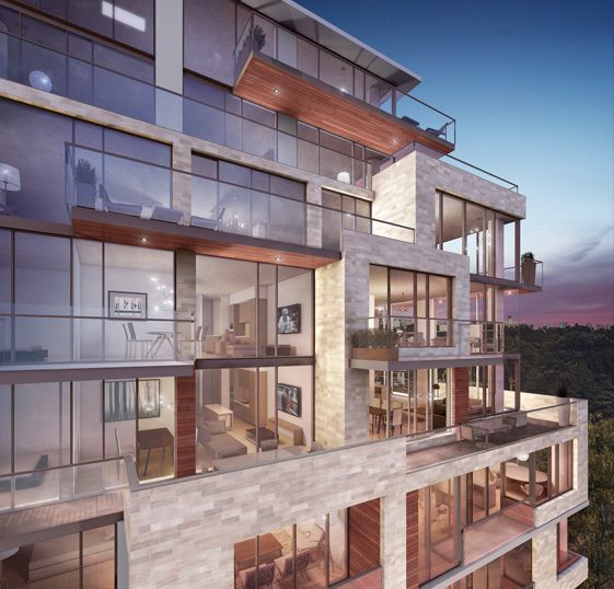
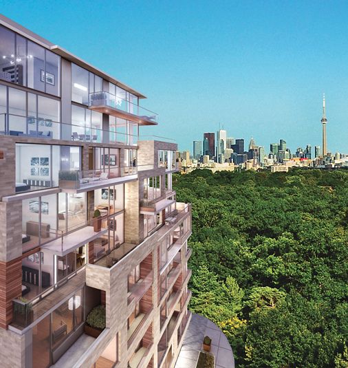
Toronto The High Park | 37.79m | 11s | North Drive | BDP Quadrangle

I walked by both sites after work for the first time in a while and I didn't realize just how close the 12-storey building (proposed) is to the subway station. I cannot believe a house was located beside the entrance (part of the project). The 10-storey site is a quick walk to the station too.
 
Community meeting June 27th

Was out at the community meeting yesterday. Great turnout. I think that there were both great questions and answers from the community and developer's consulting team. The presentation was well done and I really get the sense of what they are proposing. I think the biggest thing I learned, which was confirmed by the city planning staff, was that the developer has proposed not only to full rental replacement of the existing rental units, but also to fully integrate the renters with the condo owners; hats off to a developer willing to do something like this. I know it is always a battle between making local residents feel a part of the process and happy with density and the developer achieving their economic feasibility with a project, especially in this case when you consider rental units at rates that must be less than pleasing. I can understand the density requirement now.

I had a few concerns regarding parking, but David the moderator did a wonderful job alleviating those concerns. Looking forward to more information.
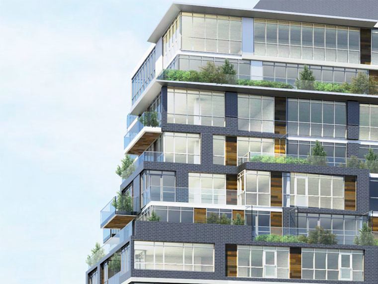
 
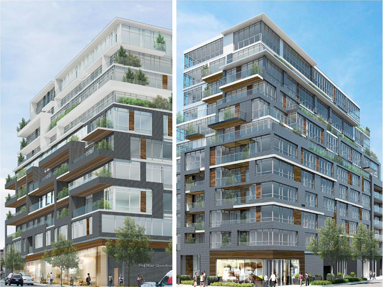
Very attractive looking building. Seems like the developer and their designer are putting a lot of effort into the built form.
 
this is exactly the type of mid-rise development that the City of Toronto needs. Smart design, as close as you can get to public transit, and in a location that real people want to live.
two thumbs up! I have not previously heard of NorthDrive, but am very impressed so far. Hopefully the typical NIMBY crowd doesn't continue with their senseless opposition.
 
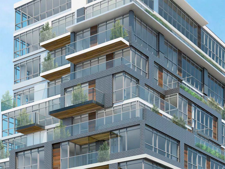
The wood on the undersides of the balconies gives it real warmth. This, of course, is often the kind of detail that gets cut in the end.
 
I really can't see a better place to intensify and build a beautiful building than at that location. The community will benefit from new residents and it is right on the transit line. People who continually oppose "intelligent" development like this really have their eyes closed. I cannot understand why they are so fearful of progress. Anyways, I look forward to it.
 
Well it sure didn't take long for the cantilevered and wood finished balconies to get cut, too bad. I do like the white, although this seems a little dumbed down overall. Good call greenleaf.
 
Big sign up on the property at 1990 Bloor Street West today advertising The High Park

http://www.thehighpark.com

As a recap:

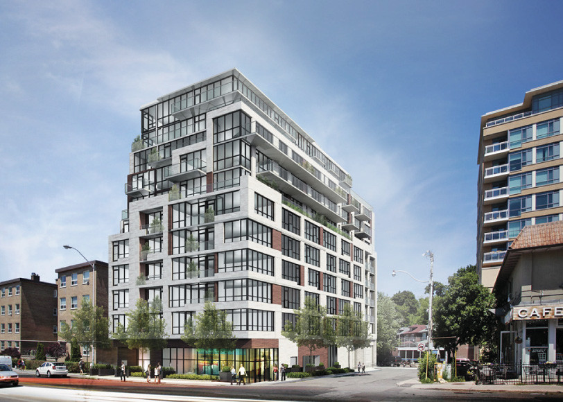
Previous Rendering for 1990 --

TheHighPark1stRendering_zps5daf0fd1.jpg


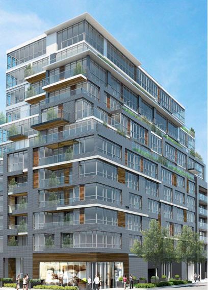
New renderings for 1990 --

TheHighPark3_zps93e031bc.jpg


TheHighPark_zpsb591a528.jpg


TheHighPark2_zps623ab33d.jpg


I'm not into grey brick like I was 6 years ago, so I find this new version a HUGE improvement over the previous one, and one storey less. I get excited about anything that is not grey or green glass.

Looks like high-quality exterior materials and a superior colour palette now. Appears that the wood accents and the wood on the underside of the balconies is staying after all. Another rendering on Jan 13th shown above shows black window mullions...and while I generally love black window mullions...they really did take away from the other exterior materials. The lighter mullions are also another improvement.

I'm loving this building just the way it is. It's very attractive, thoughtful, and has generous balconies and terraces, not to mention a fantastic location and views of DT (once you get above the trees of the park). It's literally a 10 second walk to the subway entrance. This is exactly what needs to be approved along this stretch.

Looking forward to a similar building at 2114!!!
 
Last edited:
There are some great materials and some refreshing variety in rectilinear patterns, but the architecture seems to lack a theme or motif to bring all the elements together.
 
lol that made me smile :D But, I do love a well-designed high-rise...just not a lot of what we are seeing recently DT. I'm more excited about this than most other new projects.

It certainly is a top-notch Team with Quadrangle, Cecconi Simone, and Janet Rosenburg. I like the simple and elegant landscaping, too.
 
Nice improvements from the previous rendering. Great attention to detail with the use of stone and wood finishes. Beautiful building overall!
 

Back
Top