You are using an out of date browser. It may not display this or other websites correctly.
You should upgrade or use an alternative browser.
You should upgrade or use an alternative browser.
Toronto The Campbell | 47.24m | 14s | TAS | Teeple Architects
- Thread starter AlbertC
- Start date
AlbertC
Superstar
Aug 24, 2021
Northern Light
Superstar
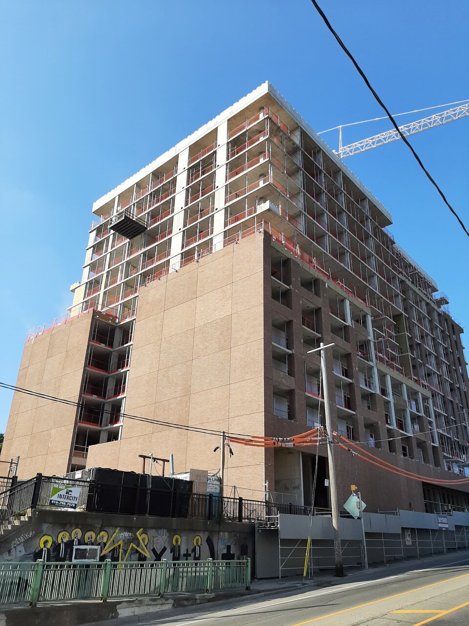
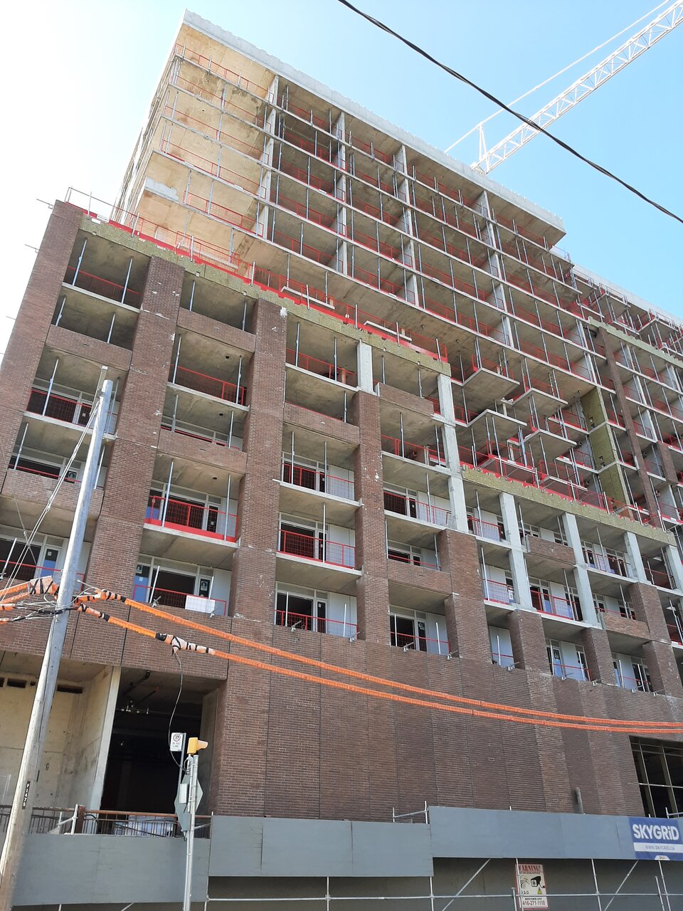
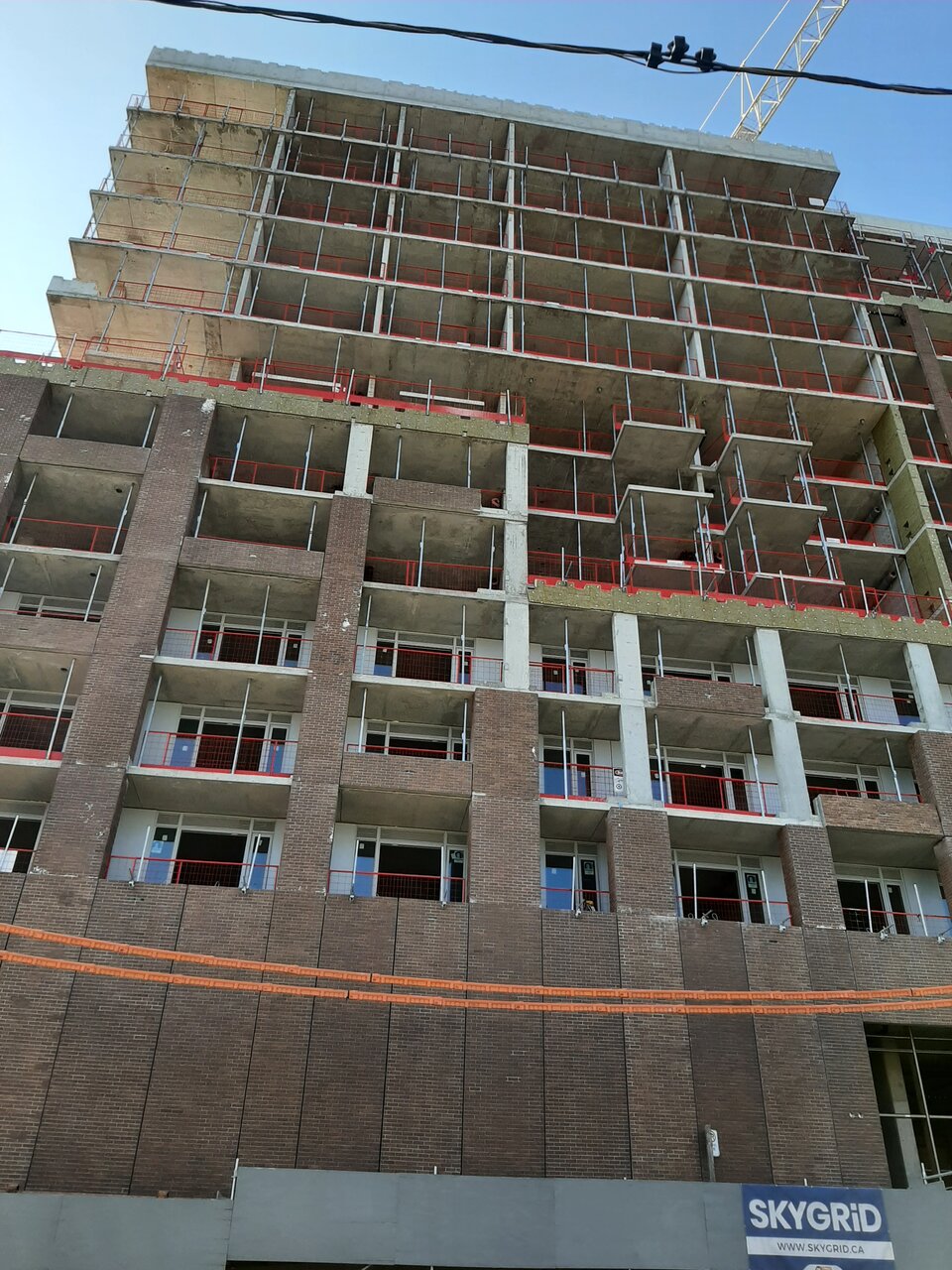
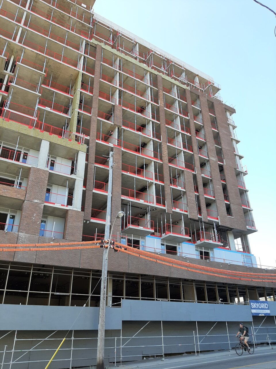
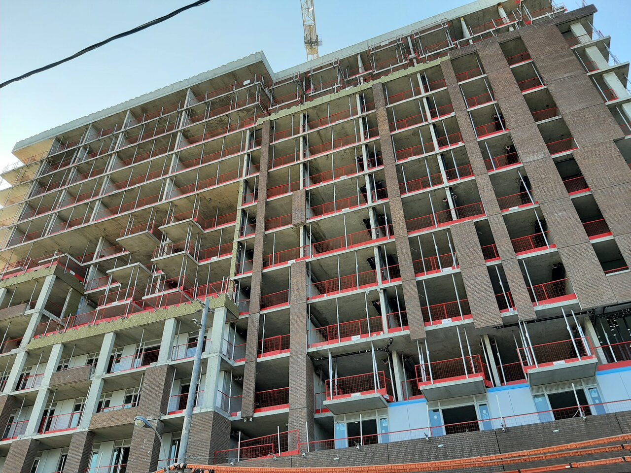
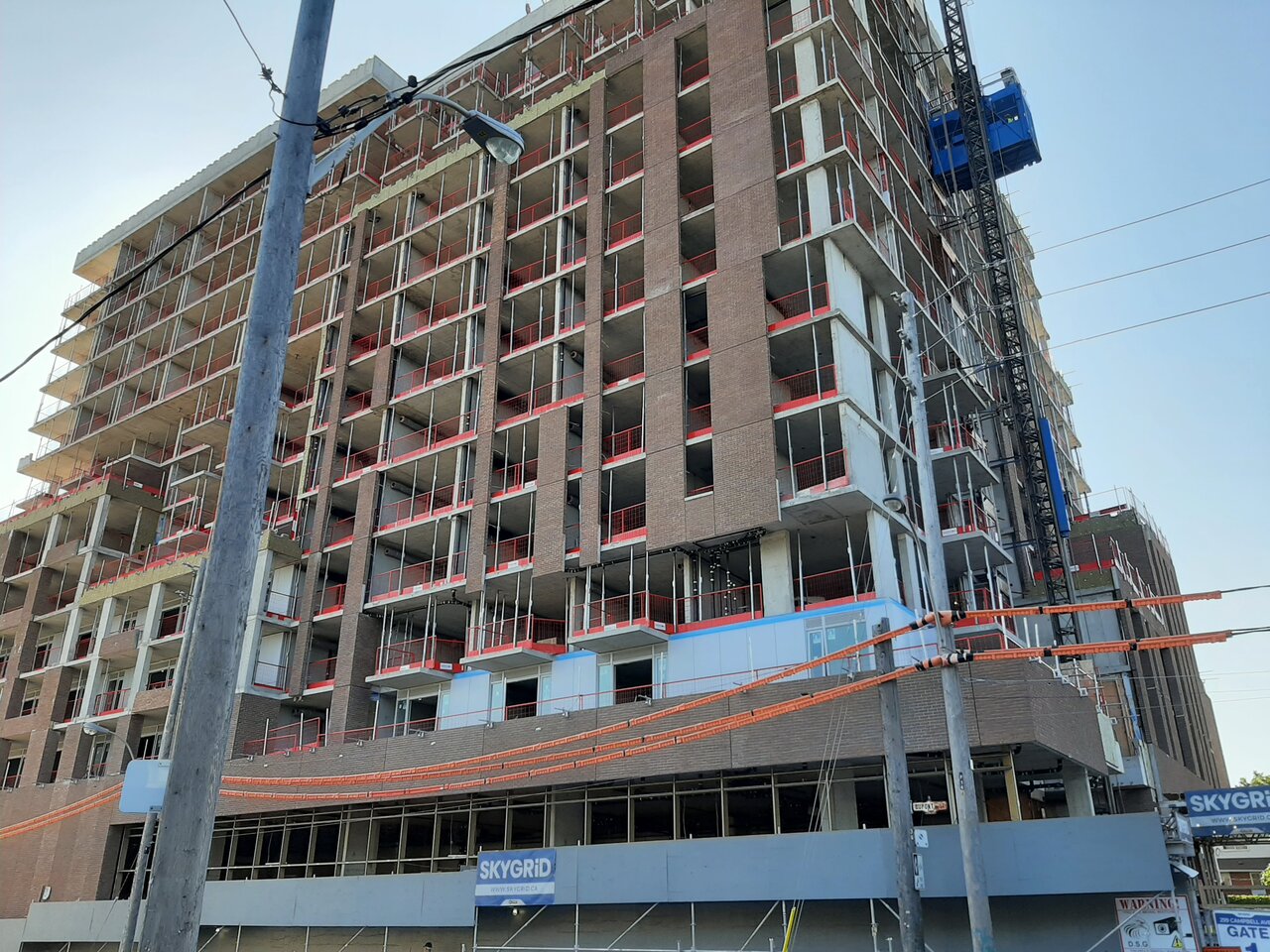
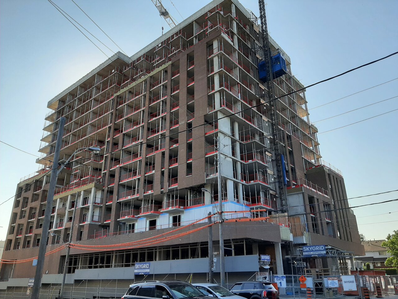
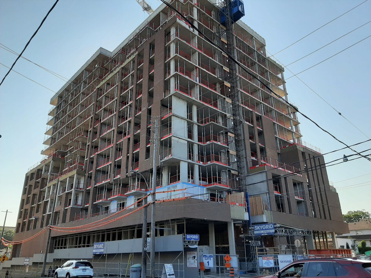
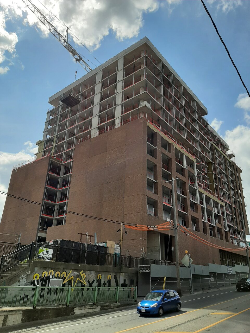
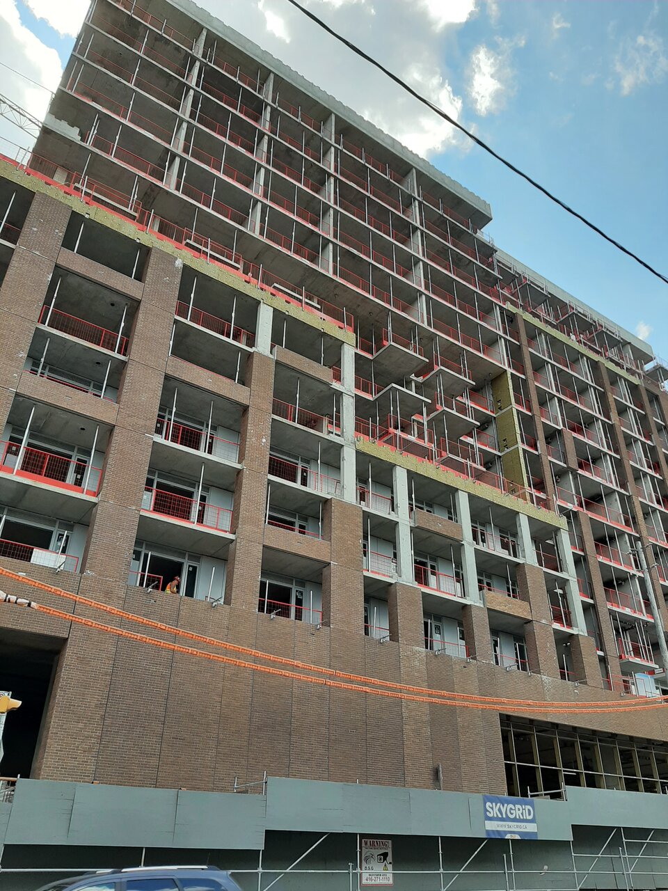
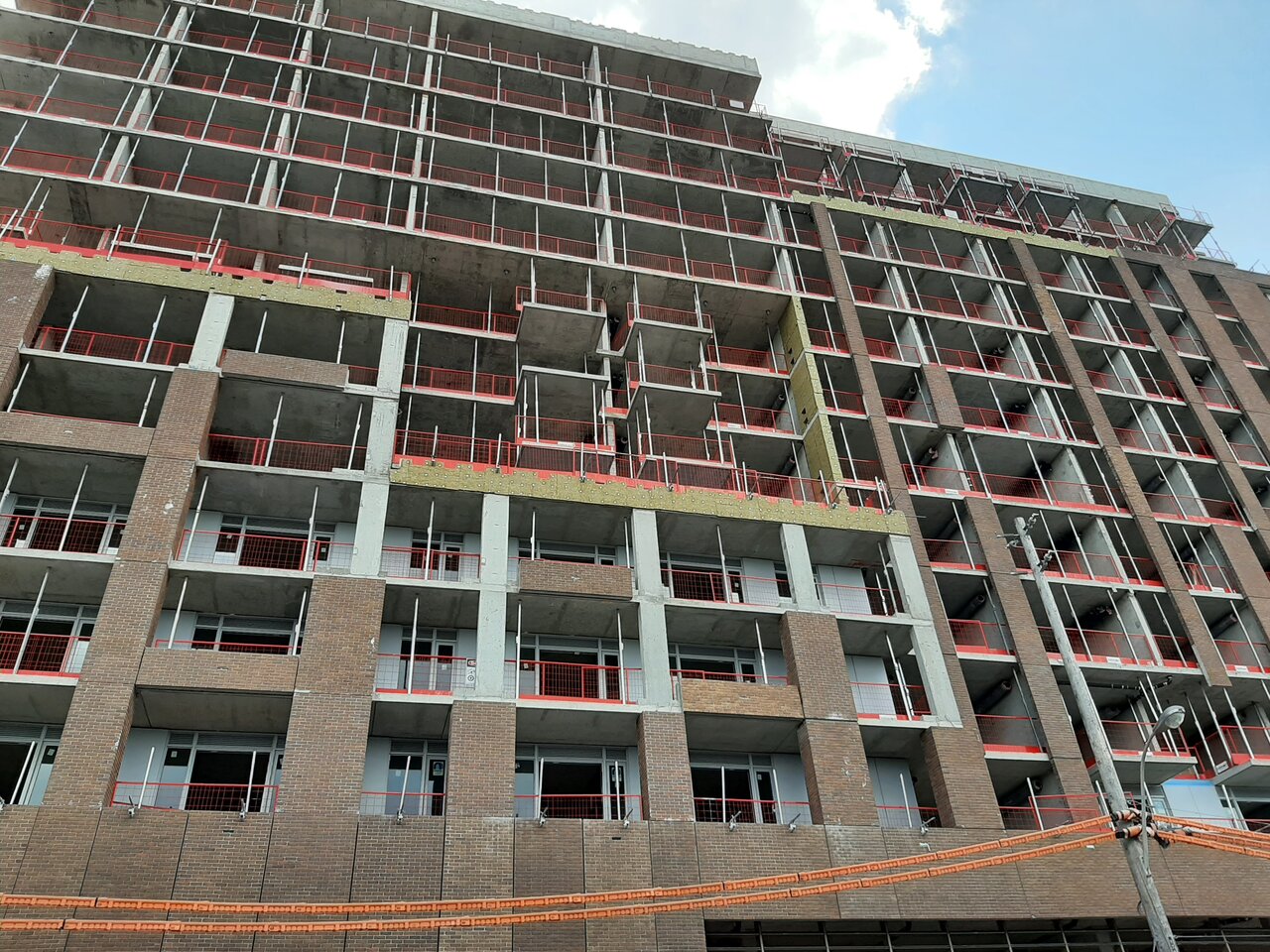
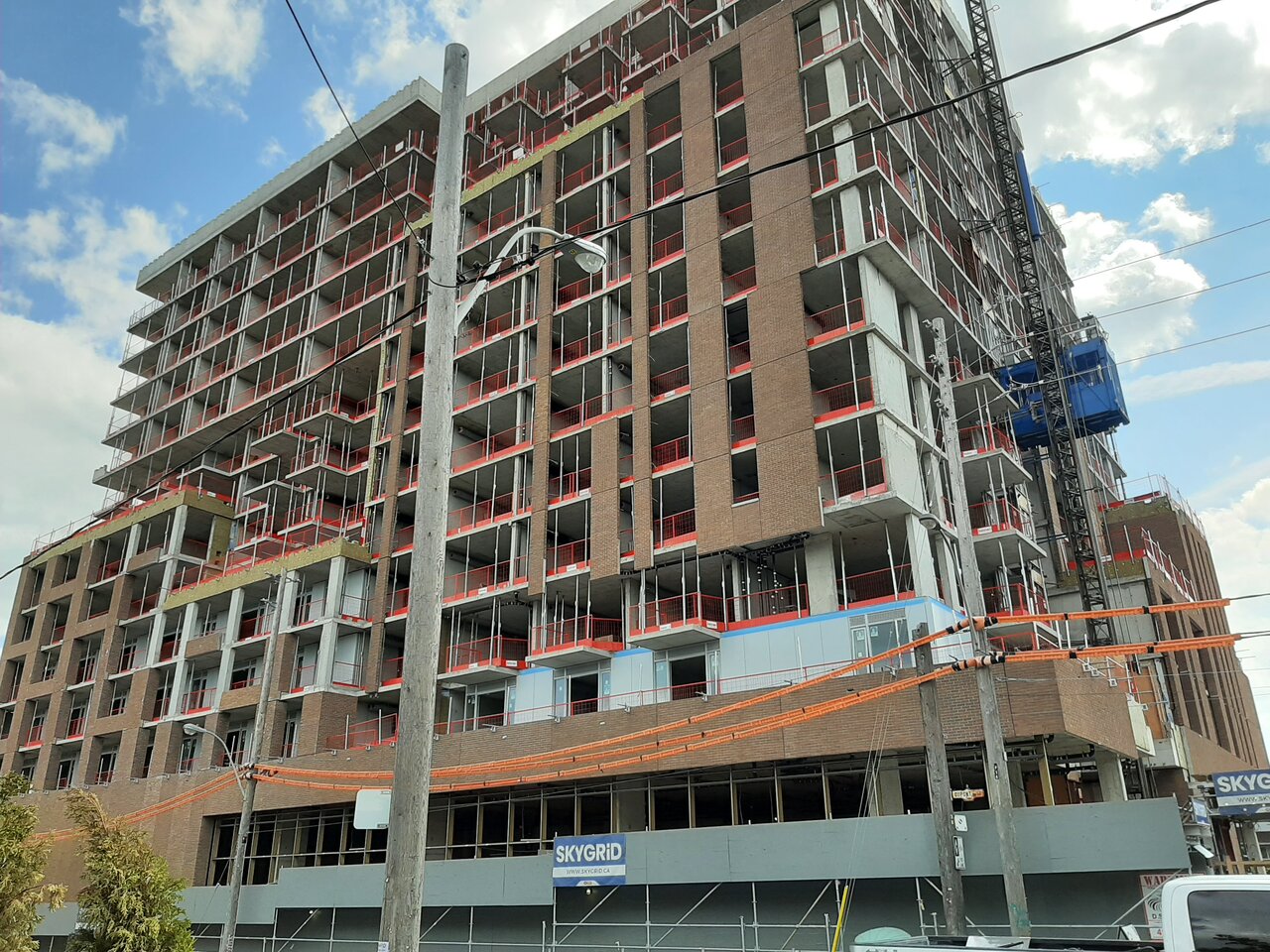
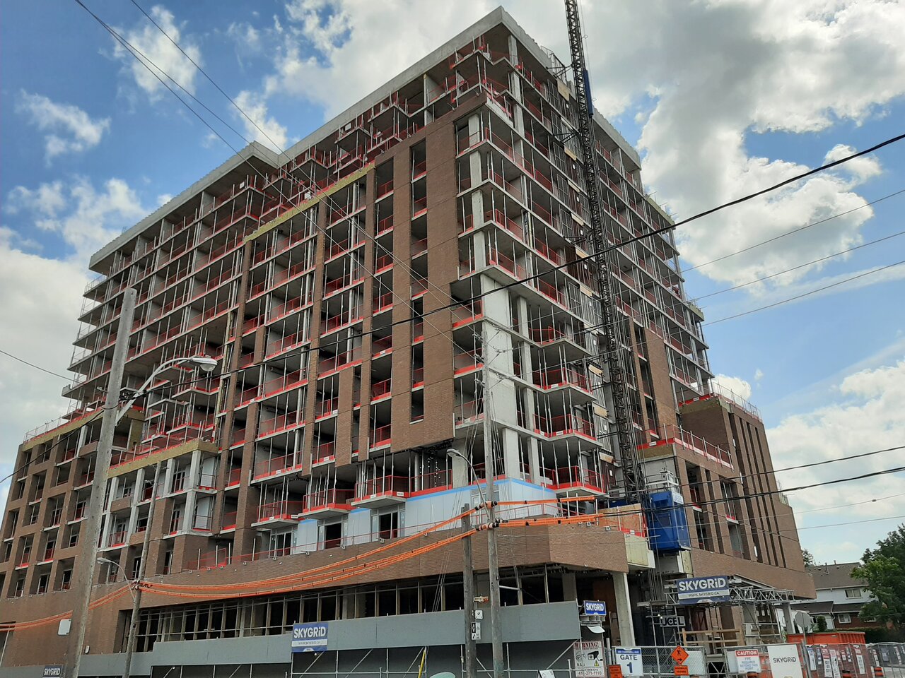
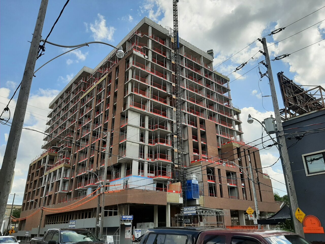
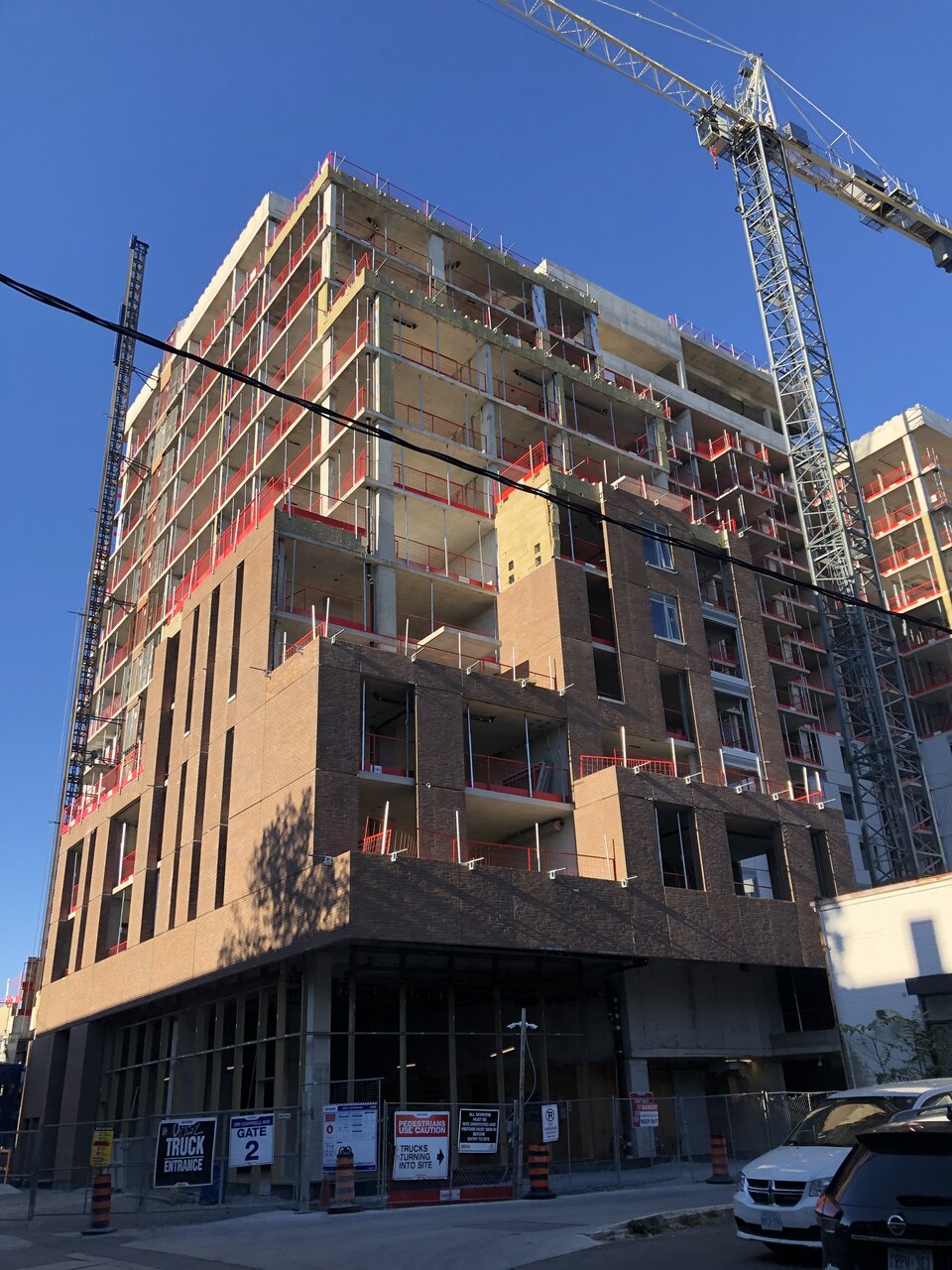
The courses of bricks at the base of the podium still standout for the mismatched colours and very overt seams.
It's not a good look.
Reminds me of badly laid wallpaper; except you rarely get that much colour variation between rolls w/the same print!
Undead
Senior Member
This one will need a clean up and some public art for the blank walls once it's done.
DavidCapizzano
Senior Member
The courses of bricks at the base of the podium still standout for the mismatched colours and very overt seams.
It's not a good look.
Reminds me of badly laid wallpaper; except you rarely get that much colour variation between rolls w/the same print!
I don't have proof, but I think they're using stucco brick and not real brick slips cast in concrete here.
AlbertC
Superstar
Aug 31, 2021

JohnnyRaylander
New Member
Who is responsible for it looking this bad? Is it an issue with the design? Is this value engineering by the developers after the design is finished and accepted? I'm clearly naive on the topic but can't really wrap my head around on how people saw these mismatched bricks with big gaps between them and thought "well, good enough."
A Torontonian Now
Senior Member
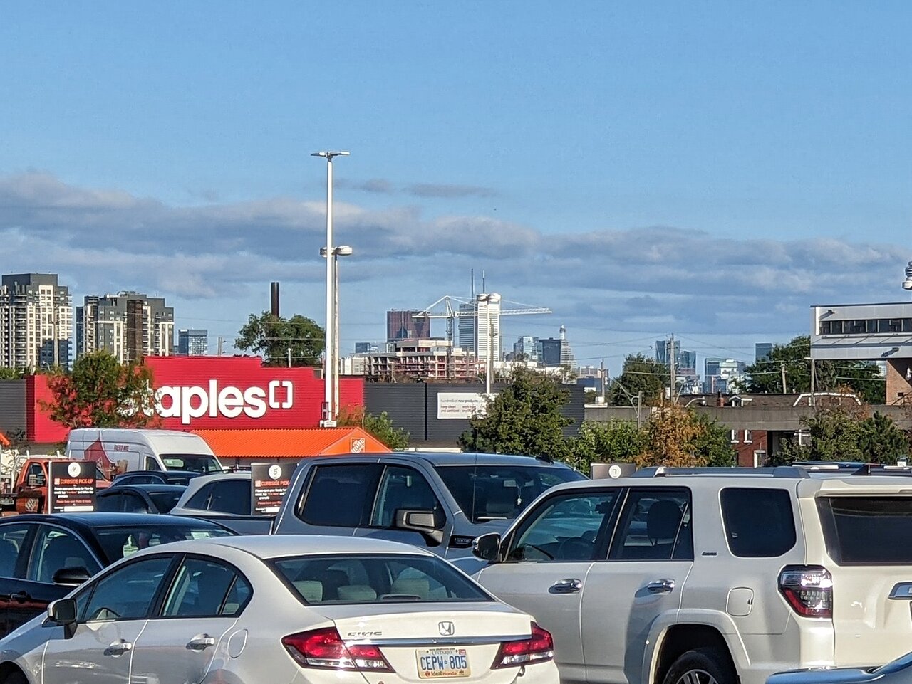
This is visible in the distance from the St. Clair / Keele Home Depot parking lot, taken today:
Northern Light
Superstar
This one will need a clean up and some public art for the blank walls once it's done.
A conventional mural, even with 2 coats of primer will be hard-pressed to hide the flaws here.
ProjectEnd
Superstar
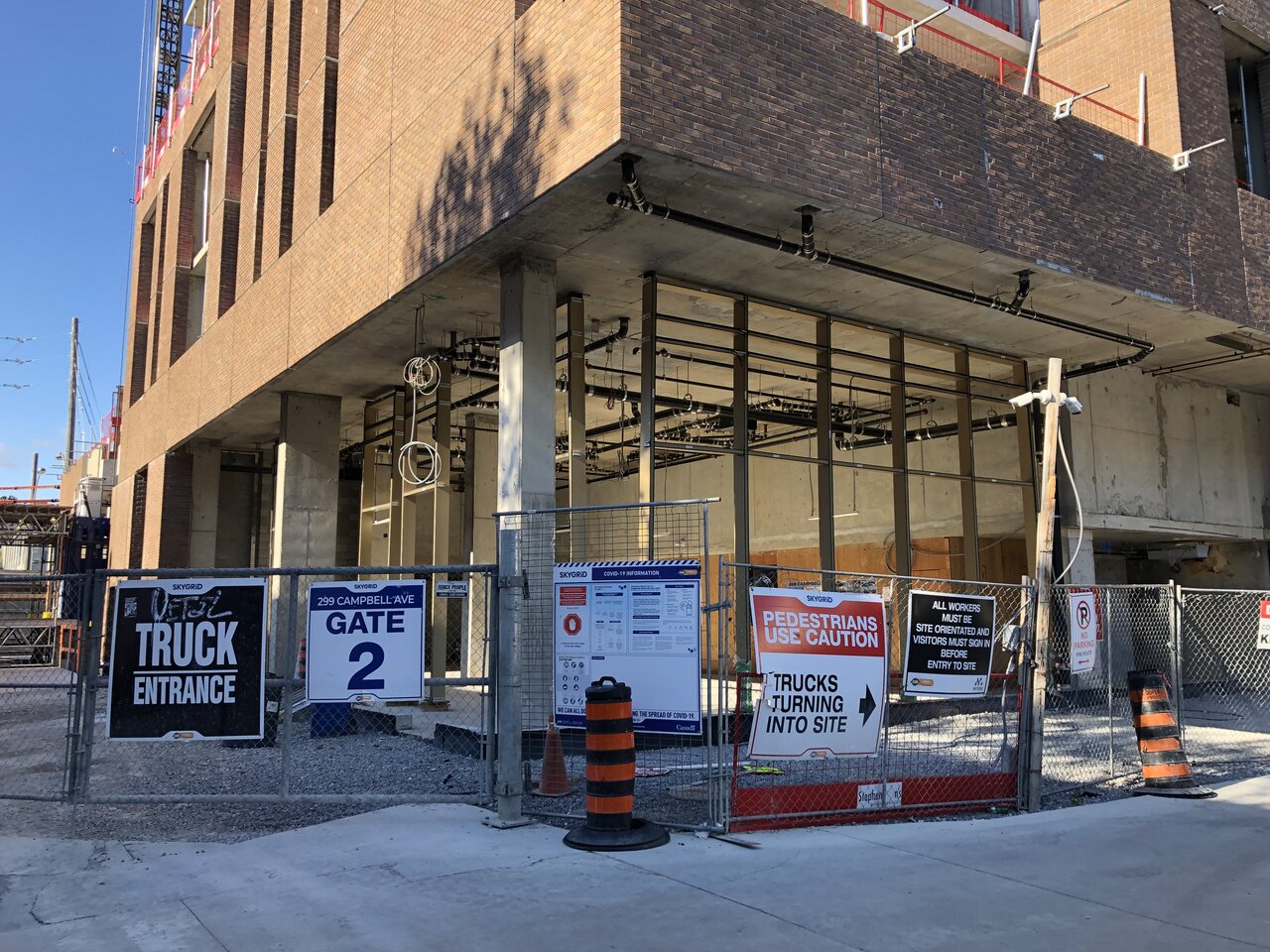
Lobby curtain wall framing:
ProjectEnd
Superstar
Windows going in on the south side:
albogino
New Member
That curtain wall is hideous. I hope everyone else finds it hideous and doesn't buy so I can
AlbertC
Superstar
That curtain wall is hideous. I hope everyone else finds it hideous and doesn't buy so I can
No one is going to be buying any of these residential units. This building is purpose built rental.
ProjectEnd
Superstar
LUVIT!
Senior Member
This already looks old