Toronto TeaHouse 501 Yonge Condominiums | 170.98m | 52s | Lanterra | a—A

You're right - I should have added and schools after jobs at the end of my post.

42
 
2012 looks like it will be an extremely hot year for Lanterra with many prominent projects lined up. According to this blog, apart from the Sutton Place redevelopment both the large Bloor/Sherbourne project and 501 Yonge should also be launched sometime next year. Both were controversial and faced heavy resistance but looks like they will be a go. Great news!

http://www.talkcondo.com/blog/lanterra-announce-exciting-2012-condo-launches
 
Last edited:
2012 looks like it will be an extremely hot year for Lanterra with many prominent projects lined up. According to this blog, apart from the Sutton Place redevelopment both the large Bloor/Sherbourne project and 501 Yonge should also be launched sometime next year. Both were controversial and faced heavy resistance but looks like they will be a go. Great news!

http://www.talkcondo.com/blog/lanterra-announce-exciting-2012-condo-launches


dude - are you on Lanterra's payroll or something? 501 is the furthest thing from a fait accompli and it will not "be a go" anytime soon. re-read the article you've referenced and consider the source - a biased residential broker.

 
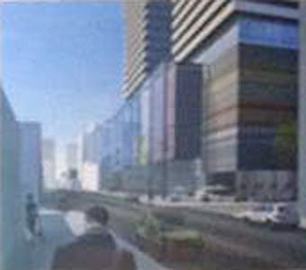
Enlarged and sharpened a bit from the 'Savel In The City' photograph, in the Sutton Place development thread.


5011.jpg


501.jpg
 
What a nightmare. Now do people understand how this block will overwhelm the low-rise charactor of this section of Yonge street?
 
I daresay the towers have not gotten thinner (in this rendering, anyway). They appear to actually overhang the base slightly. At the very least, they haven't shrunk from the edge one bit.
Barring some last minute astonishment, it looks just like the application line drawing showed it would.
 
Last edited:
I dont know about that...a tweak here and there, and this project will most likely be a go.


ummmm yeah if your definition of "tweak" is slashing 20 storeys off of each tower and ripping out all of the above grade parking (oh, and doubling the setback of the towers off of Yonge Street....which would make the towers like five feet wide each).

don't get me wrong, i'm all for high density on yonge....but it has to be smart and considerate high density, like the five/one bloor/nicholas/8 gloucester projects.
 
Still. Not. The. Real. Proposal.

Those renders are no different from the ones shown at the community meeting where Peter reiterated several times that they are only massing studies.
 
Yepp, that's just one of the mock-ups. The towers have the same bulk, it's just the base that's different in this one. The guy sitting next to me had a large, high-res version of that rendering printed out and I actually really liked how the retail at the base was handled on this one. Those vertical glass sections boxed-in the front of each store and above the store itself, behind the glass, had the store's logo. It was 10x more pedestrian friendly than anything else I've seen from Clewes before, I thought. But, again, just one idea being floated at this point.
 
The perspective of the street level rendering is still wrong - the vertical appears unduly compressed - given the impression of lesser height relative to width. There is also something not quite right about the width of Yonge as well.

AoD
 
Still. Not. The. Real. Proposal.

Those renders are no different from the ones shown at the community meeting where Peter reiterated several times that they are only massing studies.


Oh, I get it, nobody say anything about this project until i t is approved and under construction - is that right?
 
Oh, I get it, nobody say anything about this project until i t is approved and under construction - is that right?

Of course not. But it would be a good idea not to criticize the specific design of the towers until we actually know what they will look like.

Sadly, it does not seem to matter how often people are told that THIS IS NOT THE ACTUAL DESIGN, JUST A MASSING STUDY, they still go ahead and attack the design.
 
Last edited:
What a nightmare. Now do people understand how this block will overwhelm the low-rise charactor of this section of Yonge street?

For a lot of people, that's the goal. Heritage protection is important, but not if it gets in the way of smart urban design/planning. The low rises on Yonge are completely the wrong scale for modern Toronto; they're not even of much value architecturally. Urban planning can't be about turning Toronto into a working museum. Yonge has always been an utter embarrassment and I can't wait for the day that every last one of those 3 storey buildings get flattened.

5ive is a fabulous attempt to maintain the 3 storey frontage and meet the demands of modern Toronto, but it's wrong headed and falls so short of what this city really needs. These buildings are 3rd rate Victorian era housing stock and their time has passed. Save the best and get on with the job of re-inventing Toronto.

As much as I admire 5ive, it's a ridiculous compromise and will looking absurd in about 30 years.
 
Last edited:
The perspective of the street level rendering is still wrong - the vertical appears unduly compressed - given the impression of lesser height relative to width. There is also something not quite right about the width of Yonge as well.

AoD

I suspected that given the proposed height of the parking podium. Some developers are noted for squishing their renderings in sensitive areas to make the height seem less threatening for presentations with community groups and the like.
 

Back
Top