I do like the visible mechanical elements at the top with the mechanical rooms illuminated as well. As far as the overall design of Concord's buildings go (in Toronto), they sort of peaked (pun unintended) with those buildings that have the visible mechanics. West One, N1/2, Neo, Montage and Luna are the best Concord buildings, IMO, and since those have been constructed it's been more and more disappointment.
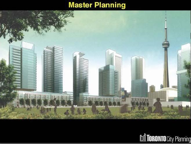
As for the Park Place buildings, Tango in particular, I find the buildings are confused and don't know if they should be blue or green or grey or black or a combination. Thick or thin horizontal bands. Flat or curved balconies*. Floor to ceiling glass levels with big, solid, blank podiums and roofs. It's not the quality of materials or execution, it's the hodge-podge of differing design elements that I'm not a fan of. The public art is nice, but it doesn't fit well into the buildings.
* The curved balconies on the west side of Tango provide a very nice effect in the setting afternoon sun - certainly a bit of relief while stuck in traffic eastbound on the 401 when the sun's out.


