You are using an out of date browser. It may not display this or other websites correctly.
You should upgrade or use an alternative browser.
You should upgrade or use an alternative browser.
Toronto Sun Life Financial Tower & Harbour Plaza Residences | 236.51m | 67s | Menkes | Sweeny &Co
- Thread starter nicetommy
- Start date
stjames2queenwest
Senior Member
Oh. Those are light panels?
modernizt
Senior Member
The coloured LED's thing is starting to get tacky and overdone. When everyone is doing it just for the sake of doing it, it loses its effect. Just some classy white uplighting of the crown would be my preference.
greenleaf
Senior Member
The coloured LED's thing is starting to get tacky and overdone. When everyone is doing it just for the sake of doing it, it loses its effect. Just some classy white uplighting of the crown would be my preference.
Gotta disagree with you. I feel like a Toronto needs to loosen up and bring on more LEDs. I like architecture for its distinct eras and right now we are moving towards or are in one with LEDs for better or worse. I suppose you see the worse.
I think white uplighting works if there is some colour or texture to highlight. Glass, which it appears this building has at the top, has neither colour or texture so no reason to highlight banality.
modernizt
Senior Member
I think white uplighting works if there is some colour or texture to highlight. Glass, which it appears this building has at the top, has neither colour or texture so no reason to highlight banality.
And coloured light (amidst a sea of competing colours from other buildings) somehow mitigates banality?
For the record, I'm not opposed to LED lighting. But I think it's best on projects where it is part of the architectural intent or makes sense, not as an afterthought or "just because". I would even argue that if it's only being done to cover up banality, that's a poor usage, and should be used in cases where there is an architectural feature to highlight (i.e. Ice, CASA, mech. rooms on CityPlace towers from earlier phases.)
I don't follow your logic that it makes sense to light up "banality" so long as the colour used isn't white.
Banality, in the darkness of night, pretty much disappears. Colouring a crown with light adds something to the night skyline whether the crown is plain or not. If everything could be as dynamic up top as Ïce, then great, but barring that, I'm happy to have the colour.
In this particular situation, Adam Feldmann of architectsAlliance told me that the top was designed in a restrained fashion because the balconies on the towers are so dynamic: the tops act as a visual rest. At night though, you're not going to see much of the balconies, and instead you get a coloured crown.
42
Logan
Active Member
What's not to love about lighting? It not only animates the night sky but adds a level of dynamism to the skyline. I also really like all the little red blinking lights. I think Cityplace started the trend and I like how developers are upping the game in each new development. Ice was a fantastic addition.
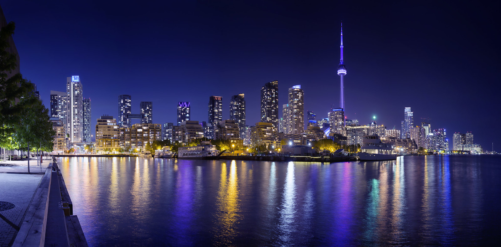
 Panoramic presentation of Toronto's skyline from Harbourfront by Roland Shainidze, on Flickr
 Panoramic presentation of Toronto's skyline from Harbourfront by Roland Shainidze, on Flickr
modernizt
Senior Member
What's not to love about lighting? It not only animates the night sky but adds a level of dynamism to the skyline.
You'll note that I never said I don't like lighting. My issue is that at this rate, in a few years it will just be a clusterfuck of competing motifs instead of an occasional point of visual interest. Clearly many here disagree with me, but please do not misstate what I was arguing.
stjames2queenwest
Senior Member
Lights in general I am a fan of. I can agree though that the nicest light features are well integrated, properly functioning and well considered.
67Cup
Active Member
What's not to love about lighting? It not only animates the night sky but adds a level of dynamism to the skyline.
Since you asked.... the answer to your question is Light Pollution. You can look it up. Here's a preliminary link. https://en.m.wikipedia.org/wiki/Light_pollution
You obviously love lighting but folks should be aware that much of what is radiated from our cities is both wasteful and possibly dangerous.
LUVIT!
Senior Member
You would love North Korea!
67Cup
Active Member
Now there's a carefully thought through answer. You know, there might just be a middle ground between Pyongyang and the 24 hours of garish light of some of our cities. We might be able to find a reasonable and attractive space between the poles, if we actually thought about the issue a bit.
steveve
Senior Member
The coloured LED's thing is starting to get tacky and overdone. When everyone is doing it just for the sake of doing it, it loses its effect. Just some classy white uplighting of the crown would be my preference.
Personally, I like the lights, and find as a whole, any lighting is better than no lighting. That being said, I get exactly what you mean when you say that it is becoming repetitive. The lighting features on recent condos (aside from outsiders like Aura and Trump) are quite similar, restricted to lighting mostly mechanical boxes with LED's to the same overall effect. Perhaps what you're getting at is a desire for a different type of lighting scheme, namely what many skyscrapers in Dubai or Asia look like in the evening, with extravagant neon pattering, often embedded in their entire facades, with more visual interest. While I think Toronto, and other North American/European cities suit a more modest and less flashy night skyline, I think it would be a cool experiment to see a building of that nature done well here... maybe around Yonge-Dundas square where bright lighting would less intrusive (although apparantly Aura's lighting is already offensive).
modernizt
Senior Member
Perhaps what you're getting at is a desire for a different type of lighting scheme, namely what many skyscrapers in Dubai or Asia look like in the evening, with extravagant neon pattering, often embedded in their entire facades, with more visual interest.
The extravagant coloured lighting of towers in Dubai or other Asian cities work in context, but I find them to be tacky in general, and that is the exact opposite of what I want here in Toronto.
Let me reiterate one last time: I like the occasional LED lighting on towers, and I was a huge supporter of it when it started to come into popularity in Toronto and when it was added to the CN Tower. However, it's becoming a 'de facto' practice for most new projects and it's just too much - it weakens the effect of successful lighting schemes when every single other new tower has its own lighting. Killing the goose that laid the golden egg, in a sense.
stjames2queenwest
Senior Member
Nah, the more the better.
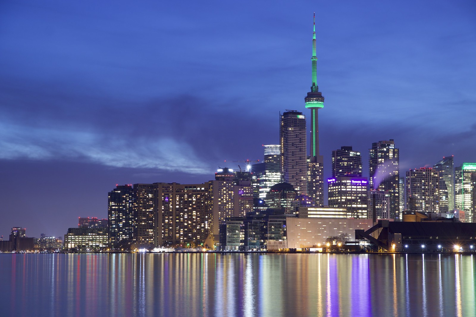
 IMG_3416