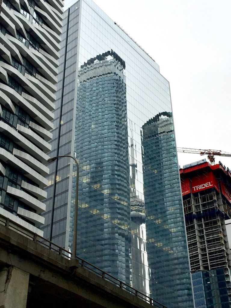
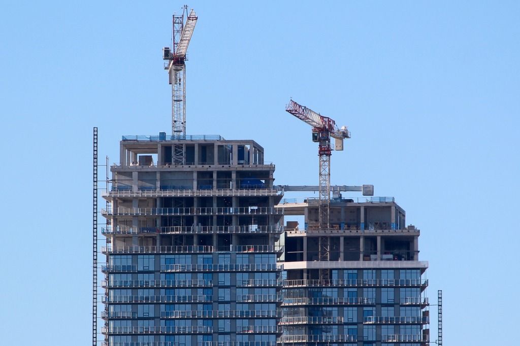
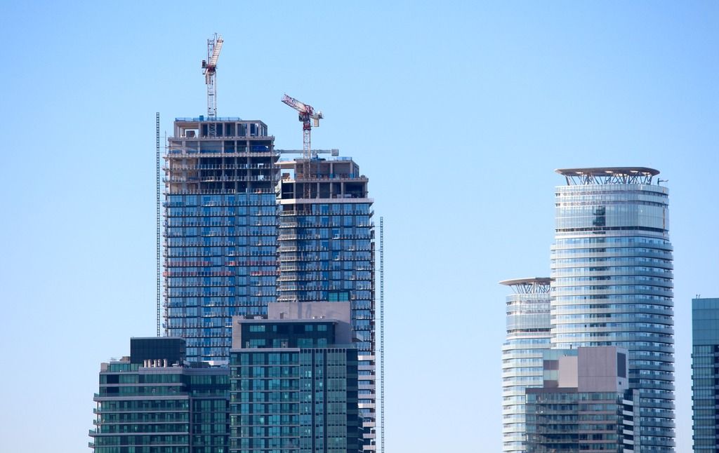
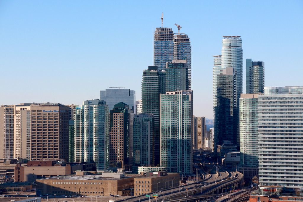
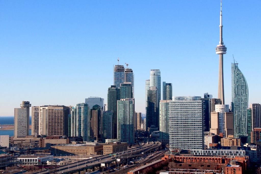
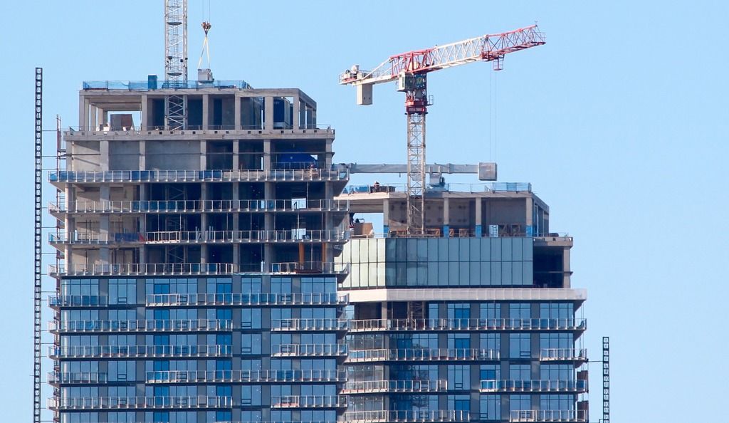
Toronto Sun Life Financial Tower & Harbour Plaza Residences | 236.51m | 67s | Menkes | Sweeny &Co

Lurker with no architecture background here:

Could someone try explain to me why this building has gotten so much praise from the site? I normally can understand most of the praise/criticism posted here but I really don't get why this won top building in the poll. Maybe some of it's qualities are less obvious in the pictures than in person but the sun life building in particular looks like a plain bulky glass slab.

Always enjoy the discussion and pictures here.
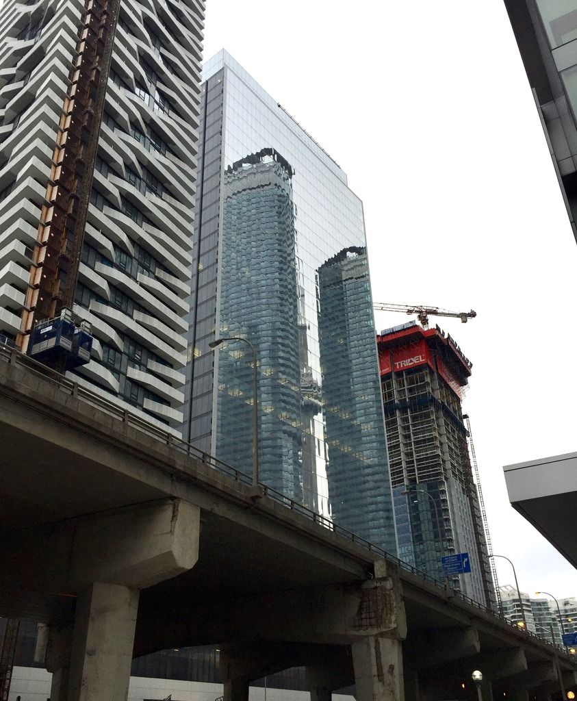
 
It took second place, to be precise.

I understand that it's quite a simple design, and that the simplicity can provoke questions of 'what's so great about this'?… but I'd venture that this is a classic case of being deceptively simple. Where a lesser architect may have delivered a mediocre box for a client looking to save a few bucks, Sweeny &Co has been able to create something that is simply elegant. That's thanks to pleasing proportions, high quality materials, and knowing when to quit. While there are a few architectural gestures here, (the protruding central portion of the building (both taller and wider), the articulation near ground level), this remains a minimalist building whose less-is-more virtues work well for it.

42
 
Yes. It's particularly noticeable when looking at it beside Waterpark III

I would argue that beyond discussions of cost or quality, it's particularly notable that the detailing is handled in a much more elegant and sophisticated way. Simple and minimalist design works when the architect is adept at construction detailing.

Edited for clarity - my post was not intended as an attack on individuals' credentials.
 
Last edited:
I would argue that we don't know just by looking at it what the actual cost in materials is or even the quality, but rather that the detailing is handled in a much more elegant and sophisticated way. Simple and minimalist design works when the architect is adept at construction detailing.

And to the contrary, I'd argue that I do know the cost and quality differential, given that I spent 10+ years fabricating and installing exterior glazing.
 
Various photos I've seen in other threads have shown the cladding progressing on the mechanical levels. I can't seem to recall where I've seen them, but if someone could do a repost that would be great. The colour scheme seems to be similar to that of One Bloor's mechanical levels. Too early to see the full effect so I'll reserve judgement.
 
Here you go @steveve ... I took these on yesterday's walkabout as well. Views of the mechanicals in a few shots.

one-1.jpg


one-2.jpg


one-3.jpg


one-4.jpg


one-5.jpg


one-6.jpg
 

Attachments

  • one-1.jpg
    one-1.jpg
    1.3 MB · Views: 516
  • one-2.jpg
    one-2.jpg
    1.5 MB · Views: 502
  • one-3.jpg
    one-3.jpg
    2.3 MB · Views: 543
  • one-4.jpg
    one-4.jpg
    2.5 MB · Views: 498
  • one-5.jpg
    one-5.jpg
    1.6 MB · Views: 499
  • one-6.jpg
    one-6.jpg
    1.5 MB · Views: 591
Various photos I've seen in other threads have shown the cladding progressing on the mechanical levels. I can't seem to recall where I've seen them, but if someone could do a repost that would be great. The colour scheme seems to be similar to that of One Bloor's mechanical levels. Too early to see the full effect so I'll reserve judgement.

Mechanical penthouse reflective cladding/glazing being installed on the east elevations.
January 6, 2017:
 
I like most aspects of these towers, except for that cladding on the mech. I will wait until the balconies are done though as perhaps it will make 'sense' when the white balconies are more dominant in these views, rather then the blues of the windows below.
 
IMO there won't be a saving grace for this turd. Even the penthouse would look cheap, and a baby can do a better job than this. Absolutely no excuse to permit this in such a prime area with TEN YORK to the west.
 

Back
Top