Toronto Sugar Wharf Condominiums (Phase 2) | 283.6m | 85s | Menkes | a—A

I still think this is going to end up looking better than many of us will admit.
Every part of this project constructed to-date looks much better than I expected, better than the renders, and better in person than they photograph.

Top-notch materials are being used. The metal (at least so it looks) spandrel on the podium of the east rental towers in the portion with punched windows looks particularly good, but the balconies also look to be shaping up nicely. The glass on the office tower is some of the best in the city.

I am confident that this will look good in the end based on what we've seen constructed to-date. I understand the desire of some members for something flashier, but I see nothing wrong with some well-executed plainer tall towers here.
These building are not my thing. But they're of a better quality not my thing. It's an important distinction for this project that they're not going to look like crap in the end.

That said, from the renderings of Phase 2 that are much more dramatic than Phase 1, that better quality I agree will likely continue. This will likely then be a win/win for buildings that's are not my thing. 😺
 
Let's just stop. We're all entitled to our own opinions and no one is obligated to defend their opinions if other people don't like them.

Let's get back to this building,

Here's my succinct opinion: waste of the waterfront

Agree and, probably, the bigger issue is that what they're planning between this and Pinnacle One Yonge is more of the same. This might end up yet another part of the city that's a sea of monotonous glass. The areas directly east and west of Skydome come to mind. It's devoid of colour, texture, architectural variation, and largely featureless.

Creating patterns by using different coloured balcony glass? 1-2 buildings like that are fine but when that becomes the go-to strategy to provide visual interest it becomes a problem. It's a cheap cosmetic to cover up a lazy pedestrian building .....and a worrying trend. Good design doesn't need gimmicks like that to create something attractive.
 
Hi everyone !
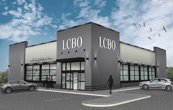
Does anybody know when the LCBO headquarters will be moved to the new office tower ? So that we could expect a imminent demolition ... Is this new phase already approved for construction?
 
Hi everyone !
Does anybody know when the LCBO headquarters will be moved to the new office tower ? So that we could expect a imminent demolition ... Is this new phase already approved for construction?

To my understanding the LCBO office move is underway.......the official change of address on the HQ went live Nov 1st.


But there are no demolition permits pulled in respect of the existing HQ, nor are their new building permits pulled for that site as yet. (or applied for so far as I can discern)...

So it will be awhile yet.
 

Toronto Model 12-22-21 Sugar Wharf.png
 
Last edited:
Agree and, probably, the bigger issue is that what they're planning between this and Pinnacle One Yonge is more of the same. This might end up yet another part of the city that's a sea of monotonous glass. The areas directly east and west of Skydome come to mind. It's devoid of colour, texture, architectural variation, and largely featureless.

Creating patterns by using different coloured balcony glass? 1-2 buildings like that are fine but when that becomes the go-to strategy to provide visual interest it becomes a problem. It's a cheap cosmetic to cover up a lazy pedestrian building .....and a worrying trend. Good design doesn't need gimmicks like that to create something attractive.
Creating patterns by using different types of balcony glass should be called The Toronto School of Architecture 🙄
 
Am I to presume they'll starting working on Phase 2 when all the LBCO staff 'n stuff have been moved over to their new building across the road from this lot?
 
Am I to presume they'll starting working on Phase 2 when all the LBCO staff 'n stuff have been moved over to their new building across the road from this lot?
Have they actually put Units in Phase 2 on sale yet? They will not really start any construction until they get a fair % sold off though they might start the demolition and even, maybe, some site preparation.
 
Have they actually put Units in Phase 2 on sale yet? They will not really start any construction until they get a fair % sold off though they might start the demolition and even, maybe, some site preparation.

Towers 4,5,6 are all "coming soon". Nothing on the market publicly yet from what I can see on Altus Data Studio. For towers 1 and 2, there are only seven units remaining for sale, in total.
 
Towers 4,5,6 are all "coming soon". Nothing on the market publicly yet from what I can see on Altus Data Studio. For towers 1 and 2, there are only seven units remaining for sale, in total.
That's good news. And as I always say, in terms of the volume of projects Built, U/C and Proposed in Toronto, we are genuinely spoiled ongoing. 😃
 

Back
Top