Toronto Sugar Wharf Condominiums (Phase 1) | 231m | 70s | Menkes | a—A

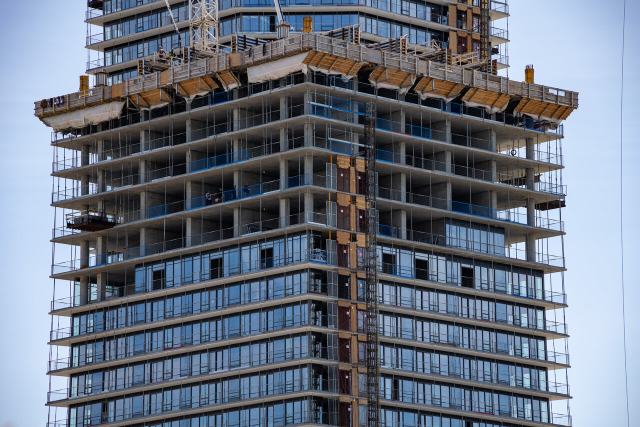
They’re back to work!

SE Tower working on 63 of 65+++
NW Tower working on 51 of 70+++
~3 and 2 floors since April 19.
700E3DAC-D19D-4E03-AD60-2614B4940F7E.jpeg


8470E8AF-5E32-43E2-AA0E-6B9E91A52400.jpeg


9400E3CA-67D7-4071-8B78-A0020FB0B0C3.jpeg
 
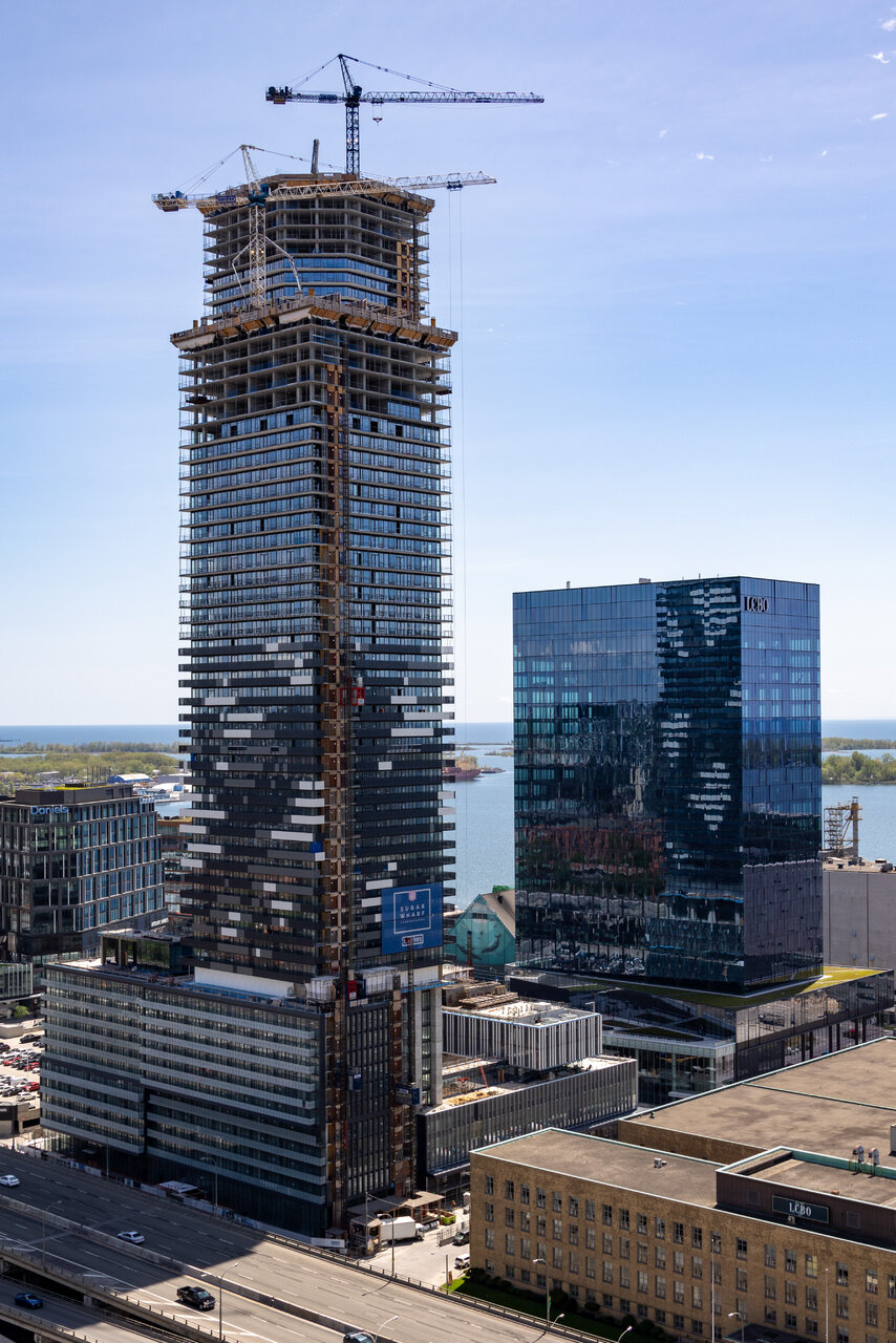
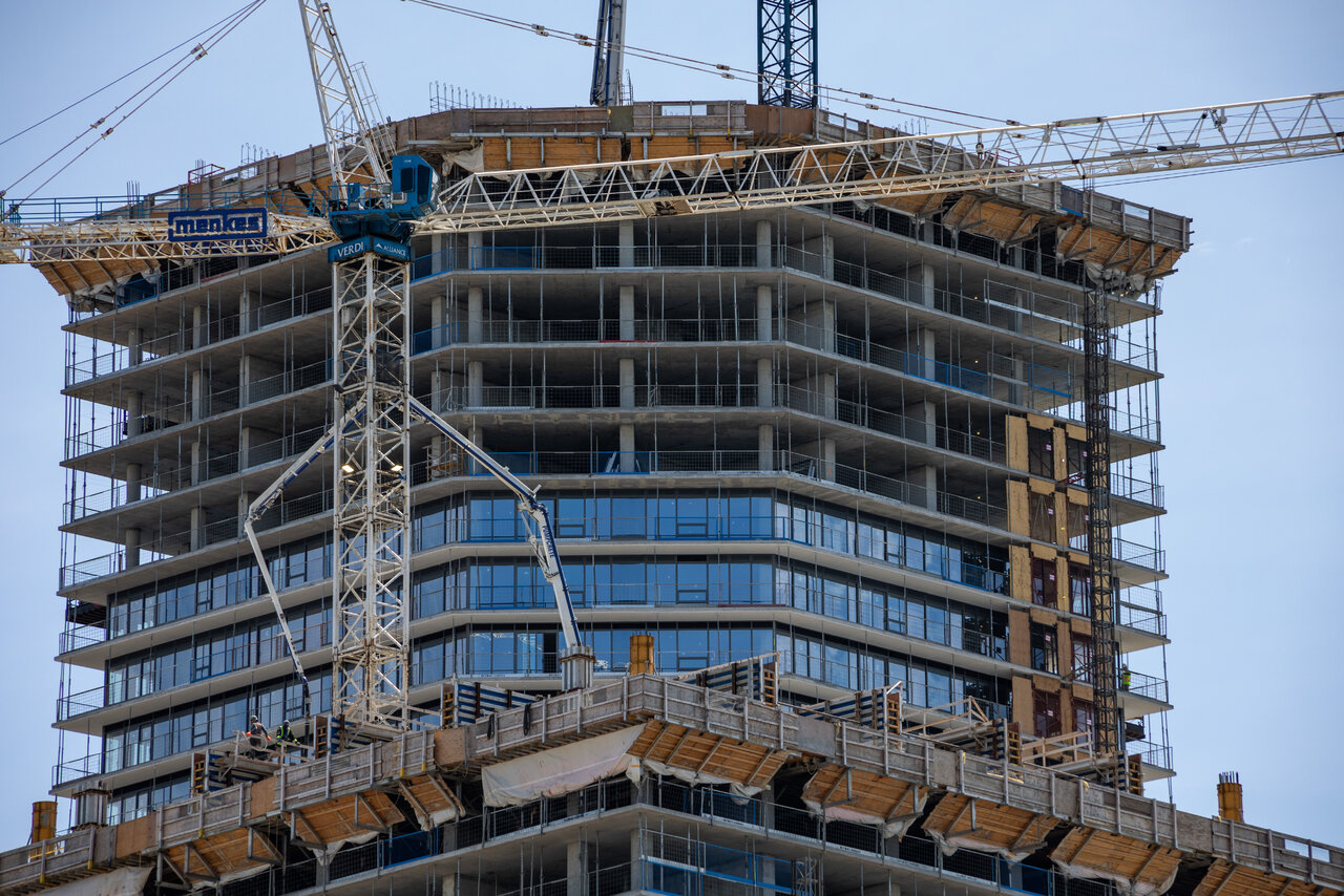
They’re back to work!

SE Tower working on 63 of 65+++
NW Tower working on 51 of 70+++
~3 and 2 floors since April 19.
View attachment 402301

View attachment 402302

View attachment 402303

Yes - great to see. Apparently agreements have been reached and ratified with all the trades except the drywallers. Some sites were quicker to mobilize and get back to work than others - the rest should be starting back up in the next day or so. The drywallers may be out for another week or so, but a settlement should be reached soon, as a settlement pattern has been established with all the other trades.
 
Then folks would complain that it's just Harbour Square Pt. II. I disagree, this works for me.

fair enough - we can agree to disagree! I just think this is already looking dated. I guess I'm just sad that they went super monochromatic and chaotic with the design. Metal panel guards can literally be any colour on earth and they went with black white and grey. The first two concepts they floated were infinitely better.

1654115238295.png
1654115256714.png
 
I always liked the colour, but the second one is just white (eg. one third of "black, white and gray"), no? To each their own, for sure, I'm just ok with how this is turning out. Kind of reminds me of the Lego whale in Van:

1654116621602.png
 
I think a lot of white panels are not installed yet, thus it looking off (chaotic). I'm hoping that once it's all filled in, it'll look great. It's a much better attempt than what Daniel's tried with their Lighthouse (West) spiral, which is barely noticeable (though I think the spiral is a cooler idea, just terribly implemented).
 

Back
Top