I've posted it before, but once again, to add perspective and focus on stylistic specifics...
The birth of Toronto Style
Forget the Gehry fanfare and the Libeskind hoopla. Mega-projects don't reflect what's really exciting about architecture in the city, writes LISA ROCHON. The new homegrown modernism that is redefining our buildings is equally worthy of attention
LISA ROCHON
6 November 2004
The Globe and Mail
Much ink has been spilled over the superstar architects called to arms to rebrand Toronto. Frank Gehry's AGO addition, Daniel Libeskind's ROM redevelopment and Will Alsop's OCAD annex have awakened even the most unlikely Torontonians to the power and possibilities of architecture. And now new international stars are being added to the roster: the great Indian architect Charles Correa has just been commissioned to design the Ismaili Centre in Don Mills, and Japan's acclaimed Fumihiko Maki will design the Aga Khan Museum next to the Don Valley Parkway.
The Sensational Six -- which also includes Norman Foster, who designed the new Leslie L. Dan Pharmacy Building at the University of Toronto -- are a formidable force. Nobody with an abiding interest in the making of a vibrant metropolis would begrudge them producing here.
But here's what isn't being talked about, even though it's equally significant: Toiling under the shadow of the Six are a cadre of Toronto visionaries responsible for a homegrown school of design that deserves just as much attention. Some call it the Toronto Style, though it has less to do with the fleeting monikers of lifestyle, like sugared-up Martinis and low-cut jeans, and more to do with architecture that is human-sized, human-complex, human-warm.
The new modernism that's redefining the public and private face of Toronto -- you can see it in the new Wellesley Community Centre in St. Jamestown and in Queen Street's new Camera theatre and bar, which shares space with the Stephen Bulger Gallery -- has an agenda: humanizing the strict religion of modern architecture.
This isn't an entirely new approach: For decades, the design thinkers in this city have been creating buildings that sit comfortably in Canada's largest metropolis, reflecting the tolerance and generosity of a unique civic society. The work is published internationally. It is regularly awarded provincial and national awards. But the recent spate of new designs makes it worthy of attention -- as Governor-General Adrienne Clarkson demonstrated last month by presenting the Toronto firms Kuwabara Payne McKenna Blumberg Architects (KPMB), Shim-Sutcliffe Architects and Ian MacDonald Architect with Governor-General Medals in Architecture for 2004.
The Toronto Style is both elegant and livable. It deserves our full attention.
What are the hallmarks of this new modernism? Three themes are emerging here that build on the legacy of modern architecture, and consolidate it. The new modernism delights in natural light, editing it tightly like the early modernists did but combining it with the seductive gesture of the glass curtain wall. It reveals a special reverence for wood: A favoured device is to create screens or fences of thin horizontal strips of cedar or Douglas fir. (This decorative trope drives some detractors crazy, but I'll take it any day over vinyl siding.) And it pays particular attention to the building site: More than ever, architects are playing with the site, manipulating space, through pinched and released entranceways, for instance, and setting up surprise views of the outside so that visitors become extra aware of how they're moving in and out of a building.
The sensibility of new modernism has been adopted for the residences of the elites and for modest back lane houses. Stephen Teeple Architects has created a new portfolio of libraries, in west Toronto and Ajax, with aggressive roof lines that point toward the community they're trying to seduce.
Creating a lantern effect to dazzle passersby during the day and night is a strategy commonly used by the practitioners of the new modern style in Toronto. Another is to take the floating planes -- walls, ceilings, partitions -- and emphasize them to a greater extent than the earlier school of European modernists once did. Brick or stone walls in Toronto might be juxtaposed over tiles or stucco -- it's a play on surfaces to create extra visual delight.
Several cataclysmic events in Toronto helped to shape new modernism in this city. Back in the 1960s, Ron Thom, a Vancouver architect with a deep, lugubrious West Coast sensibility, won a competition to design Massey College at the University of Toronto campus. Vincent Massey, scion of the Massey-Ferguson farm machinery enterprise and the first Canadian to be appointed Governor-General during the 1950s, spearheaded the need for the graduate, multi-disciplinary residence. In the competition brief he insisted that the building should possess qualities of "dignity, grace, beauty and warmth" -- music to the ears of Toronto's dedicated architects. Massey College pleases the senses of touch, smell and sight.
When it opened in 1963, it introduced the city to the way that beautiful materials -- limestone window mullions, wooden ceilings and leather sling chairs -- could be combined to make for a humanized version of modernism on a modestly scaled downtown site. Thom created a refuge using large planes of brick that dip in and out like separate walls dancing along the property line.
Carefully edited views of the courtyard landscape with its reflecting pools and mature trees come by way of slot windows. The sound of gushing water penetrates the main lounge through a generous, north-facing wall of glass.
Mies van der Rohe, the German giant of modernism who arrived in Toronto at about the same time Mr. Thom was designing Massey College, was another defining influence. His works incorporated monumental slabs of travertine, granite flooring and brown English oak. A few extraordinary materials defined the Miesian space. That sublime minimalism stuck among Toronto's practitioners, infiltrating the minds of Shim-Sutcliffe Architects, among others. Bruce Kuwabara's house for Gerald Sheff and Shanitha Kachan in Rosedale is an essay of both solidity and openness to the outdoor courtyard and the ravine beyond.
New modernism is about a city of immigrants and travellers. Windows and doors matter tremendously. Louis Kahn, the American modernist who enjoys a cult status among some Toronto practitioners, has a lot to do with the reverence in this city for deep wooden frames on windows or sliding glass doors. KPMB's Woodsworth College, built in 1992, was the first project in Toronto to introduce Kahnian wooden windows, and the rest has been history.
It's also a celebration of old and new textures. Barton Myers and Jack Diamond trained a generation of architects to carve out courtyards for private homes and commercial developments. Through their efforts, architecture in Toronto tapped into an important collective memory.
Nineteenth-century architecture has since been carefully stitched into new developments; it's understood as a beautiful texture rather than as a thing that might be confused with moldiness.
Toronto's young generation of architects has come to respect the history of the city and ways of accommodating tight urban sites, under the intellectual stewardship of Eric Arthur, Blanche van Ginkel and George Baird, the new dean of the University of Toronto's Faculty of Architecture, Landscape and Design. In his writings and professional practice, Dean Baird has insisted for decades on the need for urban architecture rather than buildings designed as autonomous creatures.
Will Alsop's addition to the Ontario College of Art & Design -- a rectangular building that gets hoisted nine storeys into the sky on brightly coloured steel legs -- lends a genuine frisson to Toronto. It's a welcome intervention.
But it does not a city make.
Camera Bar
and Theatre
Siamak Hariri, Hariri Pontarini Architects
The hardware store that once occupied this address is long gone. Entrance doors scaled like totems lead slowly, deliberately from the street into a cinematic space, the dream of director Atom Egoyan and film distributor Hussain Amarshi of Mongrel Media, whose offices are on the second floor. The entrance to the digital screening room feels like a long, high rite of passage. The great sliding doors running along the front façade are in oak and teak. When the weather co-operates, they can split apart so that Camera Bar blurs into the Stephen Bulger Gallery, the two main-floor occupants, creating a dialogue between two creative forces that totals something a lot wider than seven metres. At long last, a new horizontal line has been offered as an alternative to the pinched Victorian scale of the Queen Street storefront.
Garden Pavilion at the Frum Property
Shim-Sutcliffe Architects
The late Barbara Frum and husband Murray engaged Ron Thom to renovate their suburban house -- a project that extended over 15 years to become a gentle coercion between interior and exterior space. Howard Sutcliffe worked as Mr. Thom's assistant on the last landscape interventions on the property; after his mentor's death in 1986, Mr. Sutcliffe and his partner Brigitte Shim took over. The new garden pavilion at the bottom of a hill just beyond a green-on-green shade garden that Ms. Frum carefully tended has clarity and warmth; surface and structure -- skin and bones -- are jigsawed into an exquisite composition. The wooden doors of the house open generously to the L-shaped reflecting pool, and the resilient Ipé wood flooring extends seamlessly from the interior to become the exterior decking.
U of T's School of Continuing Studies
Jason and Raymond Moriyama, Moriyama & Teshima Architects
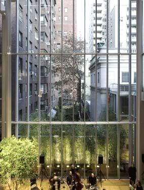
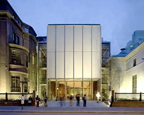
This project is a major renovation of an existing four-storey, 1954 building that, bizarrely, presented a blank brick façade to St. George Street and undermined the school's motto: 'Open to learning. Open to you.' The building measures only nine metres wide and 36 metres deep, but it now owns a significant street presence. The architects replaced the brick front façade with a double-height glass curtain wall. An atrium café is easily visible from the street along with pendant custom-lighting and an elegantly detailed wooden wall. A trellised sun shade wraps around the top of the glass pavilion, providing dynamic lift to the boxy volumes of the building.
Wellesley Community Centre
MacLennan Jaunkalns Miller Architects Ltd., with Zawadski Armin Stevens Architects Inc.
In St. James Town, an extremely dense neighbourhood of 25,000 people living in high-rise towers, a public library and community centre were desperately overdue. The architects used a broad curtain wall of glass that fronts onto Sherbourne Street and makes a right angle onto Wellesley. The building plan pinwheels around a central meeting area and two-storey-high slot with skylight that cuts north-south through the building. A multipurpose gym, daycare for 60 children, public library with some Tamil books, kitchen and workout room are all included in the centre. Making something out of nothing -- elevating the modest budget of $175 per square foot into something of visual interest -- takes intelligence and design savvy. Concrete block is cheap but stained concrete block is cheap and interesting to look at.
 Thus becoming a Wikieality.