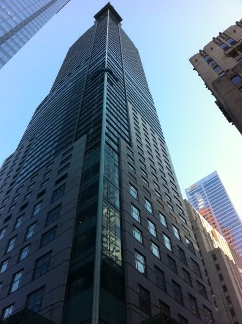
Toronto St Regis Toronto Hotel and Residences | 281.93m | 58s | JFC Capital | Zeidler

Not sure about that - unless what's considered good is drawn strictly from the functionalist/high-tech school - and even the latter are rarely bold enough to have the mundane mechanicals exposed (save, in some instances, by Rogers, Grimshaw, Piano et al). Good architects still hide - they just do so with forethought and does it better.

AoD
 
Last edited:
There's surely not one definitive right or wrong answer here (though I know I was writing in a somewhat provocative tone). What I was getting at (and what AoD seems to have corroborated) is that the real failure of Zeidler or E.I. Richmond at Trump and Beyond the Sea respectively is their insistence on certain plastic forms for their structures' crowns, even when it became evident in the working drawing stage that such forms would require additional visual baggage.

I'm also speaking to the members who see the boxes on Murano, X or the TCHC buildings as 'failures' on the part of the architects. There's nothing which indicates (aside from X) that Peter desired anything other than what was built on top of any of those structures. I much prefer that self-conscious approach to the mechanical components than the shrouding seen at Trump or Beyond the Sea or the 'trussed-up' effect produced by the prevalence of applied 'roof elements' in the early to mid 2000's.
 
But if you look, you'll see that many of the best architects don't find they need to hide those things either.

attachment.php

This is a completely false choice ("good architects don't hide things, bad architects do"). There are a million examples of bad architecture that fail to hide things that are inconsistent with the design paradigm of the building. And even more examples of good architecture that hide elements very successfully (should the buildings at the Aga Khan Museum have their Hvac systems exposed for you to consider them good architecture by good architects?)
 
PE:

To be fair, I don't know whether it is the failure of the architect or the project proponent - the latter could be the ones refusing to pay extra for a more polished final product.

AoD
 
The doolally nonsense with the crooked spire ( stand on the east side of Yonge, north of Adelaide, and try to align it visually with the vertical south east edge of the Bay Adelaide tower ... ), and the building maintenance unit that nobody was expecting, is no sillier than the rest of this eccentric design. The building is as much about not expressing what goes on within - the dead-eyed parking levels disguised to resemble the rest of the tower, the change of cladding materials to suggest a transition to a different interior use that isn't actually taking place, the fakery of trying to strap all these elements inside a coherent carapace - as anything else. In fact, if anything, the building maintenance unit is the only honest part
 
I am wondering if the ladder and the crow's nest are connected and will pivot to assist in the final cladding of the onion dome. We were told earlier on that the metal cladding there now was to be covered in the future with the same grey material the mechanical box was being clad in. Just my thought!
 
took this cell phone shot on wednesday waiting for a GO train

DDlub.jpg


I have always loved how the sky and surrounding buildings reflect off of Commerce Court West. It's great to see Trump pull off the same look
 
i agree ^^^ imo, commerce court is the backbone for the Bay street canyon in the cbd. it's perfect height wise, and size wise.

i will say that i never liked how trump looked from the south, it's too flat.
 
yes, exactly my take on it in this photo... there is absolutely no shape to Trump from this angle and the spire looks even more like a clip on tie than it does from it's "better" angles.
 
and the glass on the south side (esp. the stripes of spandrel) doesn't look that good from here either.... i know its probably physiological but the window opening gaps/lines are distracting and look bad

but on the bright side, it fits in very nicely with the canyon.
 
So i had the awesome pleasure of staying on the 44th floor of the Niagara Falls Hilton for a few nights this week. When i got into the hotel room i ran to the window like a kid at the gates of disneyworld. The view of the falls was stunning but what really caught my eye was how the fallsview hotel across the street looks like a stubby Trump Toronto. lit up onion dome, green glass, sloppy transition from stone/concrete to glass...its all there....anyways heres one of the pictures i took

qZuli.jpg
 
... it may be true, but all the buildings in niagara falls are pretty ugly to begin with, even the hilton addition that went up a few years ago, lol
 
I prefer Fallsview, to be honest. It's scaled better (the feature on the top is large enough relative to the tower to actually come off as a feature and not as a tack-on), the atrium with the fountain is actually quite nice, and tho it's all sprawly it's actually one of the nicer hotels to walk around in the area.
 
I walked by Trump:

Looks like they are working on the LED lights again
Also they have the Onion Dome covered in meshing, so I guess the glass installation is underway.


photo-2236.jpg


o48nt.jpg
 
Last edited:

Back
Top