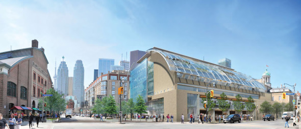
Toronto St Lawrence Market North | 25.3m | 5s | City of Toronto | Rogers Stirk Harbour

Red is clearly Rogers (or the Adamson with a Rogers dress on), and it would be awesome to have something like it in the city. At the same time, it doesn't look terrifically practical - there is a lot of interior space to warm up, for starters. I think Orange has the best combo of intriguing design and great, useful interior (and it has an AGO-like galleria!). Green is the safe choice - all of the non-design nerds at blogTO love it. Yellow looks like it was lifted from the Four Seasons and the less said about Blue, the better.
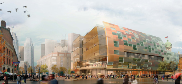
 
Orange is the only one that made me go "wow," though I think the render manipulates colors a bit to make it fit the neighbourhood better. Green's also good if they chose a more orangy/brown brick color to match neighbouring buildings more smoothly.

orange:
20100508%20St%20Law%20Orange%20Team.jpg


green:
20100508%20St%20Law%20Green%20Team.jpg
 

Because the Front Street side would mimic its southern sister, and would never become dated. Then the rest of the building could mimic the shape of the south market, in keeping with this. Otherwise I think the Red idea of deconstruction is nice because it opens up the space in ways that the south market can't match, and would help make Market Lane and Jarvis more animated, as well as the interior more open and bright.
 
Last edited:
Having looked at the models earlier today, I remain convinced that "Red" team have come up with the most engaging design. It mediates between the historic St. Lawrence Hall and the South Market by introducing a distinctive form that doesn't try to shout them down. The exterior vertical bays break up the mass of the building and adopt elements of the upper floors of the St. Lawrence Hall - which is divided by pilasters - as well as the Market Square condos to the west which has projecting bays of windows. The openness at ground level allows the market component to express itself, and the upper floors indicate that it is a building with additional uses. That it does this by ( more than any of the designs ) ignoring the guidelines which call for upper floors which "should be stepped back from Jarvis Street and Market Lane" and which reference 39 Jarvis ( the St. James condo ), 139-151 King East and 150 King East ( the King Street frontage of King George Square ) as models to be guided by, is a measure of its success.
 
Orange team is the best building that fits in nicely with the neighborhood. The building also meets the street well and the copper material gives respect to the neighborhoods industrial past.
 
All of the proposals are a vast improvement over what we have now. If we get any of these designs (as rendered), I'll be happy. Yellow is probably my least favourite, since it looks too similar to every other institutional building we are currently throwing up around town. Red is my wish: the exposed steel and glass (I agree, must be Rogers) open concept will expose the colour and animation of the market to the outside world.

In any case, I really like the idea of disguising the architectural teams by colour code; it avoids starchitecture worship or that subjective bias we sometimes harbour against local firms.
 
My favourite exterior is Orange; favourite interior, Red. As for Yellow, just looking at the renders puts me to sleep.

Overall winner: Red
 
Last edited:
RED all the way. gorgeous contrast with the area and it does not compete with the south market. A lot of market space on the ground floor and beautiful views. LOVE the staircase on the south side! From street level the openness is very inviting. Plus this building from the side reminds me of centre pompidou in Paris. (a cleaner look)

blue Love the design; but, deal breaker was the small floor area for the market. This building also has a community centre feeling. and we kinda already have a building like this in Toronto, the Gardiner museum.

green Bad bad design. looks like a barn with solar panels and not in a good way. And whats with the glass square at the front? the design is not inspiring at all. I feel this building is trying to compete with the south market. if any building should stand out it should be the south market.

orange Probably my second fave. nothing really bad to say, but when i saw red i was sold.

yellow Can the market space be any smaller? everything the farmers would sell would have to be baby sized, like baby corn. and all the antiques on Sunday.. well we can just forget about that..

VOTE RED
 
Last edited:
My favourite exterior is Orange; favourite interior, Red.

I agree.
The interior market rendering for Orange reminds me of the lobby at City Hall.

The exterior of red is too busy for me . It could win an award for most spots for pigeons to perch/nest.
 
Green is hideous. It's a blatant example of a building designed to earn support from those Torontonian's looking for something familiar and safe. In other words boring and soon forgotten. We need to push the boundaries and take a chance at something a little more daring.

Rogers is definitely the Red concept and does an amazing job of creating a fantastic new north-sound axis from the old market to St Lawrence Building. It's the perfect compliment to the old market across the street. Transparency vs the heavy brick and squared vs rounded.

I also love how it includes some familiar Rogers elements like the glass enclosed staircase similar to his 88 Wood St development in London;

1376_0041_1_w.jpg


Orange concept would be my 2nd choice though the shape looks familiar to some recent designs i've seen elsewhere.
 
Blue - reminds of a city hall you would see in kitchener or oshawa.....

Green - looks like one of those hockey arenas they build to 'reinvent' urban cores....

Orange - that shot from the air is stunning - i love it and i love the Alsop feel to the east wall

Red - was my first choice....... the more i look at it, however, the more it feels like university and other institutional buildings i saw plenty of when in the Netherlands - and they look dated and cold.....

Yellow - i find it impossible from the rendering to make any judgment -- it doesn't pull me in at all...

Orange seems to be wowing me the most but i will sit on it a bit and hear what others say before i vote....

Lovarkitec
 

Back
Top