Red Mars
Senior Member
Sept 28, 2021


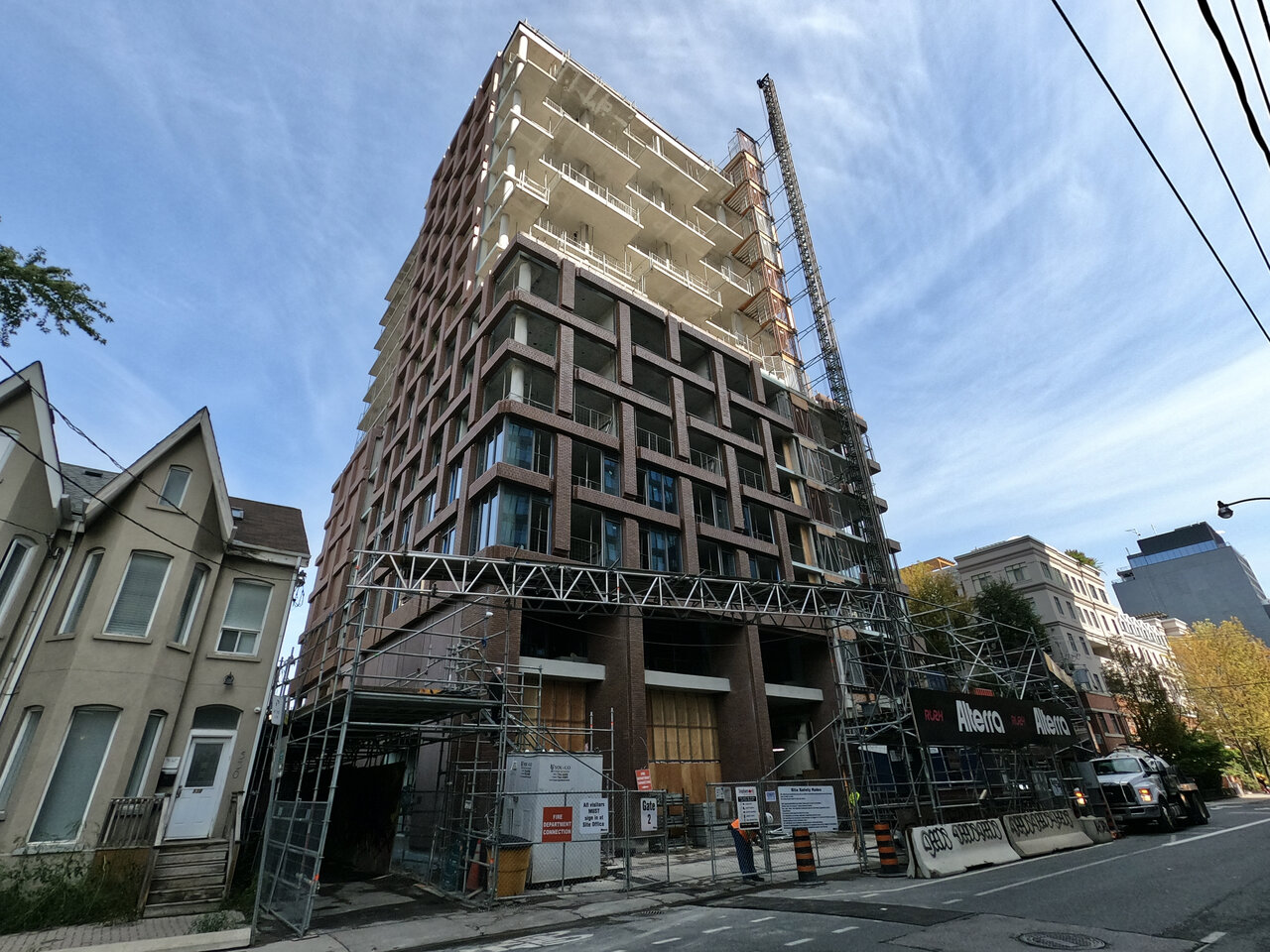
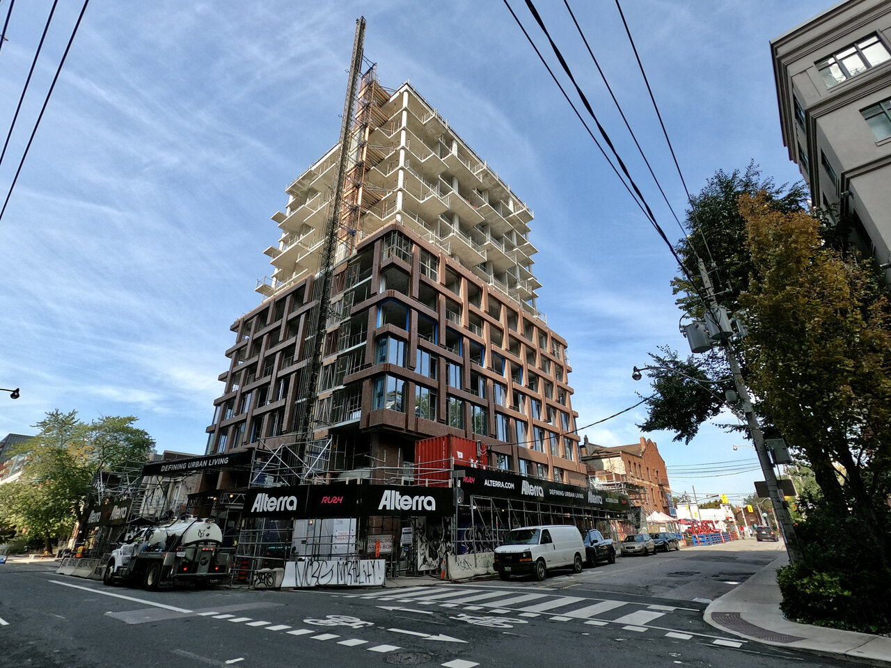
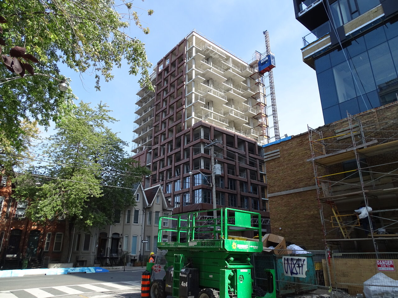
Absolutely! this was a very challenging element of the design. In the end, a sloped precast sill was integrated into the panels. This proved to be very complex, especially at the outside corner windows
@ProjectEnd - as for the glass, I agree darker would have been better.
But give the Alterra big time credit for doing laminated glass and thus avoiding the dreaded 'horizontal mullion' - this is just about as good as window wall gets.
Would have preferred perf at the louvers as well but you can't win 'em all
As explained above, the window wall itself is as good as it gets, it just should have been black.Yeah...it tends to look better if one doesn't zoom up too close to the windows.
159SW was sold years and years ago at a very low PSF. They don't have the money to do there what they did here.Can anyone explain to an outsider why Alterra would simultaneously produce a lovely product like this, with high-end glass and some of the best brick detailing I've seen on any condo in Toronto, and cheap, ugly, spandrel-infested dreck at 159SW? Is it just different budgets for different price points/market segments? Are the same people making the the call about how to value engineer these buildings or are there competing design-focused or budget-focused factions within the company or something?
...this really is starting to turn into a rare gem.Yeah...it tends to look better if one doesn't zoom up too close to the windows.