You are using an out of date browser. It may not display this or other websites correctly.
You should upgrade or use an alternative browser.
You should upgrade or use an alternative browser.
Toronto River City Condos Phases 1 & 2 | ?m | 16s | Urban Capital | ZAS Architects
- Thread starter badga
- Start date
yonderbean
Active Member
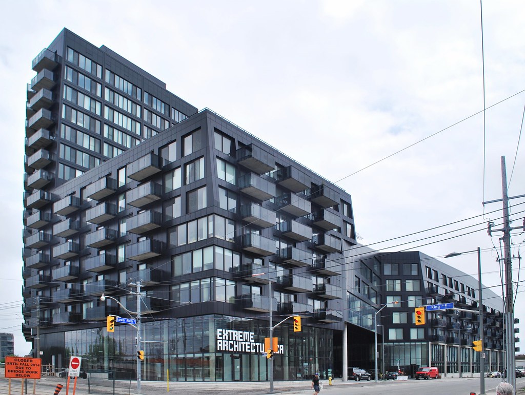
This snap taken from my bike doesn't quite do it justice, but it looked pretty slick from the DVP the other day. The black cladding glistens in the sun.

salsa
Senior Member
From the Don Valley trail

Marcanadian
Moderator
 River City by Marcanadian, on Flickr
 River City by Marcanadian, on Flickr
 River City by Marcanadian, on Flickr
 West Don Lands by Marcanadian, on Flickr
 West Don Lands by Marcanadian, on Flickr
 River City by Marcanadian, on Flickr
 River City by Marcanadian, on Flickr
 River City by Marcanadian, on Flickr
 River City by Marcanadian, on Flickr
 River City by Marcanadian, on Flickr
WislaHD
Superstar
The colors have been criticized again and again (and for good reason) but I must say the finished product does look good.
TheKingEast
Senior Member
The colors have been criticized again and again (and for good reason) but I must say the finished product does look good.
Really? I always thought RC was well received by just about everyone. Would have been nice if the low income housing opposite were a contrasting, bold color.
ProjectEnd
Superstar
The colors have been criticized again and again (and for good reason) but I must say the finished product does look good.
Have they? I was / am unaware of such criticism.
NBGtect
Active Member
The colors have been criticized again and again (and for good reason) but I must say the finished product does look good.
Yes, those of us that live here agree that the exterior is nice. But that's where the compliments stop. It's only people that don't live here that give it a Pug Award.
I'm looking forward to the white going up on phase 2. The contrast between the two phases will put photographers and cameras to the test in capturing the subtleties of both the black and white elements in the same photo, but I am sure we will get some very memorable shots.
42
42
LowPolygon
Senior Member


Patch
Active Member
Wow that first picture is incredible! Looks so sleek with the sun reflecting ")
egotrippin
Senior Member
That streetwall though.
Seriously, this is architecture for grownups. Toronto needs to embrace it and demand no less than buildings designed AND actually built to this standard. Creative use of form, contrasting colours and designs between phases, material choices beyond the same old spandrel and mullion-laden glazing that passes as cladding these days... The list goes on, but it's about time we grow up and push back on cheap, ugly designs.
Seriously, this is architecture for grownups. Toronto needs to embrace it and demand no less than buildings designed AND actually built to this standard. Creative use of form, contrasting colours and designs between phases, material choices beyond the same old spandrel and mullion-laden glazing that passes as cladding these days... The list goes on, but it's about time we grow up and push back on cheap, ugly designs.
chriskayTO
Active Member
Those ugly green balcony-edge planters in the second photo really stand out.
isaidso
Senior Member
Those ugly green balcony-edge planters in the second photo really stand out.
They're a vast improvement over no planters at all. I'm always surprised how few Canadians have balcony flower boxes. In some parts of Europe it's hard to find balconies without them.
Last edited:
chriskayTO
Active Member
Disagree - but it's a matter of opinion. The point is likely moot as they're probably not allowed according to condo rules.