Toronto Residences at the RCMI Condos | 134.72m | 42s | Tribute | Zeidler

And here it is. I have some more renderings but it is going to take me some time to upload them. Note that these are preliminary renderings, and that the design has been refined.
Picture1.png

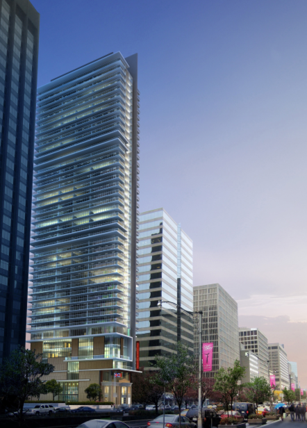
Pretty nice tower... from the 7th floor up.

Below that? Embarrassing, ugly, unworthy, truly horrific. Hopefully the promised refinements are revolutionary!

42
 
Thanks for the rendering Tuscani01 ~

what this picture shows is how Tribute's current proposal doesn't fit at this location ... there is no reason why this building should 'stand out' from the relatively consistent built form / height established along University Avenue (this is just another condo afterall)
 
Last edited by a moderator:
... there is no reason why this building should 'stand out' from the relatively consistent built form / height established along University Avenue

Well if that is the case, then Shangri-La has broken that pattern for any future University Ave.consistent street wall developments.:confused: In my view this is a grand Boulevard with rapid transit beneath that needs a bunch of more structures in the 45-60 storey range.:)
 
Pretty nice tower... from the 7th floor up.

Below that? Embarrassing, ugly, unworthy, truly horrific. Hopefully the promised refinements are revolutionary!

42

Well, I don't mind the De Stijl-esque form-playing in principle. But the retained club facade has something of this ridiculousness going on...
 
Thanks for the rendering Tuscani01 ~

what this picture shows is how Tribute's current proposal doesn't fit at this location ... there is no reason why this building should 'stand out' from the relatively consistent built form / height established along University Avenue (this is just another condo afterall)

Why not? It needs to be refined to be sure, but I see no reason why this building shouldn't project the same tall, balcony-ensconced tumescence that we're all enjoying a little further uptown at CASA. I'd really like to see something which harkens back to the time when Zeidler was Canada's answer to Team 4, Rogers/Piano, Richie, and all the other techno-nerds coming out of old Blighty. Something which takes cues from his still-fashionable-twenty-seasons-later Ontario Place perhaps.
 
Something which takes cues from his still-fashionable-twenty-seasons-later Ontario Place perhaps.

Or even more so, McMaster Health Sciences Centre.

Right now, the retained old facade makes me think of the practice of foot-binding, for some reason. (As far as Zeidler retaining facades on University Avenue goes, Ontario Hydro as a frontage to Princess Meg Hosp works much better.)
 
Well, I don't mind the De Stijl-esque form-playing in principle. But the retained club facade has something of this ridiculousness going on...

Yep, both are bungled attempts to preserve our architectural history: while both manage the preservation, they render it ridiculous. On the other hand, the Bay Adelade Centre, which I have been critical of for a couple of reasons, including its contentious reworking of the integrated historic facade, nevertheless manages to retain that facade's dignity.

If this development must go ahead, the RCMI building would be better served by being moved to the contemplated Facade District, leaving Zeidler free to create a street presence that fits with the rest of this handsome tower.

42

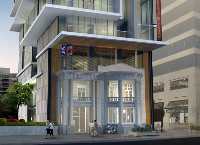
Here is rendering #2 of what the facade would look like up close.

Picture4.png


One more to go.
 
If that's the preservation solution I'd rather see them do something like what they did (or, will do) at One Bedford, where the old facade gets moved to a more sympathetic location rather than being left in situ. Even running the curtainwall down to the street and then rebuilding the facade somewhere inside the building (like, as the back wall of the lobby) would look better than what they've come up with.
 
It does look odd, but still better than what is there now i think. The floor sizes for the old institute look off to the larger floor height of the third floor, maybe make the third floor ( open lobby area?) the same height as the two existing floor heights of the original building and it might not look so out of wack..also the rendering is not very life like and I think it would look better in person in reality. Kinda reminds me of sim city...
 
Personally, I think it's fantastic. What could provide stricter access control to a high end condo than a heritage style cannon parked outside the lobby? Just have to make sure the security guard is trained in 19th century projectile launching.
 
i usually dislike facadism, but perhaps for this project, it is a necessary and beneficial evil. for one, the existing building is in shambles despite its historical value. revitalizing the facade and ridding it of that awful stucco-like paintjob will be an improvement. also, with this development, the museum will benefit from greater exposure and recognizability.

the condo itself is elegant but regular. it seems the face of university is changing dramatically.
 

Back
Top