News   Nov 05, 2024
 28     1 
News   Nov 05, 2024
 908     2 
News   Nov 05, 2024
 501     0 

Toronto Reference Library Renovation (Moriyama + Teshima)

I had a good look at the renderings for all of the renovation, and was impressed. The only problem was that they were not planning to do it all at once, because they didn't have all the money. I don't hate the glass cube; although it does disrupt the original face, I will reserve judgement until it's all finished.

On a recent outing with UT forumers, we passed the police station at Eglinton and Duplex, which looks like a stunted version of the library. I never knew it was designed by Moriyama/Teshima. What are people's thoughts on that one?
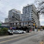
 
If there really is a Hell, and if you get to it by elevator, I hope they're as slow as the elevators in that building.
 
"On a recent outing with UT forumers, we passed the police station at Eglinton and Duplex, which looks like a stunted version of the library. I never knew it was designed by Moriyama/Teshima. What are people's thoughts on that one?"

I never knew that either and yes, it does resemble the library. Unfortunately, in my view, it suffers from the same faults: way too much blank brick wall, a slight fortress/bunker feel and poor at meeting the street.
 
Though on the whole, I'll take the Ref's existing overhang over Eg-Duplex's lack thereof. (Especially in inclement weather.)

I still think this thread reflects that UrbanToronto-itis of (a) applying overzealous 00's judgment to even well-above-average 70s architecture, and (b) applying "Toronto settling for mediocrity" judgment where it least needs to be applied. (Though the latter's less evident in this thread, as compared to those looking with excess envy at Montreal's Grande Bibliotheque...)
 
When built, it was a refreshingly open and spacious improvement on its small and crowded 1909 predecessor - a Carnegie library, now a U of T student centre and bookstore. And it was right at one of Toronto's main crossroads, seen as another improvement. But I agree that vertical movement between floors is hellish.
 
Toronto Reference Library Renovation

Canadian Architect

Link to article

A New Vision for Toronto's Most Popular Library: Open House Toronto Reference Library Renovation & Expansion

Members of the public are invited to drop by to hear about the upcoming renovation and expansion of Toronto Reference Library, Toronto's most popular library on Tuesday, June 5th at 6:30 pm. The open house will take place in the Asquith Room on the second floor of the library, located at 789 Yonge Street.

Toronto Public Library staff and Ajon Moriyama of Moriyama & Teshima Architects will be on hand to talk about renovation plans.

Scheduled to begin in late 2007, the renovation will:

*redesign the Yonge Street building façade to make the library transparent and open to the community
*add a vibrant new glass main entrance cubeM
*add a new Special Collections Centre
*provide expanded space for library programs
*expand the exhibits gallery
*add a new coffee shop and gift store
*completely renovate the upper floors to create new subject centre configurations, introduce alternative use areas, idea gardens, casual group gathering areas, improved quiet study areas and enhanced audio and visual learning areas.

The Toronto Public Library is North America's busiest public library system. Every week more than 329,000 people visit its 99 branches and borrow more than half a million items.

To learn more about the Toronto Public Library, visit their website at www.torontopubliclibrary.ca or call Answerline at 416.393.7131.
 
This is great news. It's comforting to see money being invested in libraries.
 
*redesign the Yonge Street building façade to make the library transparent and open to the community
*add a vibrant new glass main entrance cubeM

Excellent news! Any renderings?
 
I still think the proposed glass cube sucks...there must be some other space inside that they can stick a useless little coffee shop.
 
I agree, I find the cube rather uninspiring and kind of at odds to the rest of the building- Was it not possible to think a little outside the box- in this case cube?

p5
 
To repeat: if it were all about discarding the "dated", we'd have no Carnegie libraries left.

As for Toronto Ref, it just hasn't been the same since they took over the whole main floor w/library function and obliterated the through-building passageway. (Sure, it was an oasis for bums and hobos; but hey, it's a central reference library from the 1970s, it *needs* its bums and hobos...)
 
I'm looking forward to the day when...a grand skyscraper takes its place! Put a library and other public services (a school and library hq offices?) on the bottom 20 floors with either office or resident use above. Everytime I look down Yorkville Ave--I think what a grand bookend a 50 floor Peter Clewes or other highrise tower would do to the area! I'm not a fan of highrises everywhere--but@this site: perfect. The current library--while it could be said I "grew up" in the place (i'm a geek at heart;)) the vast waste of space created by the atrium has always annoyed me and overall, the bunker mentality is depressing and feels like a housing project. The basement is kinda cool though==but not cool enough to keep around forever.

A perfect site/opportunity for a grand private/public partnership, and someone willing to make a mark on this city. Does anyone know someone with $50 million to spare? (Oh yeah, let's call it the Heather Reisman Library--but wait, isn't that what Chapter's is for?;)
 

Back
Top