You are using an out of date browser. It may not display this or other websites correctly.
You should upgrade or use an alternative browser.
You should upgrade or use an alternative browser.
Toronto Queen & Ashbridge | 60.15m | 17s | Context Development | Teeple Architects
- Thread starter Northern Light
- Start date
flonicky
Senior Member
Northern Light
Superstar
Oh dear......... @flonicky 's fine photography reveals what is either disastrously bad value engineering........or utterly abysmal taste or both.
I feel like there should be an emergency stop work order on this project before more money and time is misspent.
This project had and has real potential, but its being actively squandered.
I feel like there should be an emergency stop work order on this project before more money and time is misspent.
This project had and has real potential, but its being actively squandered.
Lenser
Senior Member
Yeah.... that is most unfortunate. I live around the corner from this beast of a development and I was excited about it. Not so much now.
flonicky
Senior Member
At the original public meeting for this project there was an emphasis placed on the quality of the building. There were boards touting the track records of the architects and developers. Both city officials and developers stated at that meeting that they understood that the size of the building was a big ask for that area (made possible by atypical lot size) as well as the leveraging of public land. They emphasized that both the building and the public square would be of high quality as a trade off. The presentation and answers to questions came with a 'trust us, we won't let you down' tone, including from Councillor Fletcher.
The bait & switch of fancy renders and cheapened results happens all the time, but this is a case where public commitments were made.
The bait & switch of fancy renders and cheapened results happens all the time, but this is a case where public commitments were made.
Last edited:
Lenser
Senior Member
What a disgusting come-down from what was presented. I realize I ought to know better when it comes to the slick promise of renders in general, but this is is particularly suck-tastic.
HousingNowTO
Senior Member
Once again, I will need someone to explain their specific aesthetic and design concerns to me like I am in Grade-5...Oh dear......... @flonicky 's fine photography reveals what is either disastrously bad value engineering........or utterly abysmal taste or both.
I feel like there should be an emergency stop work order on this project before more money and time is misspent.
This project had and has real potential, but its being actively squandered.
Essentially, I don't see anything that makes me think of the phrase - "utterly abysmal taste" - in these photos --- but will generally consent that I am mostly a "philistine" on these kind of matters...
flonicky
Senior Member
Aesthetically, there are two areas of concern for me.
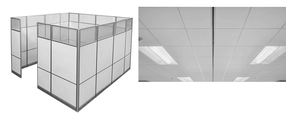
First, the panel style is comparable to suspended office ceilings and cubicle dividers. Generic office design is usually regarded as utterly abysmal taste. Because this is not shown on the renders, it's going to be difficult imagining this spread over 17 stories until we see more.

Which brings me to my second concern: office panels usually have cleaner, better connected lines than this, which reminds me of the finish on an old, fall fair midway ride:

It is difficult to get a good view, but from a distance and at an angle, all those seams and connections look pretty gunky. I'm anticipating that it looks worse up close.
When The Poet started to go bad, I stayed in denial for a long time before I accepted that they weren't going to pull it together. I'm going to trust my instincts a bit more on this one. My instincts are concerned that the brick portions are going to be plywood-backed, vinyl-printed photos of bricks.
First, the panel style is comparable to suspended office ceilings and cubicle dividers. Generic office design is usually regarded as utterly abysmal taste. Because this is not shown on the renders, it's going to be difficult imagining this spread over 17 stories until we see more.
Which brings me to my second concern: office panels usually have cleaner, better connected lines than this, which reminds me of the finish on an old, fall fair midway ride:
It is difficult to get a good view, but from a distance and at an angle, all those seams and connections look pretty gunky. I'm anticipating that it looks worse up close.
When The Poet started to go bad, I stayed in denial for a long time before I accepted that they weren't going to pull it together. I'm going to trust my instincts a bit more on this one. My instincts are concerned that the brick portions are going to be plywood-backed, vinyl-printed photos of bricks.
egotrippin
Senior Member
We used to finish buildings with things like (real) brick, stone; beautiful materials that stand the test of time and age gracefully. Now we use aluminum panels and call it a day. Garden sheds have nicer cladding.Once again, I will need someone to explain their specific aesthetic and design concerns to me like I am in Grade-5...
Essentially, I don't see anything that makes me think of the phrase - "utterly abysmal taste" - in these photos --- but will generally consent that I am mostly a "philistine" on these kind of matters...
Undead
Senior Member
Just to throw in a wrinkle: although we enjoy red brick today, I believe it was a cheap and utilitarian material back in the day. The glass of its day, so to speak, if I remember right.
ash_iwn95
New Member
Just curious are most of the active posters of this thread condo purchasers or just general enthusiasts who live in/frequent this area?
Ive been enjoying the recent updates as a purchases of a unit on the 3rd floor facing the queen street side. The white panelling finish does inded look tacky but are there any concerns about the actual engineering atm?
Ive been enjoying the recent updates as a purchases of a unit on the 3rd floor facing the queen street side. The white panelling finish does inded look tacky but are there any concerns about the actual engineering atm?
egotrippin
Senior Member
A fair assessment, something observable on many of our older stone-faced buildings; the back and sides would often be clad in "lesser" brick. I do believe there was still a variation of brick quality, from utilitarian to more "bespoke" options; much like glass and other cladding options today.Just to throw in a wrinkle: although we enjoy red brick today, I believe it was a cheap and utilitarian material back in the day. The glass of its day, so to speak, if I remember right.
flonicky
Senior Member
There's also a difference between exterior brick and structural brick that wasn't intended to face the elements. Home renovators sometimes get tripped up by knocking out a wall and reusing those bricks to patch exterior walls.
And on the cheap end, don't forget the infamous insulbrick!
And on the cheap end, don't forget the infamous insulbrick!
Lenser
Senior Member
Insulbrick... not even brick at all! But yeah, quite popular as a cheap cladding back in the day. I still see examples of it around Leslieville.
