Toronto Pinnacle One Yonge Commercial | 170.8m | 40s | Pinnacle | Hariri Pontarini

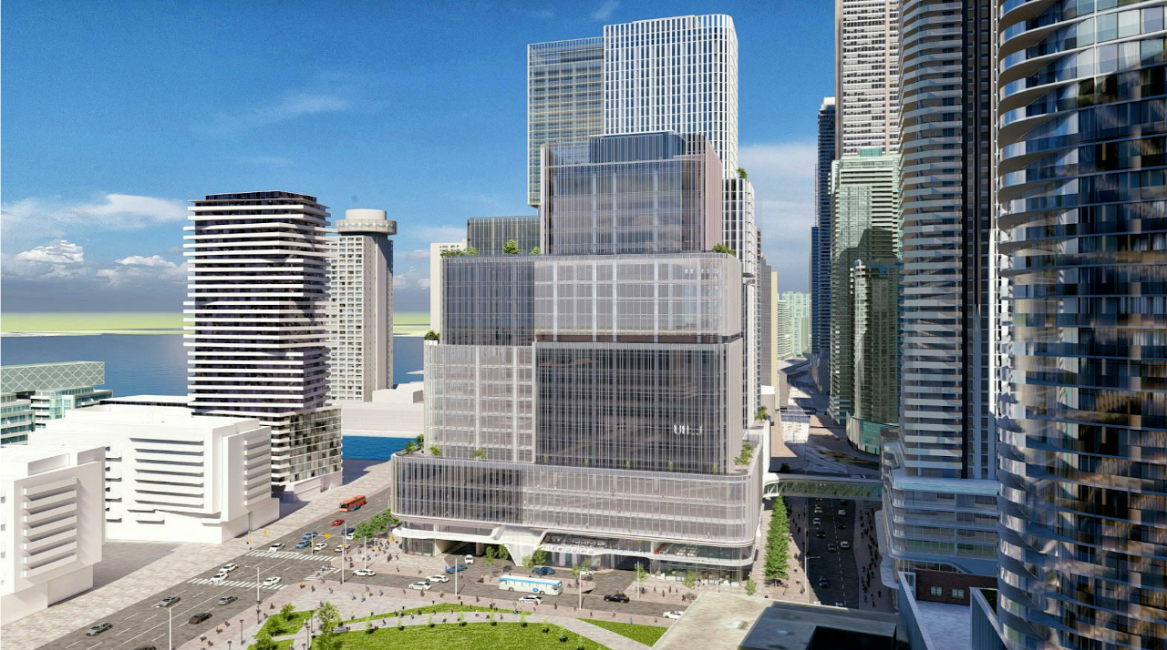
Looks like they're going to cover the Star building with more glass and metal ! This city and developer is not into preserving concrete facades! As you see the changes in the Toronto Star building in the photos up above !

Hopefully they don't destroy the architectural integrity of it in the process. When 70s era office tower design is valued 50 years from now it can be restored. I suspect we'll do to 1970s office architecture what we did to 1920s office architecture. We'll bulldoze or destroy every single example because the current generation view it as ugly.

They should have re-worked the first 2 floors to make it inviting/pedestrian friendly but respected the historical architecture of the tower. The Toronto Star would have looked great juxtaposed against a sea of glass. It's very sad to this unfold. And then people complain that we lack historical layering. We just never seem to learn.

What's next, re-cladding the CN Tower and City Hall in glass? Nothing would shock me at this point.
 
Last edited:
Hopefully they don't destroy the architectural integrity of it in the process. When 70s era office tower design is valued 50 years from now it can be restored. I suspect we'll do to 1970s office architecture what we did to 1920s office architecture. We'll bulldoze or destroy every single example because the current generation view it as ugly.

They should have re-worked the first 2 floors to make it inviting/pedestrian friendly but respected the historical architecture of the tower. The Toronto Star would have looked great juxtaposed against a sea of glass. It's very sad to this unfold. And then people complain that we lack historical layering. We just never seem to learn.

What's next, re-cladding the CN Tower and City Hall in glass? Nothing would shock me at this point.

The generic reclad as a glass tower doesn't impress me (unimaginative and cliched) - maybe keep the punched window bays and use something with colour - like Corten or paint it like CNA Center in Chicago?

AoD
 
wish the images still worked :(
I'll see if we're able to reattach those - we'll try to get them working again on all the older stories!

In the meantime, we have a front page story up on this project here, and the database file—with more images like the one below that have not been published in this thread yet—is now attached at the top of the page!

42494-124147.jpg


42
 
Oh my god, I've lost all hope for the waterfront. We live in a city with so much potential, but we still screw it up 90% of the time.
 
An enormous mediocre project from HPA right next to an enormous mediocre project from aA, supposedly the best two local condo architecture firms. The bar has been set so low in this town...
 
Hopefully they don't destroy the architectural integrity of it in the process. When 70s era office tower design is valued 50 years from now it can be restored. I suspect we'll do to 1970s office architecture what we did to 1920s office architecture. We'll bulldoze or destroy every single example because the current generation view it as ugly.

They should have re-worked the first 2 floors to make it inviting/pedestrian friendly but respected the historical architecture of the tower. The Toronto Star would have looked great juxtaposed against a sea of glass. It's very sad to this unfold. And then people complain that we lack historical layering. We just never seem to learn.

What's next, re-cladding the CN Tower and City Hall in glass? Nothing would shock me at this point.
The Toronto Star building and the Seneca One Tower in Buffalo have very similar architectural designs, as both are of the International Style:

Buffalo%2C_from_Fort_Erie%2C_2016_10_06_-af_%2830133266856%29_cropped.jpg
 
What a mess. So many different materials, shapes and angles, a lot of flair that goes nowhere. There are some nice pieces to pick out but they're lost in the confusion. Also I would expect something much nicer for the foot of our most prominent throughfare, which has always been neglected.
 
I wonder how they’re planning to reinforce the existing Star building to support the additional dozen floors or so that will be partially tacked on to it.
 
While i do appreciate them trying to break up the massing with different treatments, there are a million shapes, ideas and forms competing in the design. The differences are not even that distinct as to contrast or pop and the end result just looks incoherent to me.
 
In the last 200 years shoreline moved from Front str to its current location.
I wonder how far inland will One Yonge be in another 100 years.
 
^ Little doubt the harbour will be decked, and planted with grass (soccer fields and a ferris wheel)... everyone will walk (or skate) to the Island(s).

Sugar will be banned in 90 years so no Redpath issues.
 

Back
Top