Yegger
Active Member
If the balcony height / railing lines up with the mullion level, things might turn out less messy. Let's wait and see
That's why "not looking good" is likely one of the better disagreeable takes to have, as it does not condemn the building outright before it's built...just makes the point of not liking the current direction it's going. Saving the final judgement of the thing upon its completion.Ya with only one row of just one of the materials is a tad premature to judge this thing already. Wait till they add a lot more to say weather or not it’s gunna be crappy or good. It is what it is right now, and that’s “nowhere near completion”. Let’s calm down on the hatred of something barely above ground. Give it a chance and more time.
Style wise no. But there are two notable differences:
1) There appears to be no mullions in the rendering.
2) The cladding is much shinier with no Toronto grey accents.
...both of these suggest the cladding advertised is of much higher quality than the ones they're are currently putting up.
If you can live with that, fine I guess. But to others including myself, it feels cheapened and needlessly busy.
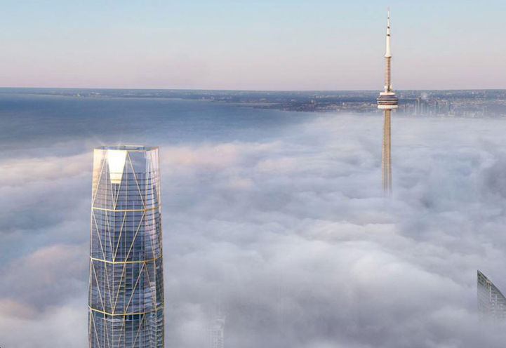
Very very rarely does the glass ever match the rendering, the glass always looks better on the renderings IMO.Yes the glass isn't what was suggested in the rendering. When it comprises ~90% of the exterior it's effectively a very different looking building than what. was advertised. This looks terrible and doesn't bode well for the rest of the building. Quite worrying.
Very very rarely does the glass ever match the rendering, the glass always looks better on the renderings IMO.
It needs to be, at the very least, a fair proximity to what they intend to build otherwise it's tantamount to a misrepresentation or lie. What's the point of producing a rendering if you have no intention on delivering.... unless the point all along was to deceive..
I get that. And to a degree devs are in their legal right to do that to my understanding. I still do not hold that as an excuse though. If they render something that does not look like the final product in a bad way, I think it's still reasonable to be critical of that.You are familiar with renderings offered by Toronto residential developers in general right? Do not trust renderings - put more trust in the plans submitted to the city - and even then ("terracotta" at Y+C, tsk tsk)..
Even Vancouver, which is more strict about materials and urban design had this story to tell: https://pricetags.ca/2013/02/19/wall-centre-controversy-it-wasnt-about-the-glass/
And how it ended: https://www.theglobeandmail.com/new...ers-previous-council-decision/article7616538/
AoD
I get that. And to a degree devs are in their legal right to do that to my understanding. I still do not hold that as an excuse though. If they render something that does not look like the final product in a bad way, I think it's still reasonable to be critical of that.
...although to be fair, I might not say anything but prasies if they took a rendered crap and made it a work of art in the end.
To be clear, while I can't speak for others...I'm not trusting the renderings either. Again, it comes down what is being presented versus what we actually get from a critical point of view, regardless if this common practice and/or whose doing it.Don't get me wrong, I'd be the first to laugh at renderings that are *clearly* inaccurate to the point of being ludicrous (perspective tricks are my particular beef) - but glazing is just something that requires more than a pretty picture to communicate - and one should not trust them, period. Also pay attention on who the developer and architect is - in this instance, no one should be surprised it ended up looking like PJ.
AoD
