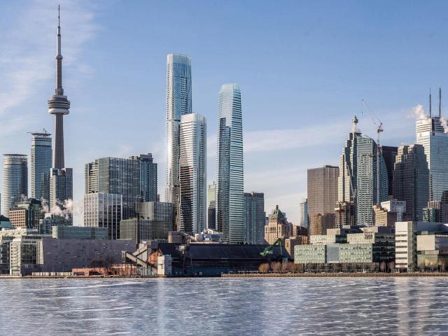
Toronto Pinnacle One Yonge | 345.5m | 105s | Pinnacle | Hariri Pontarini

So the first phase design is approved and won't change, am I correct? How likely is it that the proposed design will change again?
 
That's pretty much covered in the front page story, but the answers are "not sure" and "it'll continue to evolve somewhat, more at ground level".

42
 
I hope this development isn't going to be overwhelmed by the generic walls of glass at street level, that we are seeing in almost all new developments! This city is being bombarded with bland, glass-walled retail spaces that add very little to distinguish the location they're in. You walk by them without even noticing what the retail is inside because there is nothing there to attract your attention. Maybe that's why all there new retail units turn into banks and nail salons, where design, art or even charm, is of no importance!
 
Last edited:
Definitely a lot better than the last iteration - would love to see it happen. The DRP is on point regarding the public realm, and the square as proposed still doesn’t give the feel that it adds to the project. I can’t help but think that a canopied space along the lines of Fosters Marseille Vieux Port scaled to the podium height would be much more delightful.

If only Toronto buyers aren’t so obsessed about balconies, the tallest tower would be even tighter.

AoD
 
Last edited:
I am happy to see that for a friday.
I upload some pictures form the last article.
Someone can upload the other images. I love the tallest tower ,but i dislike the phase 3.
The balconies are too big.

29216-100950.jpeg


29216-100951.jpeg


29216-100959.jpeg


29216-100957.jpeg
 
While I agree that it's an improvement over what we've seen to date, I can't shake the notion that in the render below we've got, from left to right, a slimmer Shangri-la, a better-clad Lightbox-Clear Spirit-Ritz Carlton hybrid, and a taller and slimmer Bay Park Centre.

6918-100972.jpeg


I suppose that's at least a tad disingenuous, given that those similarities are, I think, somehow accentuated in that one rendering, but I guess I was just hoping for more of something different.
 
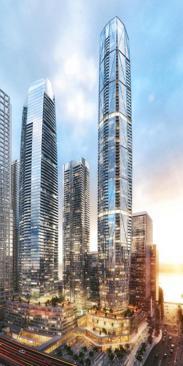
Far more sleek (previous designs were clunky), IMO- I like the diagrid on the tallest tower.

That being said, a bit of colour wouldn't hurt.
 
The tallest tower looks rather gorgeous, and I can appreciate the general direction here, but a little diversity in material would so massively exceed the sum of its parts.

Picture the smallest tower as a Selby or Picasso, playing colourfully off the beautiful curtainwall diagrid of its neighbour. Instead, more same-same glass to wash out the whole effect. Blah.
 
The highest tower almost look like the first rendering ! I like the last rendering better too much glass in this one.
 
Tallest tower gives off an ICC Tower - Hong Kong vibe
 
Unfortunately, I don't see any detail of the street level. I hope that they will make the podiums interesting with varied textures and materials, and plenty of smaller footprint commercial units.

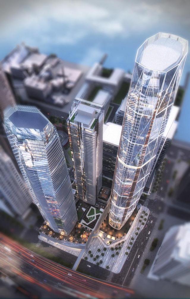
The big open plaza on the NW of the site is at risk becoming windswept and dominated by the traffic noise. They can sink this space a few steps into the ground to reduce some of the noise, or create some noise walls along Lake Shore. Or, they could have created a open plaza that is more sheltered by extending a wing of the podium west along Lake Shore. I feel that anywhere near Lake Shore will be a no go zone for hanging out in a public space. A narrow commercial building along Lake Shore could have created a much more welcoming U-shaped alcove public space just to the south

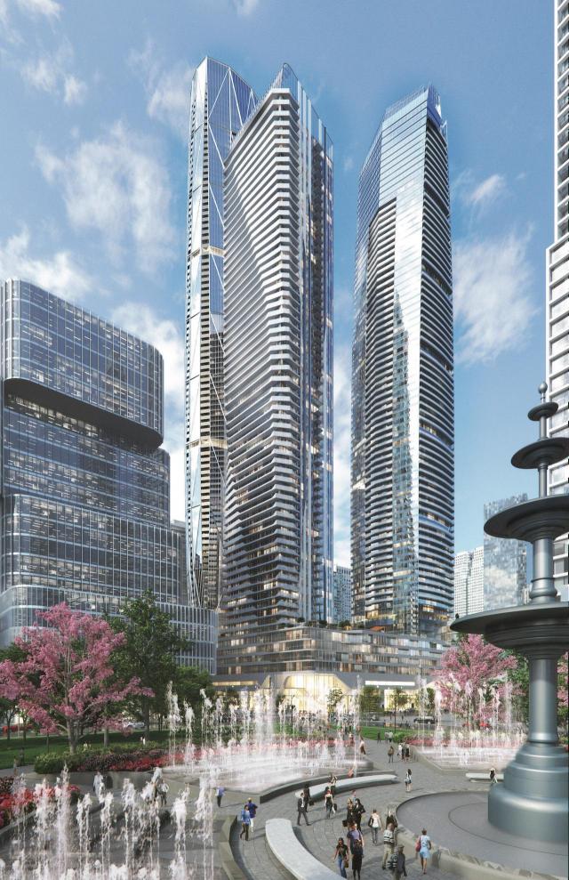
The fountain in the park looks ridiculously big in the render image.

image from: http://urbantoronto.ca/news/2017/10/design-review-panel-sees-updated-pinnacle-one-yonge-plans
29216-100955.jpg
 

Attachments

  • 29216-100955.jpg
    29216-100955.jpg
    101.1 KB · Views: 559
Last edited:
Unfortunately, I don't see any detail of the street level. I hope that they will make the podiums interesting with varied textures and materials, and plenty of smaller footprint commercial units.

The big open plaza on the NW of the site is at risk becoming windswept and dominated by the traffic noise. They can sink this space a few steps into the ground to reduce some of the noise, or create some noise walls along Lake Shore. Or, they could have created a open plaza that is more sheltered by extending a wing of the podium west along Lake Shore. I feel that anywhere near Lake Shore will be a no go zone for hanging out in a public space. A narrow commercial building along Lake Shore could have created a much more welcoming U-shaped alcove public space just to the south

The fountain in the park looks ridiculously big in the render image.

image from: http://urbantoronto.ca/news/2017/10/design-review-panel-sees-updated-pinnacle-one-yonge-plans
View attachment 124125
Lake Shore will be pretty quiet on this stretch as most east-west local traffic will be down on the extension of Harbour. There will be some noise from Yonge, and a bit from the Gardiner above, and some from the rail corridor to the north. This is downtown after all…

42

PS: As the front page story says, the park has not been designed yet, and the fountain is just a placeholder.
 

Back
Top