Toronto Peter Gilgan Centre for Research and Learning | ?m | 21s | Sick Kids | Diamond Schmitt

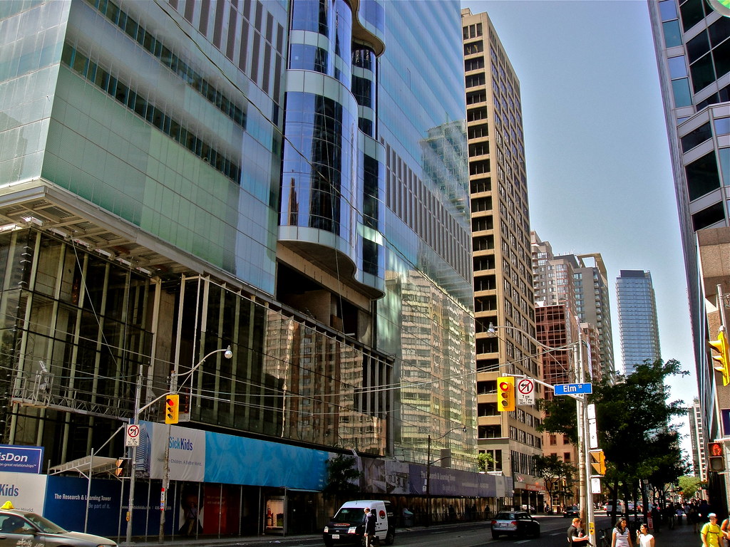
The only thing I see wrong with that picture is that there are a bunch of ugly cars on what should really be a pedestrian only street.
 
7445034738_b26f80fa4f_b.jpg
 
Photos from yesterday

I completely dig how this looks when looking straight up, with the street canyon effect. This building feels big city, it's HUGE,
7473437622_af14ae27ce_b.jpg


7473432164_146b5080bc_b.jpg


7473429382_75e145a955_b.jpg


... I only wish it were taller lol:

7473416412_55fddeed0a_c.jpg
 
Short looking-up vid by me:
[video=youtube;0tM1x_GuzdA]http://www.youtube.com/watch?v=0tM1x_GuzdA&feature=youtu.be[/video]

Found this vid on Youtube going up the tower's construction elevator:

[video=youtube;8QeeRpwmK-s]http://www.youtube.com/watch?v=8QeeRpwmK-s&feature=related[/video]

http://www.youtube.com/watch?v=8QeeRpwmK-s&feature=related
 
If ur camera is lightweight, get the SLIK les stroud tripod. 50 bucks and it collapses to about 1 foot, weighs nothing. I have one but rarely use it, only 1 of my lenses is light enough combined with the camera to be supported..if you have a heavier camera you obviously need a heavier tripod but thats where it gets pricey
 
On the walk to work
 
Can someone help explain the appearance of those vertical stripes/discoloured glass panels? Are they supposed to be discoloured? Is it because the glass in these sections are infront of concrete so they appear darker? Is it because they were installed later and therefore haven't blended in yet? Whatever the reason, it seems odd and takes away from what is otherwise a beautiful skin.
 
I'm also not a fan of the streaks of lighter glass. Rather than being a design element, it simply looks like the glass has been replaced and mismatched.
 

Back
Top