Toronto Ontario Line: Osgoode Station | ?m | 1s | Metrolinx | HDR

Coming soon! Fine Canadian wood furniture for the Osgoode Hall offices.

parnian_expensive_desk_4.jpg
From link.
Nah, they should send that to Doug, so he has an official desk to sign his Mow-'em-down Zoning Orders...
 

That really does look awful.

If it were being done in service of the best overall design for riders or for the broader public realm, I think I could be brought around to supporting it; but for a whole bunch of 'B' choices, I really find this very, very unfortunate.
 
I know there are different things going on on this particular site, but I think in general, subway stations shouldn't be temples of 'capital A', architecture. They should largely just be ctrl-c, ctrl-v conveniences. This doesn't mean that they can't express some joy, but I'm fine with 'less is more' when it comes to transit infrastructure.
 
And a special place in Hell should be made for those who went with option 'A'... /bleh
 
Last edited:
  • Like
Reactions: T3G
I highly disagree about the necessity of ctrl+v architecture for subways. I think that architecture can play a huge role in one's perception of the transit system. Even in our city, using stations like Dupont and St. Clair West is (or, rather, was, the stations are kinda dreary now) was a much more pleasant experience than the bathroom style stations on line 2. And having pleasant station buildings, when done right, can add to the street scape positively, like the Battery Park Control House at Bowling Green in NYC. If we had something like this, built in the architectural style of the Osgoode Hall buildings, it would make easier to stomach the intrusion onto the green space.

52710412004_d483dbcd26_b.jpg


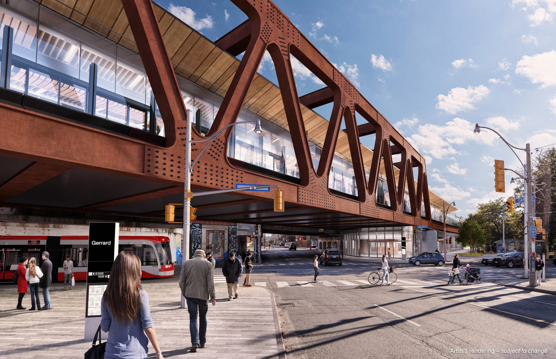
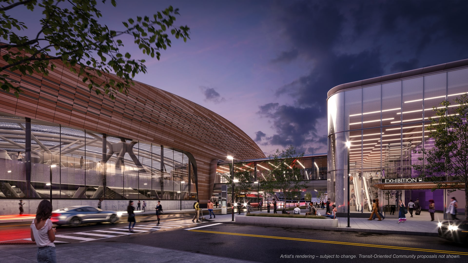
Of course, "doing it right" is not within Metrolinx's knowledge base. Few of the station building renderings for the OL seem visually pleasing, and there's no telling how badly they will be cut back before all is said and done, given how much cost cutting and value engineering has gone into the OL project already. Like, the design concept for the Gerrard station (ditto Exhibition) is really impressive, but I have very little faith that such a thing will ever see the light of day. Does anyone remember the renderings for the Crosstown stations compared to the nothing we got?

10_gerrard_view_01_street_0.jpg

01_exhibition_headhouse_street_2022_0204_print.jpg


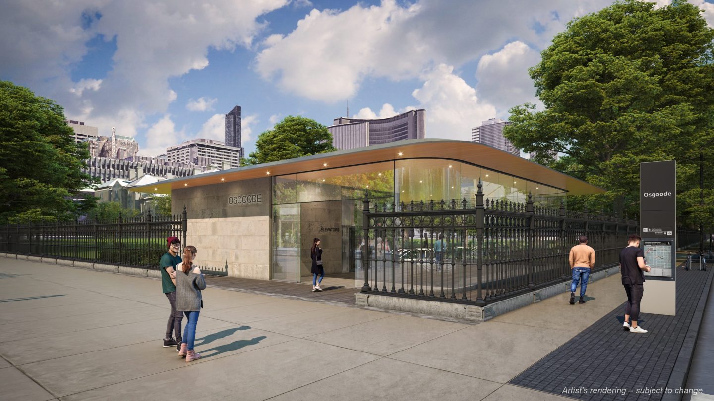
Concerning Osgoode station, it is definitely not an impressive structure in any way.

47568-142586.jpg


The "winterized" version is even worse. I'm not sure which one they ended up selecting, in the end. Either selection is hardly a win for fans of attractive public spaces or attractive architecture.

1677526539136.png
 
I think in general, subway stations shouldn't be temples of 'capital A', architecture.

If by that you mean the grandest of design statements; sure; however, I think the original 'Spadina Line' remains Toronto's gold standard for stations that show some originality, some area context-design and show a conscious effort at place making. That to me is a good jumping off point in terms of new construction.

They should largely just be ctrl-c, ctrl-v conveniences.

To me, this would define the original Line 2; which I consider a design failure with its utilitarian and public washroom aesthetic.
If you want people to treat transit like it's valuable, the architecture of its stations should not read as though it's a throwaway service; but instead as though it's something that really matters.

This doesn't mean that they can't express some joy, but I'm fine with 'less is more' when it comes to transit infrastructure.

I think I've covered this above; but would then add, in this case, the station also features an incredibly inconvenient transfer between Line 1 and the OL; a new entrance (Simcoe) with no direct connection to Line 1, and, in my judgement (though the designers may beg to differ, inadequate provision for future capacity needs for the Line 1 station, which also doesn't get its fire code compliance of a second (fully independent from the platform) exit, which would be much more cost effective to deliver in conjunction with this project.

That's all totally apart from any damage to Osgoode Hall's grounds; and the failure to use this project as leverage to achieve University Park or pedestrianization of Queen West, or both here.

To me 'Less is more' isn't really a a great design philosophy, unless we're just meaning "Hello Kirkor, five different design styles on one tower is at least three too many'.

We not only want to invest in aesthetics and future-proofing and good design from a functional perspective, we want to ask, why can't a station with washrooms also feature a drinking fountain and water bottle filling station, providing everyone access to a free, good-for-you, zero calorie beverage? Why can't we ask about bike storage, or better retail being included, or including vending machines?

I want my public expenditure to aspire and achieve; not settle.
 
Last edited:
I didn't think twice about transit station design in the past. But when I used the Montreal Metro, I realized that good design makes transit a lot more enjoyable to use and enhances the city. I've actually gone to specific Metro stations in Montreal just for the architecture and art.

There are practical aspects to it, too. The open pedestrian bridges over the platforms in Montreal are interesting from an aesthetic standpoint and result in broader sightlines, which makes wayfinding easier.

Great transit station design is, in some ways, similar to driving a nice car, except that everyone who pays a transit fare can enjoy the experience. People love to splurge on cars in Toronto. Unlike cars, transit station architecture lasts for many generations. It's another vital part of the public realm.

It doesn't have to be expensive, but it shouldn't be utilitarian. A station shouldn't feel like a parking garage or a public washroom. Each station should have design character.
It's not actually about copy and pasting architecture, it's about copy and pasting good architecture vs. bad architecture
 
That really does look awful.

If it were being done in service of the best overall design for riders or for the broader public realm, I think I could be brought around to supporting it; but for a whole bunch of 'B' choices, I really find this very, very unfortunate.
...and contemptible - no other words really.
 

Back
Top