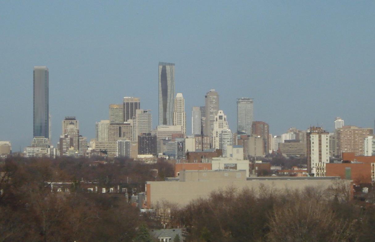
Toronto One Bloor East | 257.24m | 76s | Great Gulf | Hariri Pontarini

I'm indifferent about the retail podium. It reminds me of the Yonge St. side of Atrium on Bay. I liked the previous versions of the podium more.
 
Wow, it looks great! I'm liking the organic curves of the building and the podium looks fantastic. There's a few parts of the building that are a bit difficult to make out in the renderings but overall I'm very impressed.
 
I love what I'm seeing right now. The building looks great and I'm kinda liking the podium. I still can't quite make out the roof element, which was supposed to be "gently sloping" but otherwise it's looking good!
 
Maybe they'll pull a Cresford Maneuver. Remember Bloor Street Neighbourhood, approved for 24 stories or so and courtesy of the Committee of Adjustment, magically grows another 10 stories during construction. Hmmm..
 
I hope they do increase the height....magically or otherwise ;)
I don't understand why they stopped the height at 65 floors when they can sell 80-90 floors within a couple of months. Bazis were able to do it why not GG!!
 
2lpfnd.jpg

http://tweetphoto.com/15621991

The design makes more sense to me seeing it in its entirety like this and I do like the roofline. But I agree with Traynor. It does look a little Biscayne Bay-ish to me.* That said, in this image, I kinda like it.

*Although in Biscayne Bay the podium would be for parking.
 
Last edited:
Okay, the sloped roof is a win... makes this thing go from looking awkward to lookin' sharp.
 
Here's a quick render of One Bloor and some other towers completed...

Enjoy!

4461963874_05ddc2d0d8_o.jpg

(Original courtesy urbandreamer )
 
The calm before the storm.

It's ironic that Great Gulf is using the same space in the Xerox building that Bazis used. Hopefully things work out better this time.

Click on the thumbnail to enlarge, then click again on the image for full size.

 
I like it, but I don't.
The part I like the most is the podium, but it doesn't quite feel urban enough for Yonge & Bloor, like the Bazi's proposals did.
What I don't like is the tower itself. It could be something more. More daring, more attention grabbing, but it's not bold at all.

4/10

The roof also looks poorly done, and amateur.
I'd like to see some higher res renders also.

Maybe this one will grow on me. It's not a horrible building, and is nicer than Aqua if you ask me, but it belongs somewhere else. Closer to the lake perhaps.
 
I like it, but I don't.
The part I like the most is the podium, but it doesn't quite feel urban enough for Yonge & Bloor, like the Bazi's proposals did.
What I don't like is the tower itself. It could be something more. More daring, more attention grabbing, but it's not bold at all.

4/10

The roof also looks poorly done, and amateur.

I got as far as this line before my head up and exploded.
 

Back
Top