Toronto One Bloor East | 257.24m | 76s | Great Gulf | Hariri Pontarini

Yeah, that current Y&B Bay store is straight up dreadful. Definitely a second-third rate job they've done in current operations. Pretty much off my radar completely in multiple aspects for shopping.
 
Im curious to see what the Nordstrom Rack space looks like here.
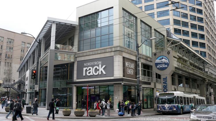
Don't expect much - most Nordstrom Racks remind me of Winners/Marshalls/TJMaxx, etc. Here's their stores in downtown Seattle and DC which is what I'm expecting the space to look like :/ But maybe we'll be pleasantly surprised since the Canadian Nordstrom stores are much nicer and more modern than in the US.

Seattle - Westlake Center
cre-nordstrom-rack-westlake-01*750xx5472-3078-0-285.jpg

(Source: https://www.bizjournals.com/seattle/blog/2014/05/nordstrom-rack-is-now-just-a-click-away.html)

Seattle - Westlake Center
o.jpg

(Source: https://www.yelp.ca/biz_photos/nordstrom-rack-seattle-3?start=30)

Washington DC - Penn Quarter
nordstrom-rack-washington-dc-penn-quarter-downtown-retail-clothing-discount-inside-view-e1477584089168.jpg


nordstrom-rack-washington-dc-penn-quarter-downtown-retail-clothing-discount-second-floor-e1477584071532.jpg

(Source: http://pqliving.com/nordstrom-rack-opens-in-penn-quarter-12th-and-e-st-nw/)
 
Don't expect much - most Nordstrom Racks remind me of Winners/Marshalls/TJMaxx, etc. Here's their stores in downtown Seattle and DC which is what I'm expecting the space to look like :/ But maybe we'll be pleasantly surprised since the Canadian Nordstrom stores are much nicer and more modern than in the US.
I'm aware of what the Nordstrom Rack stores look like and what who the store is primarily targeted to. What I was saying is that i'm curious to see the space inside One Bloor East.

The only thing we know for sure is that it's going to look better than that HBC bunker across the street.
 

This photo is a pretty good encapsulation of why I can't get behind the "all of the intrigue in this design lies in the balconies; it's just a rectangular glass tower like all the rest at its core" crowd.

Yes, it's just balconies; those balconies are an integral part of the design and it works to great effect.
I hear you. I'm ultimately a fan of the building and enjoy looking at it from all over the city, but I do think the design at its core is somewhat simplistic.
 
The tower is my favorite part (and the balconies really bring it together far better than most other condos in this city), but I have the nagging feeling that the base wasn't as ambitious or well-executed as it could have been. For instance, I wish they had found a way to make the black gaskets on the white glass strip on the 7th floor less apparent.
 
I know little about architectural design other than as a mild enthusiast, so may not get theory or terminology right, but here are my thoughts…

I suppose using balconies as a way to add visual interest to what would otherwise be a tall box may be considered a “simplistic” approach— as opposed to a more “complex” approach where the visual interest is built into the structure, e.g. L Tower— but One Bloor East does it superbly.

Compare the towers of One Bloor East and Five St. Joseph. With One Bloor East the balconies are so well integrated that there is an illusion that the structure has that shape built into it. With Five Condos, the balconies look like an afterthought, cheaply tacked-on to add shape to the tall box.

(At street level, however, I think Five St. Joseph does better. It fits its environment and enhances Yonge St., St. Joseph and the laneway between St. Joseph and Wellesley. One Bloor East’s podium is hulking, and may to impose a little too much sameness for an entire block.)

IMG_0127.JPG

IMG_0126.JPG
 

Attachments

  • IMG_0127.JPG
    IMG_0127.JPG
    142.1 KB · Views: 602
  • IMG_0126.JPG
    IMG_0126.JPG
    125.7 KB · Views: 549
I'd disagree that Five St. Joseph's balconies look like an afterthought at all—HPA have a very specific look in mind there, and it may just not be as much to your liking. Certainly any building in the city is hard-pressed to match the grand design of the One Bloor balconies, but there are many buildings which are far worse-off in terms of balcony detailing than Five St. Joe.

(Both buildings suffer from still not having all of the balcony glass they are supposed to, but that's a supply issue, not a design one, and yet I believe the unfinished state affects the way people see the buildings.)

42
 
I don't think they look like an after thought but the look they are going for feels pretty outdated to me, like mid 2000s at best.

With One East I'm bothered by the clunky podium and the balconies not going up till the top floor (transition is a little awkward), which would have been OK in any other project but not for this ambitious tower.
 
How can you even compare the two buildings at street level. One Bloor isn't even finished yet. Also, Five had the benefit of the existing brick buildings.
 
I'd disagree that Five St. Joseph's balconies look like an afterthought at all—HPA have a very specific look in mind there, and it may just not be as much to your liking. Certainly any building in the city is hard-pressed to match the grand design of the One Bloor balconies, but there are many buildings which are far worse-off in terms of balcony detailing than Five St. Joe.

(Both buildings suffer from still not having all of the balcony glass they are supposed to, but that's a supply issue, not a design one, and yet I believe the unfinished state affects the way people see the buildings.)

42

Your post is a good reminder that "intent" is important in understanding a creation, be it a building, a piece of music, an artwork, etc.

I looked into some background on HPA's aesthetic, and some early UT threads and articles on Five.

I do like "modernist lines" and "undulating forms" just not how things turned out with this project. It can look good from some angles, especially close-up, but viewed from a distance the vertical lines of the balconies and the remaining general boxiness of the tower just don't seem to work well...at least to me.

But beauty is in the eye of the beholder and I agree there are worse examples. I encounter the building almost daily...maybe one day I will see it differently.

Likely Five won the 2011 BILD award for the combination of historical restoration and modern tower. If it was just the tower it may not have won. Interestingly, another BILD finalist that Five beat out was: One Bloor East!
 
I'm not trying to convert you in terms of how much you might like Five, my post was strictly to have you reconsider the intent!

42
 

Back
Top