You are using an out of date browser. It may not display this or other websites correctly.
You should upgrade or use an alternative browser.
You should upgrade or use an alternative browser.
Toronto OCAD U: Rosalie Sharp Pavilion | ?m | 3s | OCADU | Bortolotto
- Thread starter interchange42
- Start date
DtTO
Active Member
Frankly, that looks terrible and incomplete. What a shame.
raptor
Senior Member
Frankly, it looks lovely. If you haven't noticed, construction is still ongoing so it is incomplete.Frankly, that looks terrible and incomplete. What a shame.
Northern Light
Superstar
Frankly, that looks terrible and incomplete. What a shame.
I concur, there's clearly a good idea here; but it just doesn't come off right.
It feels like a forced graft onto the existing building.
I like the cladding, but not the jarring juxtaposition, w/the banal underneath.
Frankly, it looks lovely. If you haven't noticed, construction is still ongoing so it is incomplete.
Hopefully you're correct, in which case I will revise my judgement if the finished product so merits.
jje1000
Senior Member
It was mentioned in the previous pages, but I think if the panels were darker, it would allow the cladding to pop out visually.
I think the least they could do is to paint the columns in the front black.
I think the least they could do is to paint the columns in the front black.
someMidTowner
¯\_(ツ)_/¯
Today:


Contra
Senior Member
While it's not much like the renders at all, it's definitely a superb update. Would love to see the interior...I remember many a morning being crammed downstairs buying shop tickets from the cashier along with a few dozen other students.
Yegger
Active Member
i honestly think they should've torn it down and started from scratch. This refresh is the equivalent of spraying cologne after a workout and calling it a shower.
They do have budgets to contend with, and while the work was obviously watered down from the concept plan, its spirit is still there. This is a huge improvement over what was there. Looking forward to learning about some of the symbology on the scrim.i honestly think they should've torn it down and started from scratch. This refresh is the equivalent of spraying cologne after a workout and calling it a shower.
42
jozl
Active Member
Seems silly to me.
Northern Light
Superstar
They do have budgets to contend with, and while the work was obviously watered down from the concept plan, its spirit is still there. This is a huge improvement over what was there. Looking forward to learning about some of the symbology on the scrim.
42
It is an improvement; no question.
But was it good value for money, in light of the scale of improvement vs the potential improvement with a bit more investment (be it by tear down or more extensive reno).
I like the metal fascia; but I don't feel it relates well at all the ground floor/untreated portion of the building. The negative juxtaposition really takes away from the positive aspect of the transformation.
I don't know how much further you could go w/the existing building, given the site constraints.
But my instinct would have been to extend the metallic scrim treatment along the columns at ground level; then find a way to get the glass of the set-back on the ground floor to mirror the feel/flow of scrim in some way.
Not sure doing that would create an ideal design (probably not) but it might make the juxtaposition a bit less jarring.
jje1000
Senior Member
I like the metal fascia; but I don't feel it relates well at all the ground floor/untreated portion of the building. The negative juxtaposition really takes away from the positive aspect of the transformation.
I don't know how much further you could go w/the existing building, given the site constraints.
But my instinct would have been to extend the metallic scrim treatment along the columns at ground level; then find a way to get the glass of the set-back on the ground floor to mirror the feel/flow of scrim in some way.
Not sure doing that would create an ideal design (probably not) but it might make the juxtaposition a bit less jarring.
Agree with that point- the issue is that the metal screen calls for a clean backdrop as the sole element of attention, but the current treatment of the building still makes the existing building pop up too much.
Maybe a more cost-efficient manner could have been emphasis of the horizontal elements of the existing structure to prevent elements like the columns and windows from disrupting the flow of the screen- which could mean darkening the structure beneath the datum line of the overhang.
MetroMan
Senior Member
To me, it comes across as a gimmick and I feel harms Frank Gehry's AGO work by being a cheap ripoff right next to it. There are plenty of nice buildings with ugly buildings next to them but this one drags the AGO into the conversation by trying to continue its lines and then not delivering on the expectations that its setting for itself.
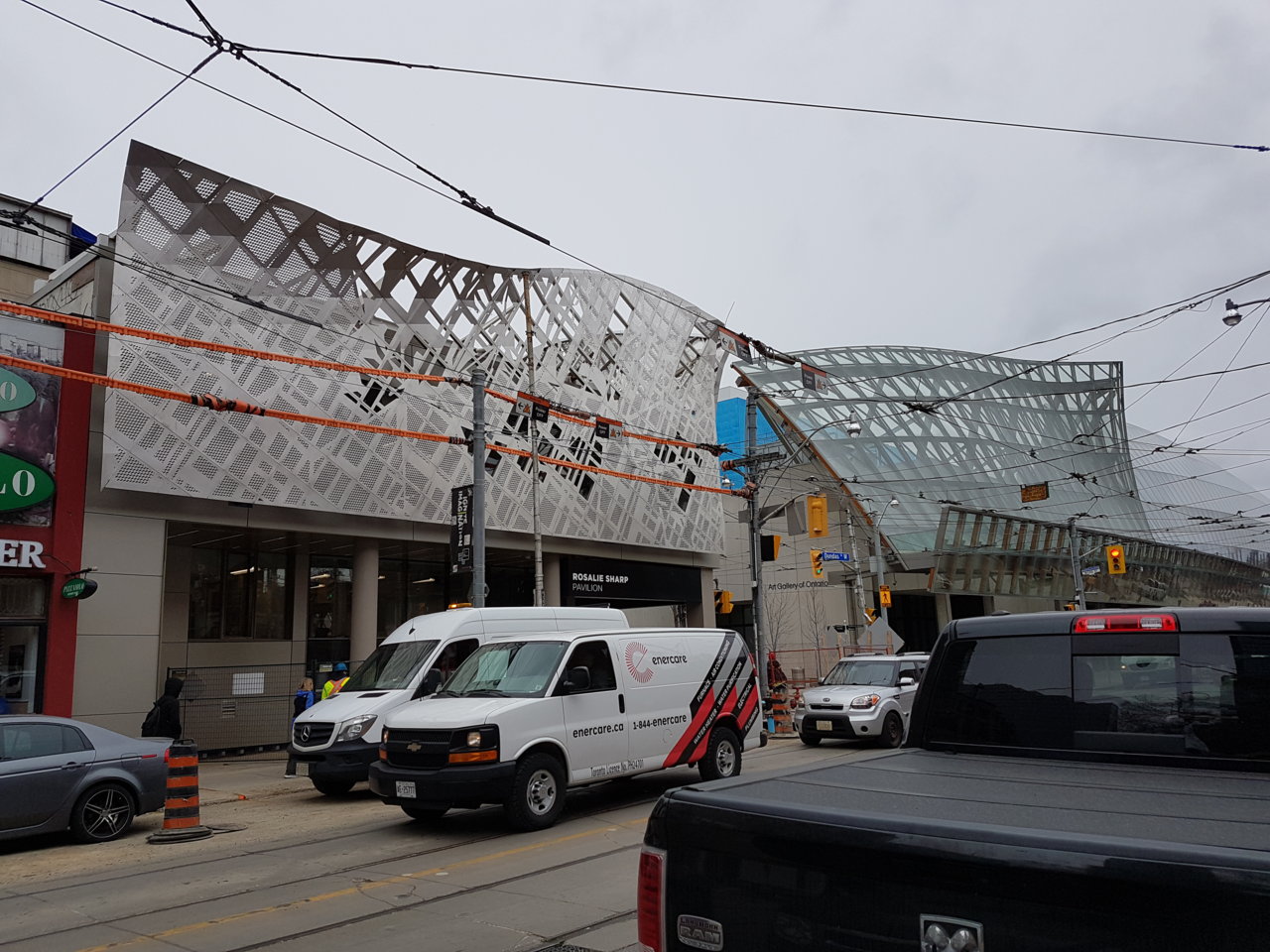
Photo: @AlbertC
Photo: @AlbertC
Last edited: