Toronto Nobu Residences Toronto | 156.66m | 45s | Madison Group | Teeple Architects

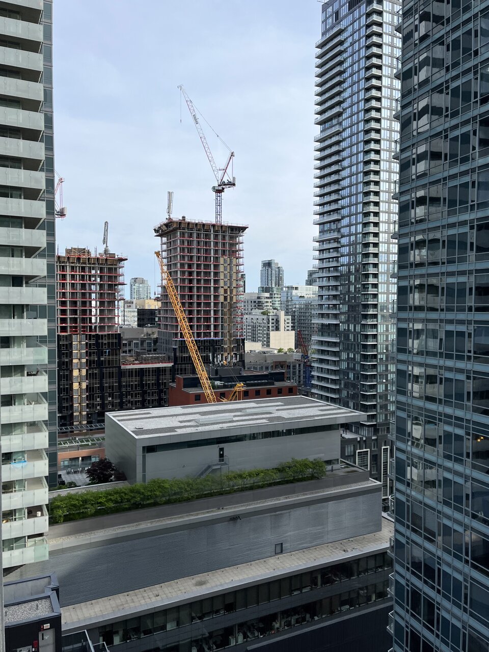
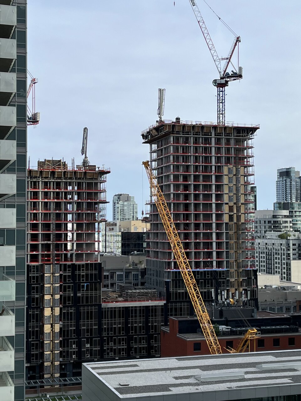
May 23rd

IMG_1142.jpg
IMG_1143.jpg
 
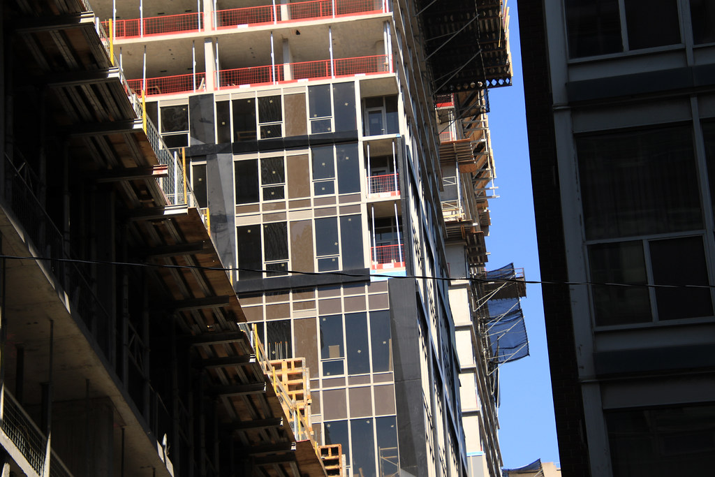
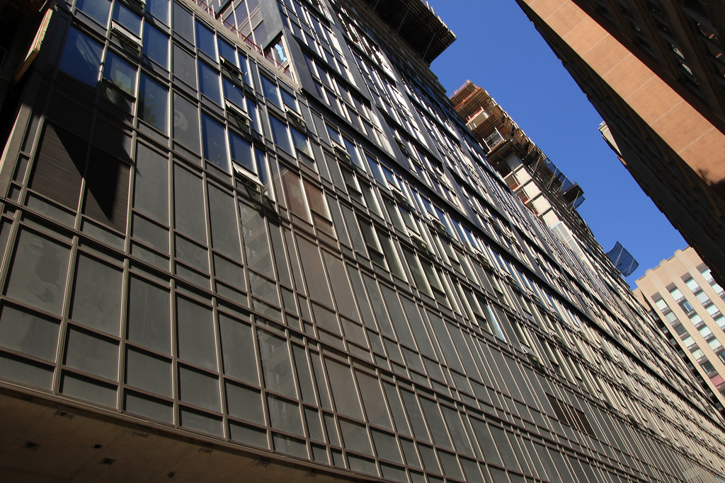
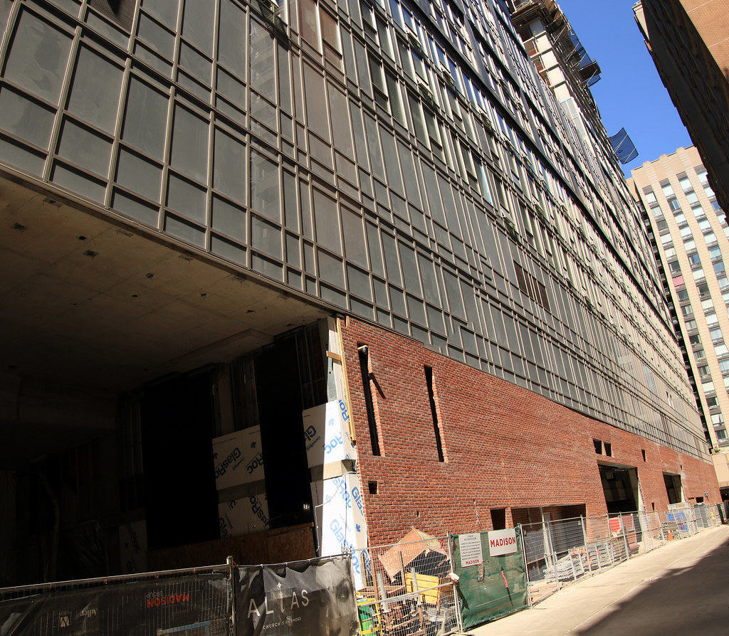
Absolute dog of a building the only redeeming angle is if you’re facing away from it.

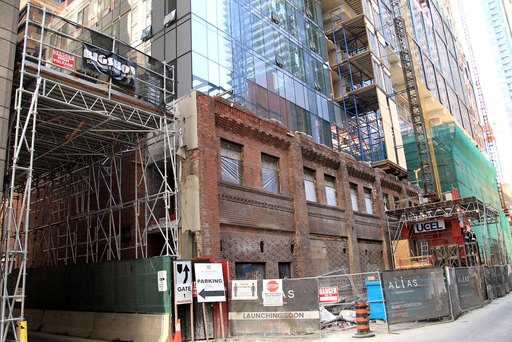
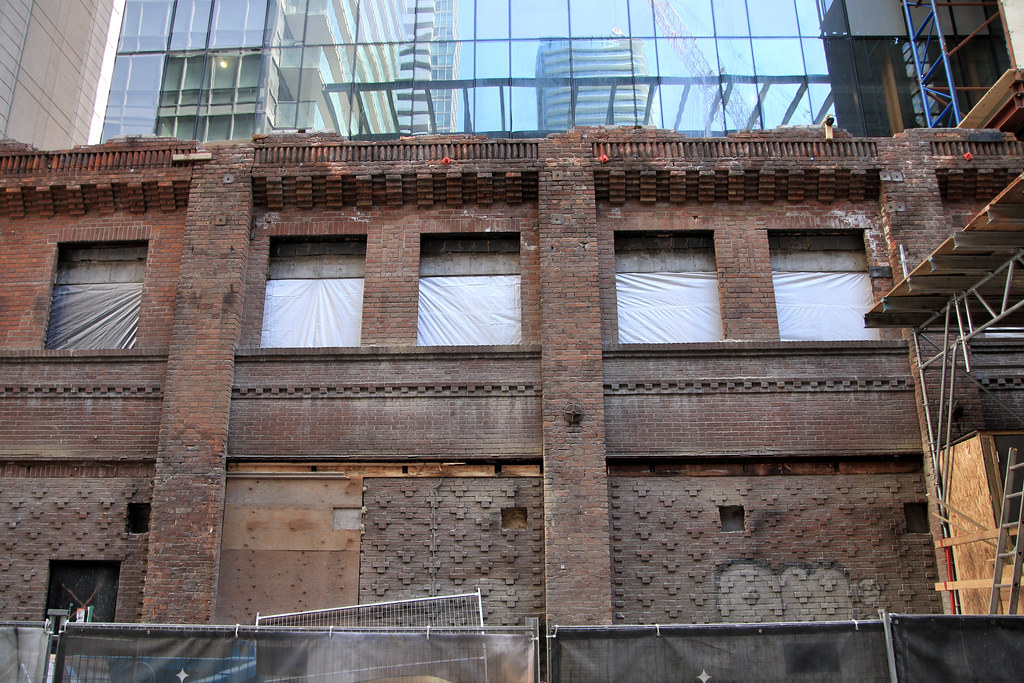
Nobu should be embarrassed their name will be on this hot mess. Not to mention an absolute waste of the heritage building on Mercer.

What would Nobu co-owner Robert de Niro say when he sees the finished product? Perhaps "someday a real rain will come and wash all this scum off the streets" (from "Taxi Driver").
 
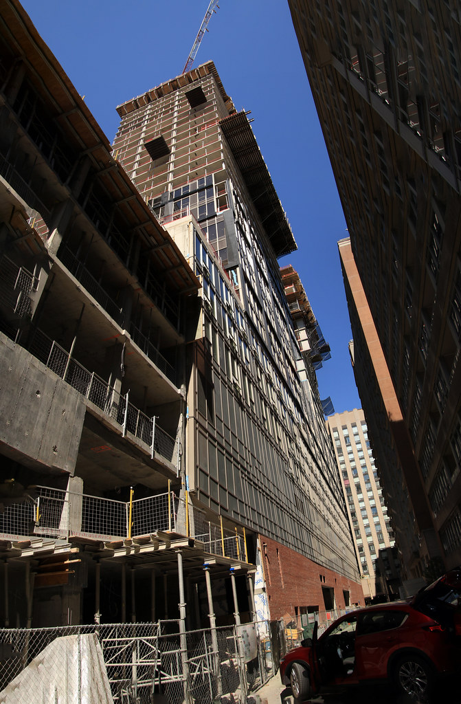
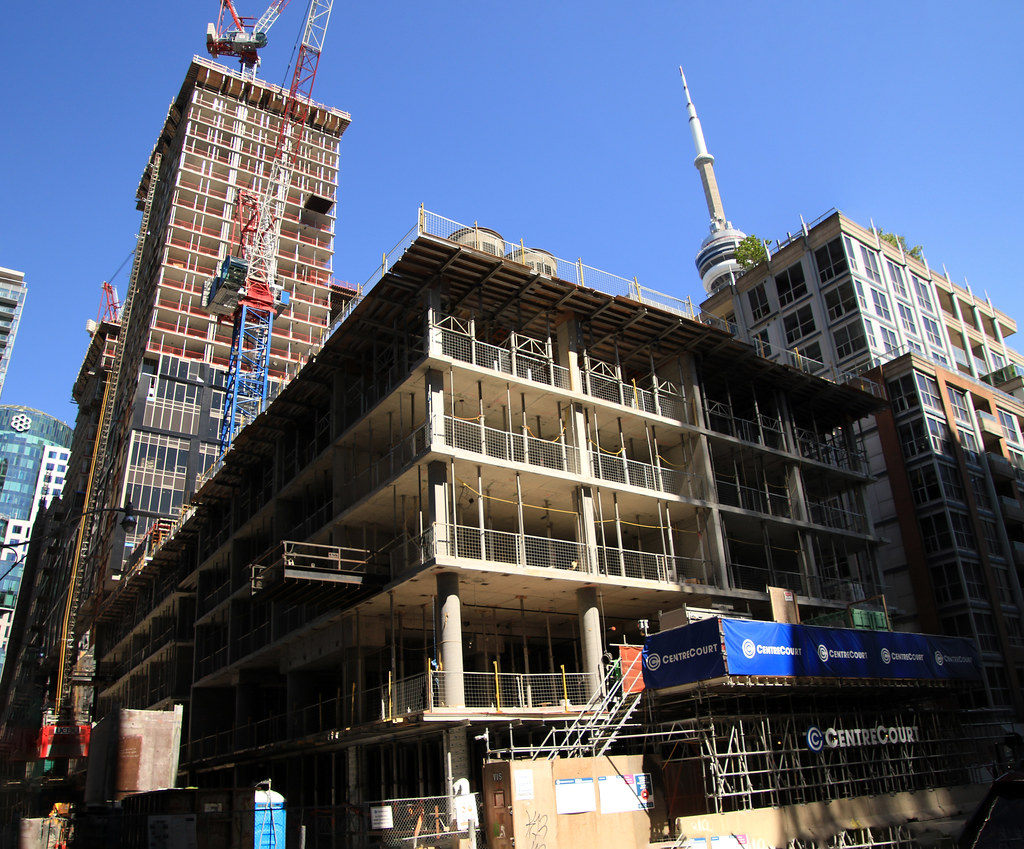
May 15
Lot More up On My site in Various Locations

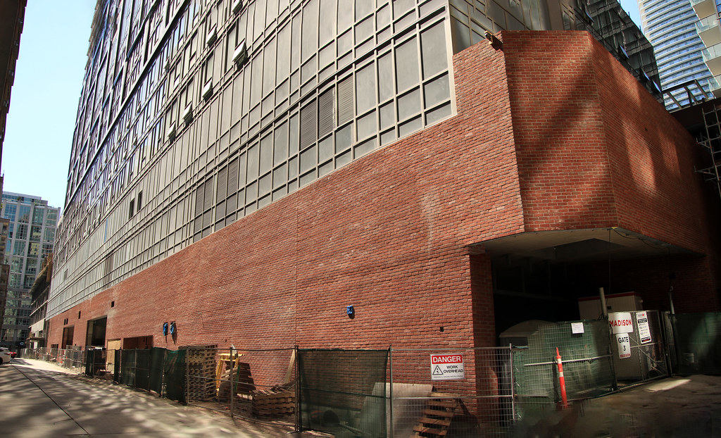
Looks like they used the original bricks on the back wall and the east end
52107592114_65ff19f44b_b.jpg

52106434512_085a18c367_b.jpg

52107495528_94661fc67c_b.jpg

52107496038_369382d9bc_b.jpg

52107592114_65ff19f44b_b.jpg

52107340806_ca2af1fc9f_b.jpg

52107379233_e39cccced2_b.jpg

52107380028_9e9c7deb2c_b.jpg

52107342406_77f3d5bc2f_b.jpg

52106321557_f1812e6cc1_b.jpg

52107381348_524ca1ea0e_b.jpg

52106321852_9150849e40_b.jpg

52106321962_a4907cda66_b.jpg

52107382488_592d8e96b7_b.jpg

52107345611_7559ca3a23_b.jpg

52106313708_2523e8332c_b.jpg
 
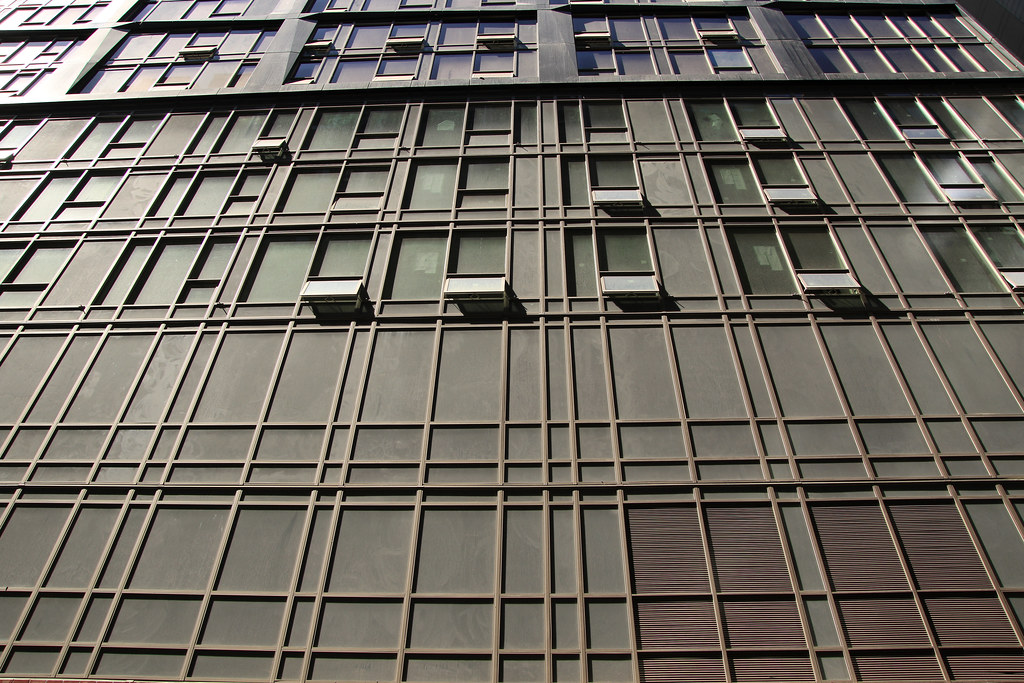
Such a confusing architecture, I. Like the blue reflective glass though. as to the rest, I don’t know what’s going on
 
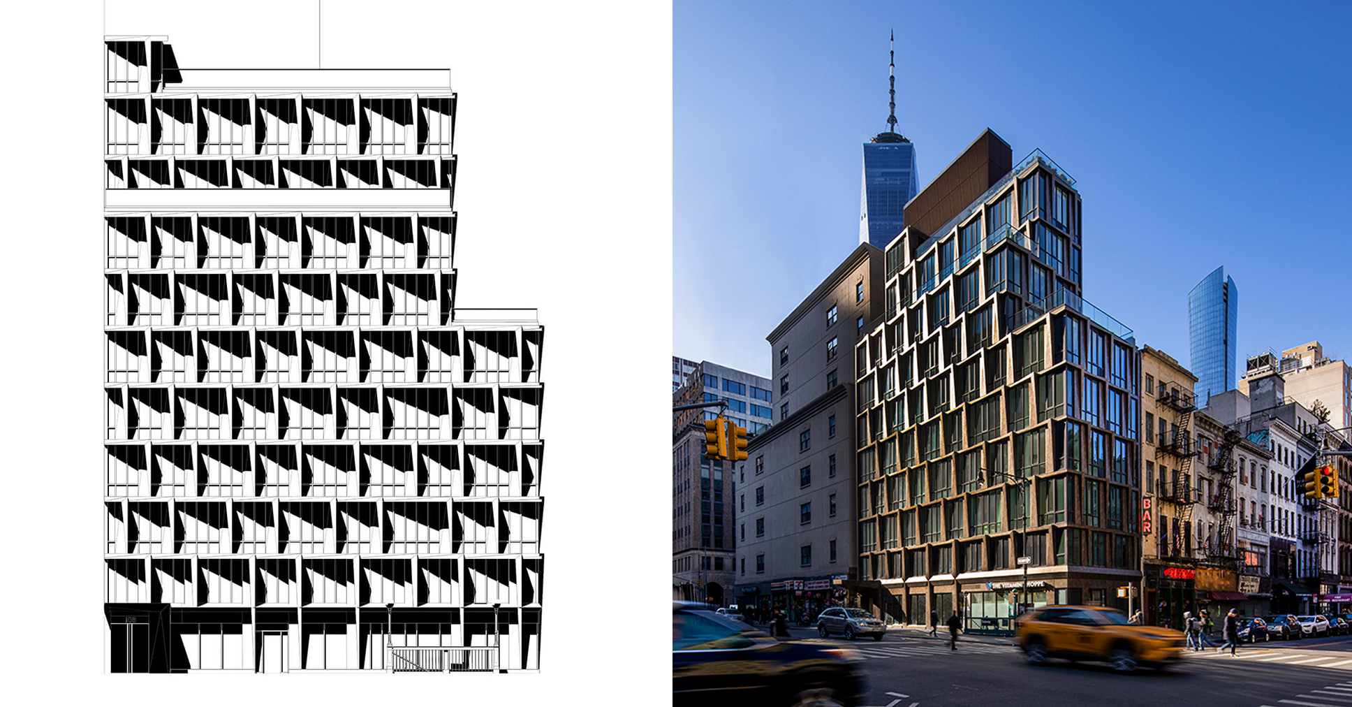
the faceted precast panels should’ve had more depth and dimension, it was the main distinctive feature of the facades but these panels became so shallow and thin that these facets are barely noticeable. Not only that, the angle of the folds don’t seem to be well coordinated with some awkward flat panels trying to transition between the angled planes of the vertical and horizontal panels.

It would have been very nice of these panels were much thicker and more sculpted like this (ironically this building is in DeNiro’s stomping ground of Tribeca):
 

Back
Top