Marcanadian
Moderator
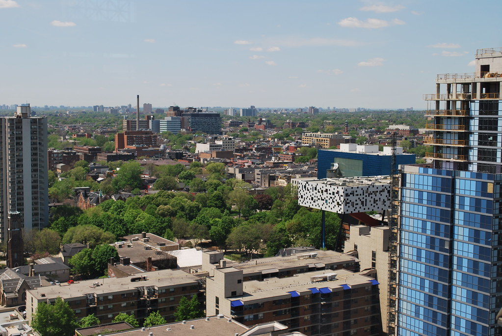 Canada Life Building by Marcanadian, on Flickr
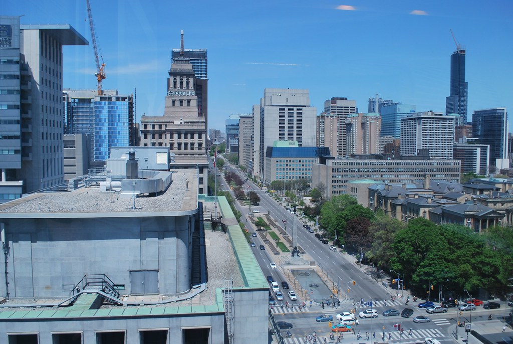 Toronto by Marcanadian, on Flickr
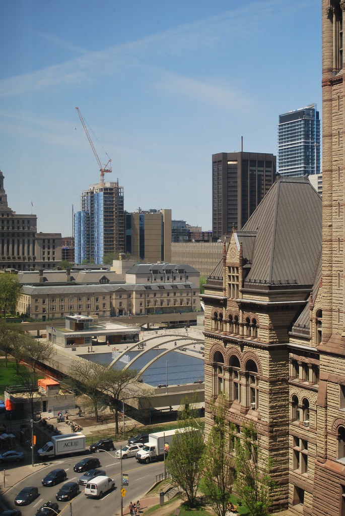 Arcadia by Marcanadian, on Flickr
 Canada Life Building by Marcanadian, on Flickr
 Toronto by Marcanadian, on Flickr
 Arcadia by Marcanadian, on Flickr
You guys know that the blue spandrel walls will be covered by the next buildings to be built immediately to the south, right? We've published that info pretty much every time we've done a story on this building. It doesn't make sense to spend more on those walls than they already have, and sure, they could have gone for a more sober expression, in which case others would be grumbling about the south walls being too dull.
42
The balconies are not glazed yet, so how pretty do you want them to be during construction? With those south walls set to disappear in the future, all you're going to see of this building over the long term is a couple of slender slices of glazed balconies. Methinks thou dost protest prematurely.
42
So what will happen to the south facing balconies on this building when the next buildings are built? Will they be completely boxed in or face into an internal courtyard? Sounds pretty dreary.
The issues with this building's design go a bit beyond the colours employed on its firewall.
EDIT: I've edited out my critique of the building and of the defence of developer mediocrity that regularly plays out on UT. I accept that we come from different places and hold even the lesser developers to different standards. No sense arguing against "the regime".
All you could have said was "I disagree"
Saturday:
View attachment 26544
Having a random pattern would look so much better, like what was done at RCMI.