Toronto Massey Tower Condos | 206.95m | 60s | MOD Developments | Hariri Pontarini

It looks beautiful, but only if executed well. I'm gonna guess that the "wave" design is just fritted glass on the balconies? In which case, it's not going to be anywhere near as prominent...just take a look at absolute world to see what I mean. Also, the way they hid the mechanical box at the top (which's beautiful) is a prime candidate for cheapening.

Given the renderings, I would say that this building has a 10% chance of looking as good as promised. 60% chance of looking ok, which would probably still be a lot better than the average for the area. 30% chance of looking ugly, mainly if they use really bad cladding, and especially since this building has a lot of balconies, it'll have a propensity to look cheap. Even with really good cladding.

Does anyone know what the big white box on top of the old bank building is for? I'm guessing above ground parking?
 
The north side of this building will likely be a blank concrete wall. Seems to me that it will be very close to the property line, the Bank of Toronto building is not part of the project and all renderings available show the west and south facades.

This could be very unsighly when looking south at the CBD...

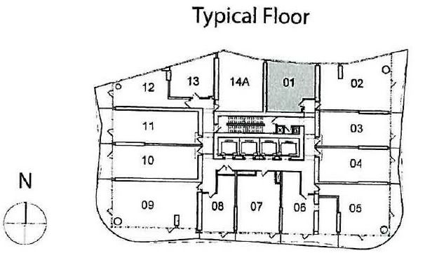
Solaris provided this floor plate from a few pages ago:

MasseyTowerFP.jpg


There was a pdf with all the floor plans earlier today, but now I cannot find it. Premature release? In any case, all four sides were full of windows.

edit -- Massey Tower floorplans can be found here
 
Last edited:
I'm fine with the white-clad podium. I assume that's spandrel - haven't asked yet - or maybe it'll be a porcelain/enamelled aluminium, like at the Eaton Centre. What I find rather weak it the glass retail pavilion. While it is important that it not overshadow the banks on either side, I don't think its proportions are right yet. It does feel tacked on as opposed to integrated. I think there's room to grow it a bit, while still have it defer to the banks. It would likely benefit from a more minimal look too: probably a restaurant would better suit instead of what looks like clutter to me through the glass. I suppose a retailer could choose something more classically, cleanly modern looking (perfect spot for a Bang & Olufsen store?), but in this area I think most high quality retail is still pulled inexorably into the Eaton Centre. With the Elgin Winter Garden and Massey Hall practically on Massey Tower's doorstep, and nearly a thousand new residents in this tower, I think a good restaurant makes more sense here.

42

The podium would be interesting if lit from behind with changing colours - but not too bright.
 
You know, they keep making these things smaller and smaller. We now have a room called the "Live/Cook/Dine" room.

I guess the next iteration will have one room called the "Live/Cook/Dine/Wash" room where the kitchen sink takes on a host of new responsibilities.

May require a range hood with a stronger fan.


Massey3.jpg
 
Enough with the floor plans in this thread please. They belong in the real estate thread. Thanks!

42
 
You know, they keep making these things smaller and smaller. We now have a room called the "Live/Cook/Dine" room.

I guess the next iteration will have one room called the "Live/Cook/Dine/Wash" room where the kitchen sink takes on a host of new responsibilities.

May require a range hood with a stronger fan.


LOL... now don't give them any ideas!
 
As small as they are, they do look like they are much nicer than most of the units at Karma. If I were able, I might actually consider buying here. The location is great, and I would definitely not have to own a car. I have to say, it would certainly beat my one room apartment in residence!
 
You know, they keep making these things smaller and smaller. We now have a room called the "Live/Cook/Dine" room.

....and it still manages to include such luxuries as a walk-in pantry and a "media room". But I'm holding out for them to come up with a way to include a zen garden in my 325 sqft apartment.
 
I'm a bit late commenting on the most recent rendering as I've been out of the country for the last two weeks. I like the overall look but my concern would be the same as a couple others... the wavy design on the balconies had better be accomplished with a solid, opaque material rather than mere fritted glass. If this is the case, we stand to have a very high quality finished product that will be quite unique in its approach to cladding and balcony treatments in this city, one that does not appear cheap. Fingers crossed.
 
possibly yes, I suppose - because the composite construction makes it opaque. Less desirable would be the translucent type used on Festival Tower for example. I'd still prefer to see something resembling a ceramic material though...
 

Back
Top