Logan
Active Member
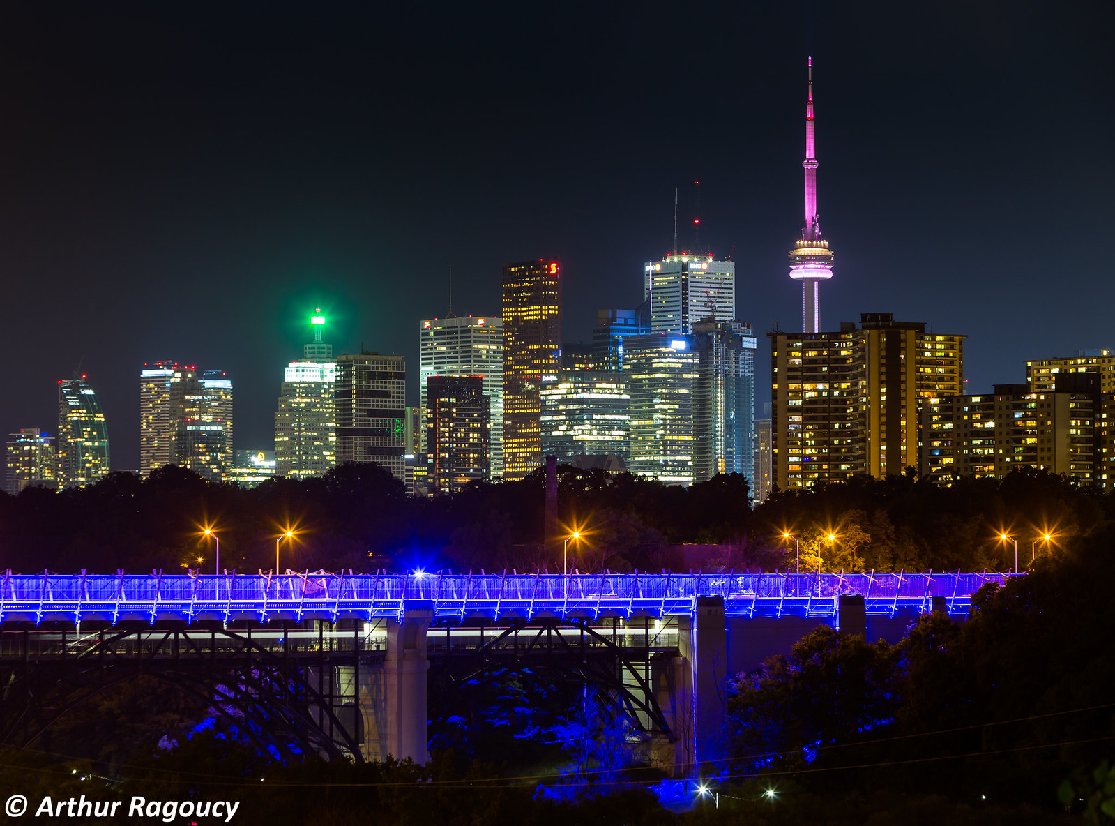
 Chester Hill Lookout Toronto by Ragoucy Arthur, on Flickr
 Chester Hill Lookout Toronto by Ragoucy Arthur, on Flickr
Every time I see the North face I am extremely disappointed.
Every time I see the North face I am extremely disappointed.
Is it just me or does this look too short for 207m? Has it topped out?
What are you basing this on? Things are measured and inspected carefully.Yeb, have been saying this a while. I don't believe the height, probably over stated it.
Every time I see the North face I am extremely disappointed.
One of the few times I'd prefer a dynamically designed window wall over a boring curtain wall with little thought to the impact from the North. I understand it will most likely be blocked in time, but I don't see why they couldn't have integrated some white to build cues with the other 3 sides of the tower (aka, RCMI condo on University).
Street level and the historical integration should be great, the balconies look awesome, but I feel like the North face is a missed opportunity and takes this building down a notch for me (how I felt about X and the mechanical).
Do we actually know why the north face is like that?
Did they think they can save on materials by not extending the design to the north face?
I'm confused, are the air rights somehow considered heritage? How does the minimum setback to the heritage building apply to the balcony treatment on the tower above the heritage building?I believe it is due to the close proximity with the historic building next door, there isn't enough setback space.