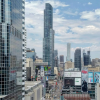
Toronto Massey Tower Condos | 206.95m | 60s | MOD Developments | Hariri Pontarini

I've always found this was interesting as well. From a design perspective, I would have expected the sides to be flipped, with the expressive balconies + cladding facing Yonge St. to the north and Dundas Square, where it has a nearly unobstructed sight line and more overall exposure.

Maybe the balconies also serve as a brise soleil to reduce heat gain; plus the view north isn't that interesting.

AoD
 
Screen Shot 2017-07-19 at 10.17.11 PM.png

Screen Shot 2017-07-19 at 10.17.18 PM.png
 

Attachments

  • Screen Shot 2017-07-19 at 10.17.18 PM.png
    Screen Shot 2017-07-19 at 10.17.18 PM.png
    32 KB · Views: 524
  • Screen Shot 2017-07-19 at 10.17.11 PM.png
    Screen Shot 2017-07-19 at 10.17.11 PM.png
    547.6 KB · Views: 526
The Northern view looks a lot cooler than I thought it would in my head. Will be cool to peer down onto Dundas Square from the higher levels. The West view is predictably beautiful and will probably be the least impacted by future developments. South view is poor.
 
Here's some shots from earlier this afternoon - from the vantage point of the parking area over the Eaton Centre.
MasseyTower-Jul26-17A.png
MasseyTower-Jul26-17B.png
MasseyTower-Jul26-17C.png
MasseyTower-Jul26-17D.png
 

Attachments

  • MasseyTower-Jul26-17A.png
    MasseyTower-Jul26-17A.png
    1.4 MB · Views: 520
  • MasseyTower-Jul26-17B.png
    MasseyTower-Jul26-17B.png
    1.4 MB · Views: 549
  • MasseyTower-Jul26-17C.png
    MasseyTower-Jul26-17C.png
    1.5 MB · Views: 550
  • MasseyTower-Jul26-17D.png
    MasseyTower-Jul26-17D.png
    1.1 MB · Views: 527
I dig the two tone look. Since the north side will be getting the most sun year round it makes sense that take advantage of it. A balcony would become a brise-soleil for the rooms inside, not to mention the dark curtain wall will look quite sharp in the sun!
 
This is ending up a lot bigger than I thought it would, with only 35 floors to go I don't think it will look as slender as some of the renders suggest. Another example of needing a bit more height! Still lots to go so I should hold my tongue for now.
 

Back
Top