You are using an out of date browser. It may not display this or other websites correctly.
You should upgrade or use an alternative browser.
You should upgrade or use an alternative browser.
Toronto Maple House at Canary Landing | 89.61m | 26s | Dream | COBE Architects
- Thread starter AlvinofDiaspar
- Start date
AlvinofDiaspar
Moderator
From the Jan WT DRP:
https://waterfrontoronto.ca/nbe/wcm/connect/waterfront/5cb67725-1fc7-4704-9dfc-eedba5f1b5af/Design+Review+Panel+Meeting+Presentation+-+West+Don+Lands+Block+8+-+DRAFT+-+January+23,+2019.pdf?MOD=AJPERES
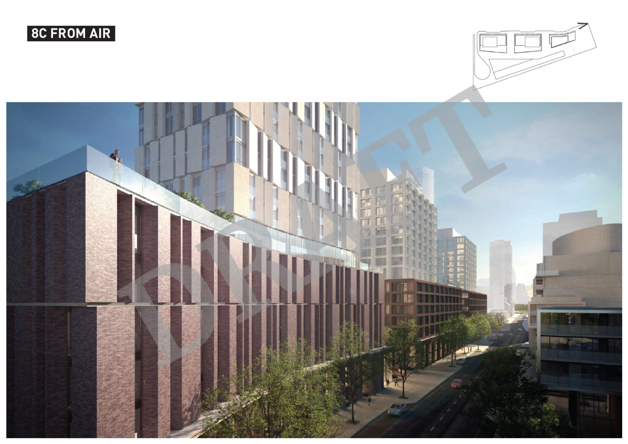
(Dream/Kilmer/Tricon/aA/COBE)
AoD
https://waterfrontoronto.ca/nbe/wcm/connect/waterfront/5cb67725-1fc7-4704-9dfc-eedba5f1b5af/Design+Review+Panel+Meeting+Presentation+-+West+Don+Lands+Block+8+-+DRAFT+-+January+23,+2019.pdf?MOD=AJPERES
(Dream/Kilmer/Tricon/aA/COBE)
AoD
Last edited:
TheKingEast
Senior Member
You will never lose with red brick and black framed windows. I like it.
DonValleyRainbow
Senior Member
Member Bio
- Joined
- Mar 5, 2014
- Messages
- 2,867
- Reaction score
- 1,927
- Location
- Kay Gardner Beltline Trail
From the Jan WT DRP:
https://waterfrontoronto.ca/nbe/wcm/connect/waterfront/5cb67725-1fc7-4704-9dfc-eedba5f1b5af/Design+Review+Panel+Meeting+Presentation+-+West+Don+Lands+Block+8+-+DRAFT+-+January+23,+2019.pdf?MOD=AJPERES
View attachment 172030
View attachment 172031
View attachment 172032
View attachment 172033
View attachment 172034
(Dream/Kilmer/Tricon/aA/COBE)
AoD
Toronto developers take note: this is how you match the character of the neighbourhood instead of making boring blue glass boxes.
smably
Senior Member
Or faux-historicism.Toronto developers take note: this is how you match the character of the neighbourhood instead of making boring blue glass boxes.
ProjectEnd
Superstar
You will never lose with red brick and black framed windows. I like it.
Yes and no. There can be an overwhelming monotony to similar materiality even if each building is excellent and architecturally reserved.
Think IJburg and Haveneiland in Amsterdam. While everything is *individually* excellent, when taken together, it quickly loses its quality in a sea of similar brick.
TheKingEast
Senior Member
Yes and no. There can be an overwhelming monotony to similar materiality even if each building is excellent and architecturally reserved.
Think IJburg and Haveneiland in Amsterdam. While everything is *individually* excellent, when taken together, it quickly loses its quality in a sea of similar brick.
Well yes. I don’t mean slap on any red brick and black windows haphazardly. But usually red brick goes well with black trim. It’s a classic look just like black and white. Or for some people glass and boxes.
ProjectEnd
Superstar
No disagreement there.
Automation Gallery
Superstar
I:m sorry to say but whats up with these new developments in those new east end neighbourhoods , so generic and sterile for my likes
Lenser
Senior Member
If it's built true to those renders - or even closely approximates that look - it'll be a very handsome, smart addition to the neighbourhood. Looking forward to it.
torontologist
Active Member
I:m sorry to say but whats up with these new developments in those new east end neighbourhoods , so generic and sterile for my likes
If you find *this* sterile, then you must be really upset about the 95% of developments that are glass and spandrel boxes.
I think these are going to be some of the best low-high-rises we've seen in a long time, up there with 60 Colborne.
AlbertC
Superstar
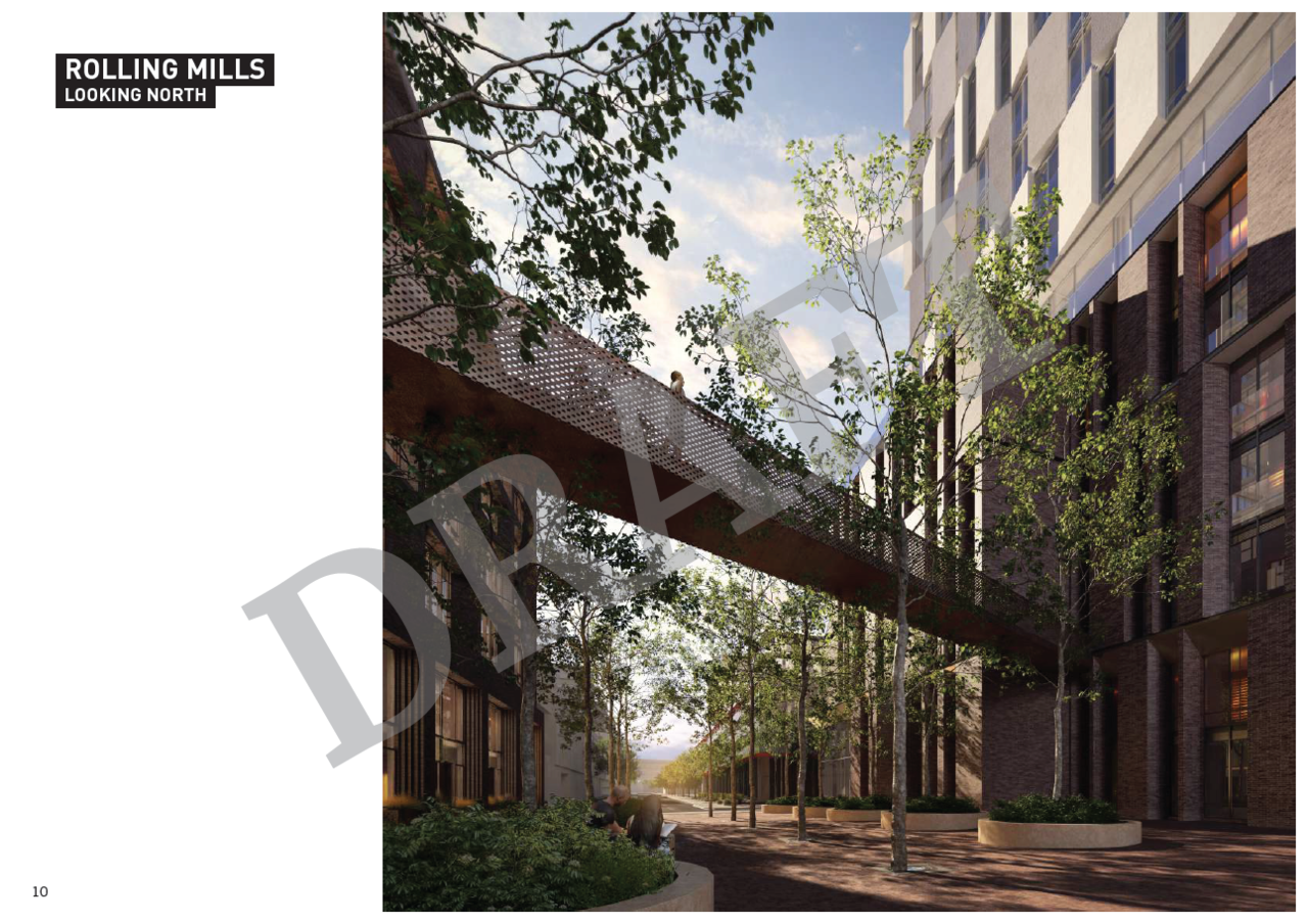
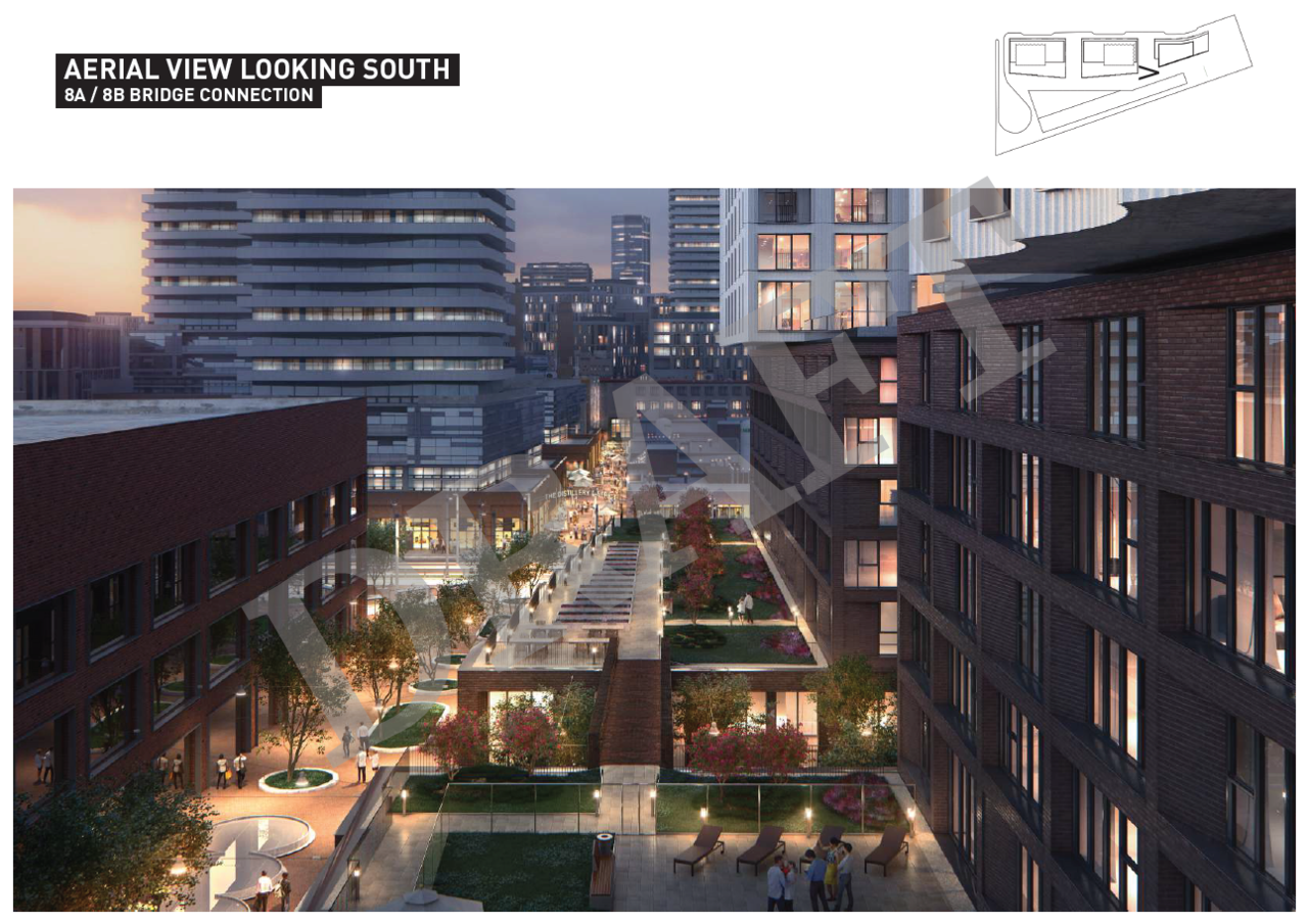
Really impressed by the renderings. Nice sense of solidarity and engaging urban fabric in the podium level experience. Looks like a natural extension of the Distillery District.
ADRM
Senior Member
.dwg
Active Member
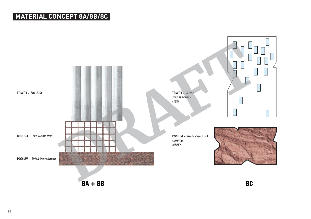
It goes beyond just "simplicity" - a project like this is an example of an assembly of "types" and simply allowing that juxtaposition/relationship to be the architectural expression. This is how you weave into the urban fabric. Maybe he speaks about it in the article (paywalled so I haven't read it) but I think key to understanding this type of architecture is this idea of a collection of massings that represent different types found in the city - the townhouse, the warehouse, the silo, the apartment block, the terrace - and combining them into an urban assembly.
smably
Senior Member
Yup, the article addresses that angle quite nicely:It goes beyond just "simplicity" - a project like this is an example of an assembly of "types" and simply allowing that juxtaposition/relationship to be the architectural expression. This is how you weave into the urban fabric. Maybe he speaks about it in the article (paywalled so I haven't read it) but I think key to understanding this type of architecture is this idea of a collection of massings that represent different types found in the city - the townhouse, the warehouse, the silo, the apartment block, the terrace - and combining them into an urban assembly.
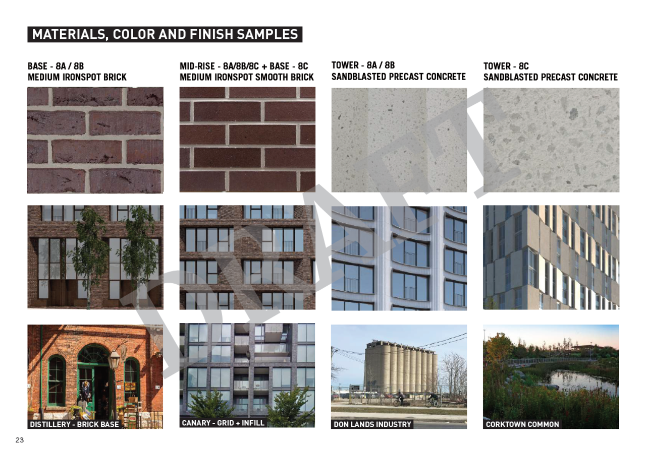
As for the architecture, the design strategy is relatively simple. Each building is broken down into three components: townhouses, clad in rough red brick; then the bulk of the apartments, broken down visually into “warehouses,” as Krarup puts it, squarish six-storey volumes of a rougher red brick; and, above, “silos” of white concrete.
There are some idiosyncratic details – the silos protrude at acute angles, the warehouses have diagonal window openings sliced out of them, and so on. But the three buildings read not as “sculptural” or “iconic.” They are essentially well-proportioned boxes. That’s no accident. “Instead of trying to overdesign,” Krarup says, “we want to simplify and let the project stand out for its elegance and simplicity.”
This three-part organization is, in this case, informed by this specific context. The site is the West Don Lands.This former industrial zone on the edge of downtown Toronto is analogous to many of the places that are getting redeveloped in major cities: It’s near an old waterfront, a bit out-of-the-way. There are grain silos on the nearby lakefront, and the Distillery District – an astonishing collection of Victorian industrial architecture turned shopping zone – is right next door. “We took our cues from the area, which has a lot of industrial heritage,” Krarup says.