Toronto Lumiere Condominiums | ?m | 32s | Lifetime | Wallman Architects

It seemed to me it also went through the sales cycle under the radar as well. I agree the West side is dramatic, but i dont yet see what the hype is around the most visible part over looking Bay.
 
9-11

IMG_0646.jpg


IMG_0645.jpg


IMG_0649.jpg
 
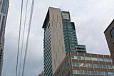
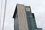
The alternating pattern of precast on the north façade is strangely unresolved at the top. It just comes to an abrupt end. There should have been one more slit/gap down the middle running up to the roof. Disappointing.

Now that you've mentioned it, I can't help but notice every time I look at it. It is indeed a very strange design choice, I mean, considering all of the other panels have the slits, it couldn't have been a Cheapening, The (TM) move. I wonder what on Earth possessed them to so abruptly terminate that feature.
 
To Anyone who owns a unit in Lumiere

Hi There,

I received a notice about a meeting for condo owners for last week. I live far away so wasn't able to attend. I wanted to know if any pertinent info was shared at the meeting eg. expected closing date being pushed back, etc.?

I'd appreciate it if you could let me know. Thanks,

Jason
 
The alternating pattern of precast on the north façade is strangely unresolved at the top. It just comes to an abrupt end. There should have been one more slit/gap down the middle running up to the roof. Disappointing.

I think this works, the pattern terminates at the top floor of apartments and will align with the roof top features.
 
^^^ I had said essentially the same thing in the recently featured front page article on Lumiere... agree it totally makes sense to me, though I did offer an alternate option that the top section could have been a solid row of slits. Either way it would contrast with the alternating patterns on the bulk of the tower.
 
They're installing the coloured spandrel-glass slivers between the precast panels now. Looks very good.

This is another terrific touch to a building that has been full of pleasant surprises. The muted coloured panels appear white, green, blue and I think one other colour. If my eyes aren't deceiving me it looks like there 's an electrical feed at the bottom of each incomplete sliver at the top half of the building to perhaps illuminate these features by night.
 
I hope so... would be good for dreary Bay Street.

I saw the panels today walking past. They are all nursery pastels-- light green, baby blue, powder yellow-- not neon colours as the renderings hinted. Looks excellent! :)

Almost every panel was up when I walked past this afternoon.
 
This is another terrific touch to a building that has been full of pleasant surprises. The muted coloured panels appear white, green, blue and I think one other colour. If my eyes aren't deceiving me it looks like there 's an electrical feed at the bottom of each incomplete sliver at the top half of the building to perhaps illuminate these features by night.

Click on the thumbnail to enlarge, then click again on the image for full size.

 
and keep in mind this is another Wallman Architects design (since they are getting so much praise the last couple days) Great to see this design carried through to the last detail. Should be interesting to see those coloured panels illuminated at night.
 

Back
Top