Toronto Living Shangri-La Toronto | 214.57m | 66s | Westbank | James Cheng

In response to UD;
Not sure I agree it is a "mess". That said, I really do not get why they used different marbles (taupe colour and then the white).
The one thing that I don't like for sure is the white glass panels above the entrance of the hotel. Originally I believe the renderings showed wood if my memory serves correctly and I think that would contrast better against Bishops Block and the marble below where the restaurant and swimming pool will be.
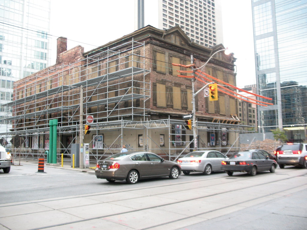
 
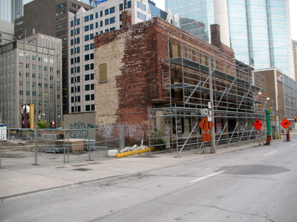
From way back in this thread:

From Oct 2-07
1684190220_6e0e5d7edd_b.jpg

1684183916_bbcdc983a9_b.jpg

I think they did a reasonably good job in recreating it. I think they did a better job here than they did at Bay-Adelaide, at any rate
 
What's going to be in Bishop's Block, both the main floor and upper floors? Anyone know/ have we been told about this in press releases?
 
That's what I thought. What about the other floors above ground level though? I imagine some sort of amenities or...?
 
I don't believe they have decided. Initially it was going to be some retail and stores. The Chang restaurants are going in the 5 story northerly portion. The hotel restaurants are in the main building. I do not believe that they were going to put other restaurants related to the SL there but if they do offer retail I suppose a restaurant could lease the space.

Looking more at the base in response further to UD; I think the Easterly side is excellent. The Southe (Adelaide) side white marble is actually quite striking. I wonder if it is the boxy design and the contrast to brick of Bishops Block(which I believe is a fabulous restoration) is creating the problem more so than the material choice. That said, I still can't explain why the 2 colours of marble (beige at the SE corner) vs. white at the middle. Along Simcoe I don't think it looks bad at all because the marble is a distance away from the Bishops Block. While the white above the entrance is OK, as I posted before, I think if they had put a wood as I believe the original renderings showed, it would contrast well as against both the brick and marble and would have been more elegant. I am guessing given our winter climate the wood might have been too much maintenance. This is the only thing from my recollection of the renderings that seems markedly different from the original proposals but I could be wrong.
 
That's disappointing. I feel personally that the space should be used for multiple uses and have more traffic than being an "exclusive club" even if the club is for "creative people". I hope that it does not end up occupying the whole of Bishops Block.
 
I thought they painstakingly saved the bricks from the original structure? Am I thinking of somewhere else?
 
^^
they did CC just as you suggest. My understanding was they did not have enough bricks and mixed old with new to get it back to as close as they could. However, I seem to recall that a lot of the old brick could not be salvaged.
 
A private club for extra-special creative people. Why am I not excited?

I agree Gristle.
I am just annoyed that it won't be public space....not just for the residents/hotel guests but for those around the neighbourhood as well as the general public. Lost opportunity for the many so that a few can benefit. Anyhow, I guess it up to the developer what he wants to do with the space he created. I gather the mandate was to try and preserve the heritage quality which they did beautifully at least from I can see on the outside and for that I am grateful but I think it could have been a neat place to set up some public space...e.g. a gallery and maybe a couple of restaurants and maybe a wine bar or a pub.
 

Back
Top