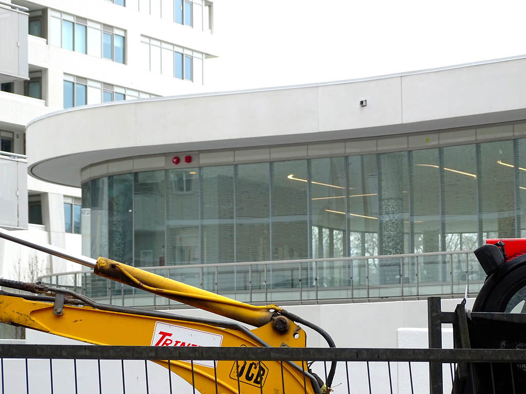
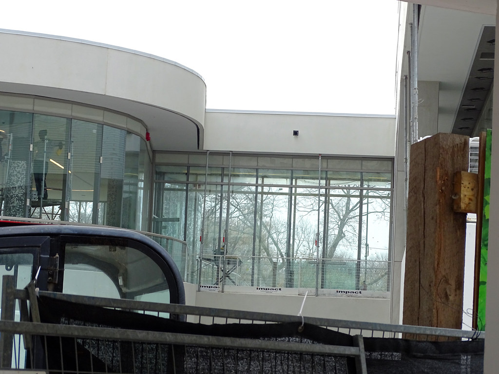
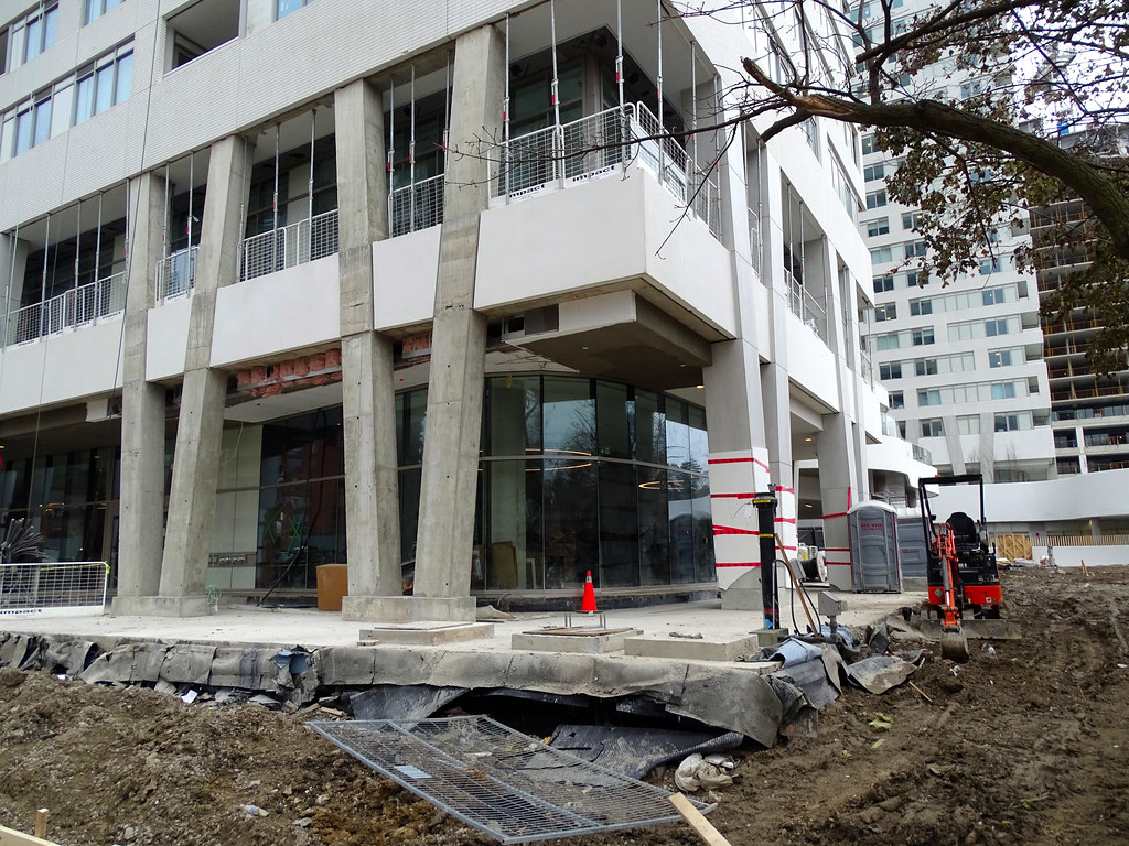
Toronto Lillian Park | 84.73m | 28s | Collecdev | Kohn Shnier

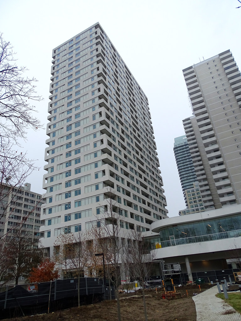
These could be saved by staining the precast bricks red or yellow like they did on the Mercer or at Gramercy Park . It would allow the pattern to come through but it would dramatically alter the feel and heft of these buildings.
 
Last edited:
July 5:

20190705_180233.jpg
 
It's really tragic to see such promising cladding completely neutered by one poorly thought out spandrel colour choice. Like, this was soooo promising...until it wasn't.
 
I honestly wonder what happened during the material selection and construction documents phase of the project.This must have had to be approved at some point, it can't be an oversight.

It's such a simple thing (spandrel color), but it's one that has essentially rendered the facade parti irrelevant. All that effort that's gone into detailing where the brick panels go, etc. is useless because the intended facade design is intelligible.

Is Kohn Shnier proud of what they did? What about Collectdev? Was there some sort of design override by someone higher up?
 
They could have easily went with a more contrasting color on the brick and/or window frames, but that seems to be a big no-no for so many developers here. This is what happens when you're overly conservative.
 

Back
Top