You are using an out of date browser. It may not display this or other websites correctly.
You should upgrade or use an alternative browser.
You should upgrade or use an alternative browser.
Toronto Leslieville Lofthouses | ?m | 4s | Urban Fabric | George Popper
- Thread starter Thesb
- Start date
Thesb
Active Member
anonymous0024
Active Member
From today:
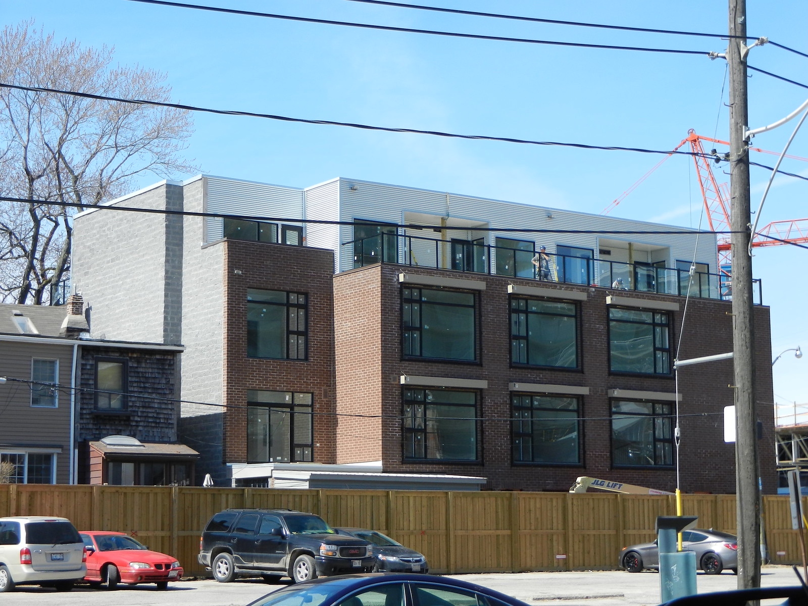
From Carlaw:
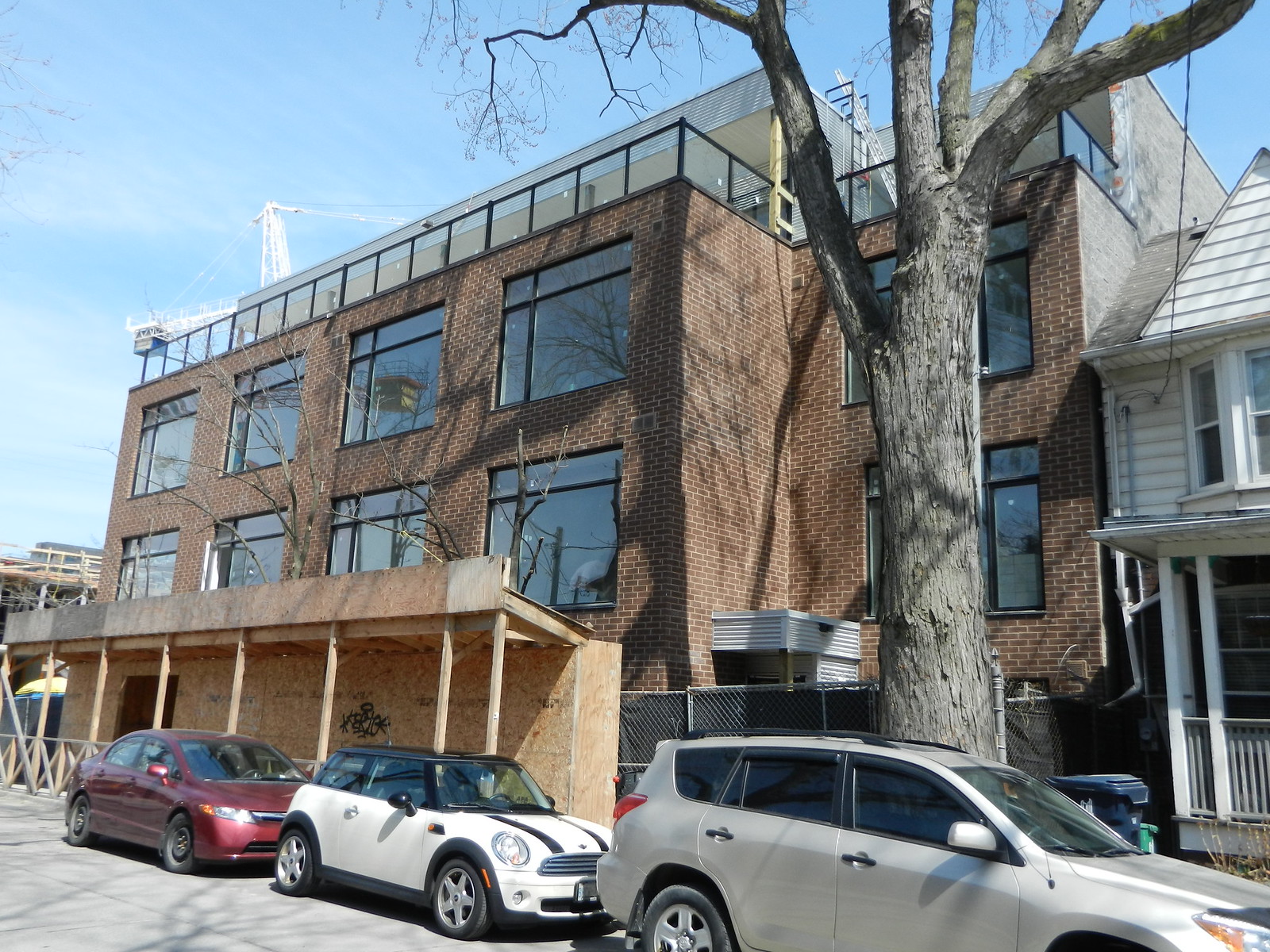
From Verral Ave:
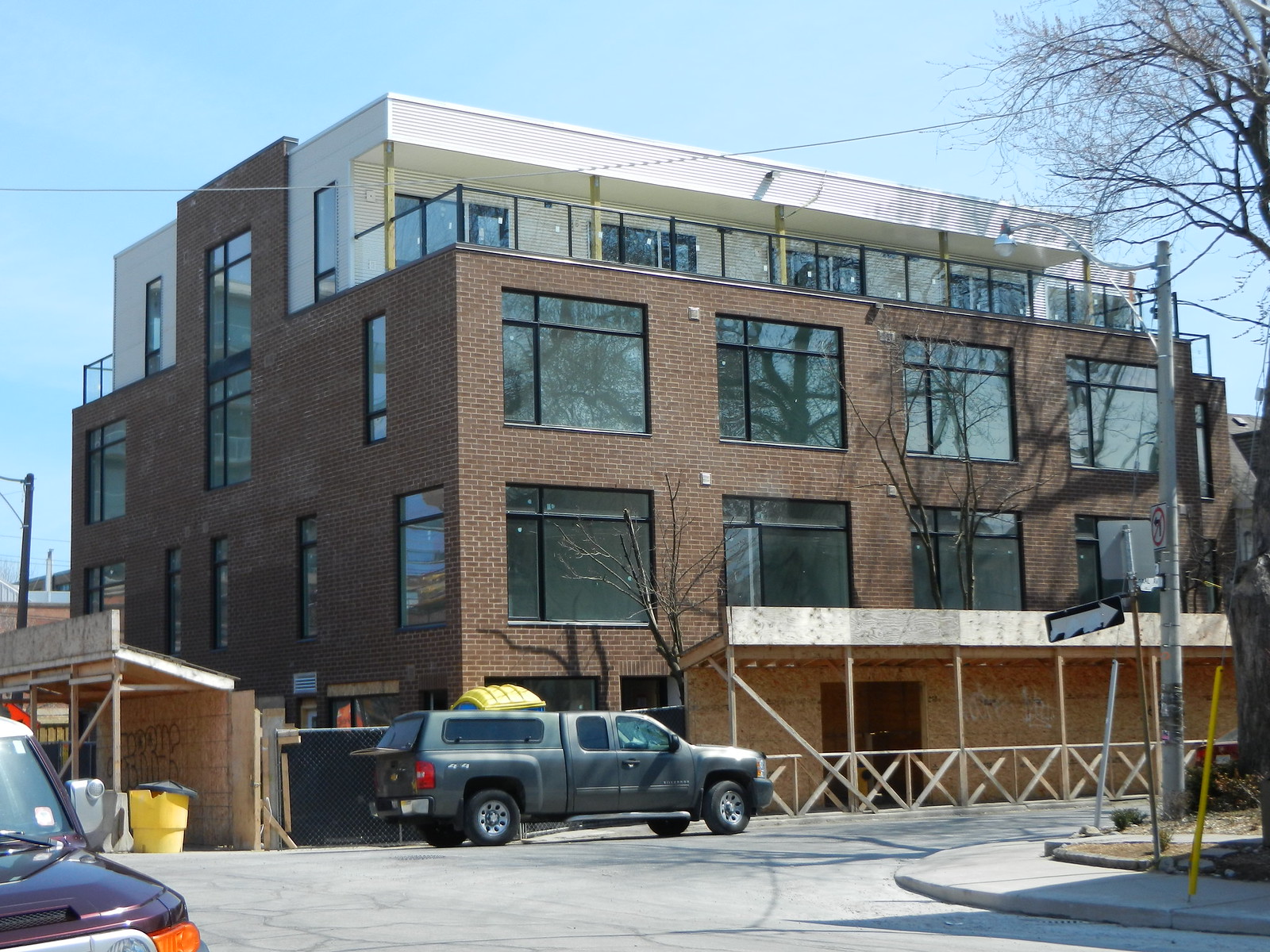
And from Colgate:
From Carlaw:

From Verral Ave:

And from Colgate:

urbandreamer
recession proof
I changed my mind: It's ok, esp on a quieter street like here.
Stratford1
New Member
So plain, why? No brick or wood trim. Basic box. Imagination or design?
How much are these things again?
How much are these things again?
BobBob
Senior Member
Looking good! The city could use more projects like this.
ProjectEnd
Superstar
So plain, why? No brick or wood trim. Basic box. Imagination or design?
How much are these things again?
I'm not sure how the brick building pictured above contains 'no brick.' Furthermore, excellent design isn't about creating endless one-off sculptures, it's about stitching together a flexible urban fabric of excellent yet quiet background buildings and leaving a few sites open for unbridled creativity. As BobBob says above, the city could surely use more projects like this.
urbandreamer
recession proof
19 May 2013: I changed my mind again: I love this project! Fantastic scale, crisp modern lines and very Montreal. Can we build hundreds of these around Toronto please?!
Love the name of this street and the old homes on the street--very nice contrast from the Carlaw grit.

I quickly got busy taking (crappy--sorry, image compression set up wrong? ) a ton of photos


Studio or retail space?


Love the name of this street and the old homes on the street--very nice contrast from the Carlaw grit.

I quickly got busy taking (crappy--sorry, image compression set up wrong?


Studio or retail space?


Last edited:
ducati0000
Active Member
Nothing exceptional about design but it doesn't stand out from the rest of the area homes which the residences wanted.I still think Toronto condos are boring as hell with the exceptions of a few like the Absolute condos.Chicago has some amazing small condo/loft projects and San Francisco projects usage of space is creative.


AlbertC
Superstar
Good photos. I've become quite fond of the Leslieville residential side streets. Interesting blue-collared, inner-city qualities to these areas. Also reminiscent of American cities like Pittsburgh.
Stratford1
New Member
Most boring new build brick building ever! Looks like a warehouse. No embellishments whatsoever. Is minimalist or cheap|?
urbandreamer
recession proof
^Clearly you don't get the modernist aesthetic. Let me guess: You like Brad Lamb's Riverside Town's on Broadview?
(It did sell reasonably cheap--$450/sf range.)
(It did sell reasonably cheap--$450/sf range.)
junctionist
Senior Member
I like it, but metal cladding on low-rise residential buildings concerns me. It tends to look harsh and industrial over time as it loses its initially polished look. One sees this with a lot of TCH buildings from the 1960s and 1970s that combine brick and metal cladding.
Xray_Crystal_Junkie
Senior Member
Great infill project, the brick looks great. However, this entrance is absolutely laughable! The biggest afterthought. I bet the owners tear it down within 5 years.
Thesb
Active Member
Hey, UD, are you writing for the Globe now? 
Novel twists on living space in Leslieville
JOHN BENTLEY MAYS
Published Thursday, Jul. 04, 2013 12:11PM EDT
Last updated Thursday, Jul. 04, 2013 12:21PM EDT
The small residential building – bigger than a single-family home, not so grand as a tower – has an important role to play in the ongoing, necessary job of intensifying the world’s cities. Here in Toronto, to name one urban centre with density on its mind, we’ve recently seen a welcome surge in the number of mid-rise condominium blocks being proposed for old districts, some of them architecturally better than just good enough. The effective ones, in fact, occasionally embody ingenuity of the kind that’s too often missing from Hogtown’s shiny new highrises.
Take, for example, the four-storey project called Leslieville Lofthouses, on a quiet corner in an elderly neighbourhood near the intersection of Carlaw Avenue and Queen Street East.
Designed and developed by Toronto architect George Popper, and now nearly complete, this attractive little building has a very modest exterior.
Large, regularly spaced rectangular openings punctuate the unadorned brown brick walls of the lower three storeys, bringing the structure’s external appearance into line with the factories and warehouses nearby.
But the reference to industrial facades in the area is not timidly imitative. Rather, Mr. Popper has drawn on the good things about those rugged, workaday buildings from yesteryear – their simple, squared-off geometry, their no-nonsense practicality – then honoured such qualities in a plain and forthright modernist scheme.
It is certainly unlike any of the two-storey houses round about, but the contrast between modern and traditional on the streetscape is not jarring.
For the record: The building contains nine ample four-storey residential units, ranging in area from slightly more than 1,000 square feet to 1,700 square feet, and two small commercial spaces that are accessible from the street. Investors or end-users have already bought up all the apartments, though a two-bedroom suite, the architect told me, is currently on the resale market for about $540,000.
While I like the street-side presence of Leslie Lofthouses, the more interesting aspect of the complex, to my mind, has to do with what happens inside. It’s in there that Mr. Popper has unleashed a little of the urban imagination we should be looking for in all mid-rise projects.
Here, for instance, is a way to provide off-street parking that doesn’t make a decent downtown Toronto street look like suburbia.
Most suites come with parking, which has been carved out of the units’ ground floors. But instead of giving every oversized garage a separate entrance – thereby cluttering up the façade with big, unsightly folding doors – Mr. Popper has routed the traffic through a single portal and along an interior corridor leading to the individual units. It’s a neat, aesthetically pleasing solution to the problem of where (other than underground) to put the cars in a small building: You take them home.
Every garage is lit by a large, bright window facing a walkway or street.
This will make it easy for home-owners without cars to transform their parking spot into a well-lit workshop, studio or gym – a place, that is, with the knockabout informality of a basement, but without a basement’s customary gloom.
More unusual than the parking facility, however, is the divvying up of territory in the apartments proper, which takes the old modernist notion of the “open plan” farther than I’m used to seeing it go.
One enters a typical three-bedroom or two-bedroom unit through a robust front door into a corridor that opens, off to the side, into the garage, and, straight ahead, to the staircase that takes the visitor up to the spacious main “living” level of the house.
The open plan on this floor is conventional, with a kitchen area at the rear and plenty of room for a dining table and a living room ensemble closer to the big, industrial-strength front window.
Continue up the staircase to the third and fourth levels, however, and you find yourself among the bedrooms, which hardly fit the routine condo mould.
In a three-bedroom layout I visited, the only one of the three that could be definitely shut off from the rest of the apartment was the master bedroom suite, on the third floor. Another bedroom, also on the third storey, was a sky-lit, double-height space open at the top to a fourth-floor loft that overlooked it.
This is clearly not a home for people (like most of us, I suspect) who want all our bedrooms firmly separated from each other. This is perhaps not a home for families of any sort.
But singles or couples who appreciate free spatial flow, and who welcome the intimacy such a configuration invites – or who just like the idea of living in places that aren’t ordinary – will probably admire Mr. Popper’s fresh reinterpretation of the condo suite as much as I do.
http://www.theglobeandmail.com/life/home-and-garden/architecture/novel-twists-on-living-space-in-leslieville/article12986197/

