Toronto L-Tower | 204.82m | 58s | Cityzen | Daniel Libeskind

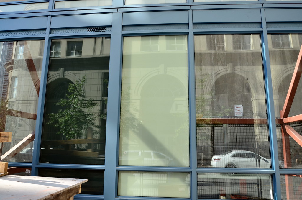
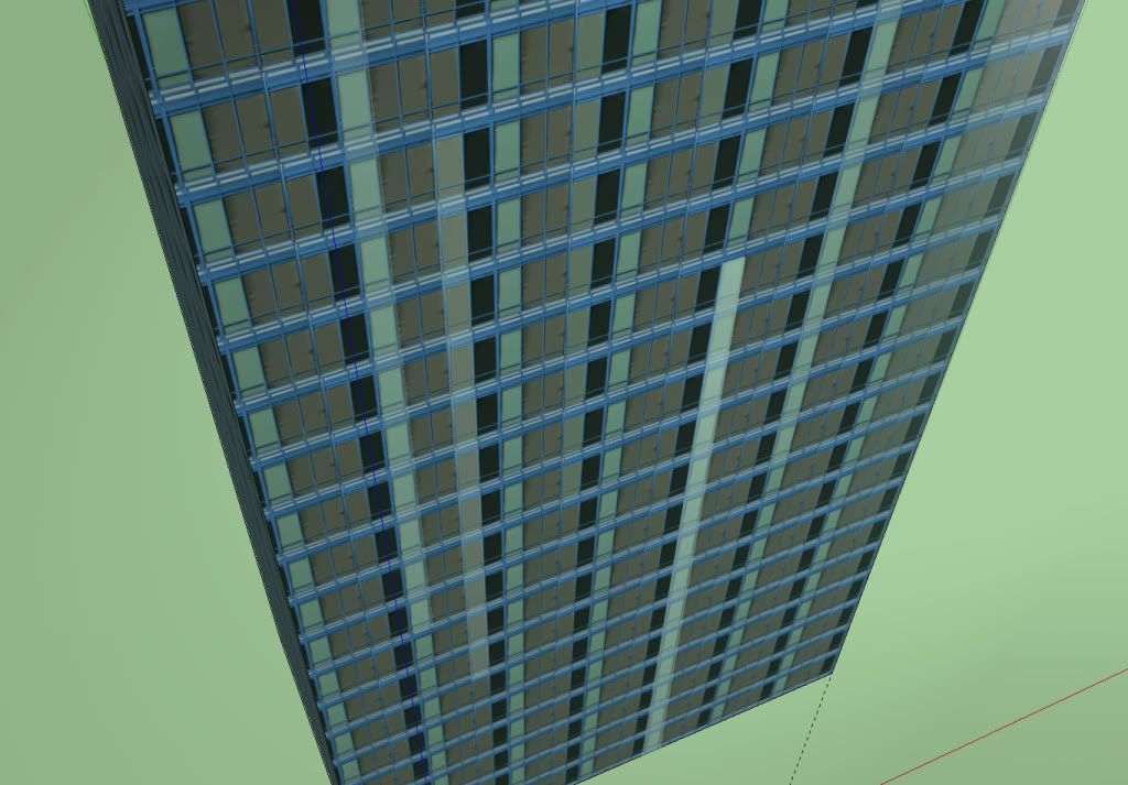
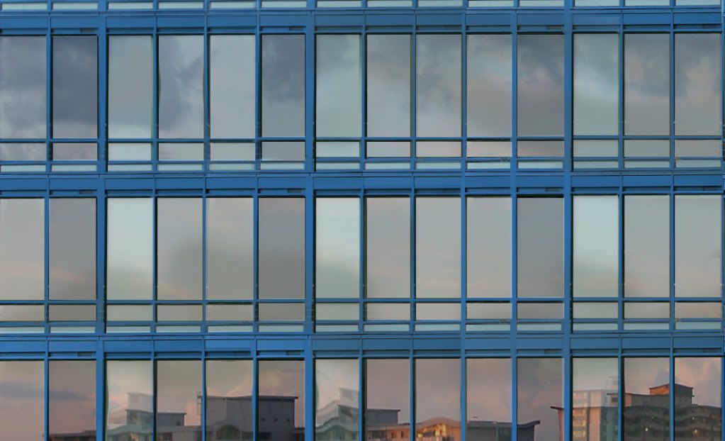
the thing to keep in mind here is that the colour on this one is in the window frames rather than the glass. I think that we will see a variation of window frames, likely with some spandrel to create the patternation implied in the renders... Even though the type of cladding is not the highest quality or most expensive, I think the effect promised here is going to be fairly unique for any building in the city.

window frames and glass doesnt match sighzzz. either (i) go with darker, grey or silver frames, or (ii) lighter blue / more refective glass.
I was hoping L tower would be sth we can look forward to / be proud of, not something we don't even wanna look at
 
Last edited:
Oh WOW!
You are going to hear that a lot in the future, when this gets finished.
I suspect some of you might be having trouble visualizing the completed package.
Bet you guys look like deer caught in the headlights when you are at the paint store looking at swatches.
Trust me on this. This one is going to just pop against the backdrop of the city when it's completed.
 
Last edited:
6539696647_833ededc95_b.jpg

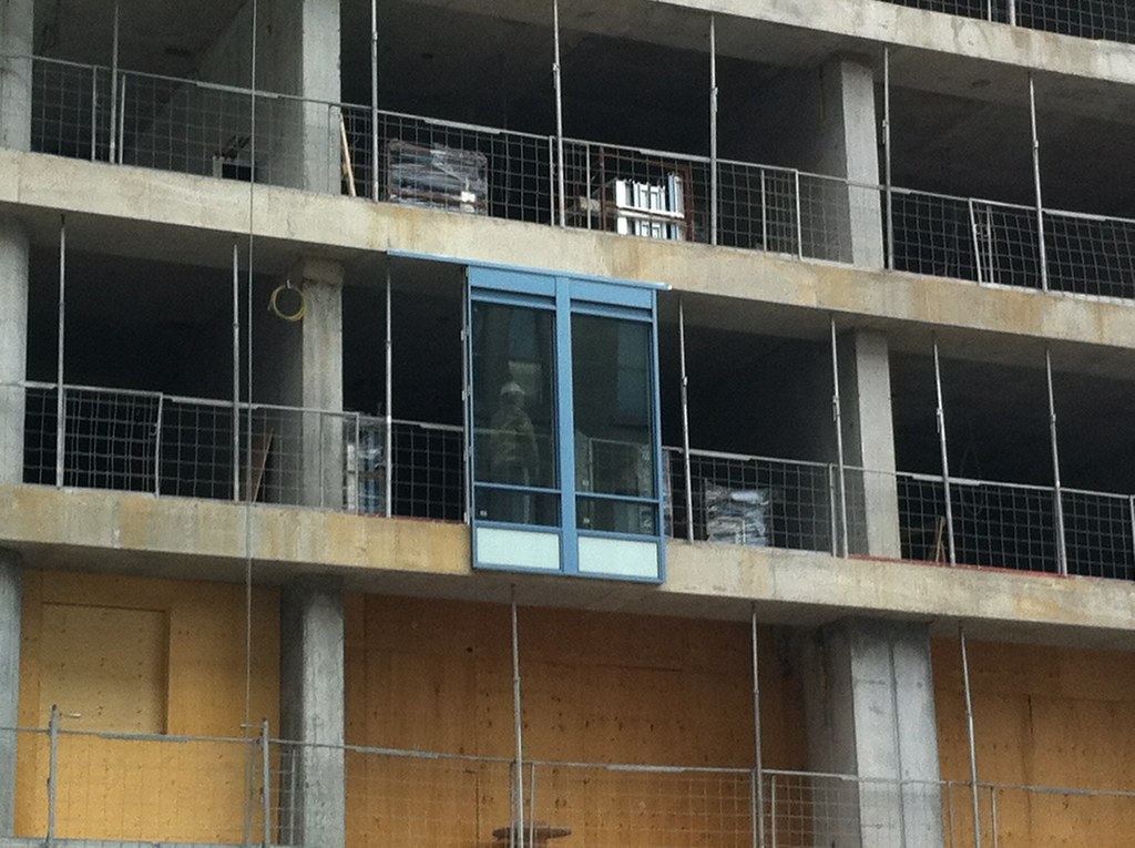
Looks like they're installing the one on the left

And a closeup shot of what it looked like on the test rig.
 
Well, that's unfortunate. I guess the budget was blown on the structural gymnastics, all that's left now is for middle of the road cladding, in baby blue no less. Ick.
 
I love how blue and tacky this will be. North York spandrel chic. Though I'd prefer an elegant silvery curtainwall with some fritted vertical slashes to establish the planned exterior pattern... the angst, hand-wringing, screams of cheapening and general disgust of most things Toronto to be reported through 2012... will mitigate the materials disappointment. If only the glass was green.
 
it reminds me of the grimy turquoise spandrel on the co-op housing buildings on merton street just south of davisville. Time will tell
 
The developers probably asked the architect they wanted something that would make the building standout. It certainly is a unique colour for the area.

The cladding on the building differs from both of the test units. The spandrel is double the height and lighter in colour. Perferred the one on the right.
 
Of the two displays shown above, the one on the right looks significantly better to me - it just looks/feels sharper and would stand out more, in a good way. That's of course just my opinion! So while the shape of this building is good (i.e. a non-box), this project got "Torontoized" (yes, that's my new name for a compromise on any feature) by its cladding. (Perhaps a condo-bust is in the order for this overly-stretched and haphazardly developing megalopolis.) Sigh....
 
Torontoized? It's called The Cheapening™!

42
 
Torontoized? It's called The Cheapening™!

42

Well, these two mean the same thing to me regarding developments in the city - that's what happens when The Cheapening is seen so frequently; you start associating it with the larger noun (in this case, the city of Toronto).
 

Back
Top