Toronto King Portland Centre and Kingly Condos | 57.6m | 15s | Allied | Hariri Pontarini

It's hard to tell from the model pic whether this plan will extinguish the row of Victorian row houses along Adelaide Place and Adelaide W. I'm sure that at least one of them is a registered heritage property - union hall or something, I think

It's a nice looking project, but a shame the historic character is being carried out of the neighbourhood by the dump-truckload.
 
Last edited:
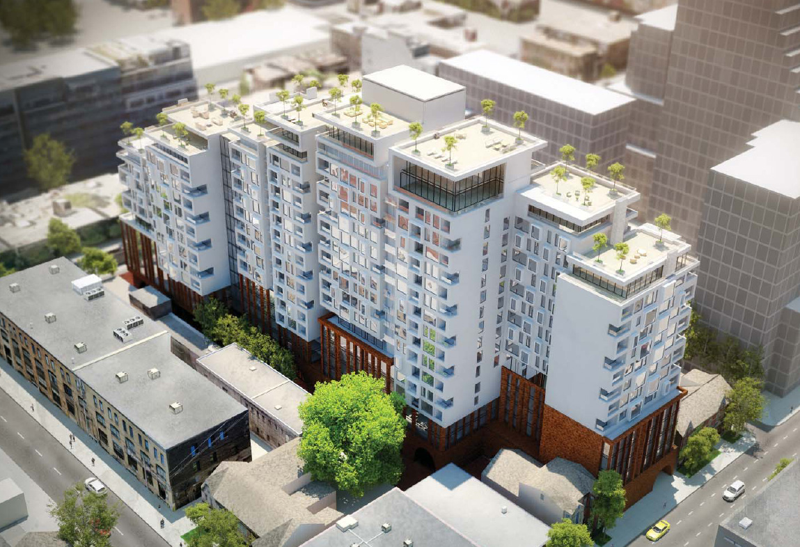
This should work...courtesy of #talkcondo and posted by Southcore.

talkcondo-new-condos-in-toronto-context-king-west-exterior.jpg


talkcondo-new-condos-in-toronto-context-king-west-grade.jpg
 
Last edited:
Agreed. Its a great design (no silly take - whether it be wavy, scattered or loopy - on wrap around glass balconies).
 
Yeah very nice, finally its great to see the area councilor and the folks of the hood tolerate a bit of height.:)

Actually, you've spent considerable time deriding those residents and the councillor while obsessing over your singular interest in height for every building proposal. If you take a look at the images, only a quarter of the building will actually hit the 65 metre mark. The remainder steps down towards both King and Adelaide as per the guidelines of the Secondary Plan that you have ridiculed as being out of date.

Just so you know, members of the community were involved in the discussions regarding this proposal - as was the councillor's office. Unlike other developers, Context and Hariri Pontarini appear to be interested in exactly what this building proposal respects: the context.
 
Last edited:
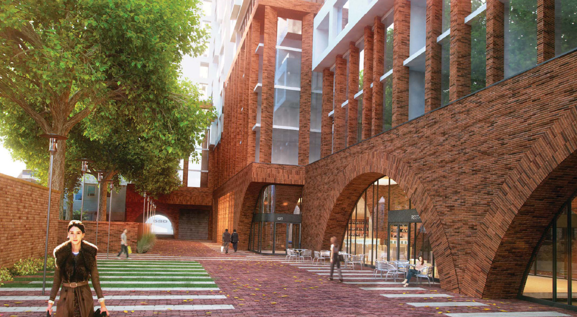
The brick they used in that rendering looks really dated (1970s Yorkville) to me, as do the shape of those arches at ground level. Otherwise I like what I see so far.
 
Okay just took another look and it's already growing on me.

The massing is like Reve gone right. And the arches and brickwork are certainly different for contemporary development in Toronto. It doesn't look very Hariri Pontarini to me though!
 
It's hard to tell from the model pic whether this plan will extinguish the row of Victorian row houses along Adelaide Place and Adelaide W. I'm sure that at least one of them is a registered heritage property - union hall or something, I think.

I don't think the houses on Adelaide Place will disappear. They were mentioned in the Community Meeting. A few houses on Adelaide Street are likely to go, though. The development site includes a parking lot accessed off Adelaide Street, so a mid-block parking area will be also removed.

Regarding the brick and other materials to be used, remember that this is the first full rendering presented. Details might be altered as the project progresses. Let's just hope all the obvious good qualities are maintained.
 
Quite nice - I like the massive, solid base with the large-scale arches - a pretty inventive move in relation to the design standards of the day. I like that one shot that shows the broken, semi-arch. I hope they include a few similarly playful modifications of the standard arch elsewhere - switches in scale, variations in % of circle used, etc. Could be great.

What are people thinking that white cladding for the upper levels of the building will be? Metal panels? Precast? Painted concrete? Ceramic rainscreen (dreaming)? It seems pretty nebulous in these renders, but it could do a lot to make or break this design.
 

Back
Top