You are using an out of date browser. It may not display this or other websites correctly.
You should upgrade or use an alternative browser.
You should upgrade or use an alternative browser.
Toronto Junction Point | 27.6m | 8s | Gairloch | a—A
- Thread starter vic
- Start date
rdaner
Senior Member
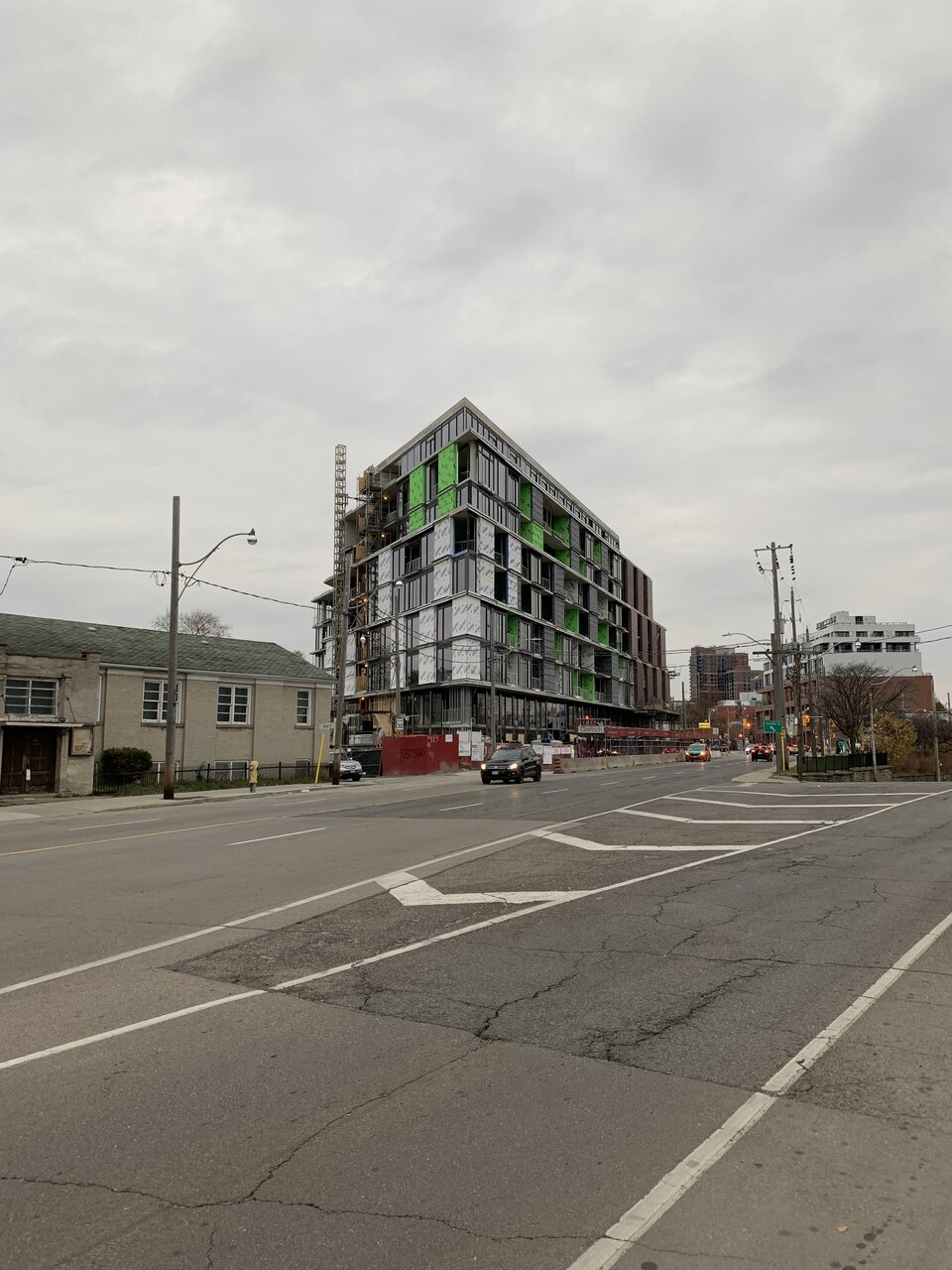
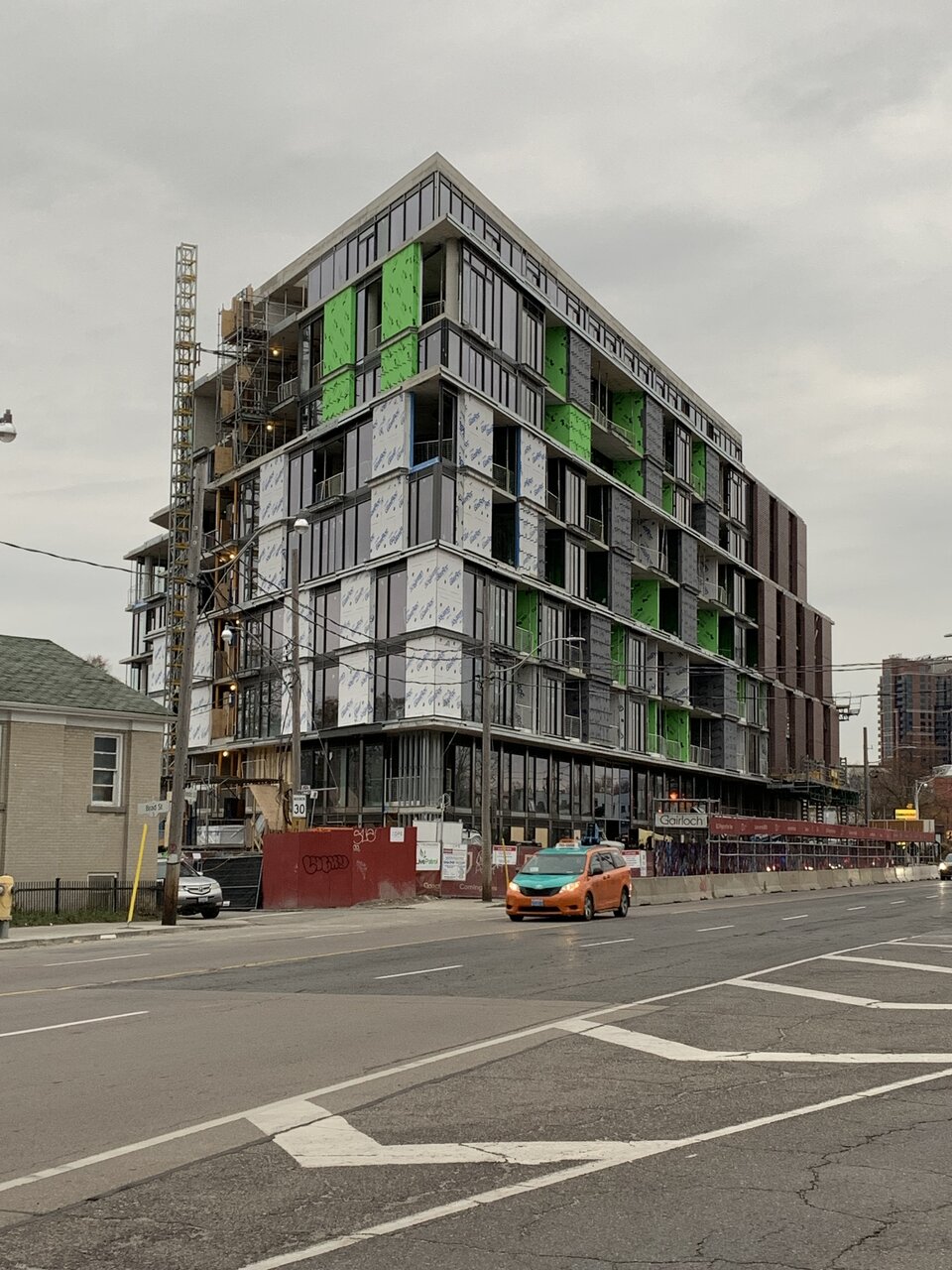
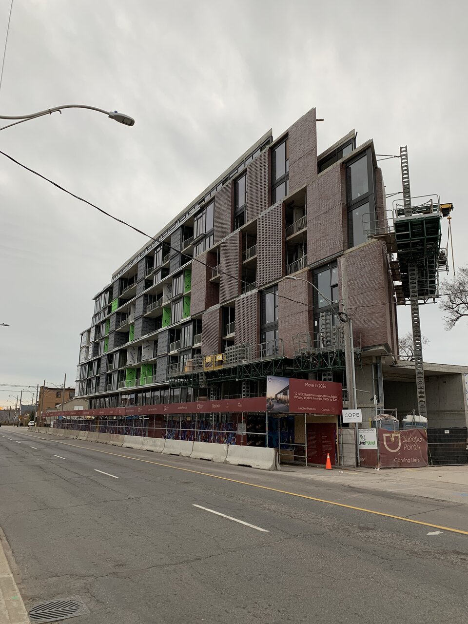
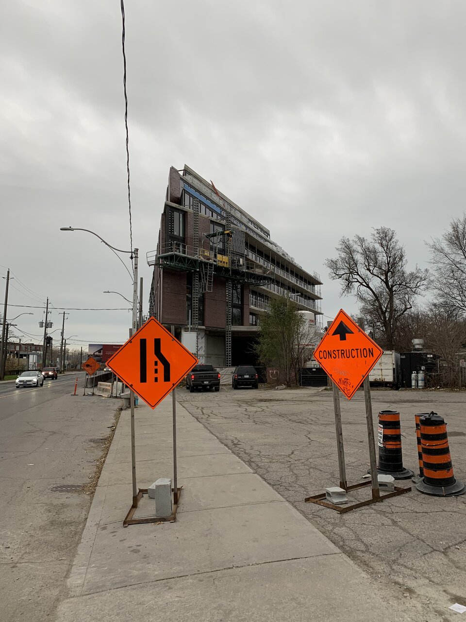
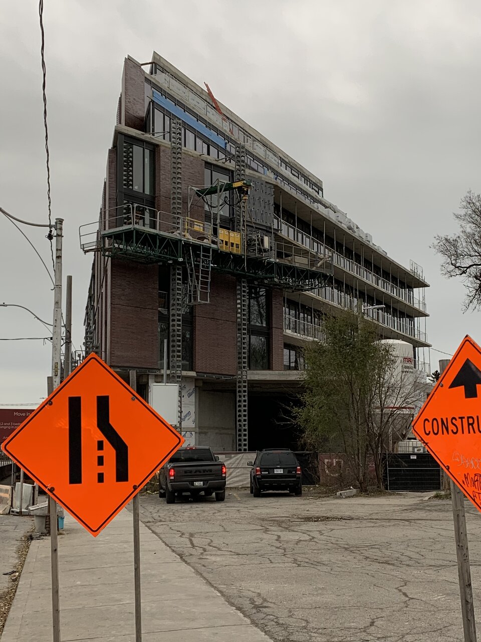
Taken 26 November.
junctionist
Senior Member
It's jarring how the building is beautiful but the public realm is terrible.
Tim1234
Active Member
Totally agree, but I do think buildings like this are what stimulate change to to their surroundings for the better.It's jarring how the building is beautiful but the public realm is terrible.
AlbertC
Superstar
Kenojuak
Active Member
Gairloch really knows how to do 'em
tomherren
New Member
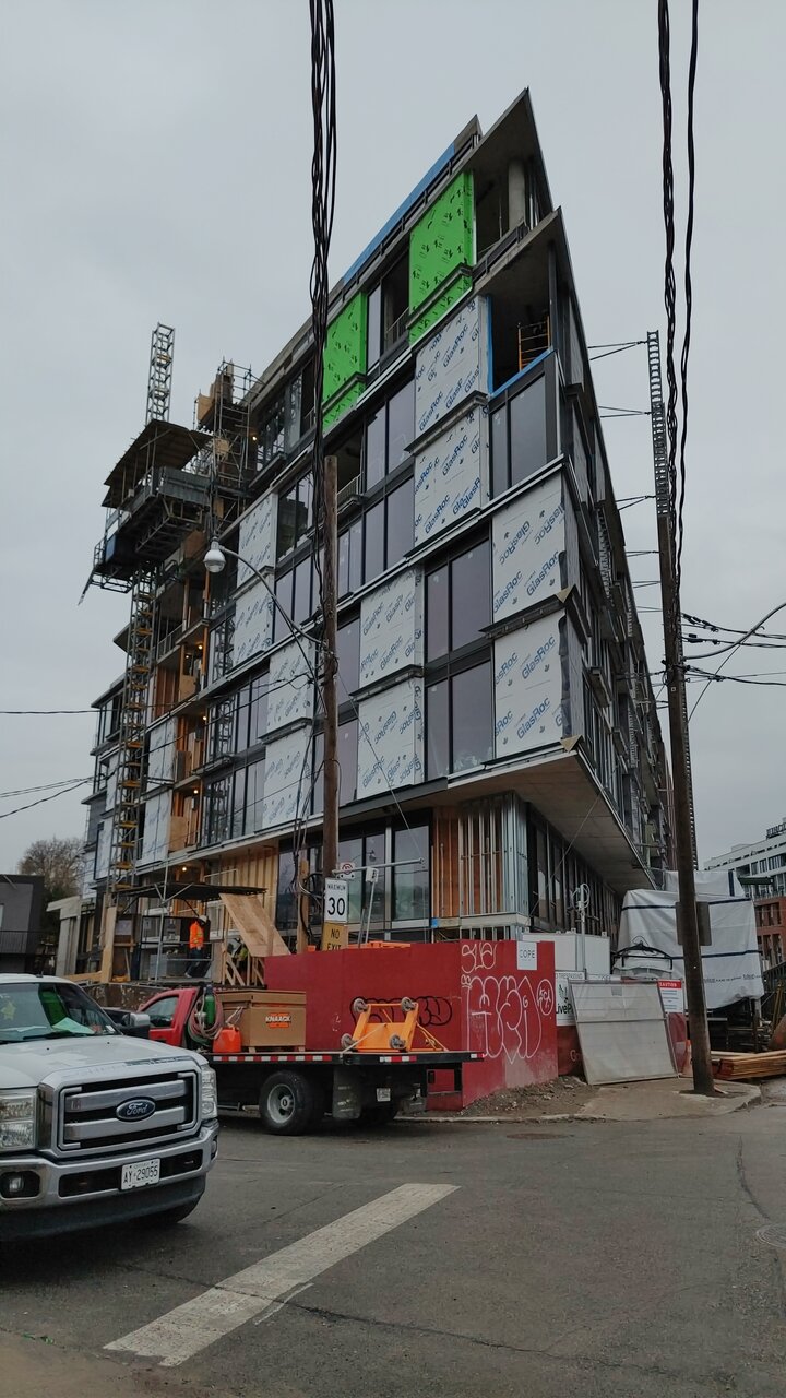
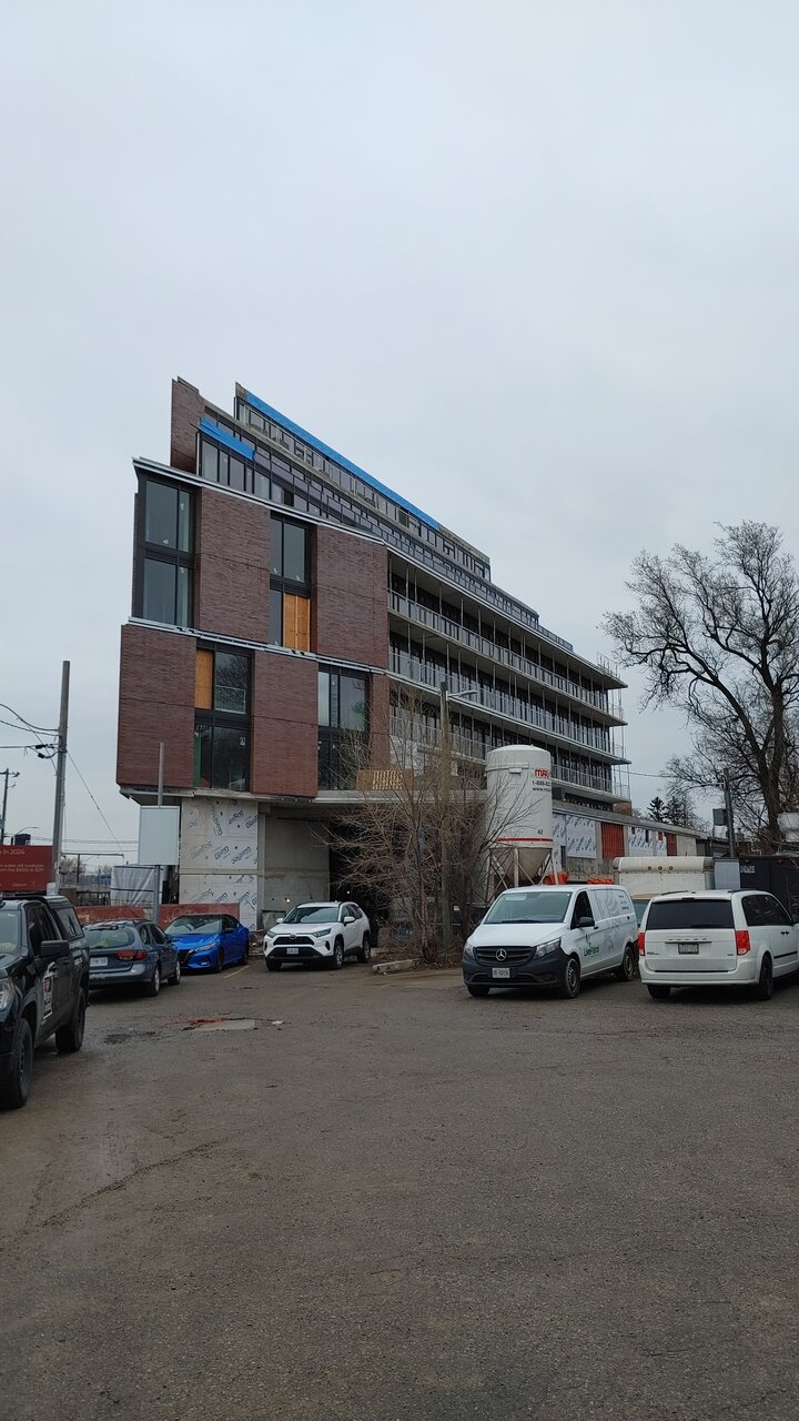
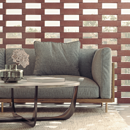
Another unfortunate case of unrealistic renderings, I worry that the units might feel very dark. In the renderings they had these large, airy bricks for those facade bits, but the pics that Gairloch release today tell a different (and cheaper) story..
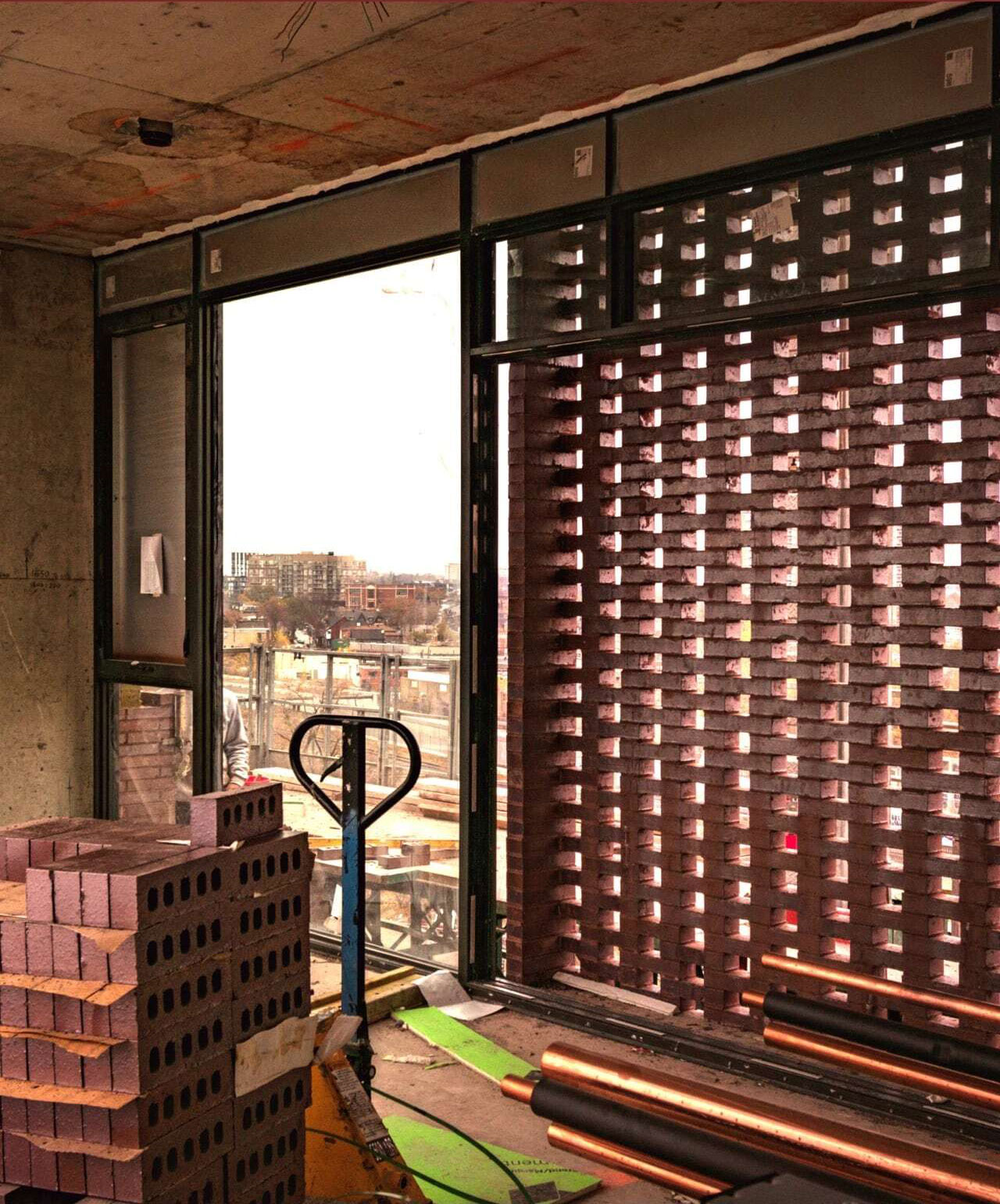
Towered
Superstar
Is it really that bad? Just consider it an enhanced accent wall.
tomherren
New Member
Stylistically it’s fine, but if that’s 60% of your natural light on your only window wall, then not greatIs it really that bad? Just consider it an enhanced accent wall.
smably
Senior Member
I'd like to see a photo taken directly facing the screen to compare to the rendering. The angle in that photo isn't doing it any favours.
Michael UD
New Member
my question is how those brick screens will be maintained. how do you even clean the exterior window? not to mention, birds will probably nest nicely within. nice design choice, but maintenance nightmare in the longterm.
Tim1234
Active Member
If anything I think this building is evidence of an atypical/smaller developer that is trying to do their best they can to replicate precisely what they rendered. I've heard from various architects and designers that industry insiders are amazed w some of the design decisions on this building. Apparently the brick selected alone (not accounting the the screen complication) is double the price of your typical Toronto red brick.Another unfortunate case of unrealistic renderings, I worry that the units might feel very dark. In the renderings they had these large, airy bricks for those facade bits, but the pics that Gairloch release today tell a different (and cheaper) story..
View attachment 527066
View attachment 527068
Towered
Superstar
For the sake of the new residents who are paying a fortune to live here, I hope there is a robust plan in place to power wash this building regularly, otherwise those punctured brick walls will be covered in pigeon poop in no time. They need the team from the Campbell Street Lofts just down the street, who keep that building surprisingly tidy!my question is how those brick screens will be maintained. how do you even clean the exterior window? not to mention, birds will probably nest nicely within. nice design choice, but maintenance nightmare in the longterm.
greenleaf
Senior Member
Today
