Toronto INDX Condos | 178.6m | 54s | Lifetime | P + S / IBI

Hopefully excessive balcony clutter doesn't make its way onto INDX in hordes. The facade containing them is already busy, contrast sharply by EY and not helped by transparent glazing. I appreciate the USB ports but that is one messy motherboard.
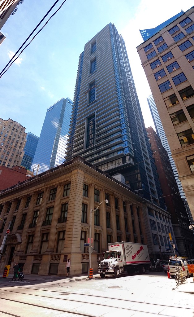
 
^ After assessing the look of the clear balconies it might actually be good for clutter to occur.

I like this building but right now the clear balconies give it a slightly unfinished look, with clutter this could create some distinction in the balconies.
 
:eek: the balcony glazing is clear! omg I've been walking by this every morning and thinking "wow its going to look great with the frosted balconies",,,,

I guess it does give a continual feeling of suspense of when will it be finished because you can never tell if it is. The building that was never finished but finished
 
Clear balcony glazing offers the occupant a much nicer view of the outside cityscape (e.g. from sitting position). A frosted balcony would block the view.

Also, this may sound wierd, but from the street, I like to see evidence of people living in a building, so I don't mind seeing miscellaneous stuff on balconies. A bit of clutter, but also some interest and signs of life.
 
On realtor.ca there are now 90 units in this building for rent, whereas a few weeks ago there were maybe 1 or 2. It's always interesting to see how such injections into the rental market supply are dealt with
 
:eek: the balcony glazing is clear! omg I've been walking by this every morning and thinking "wow its going to look great with the frosted balconies",,,,

Not even necessarily frosted/fritted, but even tinted. At least that still would have been coherent with the overall colour scheme.

Anyway. Today:

29241358541_499d897f48_b.jpg
 
Taken a couple days ago:
DSC_0347.jpg

DSC_0357.jpg

DSC_0354.jpg

...
 

Attachments

  • DSC_0347.jpg
    DSC_0347.jpg
    634.4 KB · Views: 300
  • DSC_0357.jpg
    DSC_0357.jpg
    777.2 KB · Views: 296
  • DSC_0354.jpg
    DSC_0354.jpg
    827.6 KB · Views: 297
  • DSC_0354.jpg
    DSC_0354.jpg
    827.6 KB · Views: 1,370
  • DSC_0347.jpg
    DSC_0347.jpg
    634.4 KB · Views: 1,364
  • DSC_0357.jpg
    DSC_0357.jpg
    777.2 KB · Views: 1,375
Overall a nice project, especially the historic base. I like the recessed 'ports' but I do agree about the balcony glass, I think this was a mistake. I think the clutter of occupants lives will inevitably find it's way onto balconies. Probably would have looked much better if they opted for one-way glass or at least more a reflective one.
 
The treatment of it's base abutting the historic Graphic Arts building would be more accurate. I'm seeing a lot of gaps there though, I'm assuming these will be filled.
 

Back
Top