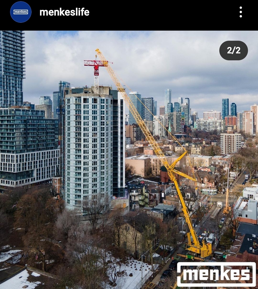
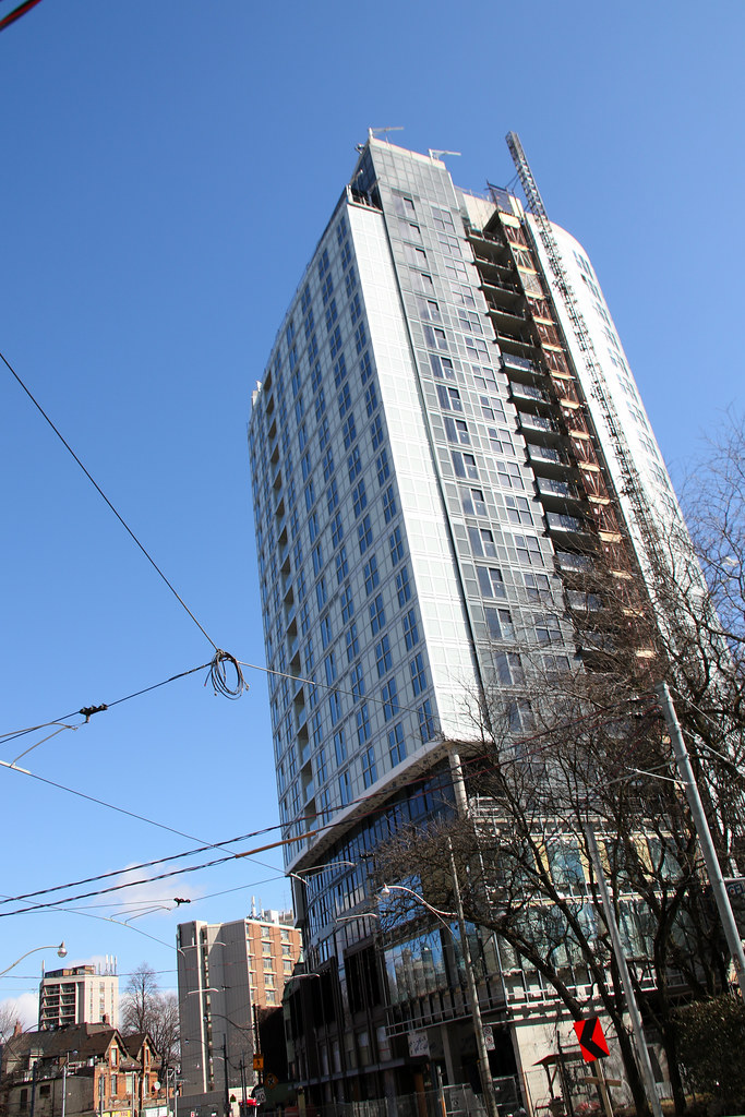
Toronto in.DE Dundas East & Jarvis Condominiums | 65.53m | 21s | Menkes | Turner Fleischer

may the holy land engulf this blasphemy. lol! and whats with the stupid name?
Screenshot_20210302-152220_Instagram.jpg
 
Last edited:
March 14
Have to say this one of the better buildings I have seen in some time as well how long since I last shot it like 9 months.
51045287522_2fea5c9f20_b.jpg

51044465293_5ec29064db_b.jpg

51045288072_6f57ef1706_b.jpg

51044465123_1d42cc468e_b.jpg

51045196456_3643c6ab13_b.jpg

51044465733_9cde80fa60_b.jpg

51044465848_14b0687018_b.jpg

51045196751_876b527396_b.jpg

51045196821_e66c0e31c5_b.jpg

51045288447_25c51934b7_b.jpg

51045288497_d1991e543e_b.jpg

51045288702_2bfb14d502_b.jpg

51045289017_2a8004e99a_b.jpg

51045289062_7f89bb86c1_b.jpg

51044465033_92f8bd7603_b.jpg

51045197686_e46776f60b_b.jpg
 
I mean it's possibly TFs best work.. but not one of the better buildings to go up recently by a long mile. Look at what Menkes did with aA two blocks away.

It is better than I expected it to be. Especially the lower podium levels by the looks of it.
 
No worse than Whitehaus at Yonge and Eglinton and this ain't Yonge and Eglinton so altogether not terrible.

Not that often we disagree on such matters; but here we part ways.

1) Whitehaus IS terrible. Being better than that, to the extent its true is not braggable.

2) This is awful. Bad design, worse finishing.

Yuck!

I'd take some of TF's more Disney-fied plaza offerings over this. (well minus all the surface parking).
 
It's the "townhouse" fronts that sell it for me. They're nicely done. The rest is crap but not egregiously so given the area.
 
I like the idea of a tall building on this site creating a view terminus up the street but what we got is almost not worth it. The only thing I’ll give this development is that there’s not crazy spandrel patterns. It’s fairly uniform, still bad but organized bad
 
This is one of the worst new towers in the city but at street level, it is one of the better ones. First of all, thankfully, this tower does not have the generic, ubiquitous wall of glass and it actually has some contrasting materials to clearly separate the storefronts and entrances. The use of red brick and canopies make this much nicer than expected. I wish there wasn't so much ugly grey above but at street level, so far, I'm not seeing much grey and my eyes will be thankful for that, as Jarvis/Dundas is already a grey spandrel assault from all directions.
 

Back
Top